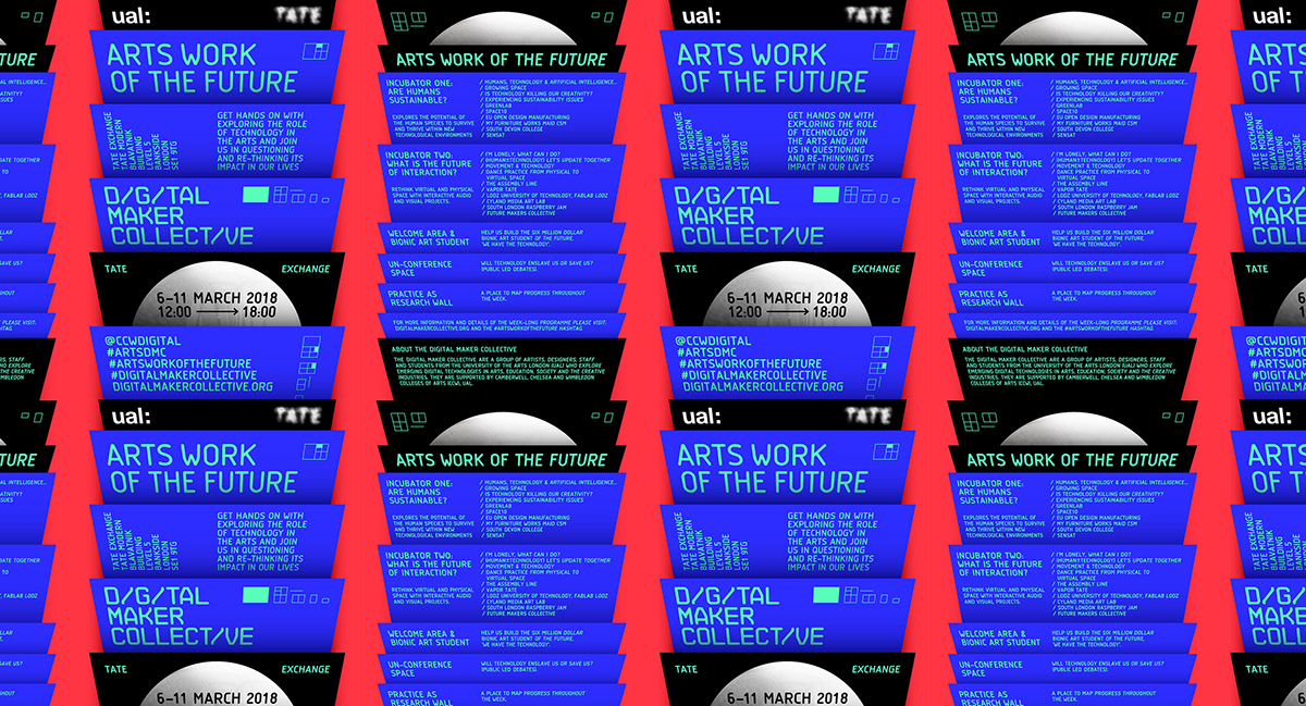
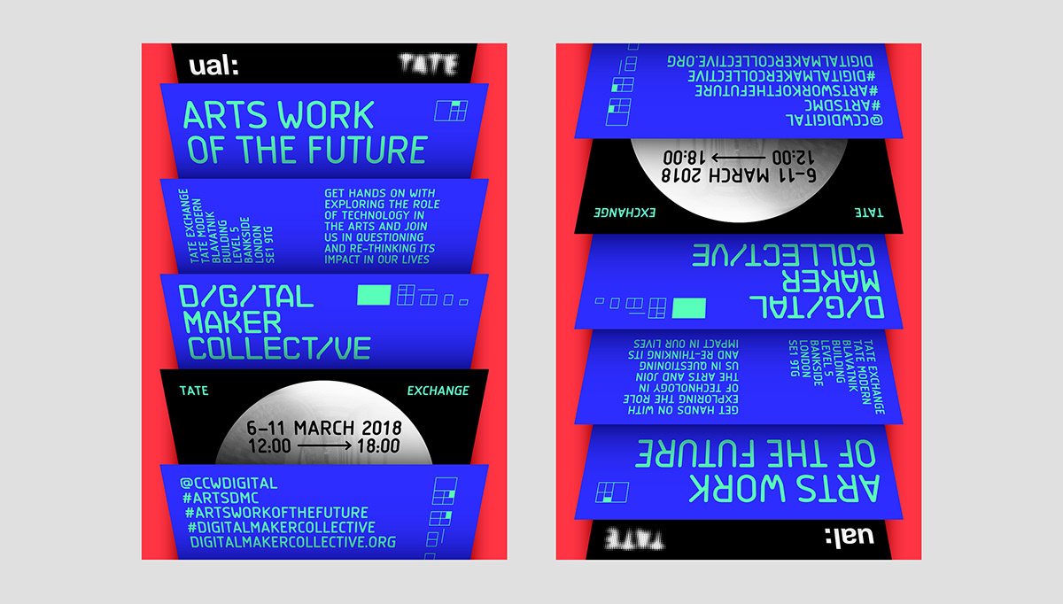
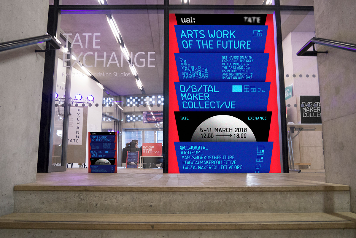
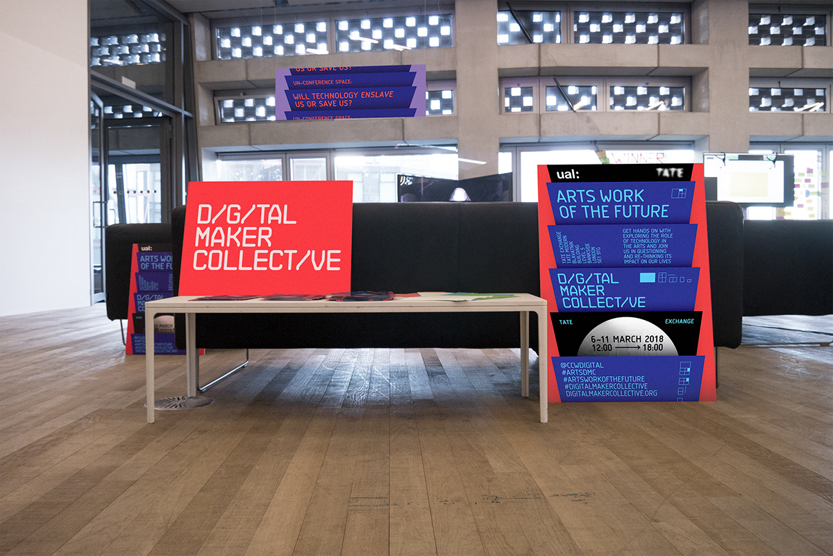
Arts Work Of The Future
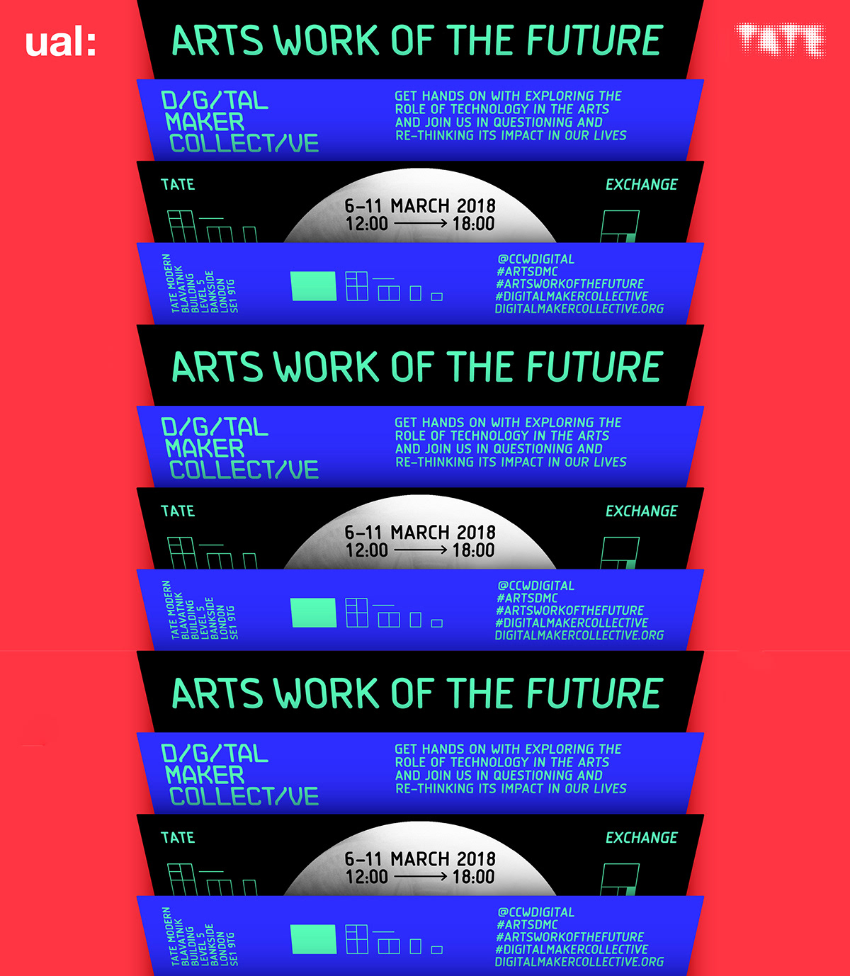
Identity by Tina Touli for “Arts Work Of The Future”, a programme by the Digital Maker Collective at Tate Modern, London.
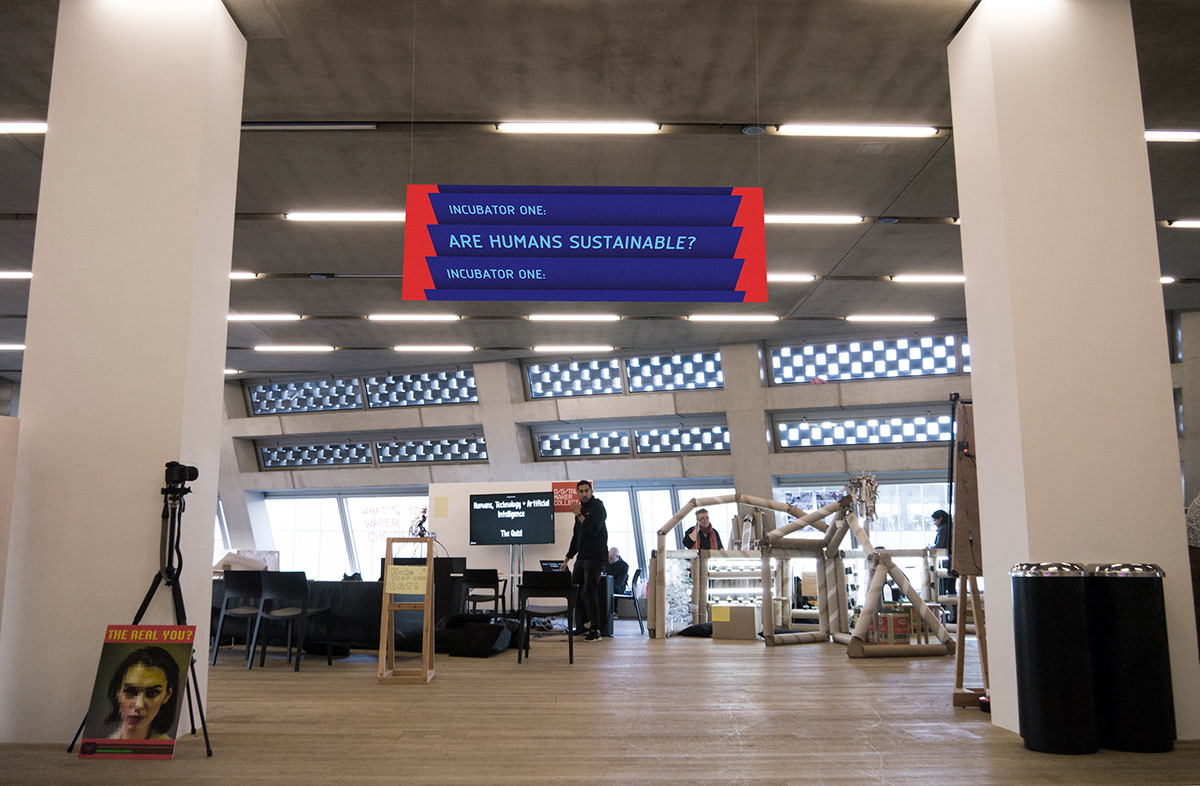
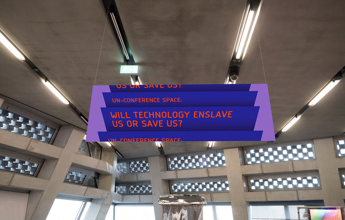
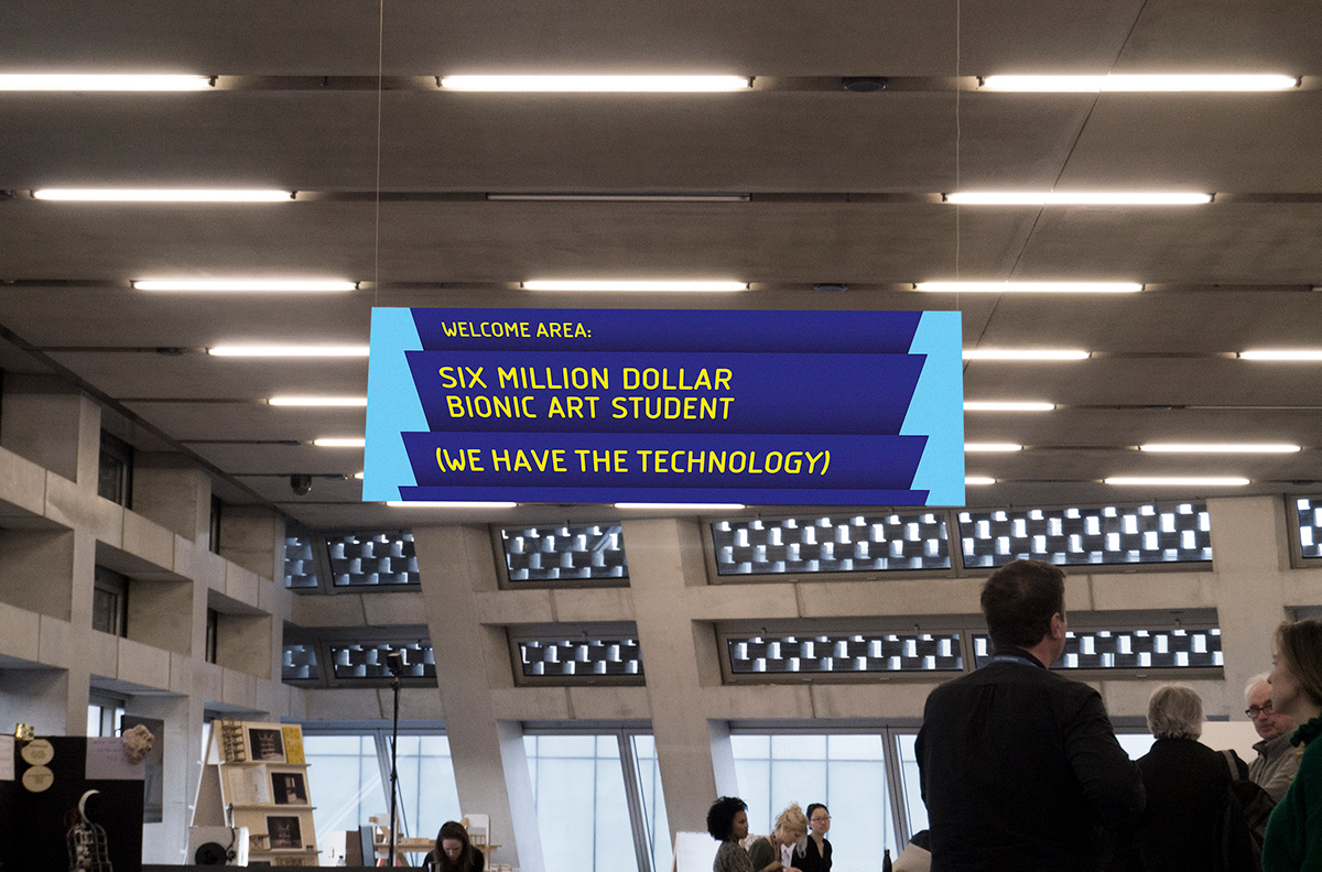
Tate London: The Digital Maker Collective, and invited guest contributors/makers from across the globe, will transform Tate Exchange into a large public tech innovation studio, a space to get hands-on with technology exploration and rapid prototyping, and discover new forms of collaborative digital making experimentation.
Tina Touli: The campaign has been inspired by the windows that we are browsing through on our mobile devices, scrolling from one to another heading towards the future. All these “pages” represent various provocations explored by the Digital Maker Collective. They bring together the students, artist and designers along with industry experts in a path towards the future, exploring the role of technology in the arts and re-thinking its impact on our lives.
Here is a report by Sky News on the exhibition/conference/program:
The typography on posters and signs for this event is set in PF Isotext: a ‘text typeface’ exploration of Isonorm by Greek type foundry Parachute.
Isonorm itself is a design by the International Standard Organisation (ISO), a Swiss organization that aims to “develop and publish International Standards”. One of those standards was the proposal of a standard typeface for drafting and architectural purposes etcetera: Isonorm. The proposal, based on existing lettering devices (stencils, routers) was subsequently implemented, revisited and revived by many foundries in the 1990s and 2000s – see for example this overview.
PF Isotext, the Isonorm version at work here, has two traits that sets the design apart from its siblings. First of all by supporting Greek (not used or shown in this project); and by harmonising the quirks of the original, with wider letter shapes and squarish capitals. Note how the capital W gets a slightly ‘futuristic’ treatment with bent diagonals to keep the letter shape in line with the overall capital width.
This futuristic-look-for-a-workman-typeface-approach is taken to the max in the typeface used for the Digital Maker Collective logo: NB Architekt. It was designed by Stefan Gandl and is available from Neubauladen, who describe it as a typeface that “pays tribute to typefaces used on architectural construction plans during the ‘Letraset’ era.”