
The Extranet (Extratone)
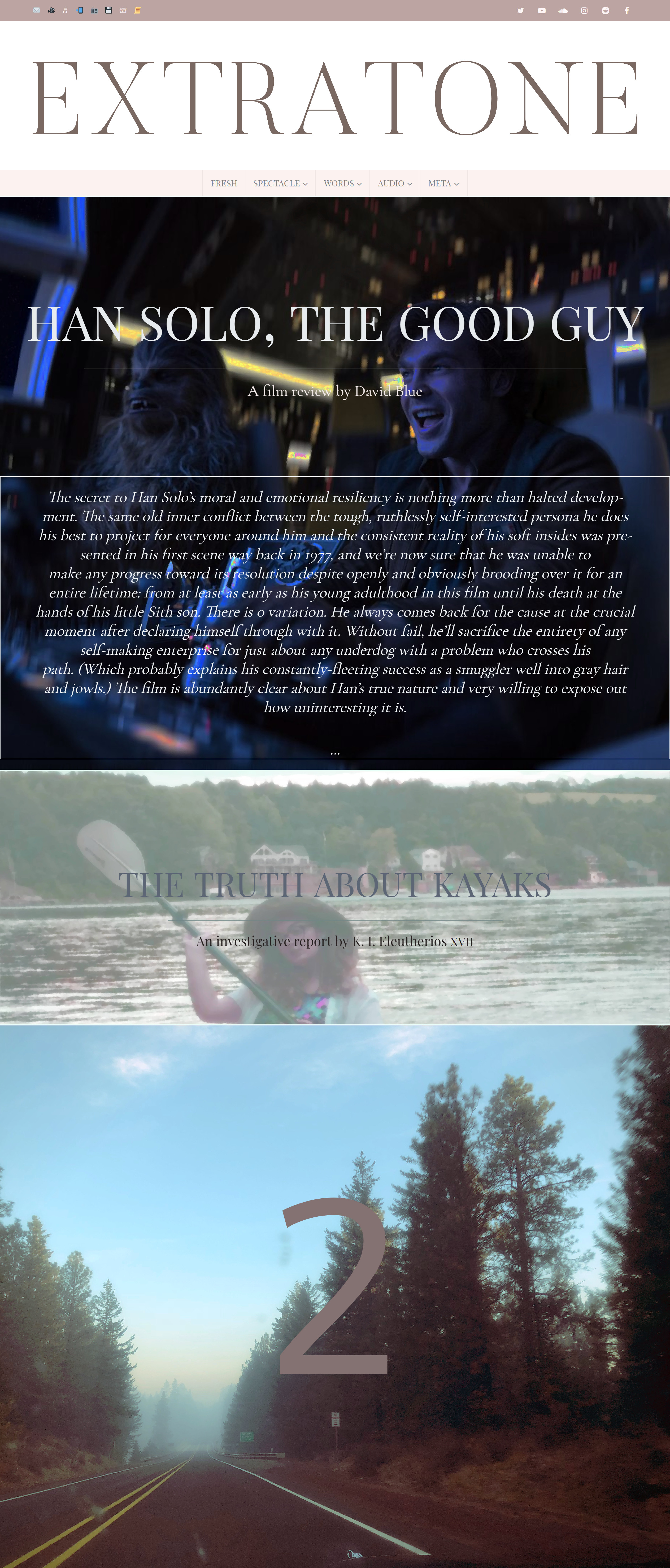
Extratone’s frontpage is designed to be modular enough so as to remain unpredictable, and it changes often. Here, for May 2018, it uses Playfair Display for its secondary byline, Cormorant for its primary byline and its excerpt, Playfair Display SC for titles, and Quattrocentro Sans for a large numeral.
Extratone is an independent online magazine created and maintained by volunteer contributors, so we needed to minimize the overhead of our platform both financially and architecturally as much as possible while still allowing it room to be visually compelling and typographically adaptive. In the pursuit of frugality and ease-of-use, we managed to build The Extranet using exclusively open-source type properties into a platform that satisfactorily manifests the principle design philosophy which we agreed would best compliment our editorial mission.
Specifically, we wanted to avoid black text on white background in unilateral typefaces across a single page and agreed early on that a diverse palette of tried-and-true serifs would be fundamental to the design’s identity instead of a few more attention seeking or radical types. We also knew that the ideal readability as it is quantified in digital media was an unimportant metric for us, and we were willing to sacrifice it to achieve a busier, more vain reading experience that would require visitors to slow down and have a look at the design instead of forcing it stylistically to be nothing more than a tool of delivery. (So far, our exceptionally low bounce rate would suggest that our product works as designed.)
Because we chose to experiment and build the look ourselves from a position of relative inexperience with web design instead of seeking out a professional solution, The Extranet as it exists now represents more than two years of exhaustive trial and error that was a significant learning experience for myself, especially. It has been tinkered with, poured over, and broken exponentially more than if we’d chosen to turn its creation over to third-party hands. As a result, our team’s become bizarrely sentimental and proud of it as a part of our organization’s identity.
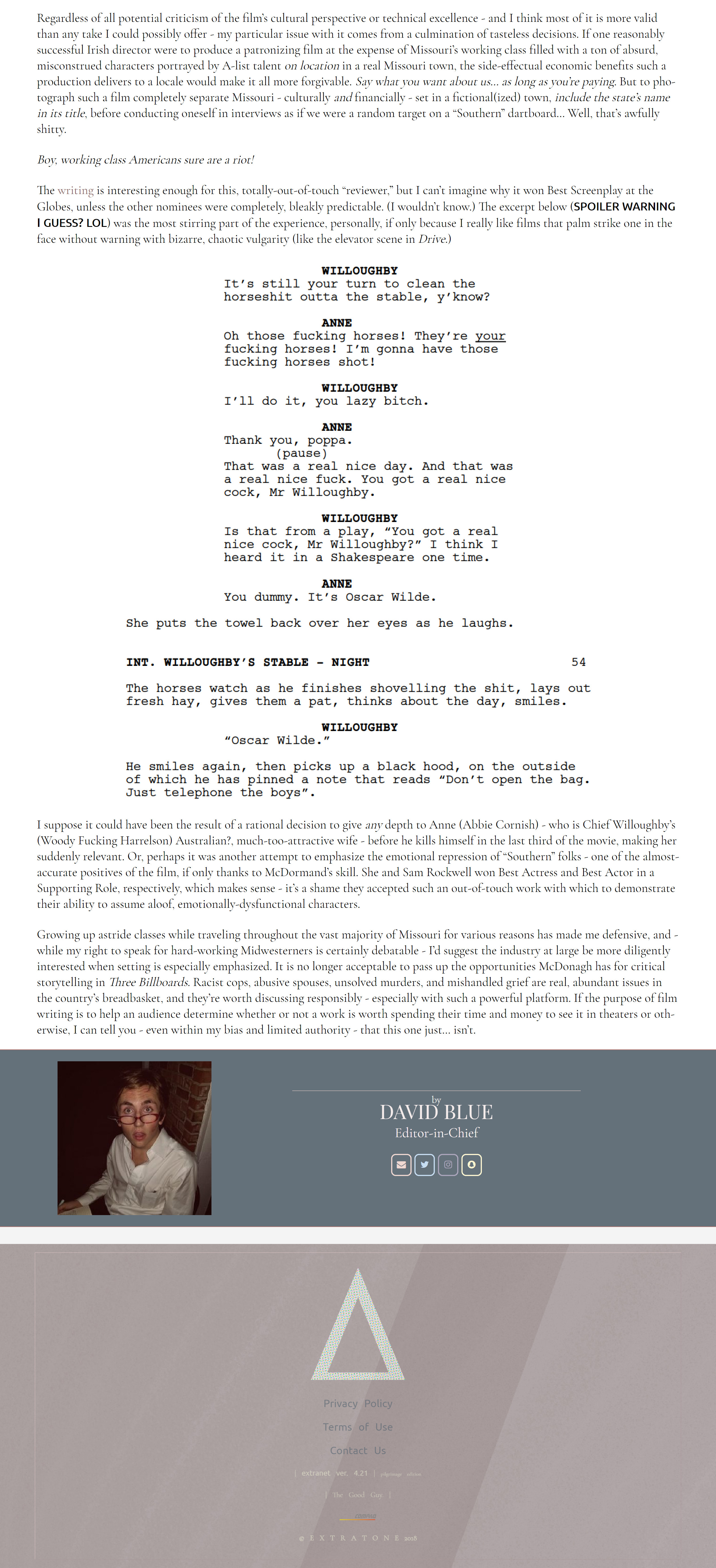
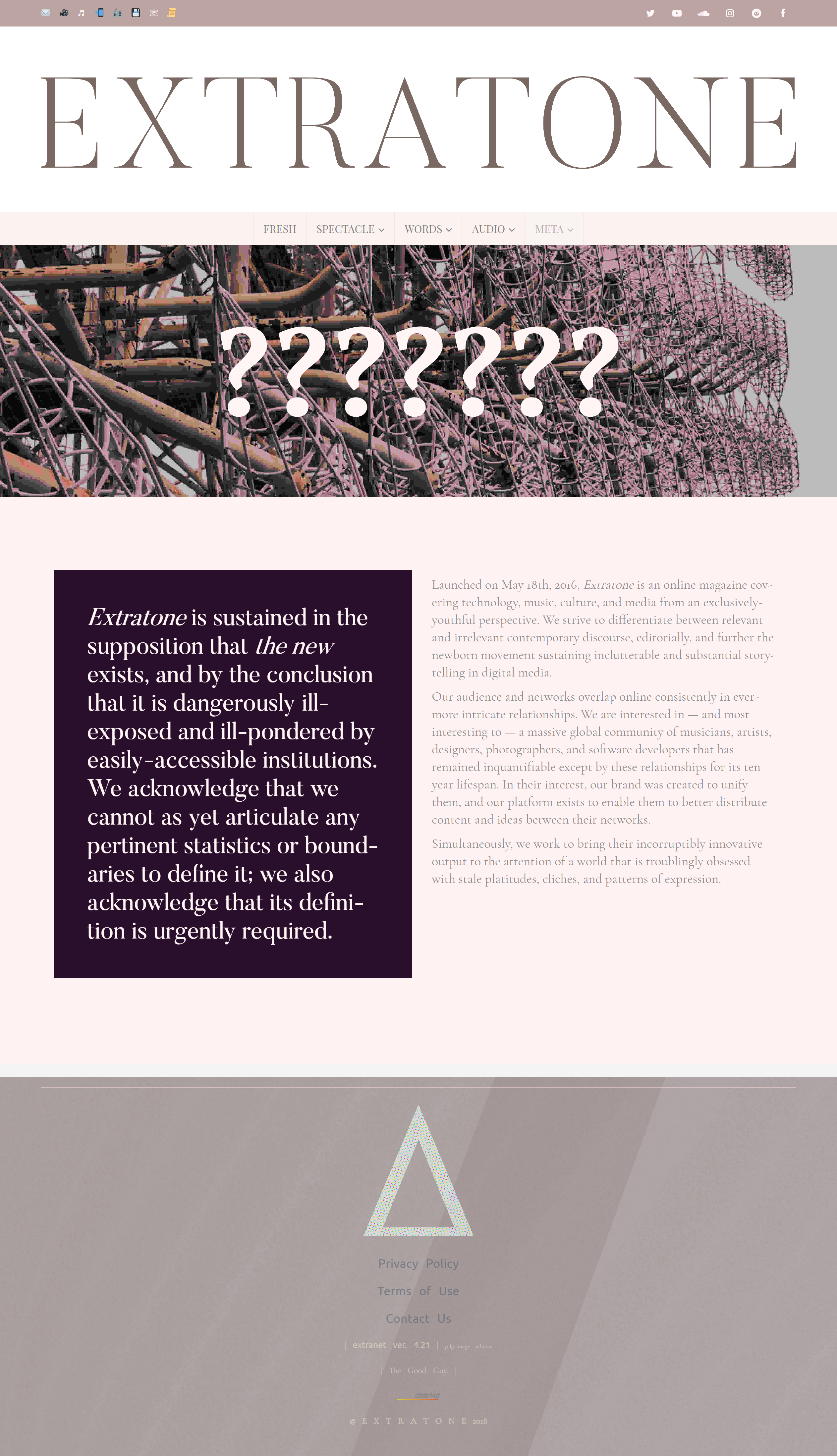
Body and meta text both use Christian Thalmann’s versatile Cormorant family, which also often function in larger roles (e.g. on the About page shown).
Frontpage titles, bylines, and all main navigation use Claus Eggers Sørensen’s open-source Playfair Display of varying weights.
Headings, section titles, and the header’s oversized central mast use two variations of Fabian De Smet’s Butler – Regular weight and Stencil, respectively.
Impallari Type’s Quattrocento Sans is used for the footer’s links to legal documentation and occasionally for pull-quotes, where appropriate.

Cormorant is occasionally called upon for larger text.

The use of Adobe's Source Code Pro for the Best of the Open Web list is an example of our occasional bespoke single-use cases.


")


1 Comment on “The Extranet (Extratone)”
Hi David,
Ooof, that’s some very long lines! They make the site quite difficult to read (look into the max-width property). Center-aligned text set reversed on an image may work when the type’s big enough, and when it’s about a few lines only. The film review teaser shown in the first image is both too small and too long for this treatment. By the way, please note that Cormorant Garamond has true italics; no need to slant the roman. I’d also like to suggest to revisit the spacing of the logo, compare e.g. the space between A and T to the one between, say, N and E.