
The German Revolution. Expressionist Prints
Contributed by Jeremy Tankard on Apr 12th, 2019. Artwork published in
.
Jeremy Tankard. License: All Rights Reserved.
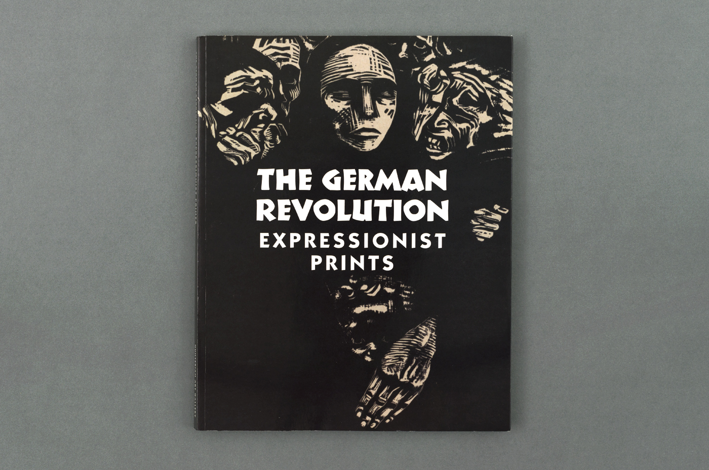
Koch Nueland shown on the front cover, paired with ITC Kabel (Expressionist prints)
The German Revolution (1918–1919) was a period of anarchy and violence that broke out at the end of the First World War, in Berlin and other cities. This publication accompanies a centenary exhibition at the Hunterian Art Gallery, University of Glasgow, from 1 March to 25 August 2019.
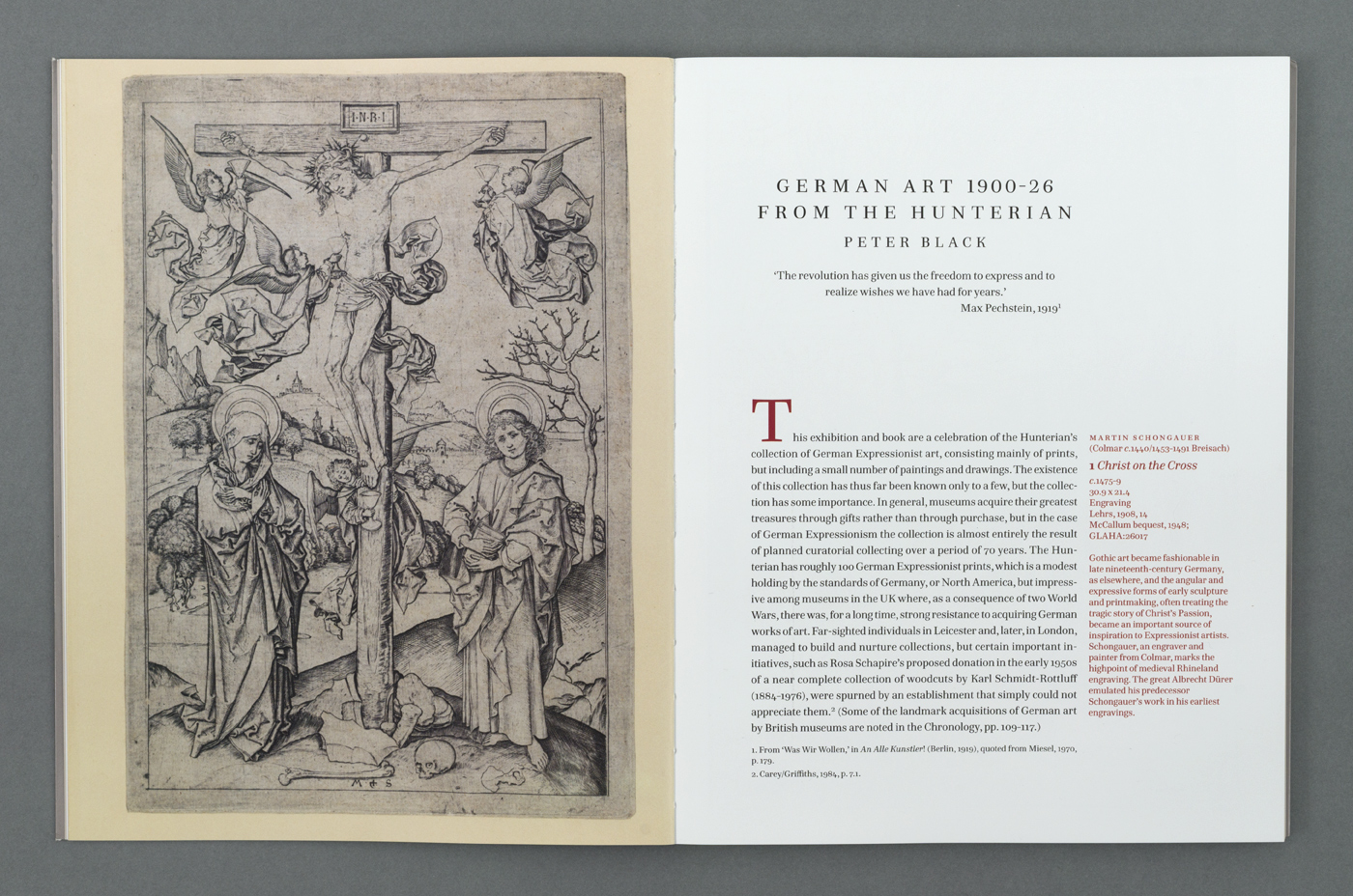
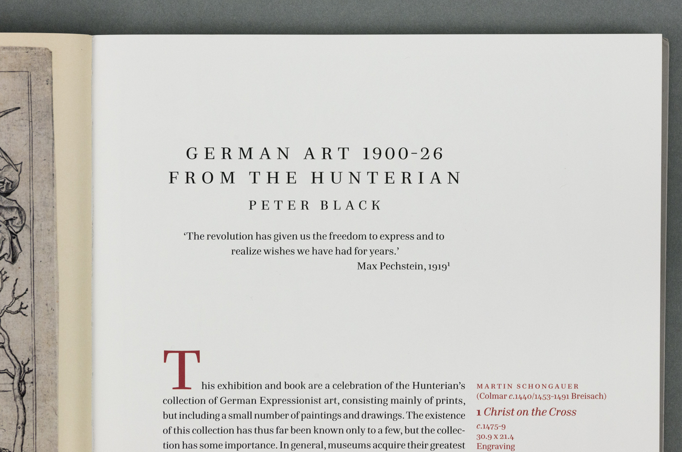
The book uses Hawkland for text throughout, ITC Kabel for running heads and Koch Nueland [P22’s version of Neuland, see comments] on the cover.
Jeremy Tankard. License: All Rights Reserved.
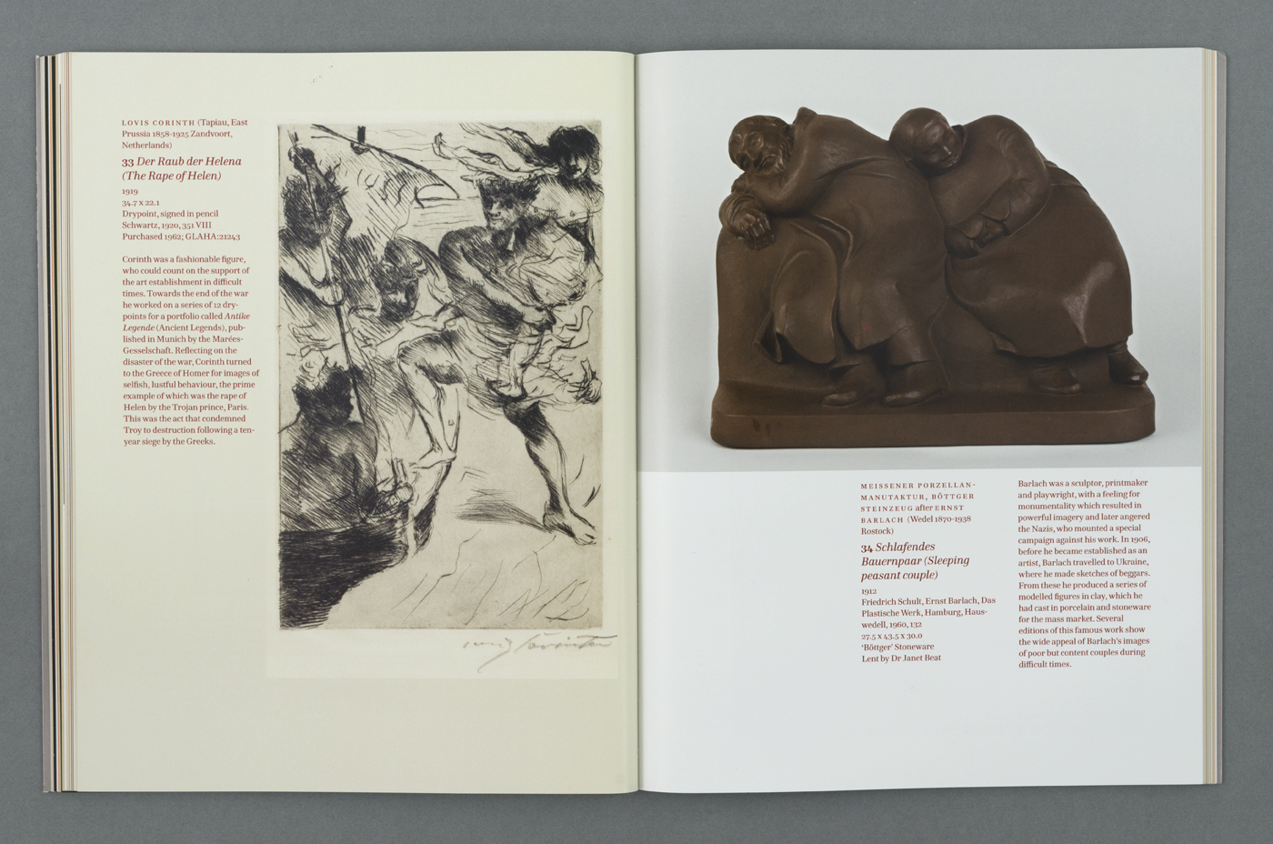
Chapter opening using Hawkland
Jeremy Tankard. License: All Rights Reserved.
Jeremy Tankard. License: All Rights Reserved.
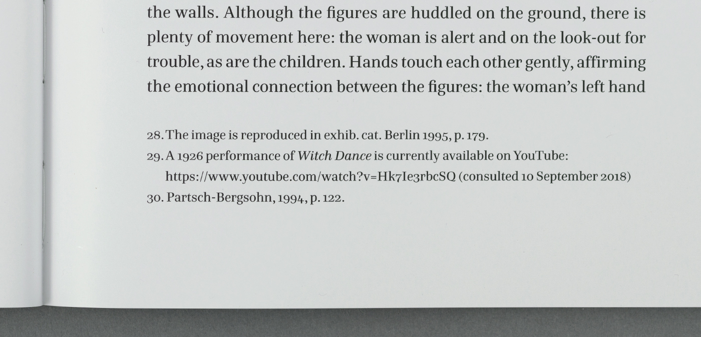
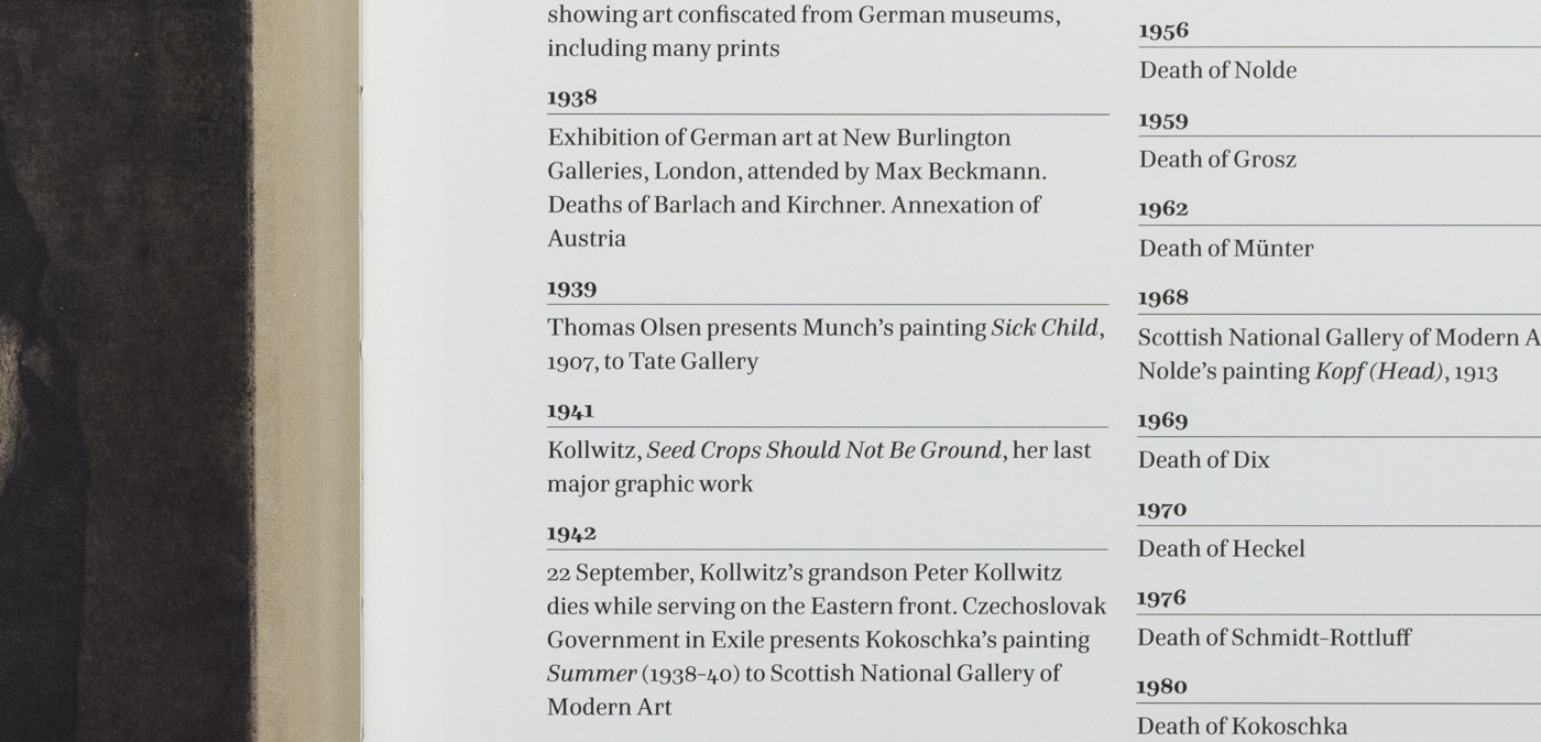
Detail of footnote set in Hawkland
Jeremy Tankard. License: All Rights Reserved.

Jeremy Tankard. License: All Rights Reserved.
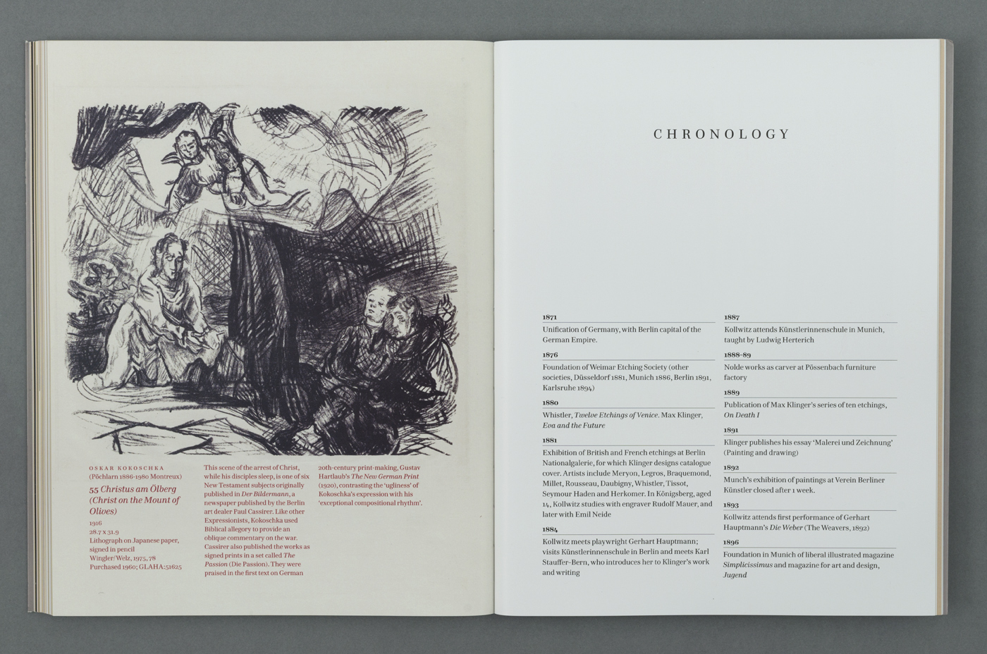
Page spread showing Hawkland for text and Kabel for running head

Jeremy Tankard. License: All Rights Reserved.
Jeremy Tankard. License: All Rights Reserved.
Jeremy Tankard. License: All Rights Reserved.
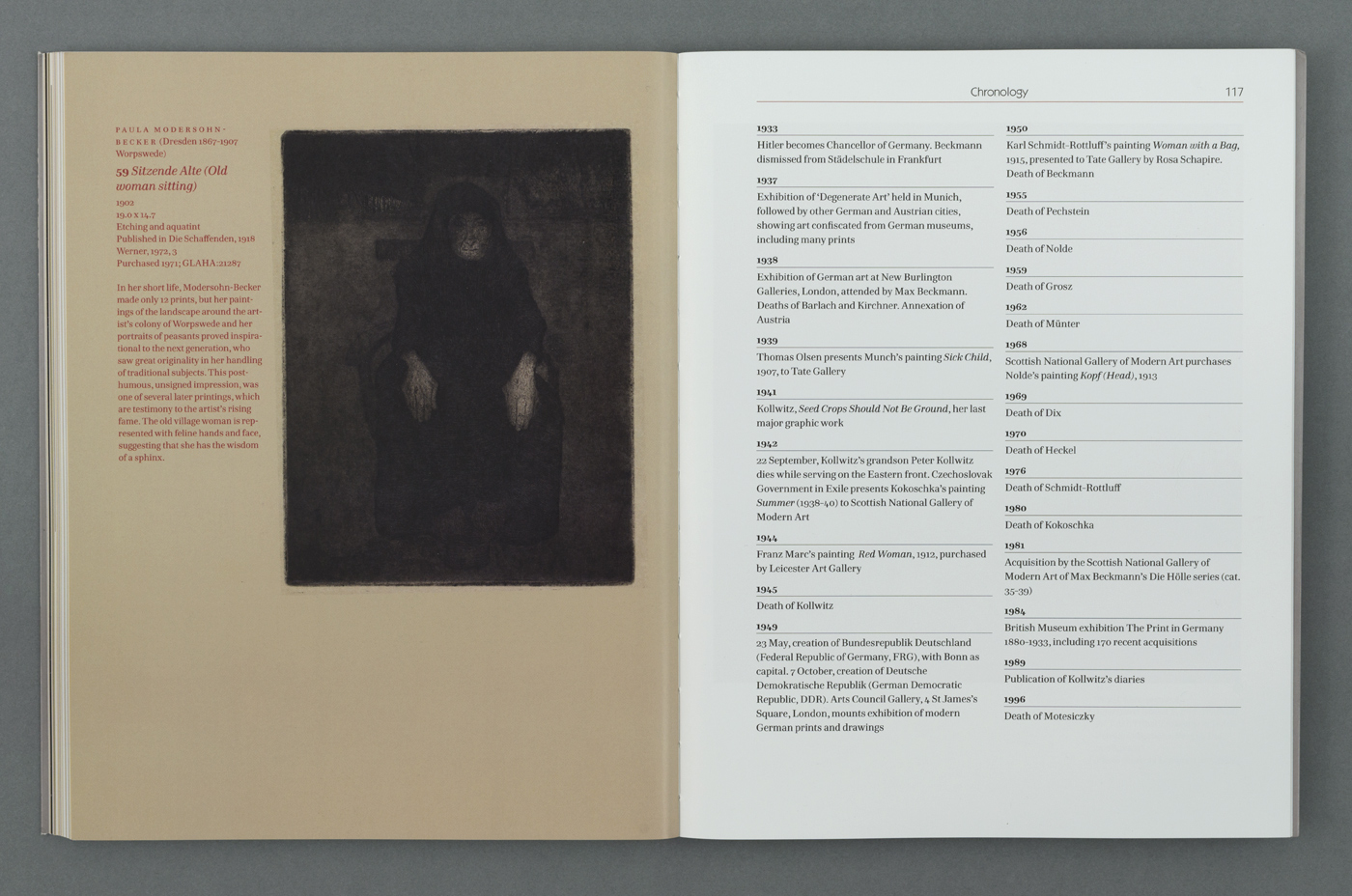
Chronology information set in Hawkland with Kabel for running head
Jeremy Tankard. License: All Rights Reserved.


1 Comment on “The German Revolution. Expressionist Prints”
The version of Neuland (1923) used here is Richard Kegler’s digital interpretation named Koch Nueland, released in 2000 by P22. It’s special in that it has alternate capital forms in its lowercase. Kegler elaborates in the release notes:
The cover shows the distinctive A with the angled crossbar, which is unique to the original 10pt cut, and the narrow R with a very small counter and a horizontal terminal on the leg, which can be found in the 36pt cut. Both forms are included in Koch Nueland’s lowercase. Its uppercase R (in “Revolution”) by contrast appears to be derived from the 8pt size.