
Le Mystère des Voix Bulgares (4AD) album art
Vinyl record cover
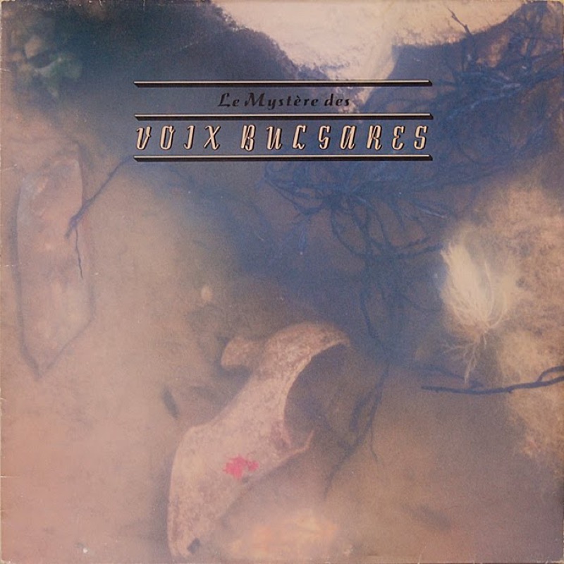
Album art for 4AD’s reissue of Le Mystere Des Voix Bulgares from 1986, designed by 23 Envelope. Under this name, Vaughan Oliver (graphic design and typography) and Nigel Grierson (photography) worked together to create the artwork for almost all releases by the British record label until 1987, building up a distinctive visual identity.
The artwork is just as enigmatic and difficult to place in time as the music. Performed by the Bulgarian State Television Female Vocal Choir and recorded by the Swiss ethnomusicologist Marcel Cellier in the mid 20th century, it was later referenced in the score of Xena: Warrior Princess, set in a fantasy version of ancient Greece.
The cover design combines Grierson’s desaturated photography (a single lady’s shoe under water?) with Oliver’s non-conformist typography. The two lines are set in two script typefaces which, from a conventional viewpoint, are neither similar enough to harmonize nor different enough to yield a contrast. They are enclosed by three borders. With their deep shadow, these echo and amplify the dimensionality suggested by the shade on the letters of the second line. “Voix Bulgares” is set in all caps – featuring several letterforms that don’t lend themselves to being used in medial position, like the hooked I or the G with the descender on the baseline – further increasing the disturbing atmosphere.
Oliver loved to dig up obscure fonts that no-one else used in the 1980s. In fact, both cover typefaces haven’t been documented on Fonts In Use before. Atlántida is an outlined and shaded stand-alone italic with modest slant and deep crotches. It was issued by the Richard Gans foundry in Madrid sometime in the second third of the 20th century. Saltino is a bold unconnected cursive, designed by Karlgeorg Hoefer with a self-made broad nib (the Brause 505) as an extension of his earlier Salto. It was first cast by Klingspor in Offenbach, Germany in 1954. Neither Saltino nor Atlántida is currently available in digital form.
Vaughan Oliver passed away today at the age of 62. Thank you for the inspiration.
Inner sleeve

Record label

Back cover

CD cover


")


5 Comments on “Le Mystère des Voix Bulgares (4AD) album art”
Michael Bierut recommends an interview with Vaughan Oliver conducted by Joan Pons.
Here’s a specimen cover for Atlántida and a glyph set for Saltino (from a combined specimen for Salto, Saltino, and Diskus).
r.i.p. king :(
Just to let you know, Saltino is now available.
Thanks, Conrad. Yes, that’s a freebie digitization of subpar quality. It was made sometime in the 1990s and extended by Dieter Steffmann in 2000. I’ve added this info to the font page. I had to remove the link, as a) my understanding is that it’s unauthorized, and b) that website also offers pirated fonts.