
Faber Poetry titles
Contributed by Chris Purcell on Aug 9th, 2017. Artwork published in
.

License: All Rights Reserved.
From Design Week, July 2001:
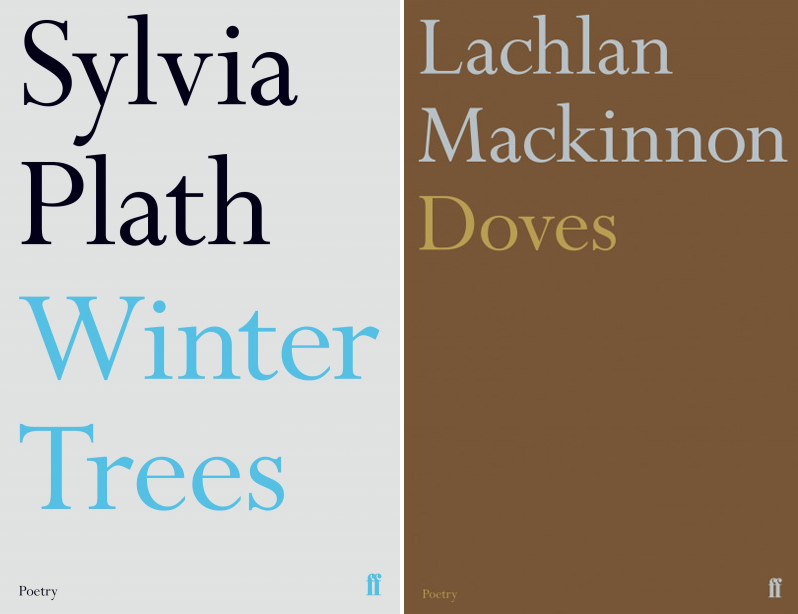
Pentagram partner Justus Oehler has redesigned the entire poetry book series for Faber & Faber. Inspired by some original covers created by post-war graphic designer Berthold Wolpe, the new look emphasises the use of large typography and bold colour combinations. The colours are used to express the feeling and mood of each book, says Oehler. ‘The use of typography only on the covers, rather than images, makes the volumes feel more honest and should appeal to real bibliophiles,’ he adds.
See Faber & Faber’s current Poetry collection on their website.

License: All Rights Reserved.

License: All Rights Reserved.
License: All Rights Reserved.
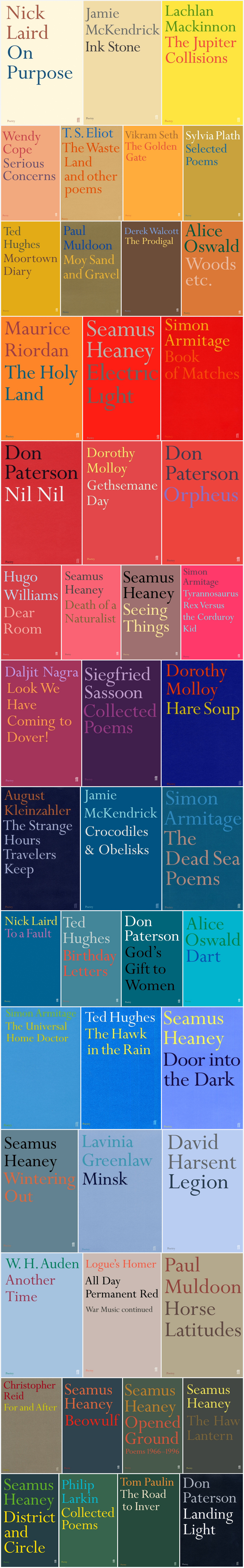
Faber Books showcases a selection of covers from the Poetry series on their Flickr photostream.


")

1 Comment on “Faber Poetry titles”
In c. 2009, Tony Davis was commissioned “to create designs which could both exist as designs for retail but also complement the Faber brand and books taking it into new areas of business.” Among the products that reference the Poetry series were porcelain mugs, bookbags, and a pack of playing cards, further iconizing the cover designs featuring Perpetua.