Fighting Fantasy gamebook series (Laurel Leaf/Dell)
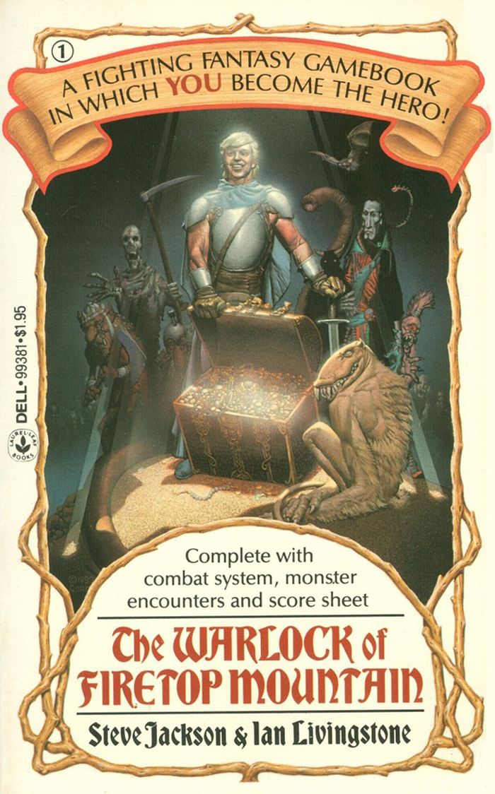
1: The Warlock of Firetop Mountain by Steve Jackson and Ian Livingstone, 1983. Cover art by Richard Corben.
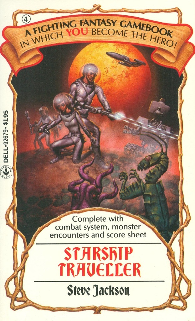
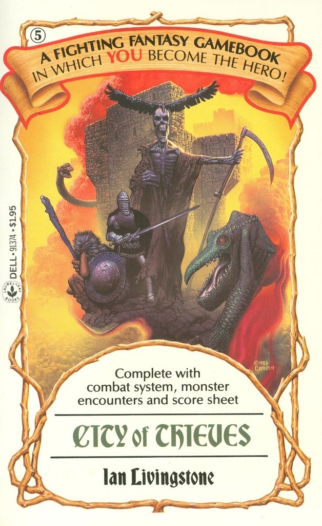
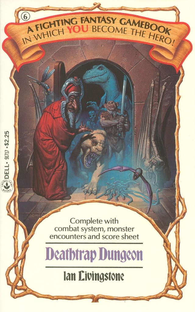
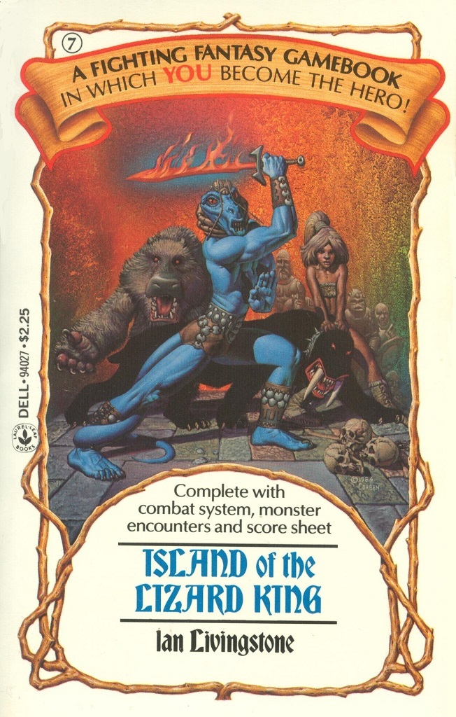
When Laurel Leaf, an imprint of Dell, published the US version of The Warlock of Firetop Mountain in November 1983, they adopted the book’s typographic identity featuring Bradley, which had been introduced with Puffin’s original UK edition the year before, see this post.
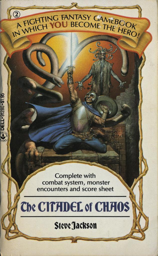
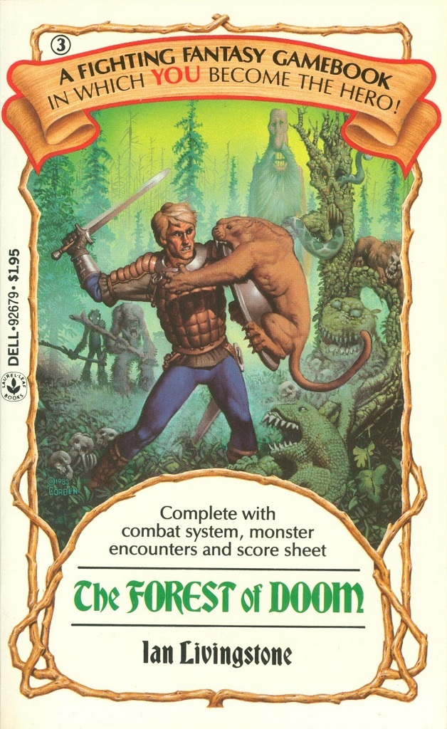
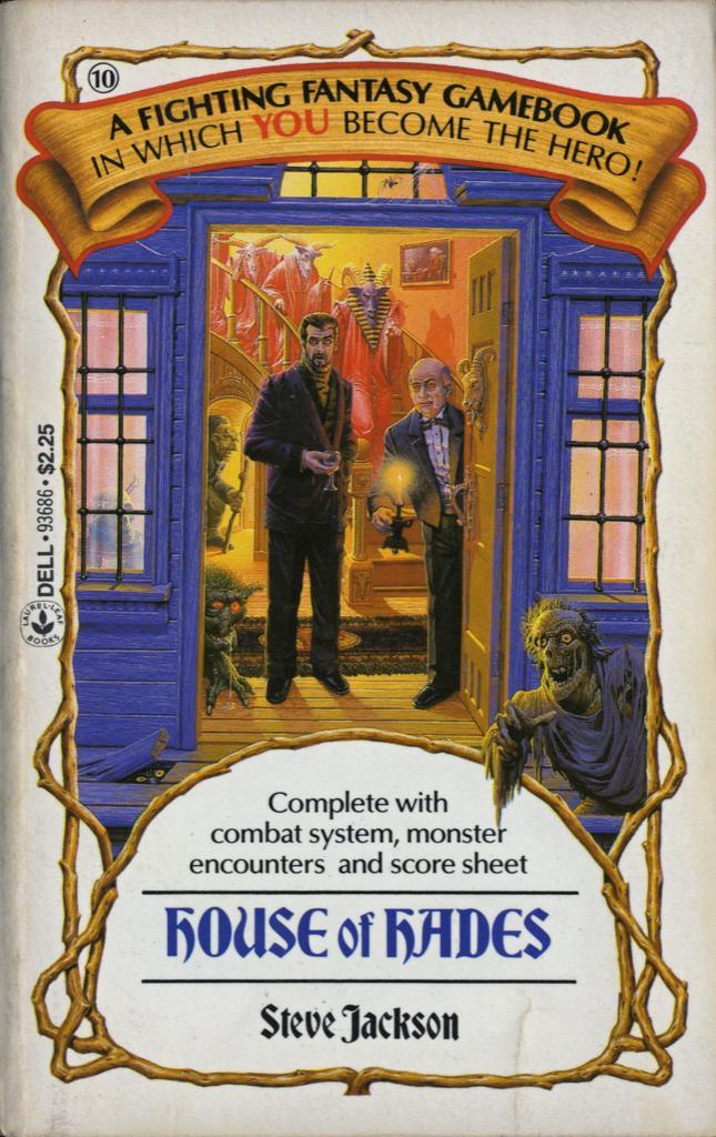
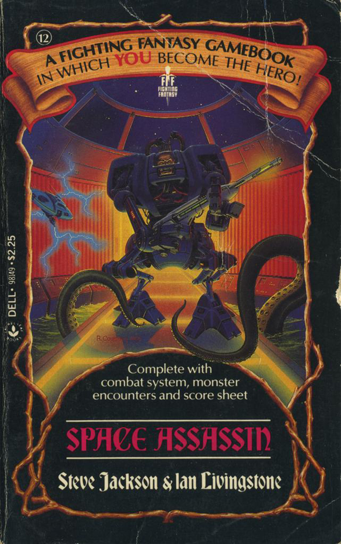
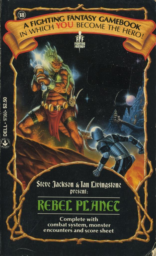
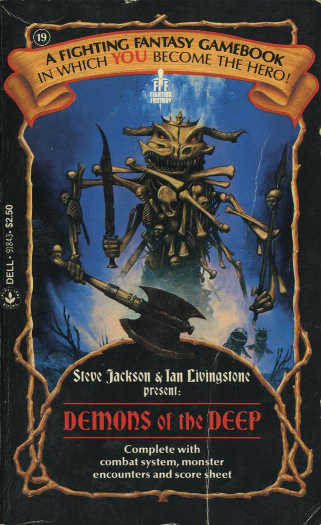
While Puffin changed to different cover typefaces for the subsequent books in the Fighting Fantasy series, Laurel Leaf stuck to Bradley for the complete run of the series. The Americans didn’t squeeze the letterforms, and also went less heavy with the caps: Author names as well as articles and prepositions in the titles are set in mixed case — Deathtrap Dungeon dispenses with the caps craze altogether — for a slightly less outlandish look.
The C gets the same simplified treatment as in the UK. Additionally, I and T (in non-initial position) exhibit alternate or altered forms that work better in all caps. From issue 5 on, these subtleties were forgotten, though. Now C, I and T show exclusively the standard letterforms.
The Titannica Fighting Fantasy Wiki on the US edition:
The gamebooks featured a new cover design with the first eleven books using a generic white background, whilst books 12 through 21 had a generic black background. Initially the gamebooks had completely new cover illustrations, by Richard Corben (The Warlock of Firetop Mountain to Island of the Lizard King) and R. Courtney (Scorpion Swamp to Freeway Fighter), until 1986 when with Temple of Terror the original Puffin Books cover illustration were used till the range ended with Trial of Champions. During this run House of Hell was retitled House of Hades.
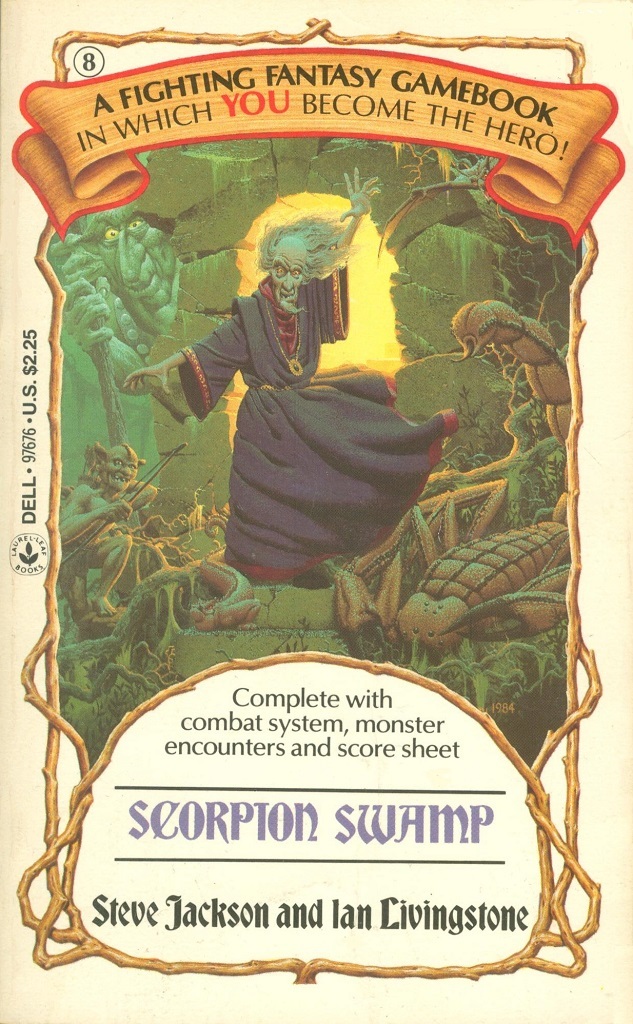
8: Scorpion Swamp by (the other) Steve Jackson and Ian Livingstone, 1985. Cover art by Richard Courtney.
Formats
- Books (3992)
Topics
- Entertainment (1001)
- Literature (1911)
Designers/Agencies
Tagged with
- book covers (3482)
- book series (348)
- paperbacks/softcovers (886)
- Dell Publishing (15)
- Steve Jackson (2)
- Ian Livingstone (2)
- fantasy (85)
- gamebooks (2)
- role-playing games (12)
- Fighting Fantasy (2)
- Laurel Leaf Books (1)
- 1980s (432)
- alternate glyphs (747)
- modified typeface (1144)
- all caps (4047)
- mystery (32)
- type on a curve (603)
- logos (2687)
Artwork location
- United States (6364)
- New York City (1705)


















2 Comments on “Fighting Fantasy gamebook series (Laurel Leaf/Dell)”
But what type is used in the Fighting Fantasy logo?
Hi Xiko,
Thanks for your question. That looks like Hess Neobold. The type in the image below has some minor differences, but that might be because it’s a contemporary emulation?