
Six Flags logo
Contributed by Jackson Tomlinson on Jan 5th, 2017. Artwork published in
circa 2005
.
Six Flags Theme Parks Inc. License: All Rights Reserved.
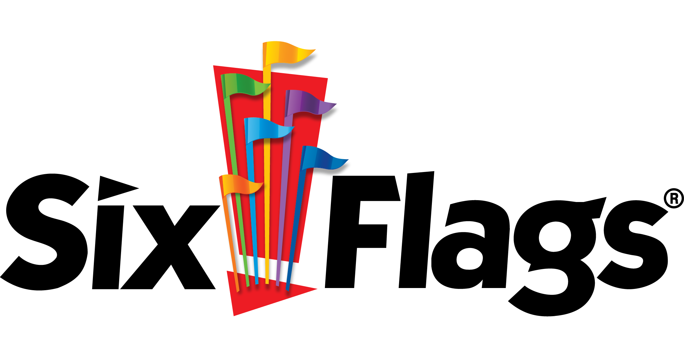
Logo version used from 2005 to 2015
Six Flags Entertainment Corporation, or simply Six Flags, is an amusement park corporation based in the United States, with properties in the US, Canada, and Mexico. It is the largest amusement park company based on the number of properties it owns, and the fifth-most popular in terms of attendance.
The wordmark appears to be a modified ITC Kabel Bold, inclined (ITC Kabel doesn’t have italics) and with straightened terminals towards the baseline. The diamond-shaped dot on ‘i’ has been replaced by a triangle, to echo the flag motif and maybe also to evoke velocity.
Source: content.sixflags.com License: All Rights Reserved.
Current logo version (2017)
Source: twitter.com License: All Rights Reserved.
Twitter avatar (2017)


")


")


 opening title sequence")


2 Comments on “Six Flags logo”
ITC Kabel Ultra seems very similar to standard Kabel Black. However, I prefer the ITC version as it seems to have a little more personality, a bit more quirkiness.
Identifont’s comparison tool lets one see the differences between Kabel Black and ITC Kabel Ultra at one glance.