The English Riviera tourism posters

Torbay is a borough in Devon, England, […] spanning the towns of Torquay, Paignton and Brixham, located around an east-facing natural harbour (Tor Bay) on the English Channel. A popular tourist destination with a tight conurbation of resort towns, Torbay’s sandy beaches, mild climate and recreational and leisure attractions have given rise to the nickname of the English Riviera. — Wikipedia
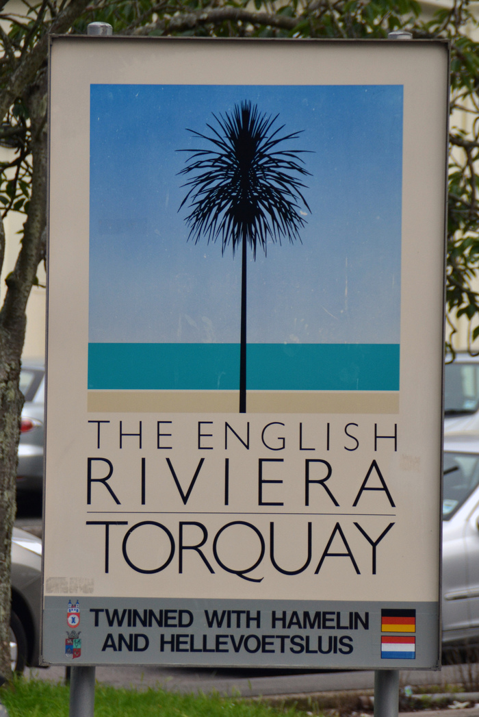
In 1982, British graphic designer John Gorham (1937–2001) was commissioned to devise a poster for the English Riviera. His solution presents a detail of the scenery in a carefully defined color palette, echoing the style of travel posters made in the second quarter of the 20th century. The composition here is boiled down to the absolute essence: a sandy stripe for the beach, separated by a thin white line of spume from a turquoise rectangle for the sea, underneath a gradient from white to deep blue for the sky — Rothko meets Albers. In the foreground: The silhouette of a stylized Torbay palm tree. Not only is it perfectly centered, its crown is drawn with symmetrical leaves — this is the English Riviera. The type is Gill Sans (what else?) set in three stacked and justified lines of caps from the Light weight (first issued in 1931), with the names of the three towns joined by middle dots. Johnson Banks’ blog post about John Gorham suggests that this work of his became quite influential:
His poster for the English Riviera unfortunately encouraged a whole generation of designers to pretend that they actually were 1930s poster artists.
For those interested in Gorham and his work, see also Mike Dempsey’s article about his “local hero”.
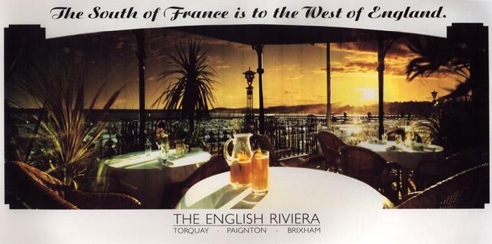
Gorham’s iconic poster spawned many variations and follow-ups. These were designed by David Hughes and others. Most of them maintained the combination of Gorham’s symmetrical palm tree and light Gill Sans. The website of the English Riviera Tourist Board used to have a dedicated page with a full list of the annual posters, from 1983 to 2004. Unfortunately the images are gone, but bloggers designatweeta and Torquay Palms reposted some of them. A selection is reproduced below.
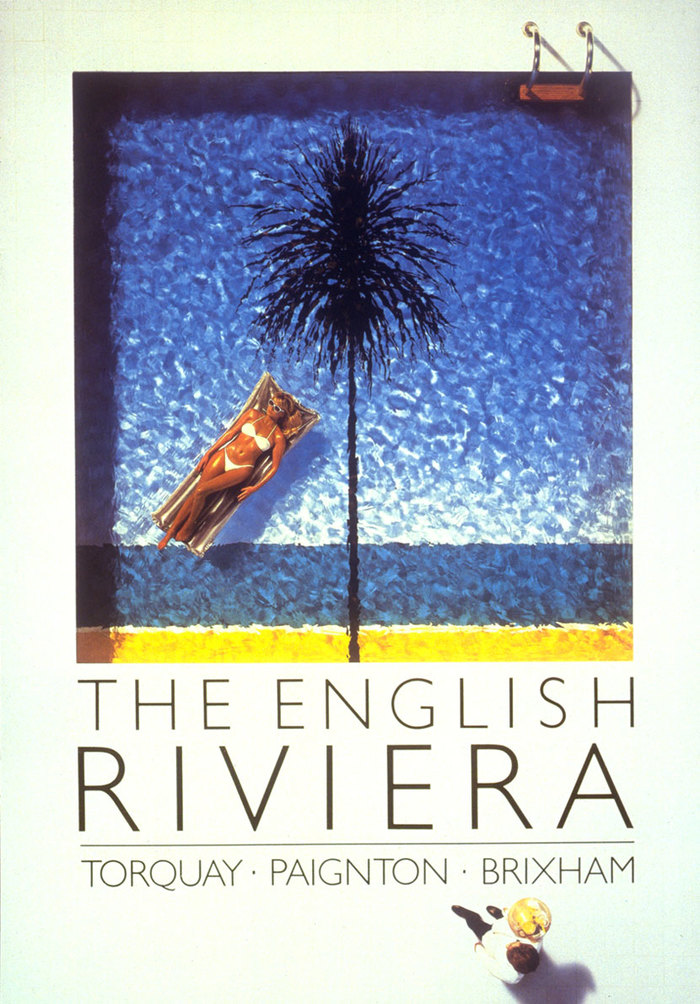
Pool, 1986. “One of several posters designed by David Hughes in this long-running campaign for The English Riviera.” — Anatomised
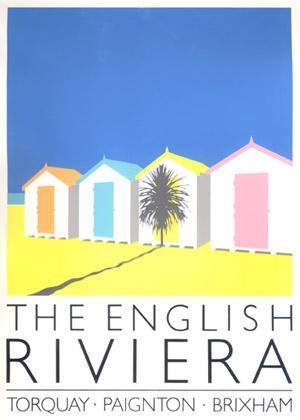
Beach huts, 1988
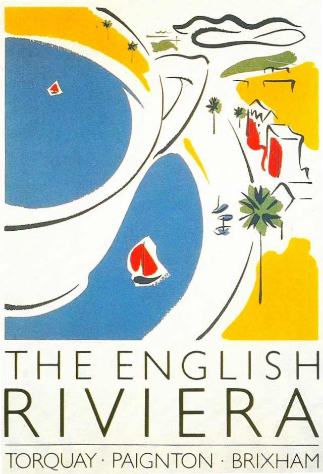
Teacup, 1990
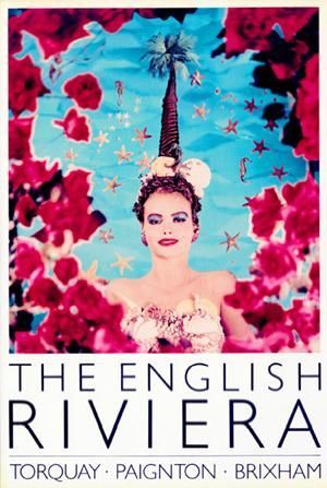
English Rose, 1991
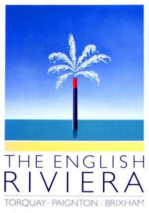
Snorkel, 1997
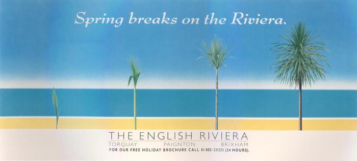
Spring Breaks, 1992. From a series of seasonal ads featuring Bernhard Modern Bold Italic (ATF, 1938).
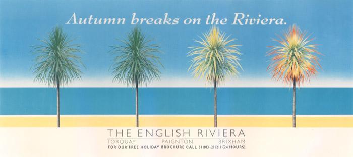
Autumn Breaks, 1992
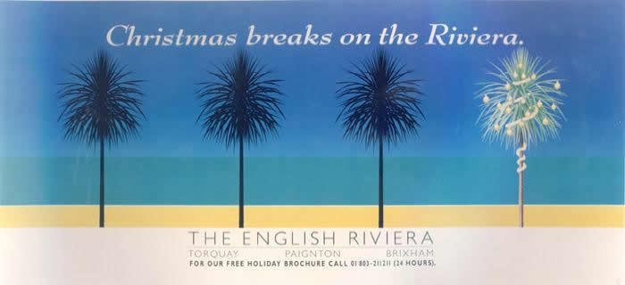
Christmas Breaks, 1992
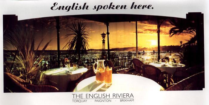
English Spoken Here, 1993. The script is Ariston extrafett (Berthold, 1936).
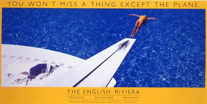
Diving Board, 1995
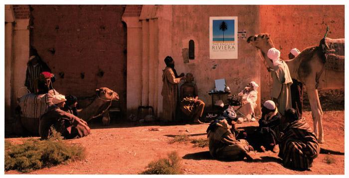
Camel, 1999. From a series of ads that showed John Gorham’s original poster in other places, from Egypt to Australia and Mars.
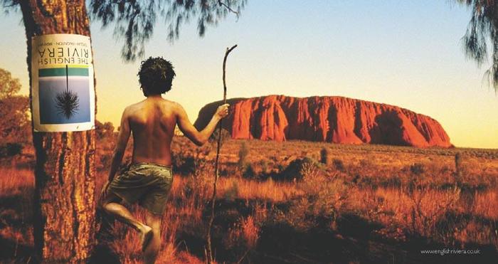
Uluru, 2004

The current version (2018) features a weaker, asymmetric palm tree (or is fireworks?) in red and blue. The type is still in Gill Sans caps, but now in two weights, paired with Arial Rounded Bold, set on a wave.
Typefaces
Formats
- Advertising (1402)
- Branding/Identity (4738)
- Posters/Flyers (3485)
Designers/Agencies
- unknown (2140)
- John Gorham (1)
- David Hughes
- Pictorial Publicity (1)
- Derek Hass (1)
Tagged with
- tourism (125)
- travel posters (17)
- 1930s style (22)
- 1980s (429)
- 1990s (218)
- poster series (360)
- all caps (4040)
- stacked and justified (453)
- campaigns (181)
- palm trees (31)
- England (10)
- beach (26)
- swimming (13)
- seasonal (30)
- spring (12)
- autumn/fall (14)
- Christmas (132)
- long-time use (89)
- light type (21)
- middle dots (89)
Artwork location
- United Kingdom (2126)
- Torquay (1)
- Paignton (1)
- Devon (4)
- Brixham (1)























4 Comments on “The English Riviera tourism posters”
John Gorham’s poster design was used for the cover art of Metronomy’s album The English Riviera from 2011.
I’ve had a printout of Metronomy’s album cover on the wall for over a year, and I’ve just now found out its origin!
The ad agency back in 1982 was Pictorial Publicity, a subsidiary of CDP. Derek Hass was the art director. Pictorial Publicity became Travis Dale and then Travis Sennett Sully Ross and it eventually transitioned into cdp-travissully (part of Dentsu), I know because I was the account director on the business from 1982 until 2004.
Peter, thank you very much for providing this additional information! I have added Pictorial Publicity and Derek Hass to the credits.
I grew up in Paignton and have fond memories of the poster and branding our bay had. I feel it had some influence on my interest in graphic design and becoming a designer myself.
When they changed the branding to a patriotic blue and red (coinciding with a change of political party, did they think the yellow was political?), I was so disappointed. I hope one day it changes back, or at least another designer takes inspiration from the original.