

Douwe Egberts (2014)
Contributed by Matthijs Sluiter on Nov 24th, 2018. Artwork published in
November 2014
.
License: All Rights Reserved.
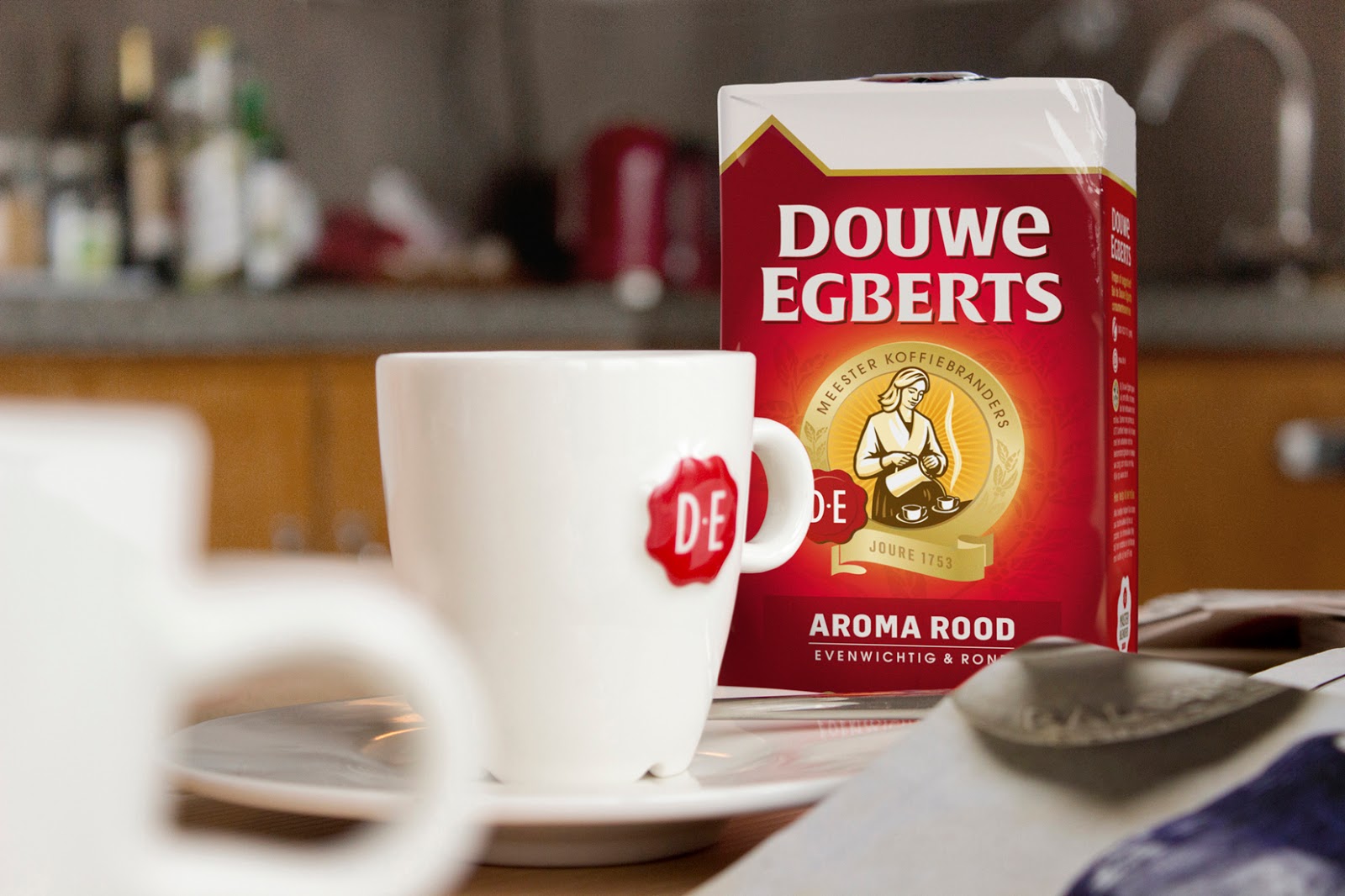
Douwe Egberts – selling coffee since 1753 – is the leading coffee brand in the Netherlands. In 2014, Design Bridge were tasked with bringing back lost brand equity. The challenge of the brief was to be authentic, yet not become a “nostalgic window into the past”.
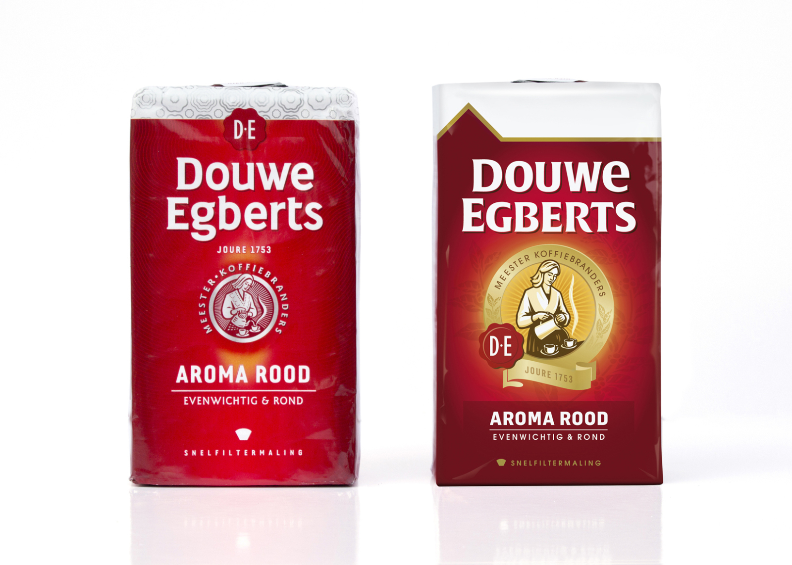
The redesign came with a new wordmark, based on Gerard Unger’s recently released Alverata. This mark combines some unusual choices for a mainstream brand: an early use of a retail typeface used as the brand’s staple, and combining capitals, small caps and unicase letter shapes within a logo that should evoke nothing but tradition and familiarity.
Source: www.packagingoftheworld.com License: All Rights Reserved.
Before and after.
Source: www.packagingoftheworld.com License: All Rights Reserved.
Source: www.packagingoftheworld.com License: All Rights Reserved.

Source: www.packagingoftheworld.com License: All Rights Reserved.
Source: www.packagingoftheworld.com License: All Rights Reserved.


")


 and <cite>Electric Monkey Sessions 2 </cite>(2017) album art")


")


