
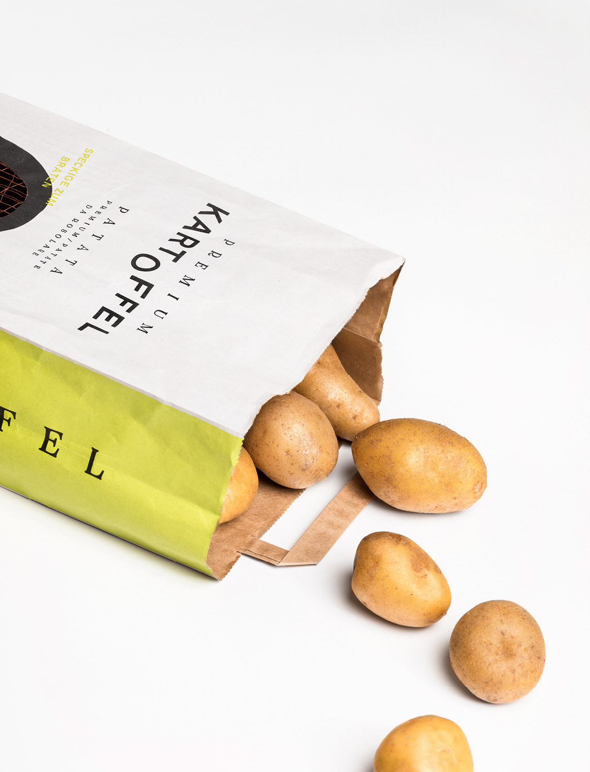
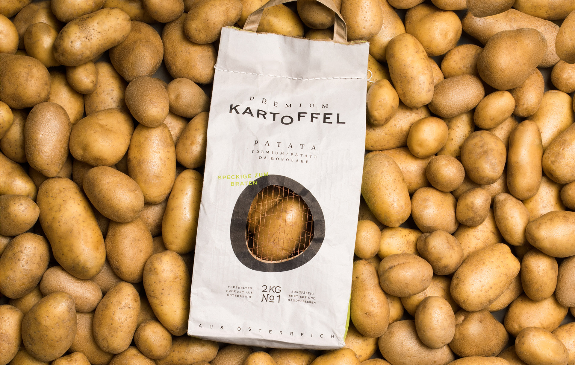
MPreis Don Patata
Contributed by Rodrigo Saiani on Jul 10th, 2019. Artwork published in
June 2019
.
Nice to see Tenez in use for the packaging of premium potatoes as designed by Moodley for MPreis, an Austrian supermarket chain.
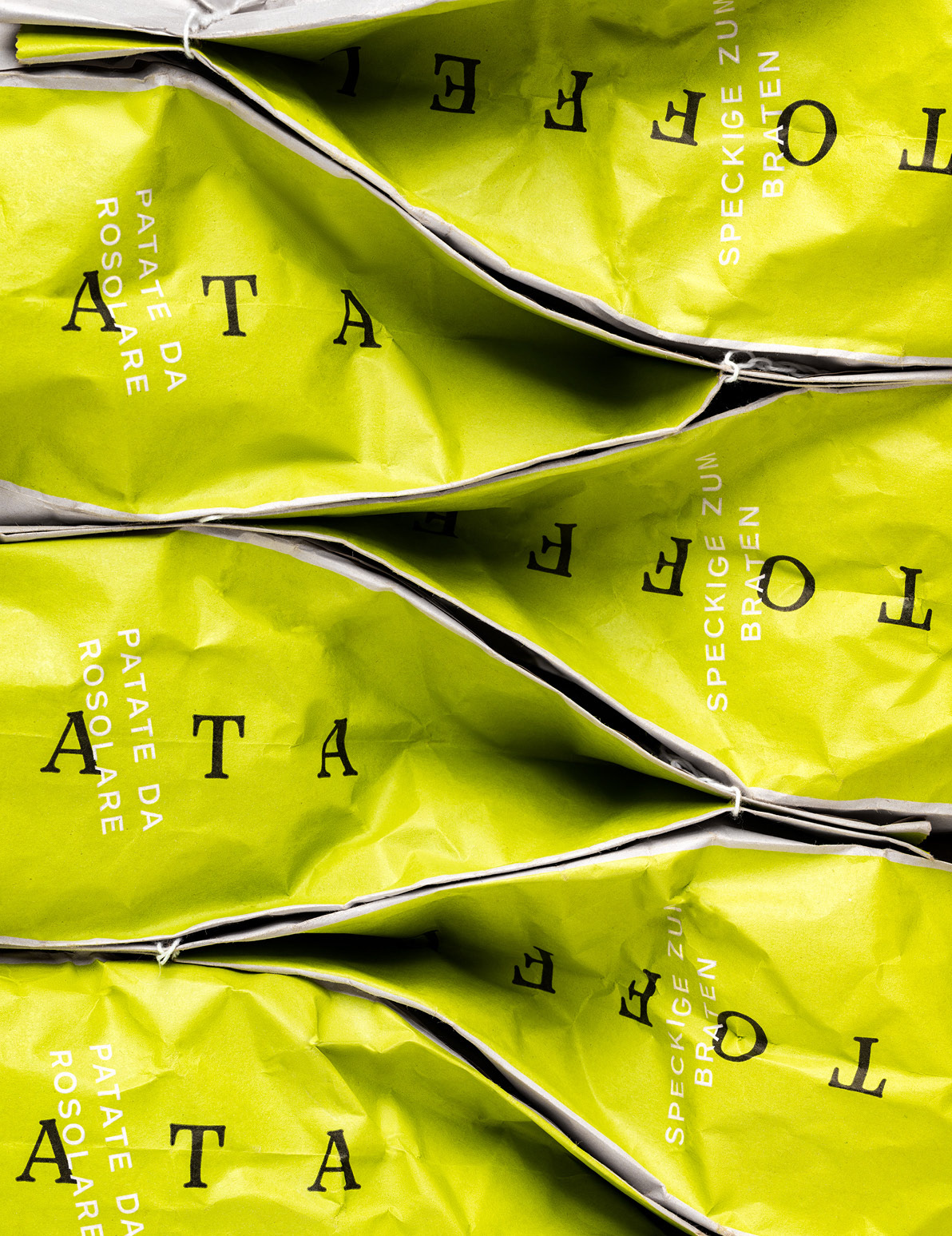
The loosely spaced all caps setting in combination with a more neutral sans (not sure what the sans is … Akzidenz Grotesk? Benton?) gives this commodity an air of elegance. Also, the detail with “2 KG, No 1” is well-crafted, adding more life to the center axis of the design. Of course, the lowered O in Kartoffel (“potato”) is also a witty take on the product name.
Project management & consulting: Sabrina Dojlidko
Creative direction: Mike Fuisz
Art direction: Marie Pierer
Graphic design: Marie Pierer, Kristina Kurre


")


