
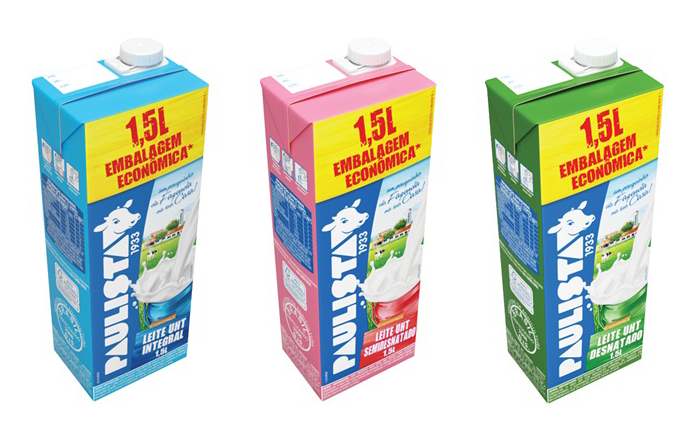
Paulista brand milk boxes
Paulista, named after the demonym for an inhabitant of the Brazilian state of São Paulo, is a brand of milk and other dairy products. It dates back to 1933, when a number of cooperatives from São Paulo united into the Cooperativa Central de Latícinios do Estado de São Paulo (“Central Dairy Cooperative of the State of São Paulo”), which was known as Leite Paulista (“Leite” meaning milk). It was bought by Danone in the year 2000. It currently has a large line of dairy products.
The logo appears to be based on Baby Teeth. On the packaging, we can also see the flavors written in Impact and the legal text in a heavily machine-condensed Arial. The script is Signfonts’ Speedway.

Paulista brand yoghurt bottles (legally “fermented milk”, as seen in the legal text near the bottom)
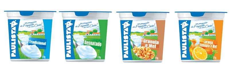
Paulista brand yoghurts

Paulista brand strawberry pulp

Paulista brand yoghurts


")


")


")


1 Comment on “Paulista dairy”
Their old logo had a different S, as you can see. I speculate it was meant to evoke the shape of the state of São Paulo.