
Eaton’s Spring and Summer Catalogue No. 27
Contributed by Matthijs Sluiter on Jan 5th, 2019. Artwork published in
.

Source: static.torontopubliclibrary.ca License: All Rights Reserved.
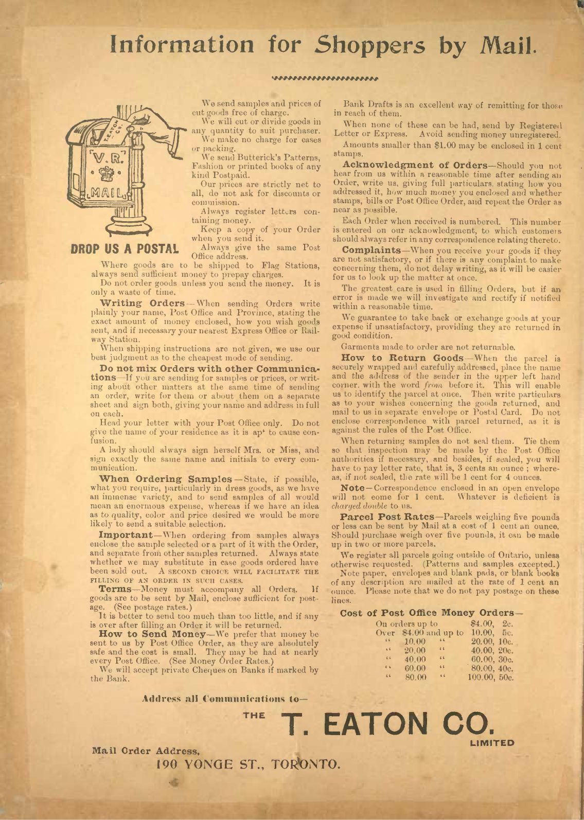
A few pages from Eaton’s 1894 184 page (!) spring/summer product catalogue for “shoppers by mail”. On the back of their catalogue, Eaton’s is described as
A chain of stores. A village of busy people, all under one roof, including over 1,200 Employees. An Organisation representing Half a Hundred Different apartments, each complete in itself, making a perfect “Chain of Stores.”
Among the typefaces are Rubens, used for the headline on the front cover; Grotesque No. 7 with its nearly-closed-loop capital C from Miller & Richard’s Sans-Serifs & Grotesques type series that inspired Klim Type Foundry’s Founders Grotesk; and De Vinne, used for headlines throughout the catalogue.
Source: static.torontopubliclibrary.ca License: All Rights Reserved.

Source: static.torontopubliclibrary.ca License: All Rights Reserved.
Source: static.torontopubliclibrary.ca License: All Rights Reserved.
Source: static.torontopubliclibrary.ca License: All Rights Reserved.

Source: static.torontopubliclibrary.ca License: All Rights Reserved.

Source: static.torontopubliclibrary.ca License: All Rights Reserved.


</cite>")


")


")


