
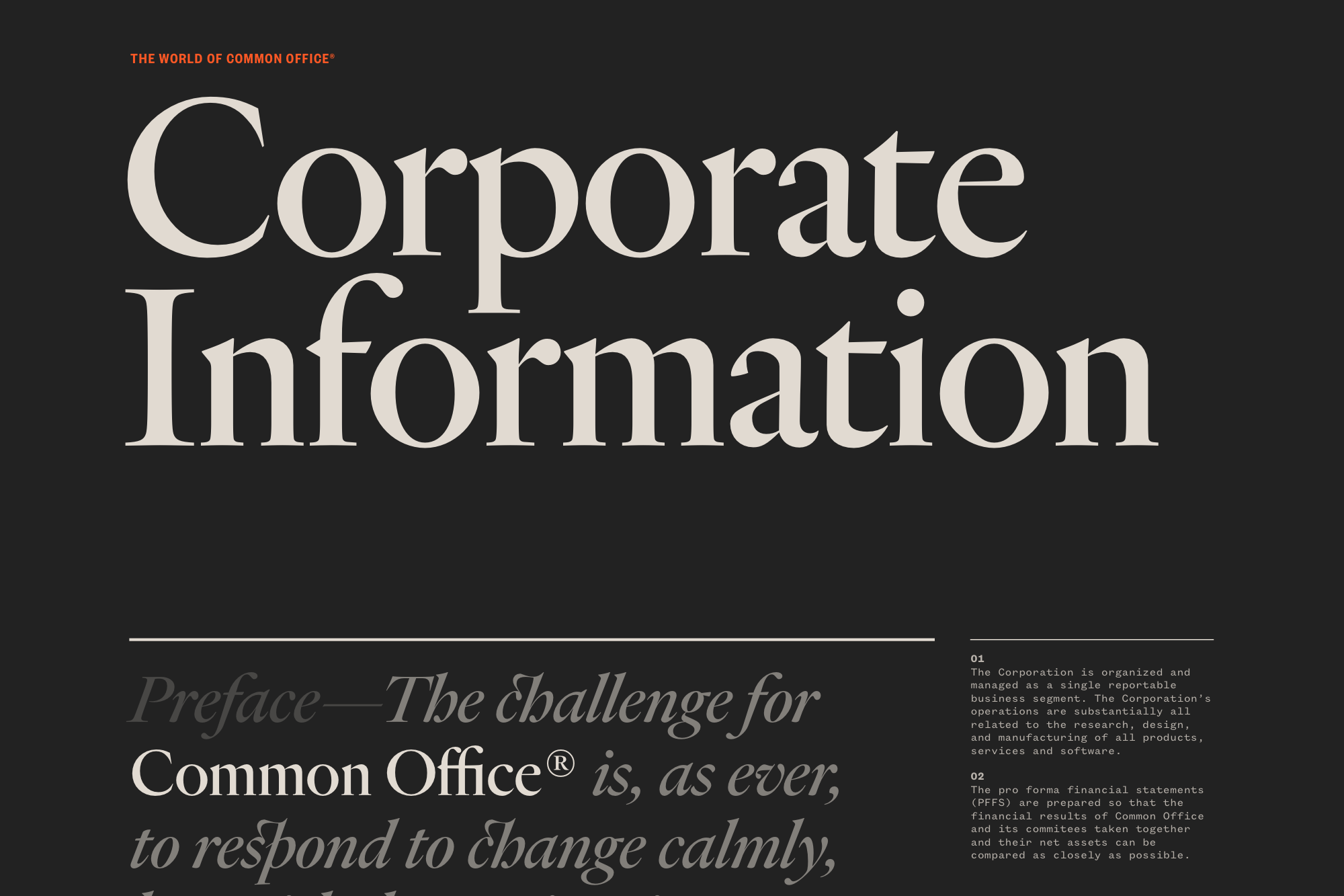
Heldane Display set at 250px.
Common Office is a newly-formed design practice located in New York City. We had a singular goal for our website: use our favorite fonts in the largest possible sizes (up to 250px!). Heldane has a unique texture, especially set against black, so we switched on some stylistic alternates and discretionary ligatures and just let it go to work. It’s a typeface that manages to be classical yet contemporary at the same time, which fits our serious yet sort of ridiculous tone of voice. Heldane is used in both Display and Text cuts.
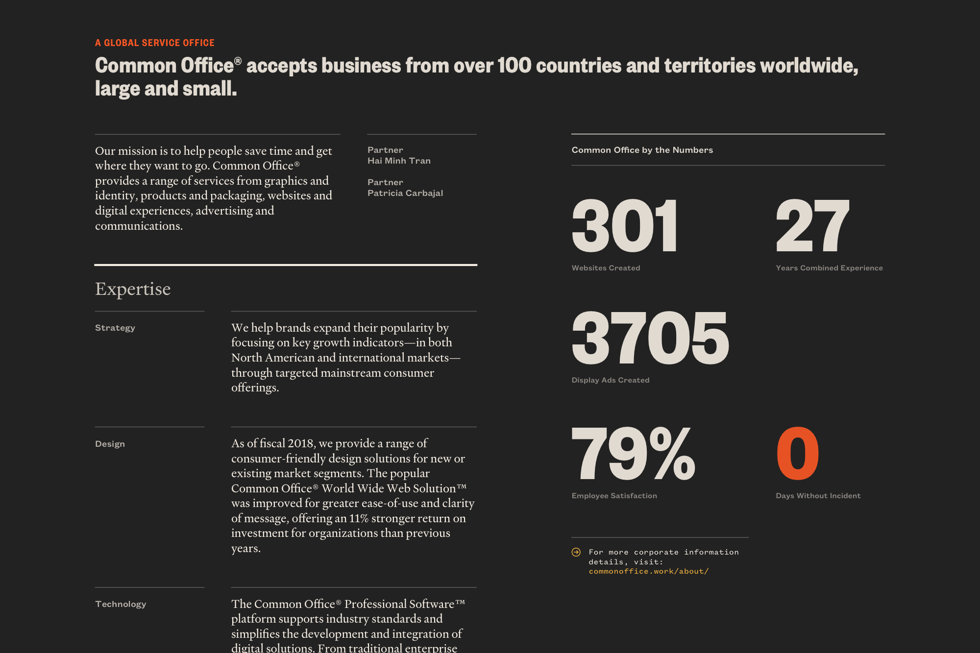
Founders Grotesk is essentially a modern day classic, and we use almost every cut of it here.
Founders Grotesk Condensed set at 120px.
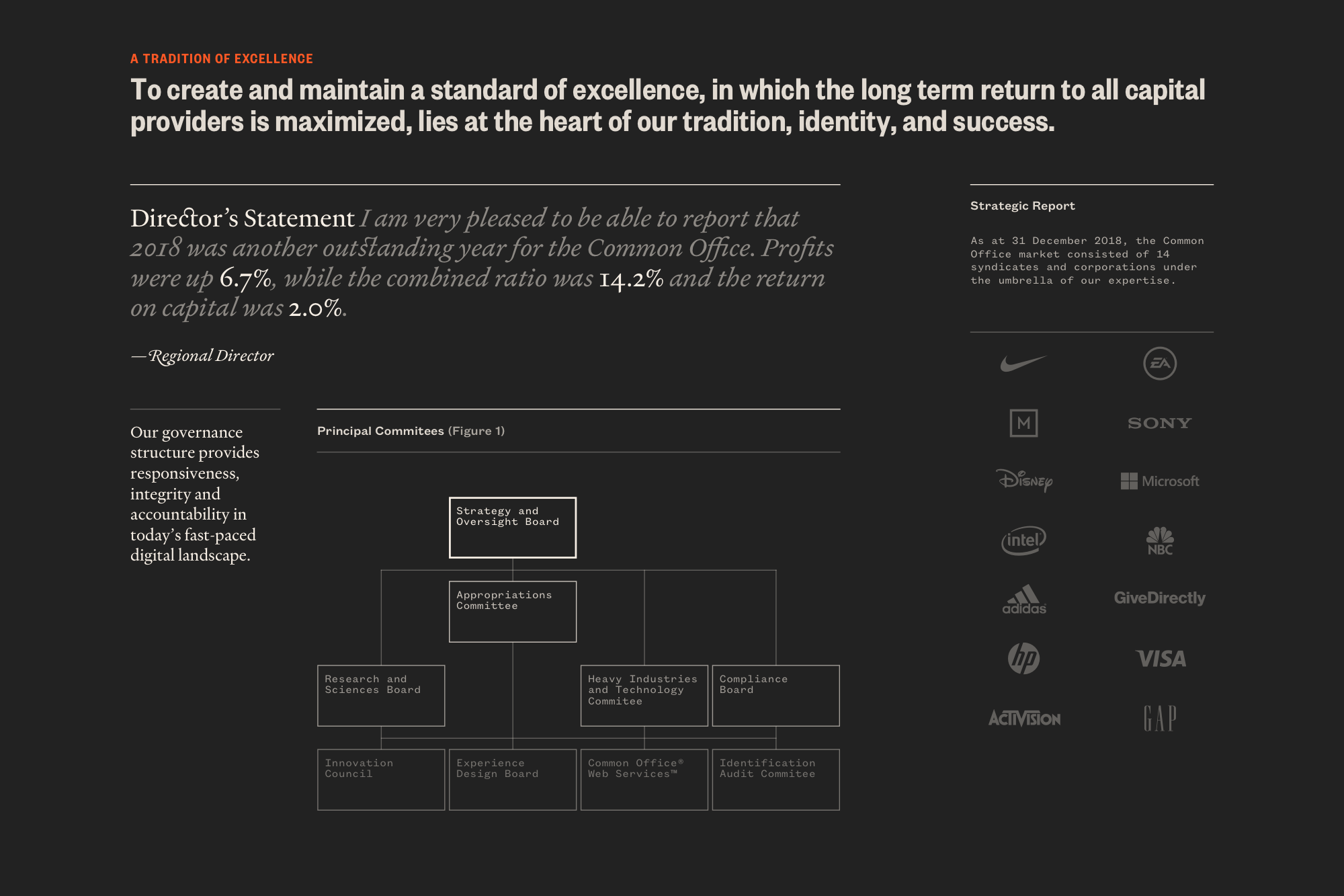
Heldane Text using old-style numerals.
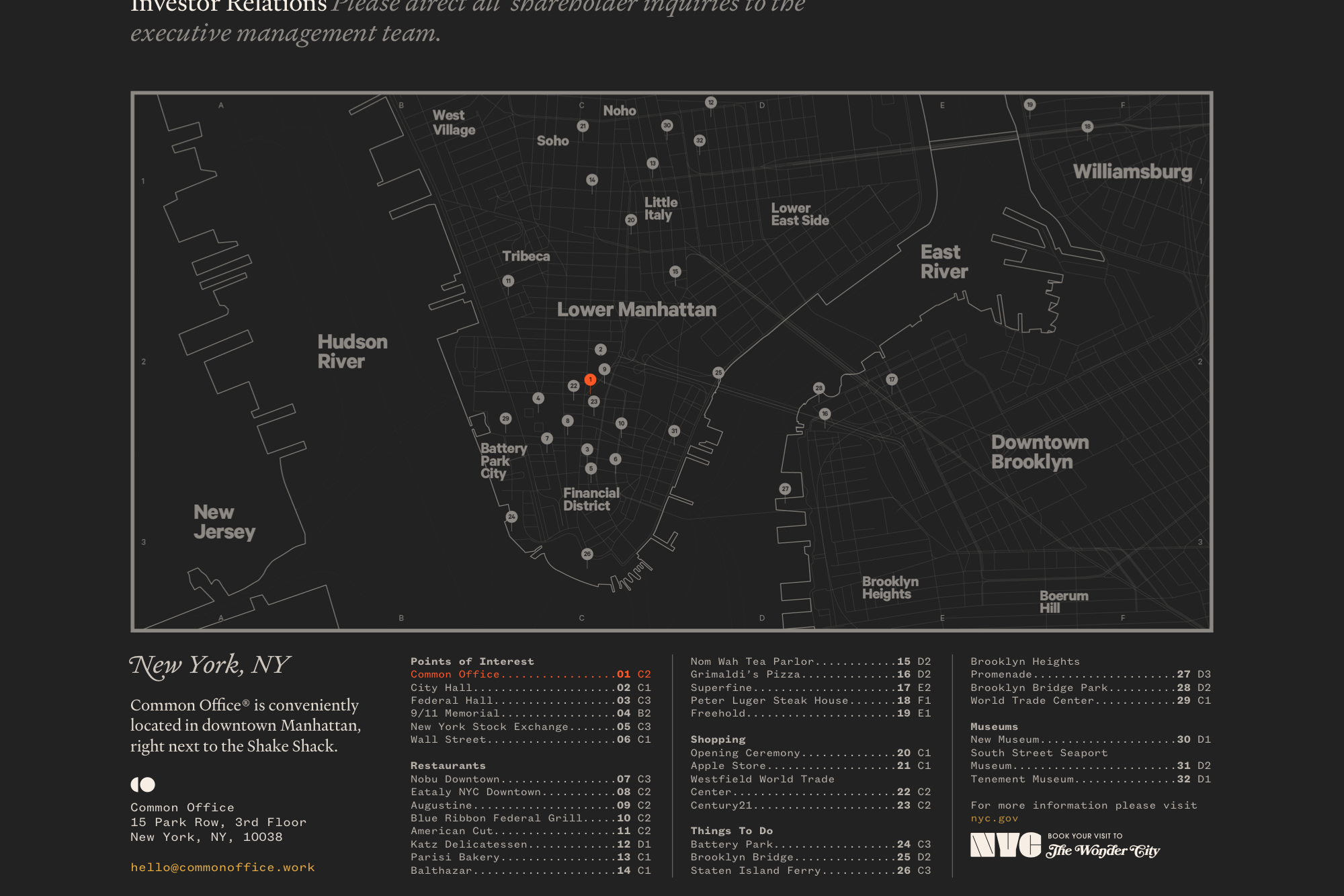
Throwback NYC lockup featuring some classics.

Using the discretionary ligatures featured in Heldane.
Captions set in Founders Grotesk Mono at 12px.


")


")


")


2 Comments on “Common Office”
This is some thorough art direction, from the high-level concept all the way down to copywriting. Good job guys.
This is hilarious (and apparently quite subtle) satire. Their instagram is similarly incisive.