
Patois restaurant
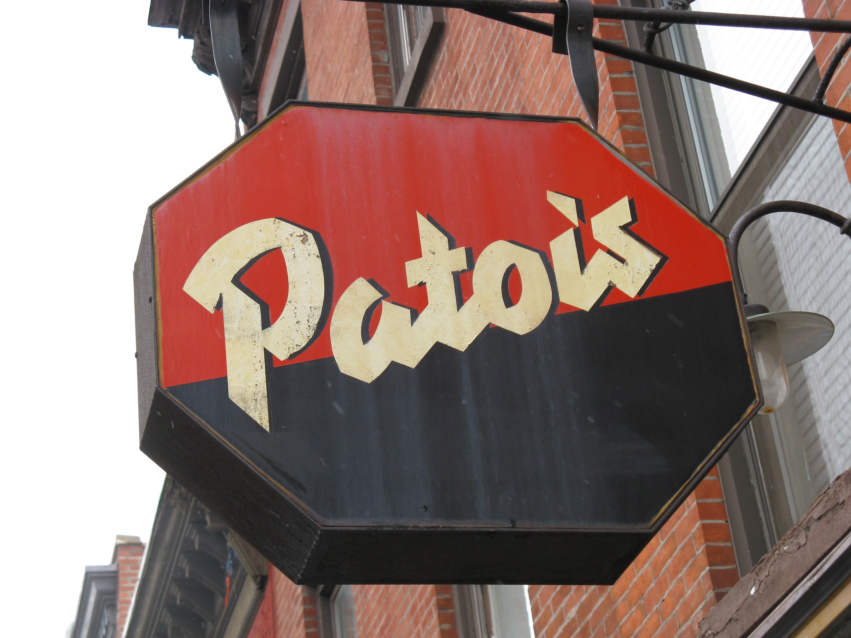
Patois sign, 2008
The hanging sign for the Patois was handpainted by New York designer and illustrator Laurie Rosenwald, loosely based on the Loupot typeface that she was working on at that time, and which she completed together with Boston type designer Cyrus Highsmith in 1998. The angular script letterforms are inspired by the St. Raphaël logotype drawn by French designer Charles Loupot in 1938. The final Loupot typeface is a tad lighter and got a conventionally angled t top. It’s available from Occupant Fonts.
Patois was a “groundbreaking French bistro that launched the culinary Renaissance of Smith Street”. It opened on 255 Smith St., Boerum Hill, Brooklyn in 1997.
It’s hard to tell from the look of it today, but when [Alan] Harding and sibling partners Jim and Paul Mamary opened Patois in 1997, Smith Street was so depressed that many retail storefronts were used as apartments. The trio’s original rent on the space, between Douglass and Degraw streets, was just $900. — Brooklyn Paper
The restaurant closed at the end of 2008. Google Street View’s earliest capture is from June 2009: the hanging sign was already gone then. By 2011, La Casita Yarn Shop Café had opened at this address. There was a new Patois on 177 Mulberry Street in Little Italy, Manhattan, which lasted until c. 2013. That place is now known as Grotta Azzurra.
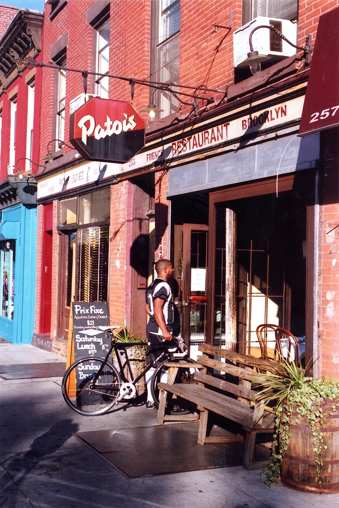
The Patois in the summer of 2008, the last year of the restaurant. The fascia lettering is not by Rosenwald. It includes solid (vinyl?) and stencilled caps from Helvetica and Franklin Gothic.
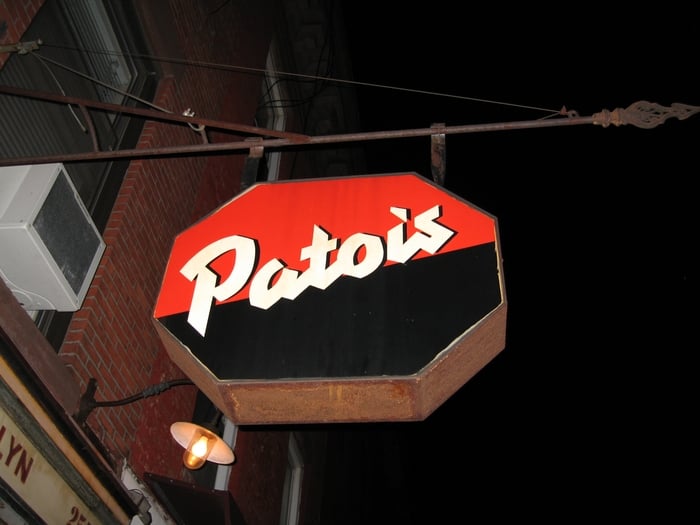
At night, 2007.
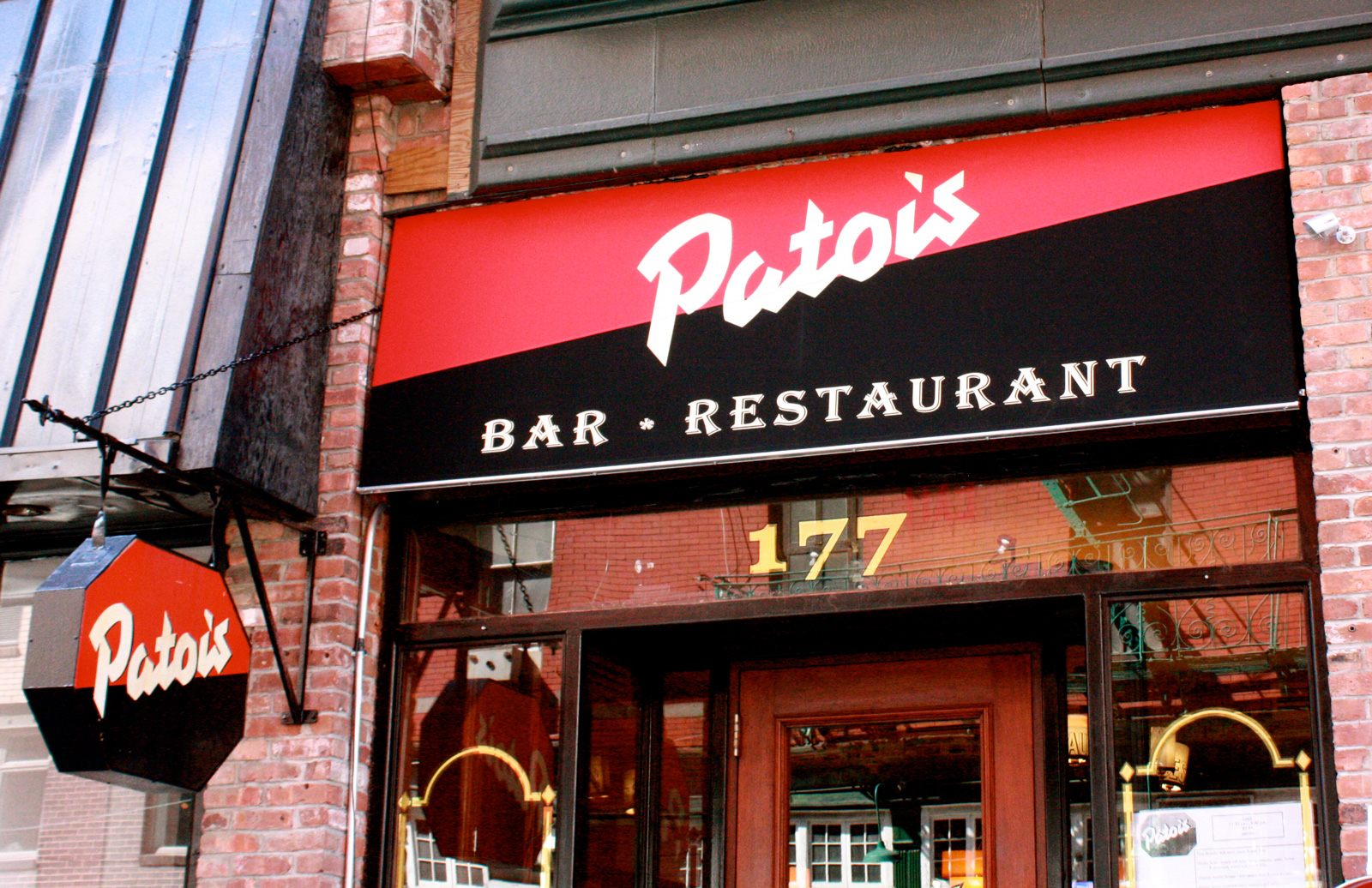
Façade of the follow-up on 177 Mulberry Street, with new signs and “Bar • Restaurant” in Algerian. Note the missing close shade on the sign above the entrance.


")


