
Nintendo Entertainment System consoles and components
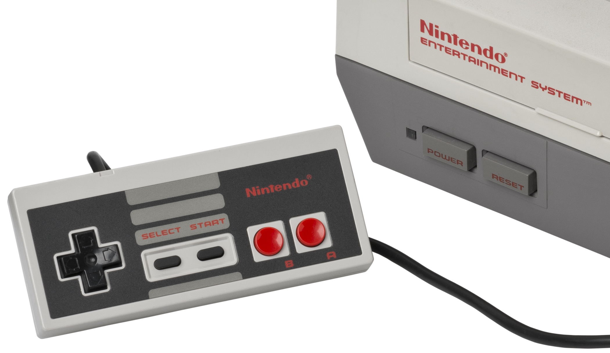
Nintendo Entertainment System, 1985
Corporate’s wide stance, simplified forms, and rounded rectangles are strongly associated with 1970s–90s tech. The original Nintendo Entertainment System, and many of its related components, used the typeface for its name and other labeling, copying the ColecoVision from three years before.
Corporate was released in 1971 by Alphabet Innovations, having licensed the design from its creator, Roc Mitchell. Mitchell passed away in 2015 after a 60-year career in commercial art — and his letters printed on millions of electronic gadgets.
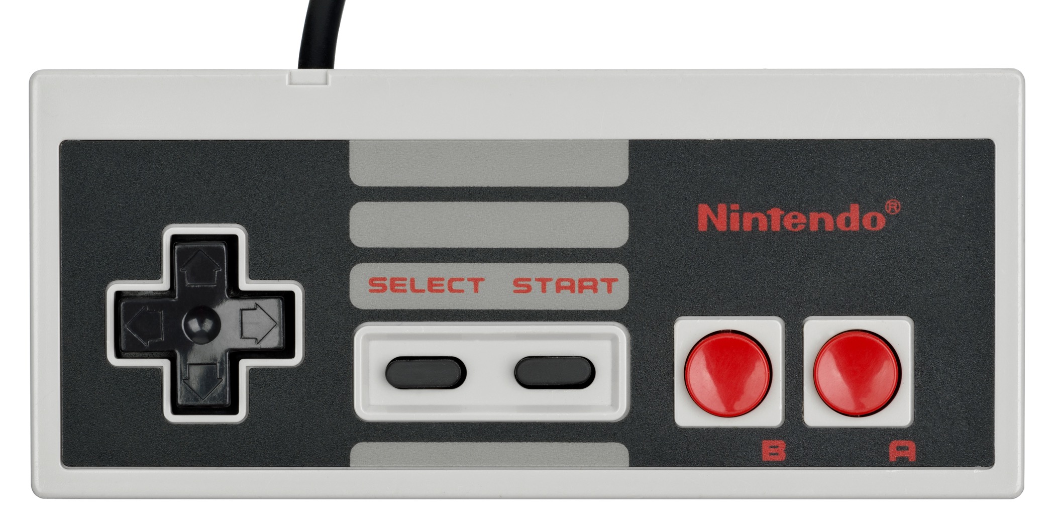
Nintendo Entertainment System controller
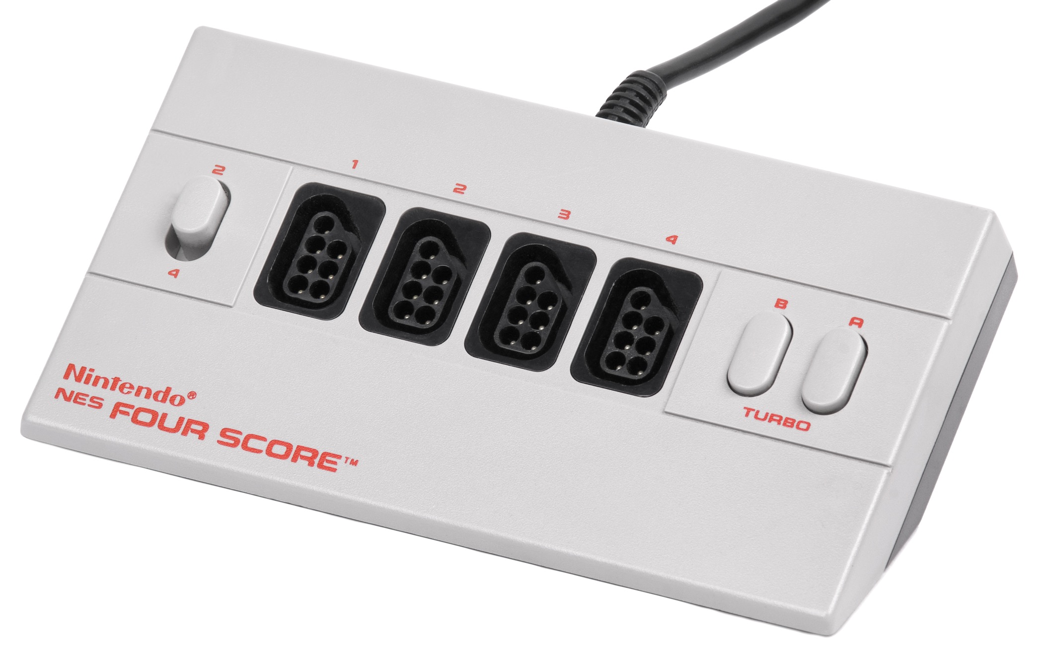
Nintendo NES Four Score, 1990. This version of Corporate has angled cuts in many of the strokes. It’s available digitally as Corporate URW.
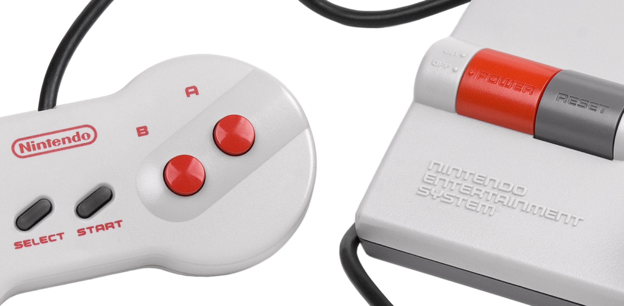
Nintendo Entertainment System, model NES-101, 1993


")


")


")


15 Comments on “Nintendo Entertainment System consoles and components”
It’s interesting that Corporate Gothic was used as a stand-in for the “official” Corporate, in the case of the Four Score. Speaking of NES 4-player adapters, anyone want to take a crack at the funky text on the NES Satellite?
Hi Lee, sorry, I don’t recognize the style used for NES Satellite.
Thank you also for sharing Ray Larabie’s observation that Corporate Gothic seems to be based on Microgramma as opposed to Corporate! I made a visual comparison and it definitely holds water.
The image below shows Corporate URW (URW’s digital version of Corporate Gothic, top) vs. Eurostile Black Extended (again URW’s digitization, bottom; Microgramma is the caps-only precursor to Eurostile and only different in small details).
About all the proportions match up. The most revealing details include the K with horizontal link and the Q. Compare to Corporate/Limit.
Thanks, Florian!
As long as we’re cataloguing other OEM NES accessories with unique logotypes (none of which seem to match one another), we’ve also got the NES Advantage and NES MAX controllers, both photos were taken from eBay auctions
NES Advantage:
NES MAX:
Hello, Lee! The NES Satellite font reminds me somewhat of a font used by Konami in some Dance Dance Revolution games, especially the SuperNOVA entries to the series. I’m having trouble identifying it myself, but the Beatmania/DDR themed fan forums Zenius-i-Vanisher has a massive thread about identifying fonts used in the various Konami rhythm games if you feel so inclined to peruse for something similar.
NES Max is typeset in Vero Fat Antiqua.
NES Advantage is certainly using a typeface as the cover art for the Intellivision video game Triple Challenge (1986) also used it. I’ve yet to find a name to pin to it.
Corporate, Corporate Image and Corporate Gothic are all probably loosely based on Eurostile Bold Extended.
Corporate Gothic’s origins are a bit of a mystery as it doesn’t seem to appear in any Alphabet Innovations or TypeSpectra catalogs but a very similar typeface was used in several books published by The Times Mirror Company from around 1975. The similar typeface was also used for KDFW-TV in Dallas and KTVI-TV in St. Louis, which were all owned by Times Mirror Broadcasting.
Previously discussed in these places:
fontsinuse.com/uses/25193/s…
fontsinuse.com/uses/35405/a…
www.dafont.com/forum/read/1…
www.myfonts.com/WhatTheFont…
Thanks for the identification of Vero Fat Antiqua, Patrick! Added. Thank you also for the glyph set and the additional pointers. I can’t offer a name for the NES Advantage typeface either, but I’ll keep an eye out.
Typeface for NES Advantage is known as Broken English in Chartpak’s Velvet Touch range.
Or maybe Chartpak’s Designer Series range, based on the transfer sheet featured in the ad.
Nice sleuthing, Patrick! Broken English was a Chartpak original, and a winner in their first Annual Designer Typeface Competition in 1986, as announced in U&lc Vol. 13 No. 1 p77. It was designed by Steven Fabian and came in three weights.
My understanding is that Velvet Touch was Chartpak’s brand of dry transfer lettering, and “Designer Series” was their range of original designs.
Nice. Was just about to link you to that issue. Always good to have the designer info. Just the NES Satellite to go.
Right! Here’s a better image. I don’t think there’s a digital version. If it’s a font (and I believe it is), it must have been available in 1989.
Something similar from 1982.
And this from 1993. Based on the E, maybe the Lexus logo from 1989 too.
Also used in the film, only here the A’s have no crossbars. If that is the glyphs original form, it could explain the discrepencies between A’s across samples.
Morishima Funletter (PLINC, in or before 1971) is in the same ballpark. I haven’t seen a full glyph set, and it might have had alternates, but from the glyphs shown in Alphabet Thesaurus, vol. 3, it’s not a match.
A clipping from Creepy, p77, Issue 115, February 1980 (Warren Publishing):
I couldn’t find a copy of the novel with that cover, so I’m guessing it was a mockup. I’ve also put together a sampling plus some other noodling to show how these are all potentially connected. Hopefully it might jog someone’s memory, which might lead to further sightings or a name.