Depero Futurista, Dinamo-Azari
The Bolted Book from 1927 shows that Fortunato Depero didn’t need hot new fonts to make groundbreaking typography.
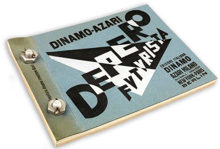
Known as the Bolted Book because of its signature binding using two industrial bolts, Depero Futurista was conceived as a showcase and “portable museum” for the work of Italian Futurist artist Fortunato Depero (1892–1960). Written and designed by Depero, it was published in 1927 and dubbed “a typographical racing car” by Futurism’s founder, F.T. Marinetti. Today it’s recognized as the first modern-day artist’s book.
Designers & Books, in collaboration with the Center for Italian Modern Art and Mart, is currently running a crowdfunding campaign to print a facsimile edition. If you’re interested in getting your hands on a replica of this “avant-garde masterpiece” (MoMA), don’t hesitate: There are only a few days left to support the project and secure a copy.
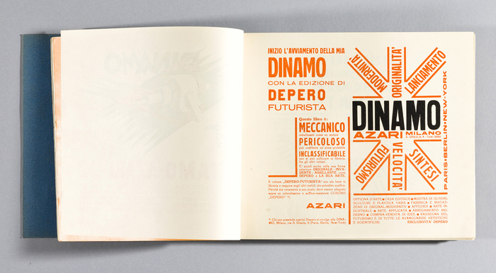
Page 11 announces the launch of the Futurist art gallery Dinamo-Azari. “Written by publisher Fedele Azari, it describes Depero Futurista as “MECHANICAL: bolted like an engine,” warns it is “DANGEROUS: can be used as a projectile,” and declares it is “UNCLASSIFIABLE: cannot be placed alongside other books in the library.” — from the page by page annotations, which rely heavily on original research done by Gianluca Camillini, and were edited by Russell Fernandez with assistance from Raffaele Bedarida.
In this article, we’ll take a look at the fonts that Depero used. For more information about the artist and the book’s rich content, make sure to visit the dedicated website, boltedbook.com. Depero Futurista has 240 pages, 146 of them with text or images, many of which are purely typographic. I’ve examined ten sample pages which are reproduced below. On these pages, about 20 typefaces from 16 families are used. There are a few other typefaces that were used elsewhere in the book, but the vast majority was typeset in the fonts identified here.
One finding that may or may not come as a surprise is the stylistic diversity. At times, it seems as if Depero used all the fonts that were available at the print shop. There are several different romans and italics, a fat face, grotesks from narrow to wide and in various weights, italic sans serif, and two compressed advertising faces. Depero definitely showed less restraint than his fellow countryman Massimo Vignelli. He rather followed László Moholy-Nagy’s lead, who wrote in “The New Typography” from 1923:
We use all typefaces, type sizes, geometric forms, colors, etc. We want to create a new language of typography whose elasticity, variability, and freshness of typographical composition is exclusively dictated by the inner law of expression and the optical effect.
Some of the faces are relatively nondescript, like the old style Archiv-Antiqua, Depero’s primary choice for small body copy, or the various plain grotesks including Schelter & Giesecke’s Breite magere Grotesk and members of the Neue Moderne Grotesk / Aurora-Grotesk I–IV series (nondescript at least to today’s eyes). Others are stronger flavored, like Lucian Bernhard’s eponymous roman with its handdrawn-looking contours and the jolly, almost cartoonish look, or Sezessions-Grotesk, an austere monolinear Art Nouveau sans by Julius Klinkhardt. A remarkable number of the featured typeface designs originated north of the Alps, at foundries in Leipzig, Frankfurt, Offenbach, or Berlin. This hints at the dominant role that the German type industry, next to the British and French, must have played in the early 20th century, not only in Italy, but in many neighboring countries and beyond.

Page 53, featuring lines in all caps, set on various angles, in seven fonts: Modena AKA Sansone (AKA Poppelbaum’s Schmale Block?) in two sizes (“Architetto”, “Arazzi”), Bernhard-Antiqua fett (“Teatro Magico”), Romanisch halbfett (“Glorie Plastiche”), and Schmale Etienne (“Motorumorismo Plastico”. The grotesks used for “Depero” and “pittore” are unidentified. The former might be Schelter & Giesecke’s Schmale fette Steinschrift.
One of the most extensively used faces is a narrow sans with soft corners, similar to Berthold’s Block. It appears on at least 55 pages of the book. This typeface was sold by Fondografica in Turin as Modena and by Reggiani in Milano as Sansone. I’m pretty sure it’s identical to Schmale Block, shown in Seemann’s Handbuch der Schriftarten as an in-house design by the Poppelbaum foundry in Vienna, Austria from 1920. I still need to confirm this assumption, though – thanks to Dan Reynolds who has pointed me to a specimen that might have the answer and which I will consult soon.
The lettering on the cover gives us an idea of what genuinely futurist letterforms look like, according to Depero: elementary, constructed, unconventional, edgy. This attitude is echoed in the typeface choices only to little extent. It was not important to (or feasible for?) Depero to use new, forward-looking typeface designs. Modena AKA Sansone AKA Schmale Block might be the only one from after World War I, released seven years before the book was printed. All the other faces are older – Bernhard-Antiqua fett is from 1911, Aurora-Grotesk from the 1910s, Archiv-Antiqua from 1908, Lukrativ and Mignon from 1906, Sezessions-Grotesk from c. 1905, Schmale Herold from 1904 – or much older: (the precursors of) Normande, Old Gothic Bold Italic, Schelter & Giesecke’s Breite magere Grotesk, and Etienne schmal stem from the 19th century. Romanische Antiqua (or Anker-Romanisch) halbfett was issued by Schelter & Giesecke in 1895 (Grimoldi in Turin later carried the same design as Padova, and Nebiolo as Raffaello). Several of these faces feel downright dated, and must have smelled weird already in 1927. They’re certainly not what one would commonly expect to see in a Futurist publication.
What makes Depero’s book so seminal are not the fonts, but the imaginative arrangements. He skillfully plays with contrasting sizes and weights, column shapes, white space, orientation, and text as image. His dynamic layouts are all the more awe-inspiring when one brings to mind that this was done over 90 years ago, long before type was liberated from physical constraints, first by photographic and later digital means. Each of the pages had to be manually composed from hundreds of little pieces of metal type, and firmly locked up in a forme before it could go to print. This was already a laborious process for standard layouts, but truly challenging when diagonal, circular, or otherwise non-rectangular settings were involved. The revolution is not in the typefaces, but in the typography.
![Page 57 is the first in a series of typographic compositions Depero refers to as manifesti murali, or wall manifestos. [Camillini et al.] The arrow-shaped text is set in three sizes of Bernhard-Antiqua fett. The clumsy grotesk for “necessità di auto-rèclame” (“the need for self-promotion”) is unidentified.](https://assets.fontsinuse.com/static/use-media-items/86/85140/upto-700xauto/5cd40c37/auto-reclame.jpeg)
Page 57 is the first in a series of typographic compositions Depero refers to as manifesti murali, or wall manifestos. [Camillini et al.] The arrow-shaped text is set in three sizes of Bernhard-Antiqua fett. The clumsy grotesk for “necessità di auto-rèclame” (“the need for self-promotion”) is unidentified.
![Page 61. “Designed to be read by rotating the page, this wall manifesto describes the Futurist approach to sculpture and the other plastic arts. Depero also celebrates Futurism as the culmination of the previous two movements, Impressionism and Cubism.” [Camillini et al.] Headlines in uppercase Bernhard-Antiqua fett, text in Archiv-Antiqua mager and halbfett (1908). All lines in the “Futurist quarter” are underlined. Note the nonchalant way of filling up the remaining space by repeating “ecc.” (etc.) 17 times.](https://assets.fontsinuse.com/static/use-media-items/86/85108/upto-700xauto/5cd40c40/Plastica_Doggi.jpeg)
Page 61. “Designed to be read by rotating the page, this wall manifesto describes the Futurist approach to sculpture and the other plastic arts. Depero also celebrates Futurism as the culmination of the previous two movements, Impressionism and Cubism.” [Camillini et al.] Headlines in uppercase Bernhard-Antiqua fett, text in Archiv-Antiqua mager and halbfett (1908). All lines in the “Futurist quarter” are underlined. Note the nonchalant way of filling up the remaining space by repeating “ecc.” (etc.) 17 times.
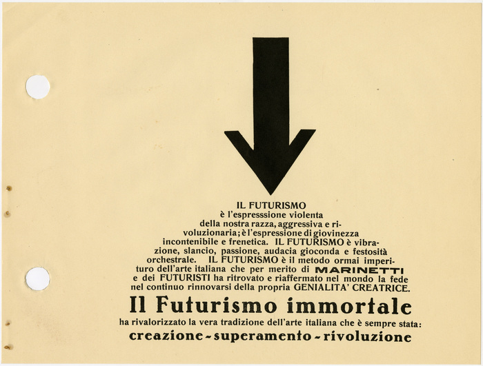
Page 65, “Il Futurismo immortale” (The Immortal Futurism). Romanisch halbfett is paired with Bernhard-Antiqua fett. The bold wide grotesk for “Marinetti” is unidentified (see also page 89).
![Page 67, “racconto grafico” (graphical tale). “This wall manifesto is an open letter to the Italian Minister of Education about the importance of visual literacy and of encouraging children to express themselves visually in all spontaneity and freedom.” [Camillini et al.] Deporo wasn’t shy of setting a whole page in italics. This decision here might have been made because it’s a letter, as a (distant) reference to handwriting. The big lowercase letters are from a late 19th-century fat italic that today is probably best known as Old Gothic Bold Italic. It went by numerous names incl. Fette Kursiv-Grotesk and Doric Italic. The Italian foundries Nebiolo and FTC had a version named Etrusco corsivo nerissimo which is shown in mid-20th century specimens with an r that is different from the one used here (with diagonal terminal). The text face matches Mignon (1906), except for the S. Maybe it’s an alternate, maybe it’s a modification made in the version that was available from Società Augusta as Fulgens (before 1914). [Update: Fulgens is shown in the January/February 1905 issue of Archivo Typographico with an S that matches the one in Mignon.] The German origin is still visible in the ch ligatures. Two sizes of Bernhard-Kursiv fett are used for emphasis.](https://assets.fontsinuse.com/static/use-media-items/86/85196/upto-700xauto/5f84357a/Depero-Bolted-Book-35.jpeg)
Page 67, “racconto grafico” (graphical tale). “This wall manifesto is an open letter to the Italian Minister of Education about the importance of visual literacy and of encouraging children to express themselves visually in all spontaneity and freedom.” [Camillini et al.] Deporo wasn’t shy of setting a whole page in italics. This decision here might have been made because it’s a letter, as a (distant) reference to handwriting. The big lowercase letters are from a late 19th-century fat italic that today is probably best known as Old Gothic Bold Italic. It went by numerous names incl. Fette Kursiv-Grotesk and Doric Italic. The Italian foundries Nebiolo and FTC had a version named Etrusco corsivo nerissimo which is shown in mid-20th century specimens with an r that is different from the one used here (with diagonal terminal). The text face matches Mignon (1906), except for the S. Maybe it’s an alternate, maybe it’s a modification made in the version that was available from Società Augusta as Fulgens (before 1914). [Update: Fulgens is shown in the January/February 1905 issue of Archivo Typographico with an S that matches the one in Mignon.] The German origin is still visible in the ch ligatures. Two sizes of Bernhard-Kursiv fett are used for emphasis.
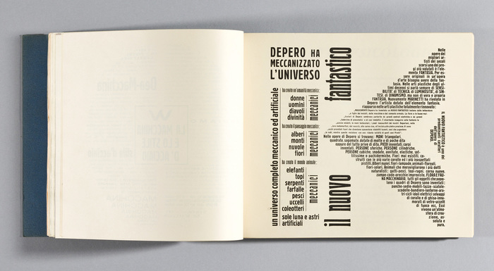
Page 75, “il nuovo fantastico” (the fantastic new), in (not so new) Schmale Herold (1904). The compressed advertising face was sold by Fondografica as Lodi and by Reggiani as Licia. This page also features the similarly compressed Lukrativ (c. 1906) for “meccanici” as well as Schmale Block in at least five sizes.
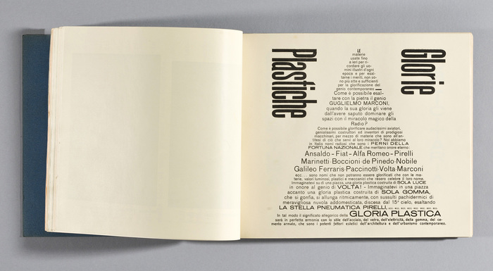
Page 87, “Plastic Glories”. In addition to Sezessions-Grotesk (bottom two lines) and Neue Moderne Grotesk / Aurora-Grotesk I–IV VII (“Gloria Plastica”, see p.89), there are two more grotesks in use. Most of the text is set in Breite magere Grotesk. This face by Schelter & Giesecke was avaiable from the local foundry Reggiani as Eia. The big compressed sans is unidentified, and probably wood type.
![Page 89 opens a ten-page section devoted to Depero’s architectural work. [Camillini et al.] The text face again is Archiv-Antiqua (with halbfett for emphasis). The lines that form the A’s crossbar are set in Schmale Block and (or a similar fat face). “Martellatori-Macchina” looks like the wide sans that was sold by Weber as Aurora breithalbfett (and by L. Wagner as Edel-Grotesk, etc.). “Glorie plastiche e villaggio futurista” is in Aurora-Grotesk II halbfett (1912), see . Nebiolo had the latter under the name Cairoli tonda neretta, but it’s not clear whether their version was released before 1928. The big stacked caps (“architettura publicitaria”) are only similar to this series. They are heavier than Aurora’s VII cut and lighter than the V (in Italy available as Etruria from FTC), and are distinguished by a very small aperture in C and a short middle arm in E.](https://assets.fontsinuse.com/static/use-media-items/86/85106/upto-700xauto/5fddf32f/Architettura_Publicitaria.jpeg)
Page 89 opens a ten-page section devoted to Depero’s architectural work. [Camillini et al.] The text face again is Archiv-Antiqua (with halbfett for emphasis). The lines that form the A’s crossbar are set in Schmale Block and Normande (or a similar fat face). “Martellatori-Macchina” looks like the wide sans that was sold by Weber as Aurora breithalbfett (and by L. Wagner as Edel-Grotesk, etc.). “Glorie plastiche e villaggio futurista” is in Aurora-Grotesk II halbfett (1912), see Neue Moderne Grotesk / Aurora-Grotesk I–IV. Nebiolo had the latter under the name Cairoli tonda neretta, but it’s not clear whether their version was released before 1928. The big stacked caps (“architettura publicitaria”) are only similar to this series. They are heavier than Aurora’s VII cut and lighter than the V (in Italy available as Etruria from FTC), and are distinguished by a very small aperture in C and a short middle arm in E.
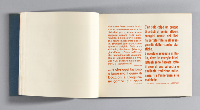
Page 101 has quotations by Futurist painter and sculptor Umberto Boccioni (1882–1916) and Depero himself, printed in orange. The fonts in use are Schmale Block and three sizes of Sezessions-Grotesk, with several descending alternates for c and e. The latter was also available from Italian foundries Società Augusta (as Melpomene, before 1914) and Fondografica (as Como).
![Page 113 repeats the dedication to Marinetti that already appeared on page 13. “‘I set off this futurist creation as a sign of celebration for F. T. Marinetti.’ The letter W in the center of the composition is an Italian abbreviation of the words ‘long live’ as in ‘Long live Marinetti.’ It appears on numerous pages throughout Depero Futurista.” [Camillini et al.] The fonts used on this page include four sizes of Schmale Block, Lukrativ (“temporale-patriottico”), and Schmale Etienne (“cuore-bombarda”).](https://assets.fontsinuse.com/static/use-media-items/86/85197/upto-700xauto/5cd40c6f/Depero-Bolted-Book-58.jpeg)
Page 113 repeats the dedication to Marinetti that already appeared on page 13. “‘I set off this futurist creation as a sign of celebration for F. T. Marinetti.’ The letter W in the center of the composition is an Italian abbreviation of the words ‘long live’ as in ‘Long live Marinetti.’ It appears on numerous pages throughout Depero Futurista.” [Camillini et al.] The fonts used on this page include four sizes of Schmale Block, Lukrativ (“temporale-patriottico”), and Schmale Etienne (“cuore-bombarda”).
Formats
- Advertising (1403)
- Books (3993)
Topics
- Graphic Design (2170)
- Architecture (870)
- Art (2756)
Designers/Agencies
- Fortunato Depero (2)
Tagged with
- 1920s (78)
- Futurism (13)
- Italian (language) (308)
- book interiors (1912)
- type fit to shape (85)
- arrows (389)
- rotated type (1299)
- type on an angle (778)
- type in a circle (343)
- stacked glyphs (307)
- colored body text (486)
- typeface combinations (2101)
- image made with type (102)
- all caps (4048)
- only type (890)
- underlined (458)
- open letters (1)
- artist’s books (55)
- portfolios (432)
- Modernist (71)
- special binding (52)
- screws/bolts (10)
- alternate glyphs (748)
- uncertain typeface ID (160)
- manifestos (23)
- Avant Garde (movement) (12)
- typographic eclecticism (172)
- lettering (373)
- type size gradients (27)
- quotes (295)
- book covers (3484)
- self promotion (138)
- Filippo Tommaso Marinetti (4)
- Umberto Boccioni (1)
- Fortunato Depero (1)
- author as designer (60)
- Fedele Azari (1)
- Dinamo-Azari (1)
- letterpress (197)
- metal type (108)
- wood type (44)
- high profile (511)
- historically significant (22)



















3 Comments on “Depero Futurista, Dinamo-Azari”
In 2015, Giulia Laco (webmatter.it) made a cool experiment as a conference demo. She emulated one of the pages (p. 229, “l’onomalingua”) with web fonts that would match the original as close as possible. The live version is still online.
OL Headline Gothic Bold Triple Condensed is a great approximation for the compressed sans. P22 Woodtype for Lukrativ has the right feel, too. And AT Move MMM does a decent job as stand-in for Schmale Block. Alternative options include Amsi Condensed, Hermes Maia, or Bigticy Narrow. For the text in Romanisch, I’d prefer Roslindale Text or Rando over Pona, but of course these typefaces weren’t available in 2015 yet.
Incidentally, when I added the lines about letterpress formes, I had wondered what’s more laborious: composing the pages from metal type, or building it with CSS. Of course digital tools ease many of the steps, but it’s still rather tricky to do non-rectangular arrangements, and it probably was even more so back in 2015.
In the article, I wrote that one of the most widely used typefaces in Depero Futurista can probably be traced back to a design that was cast as Schmale Block(schrift) by the Poppelbaum foundry in Vienna. After consulting various specimens, this assumption is now confirmed. See the typeface page for details.
Some of the mentioned research on Depero Futurista carried out by Gianluca Camillini can be found in his article “The Bolted Book”, published in the third issue of TipoItalia (Cornuda: Tipoteca, pp. 28–33) in 2015. See also the post on Fonts In Use about this journal.
In addition, Gianluca presented a paper at the Department of Typography & Graphic Communication, University of Reading, UK, on 11 February 2016. It’s available on academia.edu, and is a must-read for anyone interested in this book and its content and design. Gianluca also looked into the typefaces that Depero used, and comes to similar conclusions. I wish I had been aware of this paper before – it would have saved me a lot of time! :)