
The Modulor by Le Corbusier, Faber & Faber
Contributed by Florian Hardwig on Dec 4th, 2012. Artwork published in
circa 1954
.
Source: www.flickr.com License: All Rights Reserved.
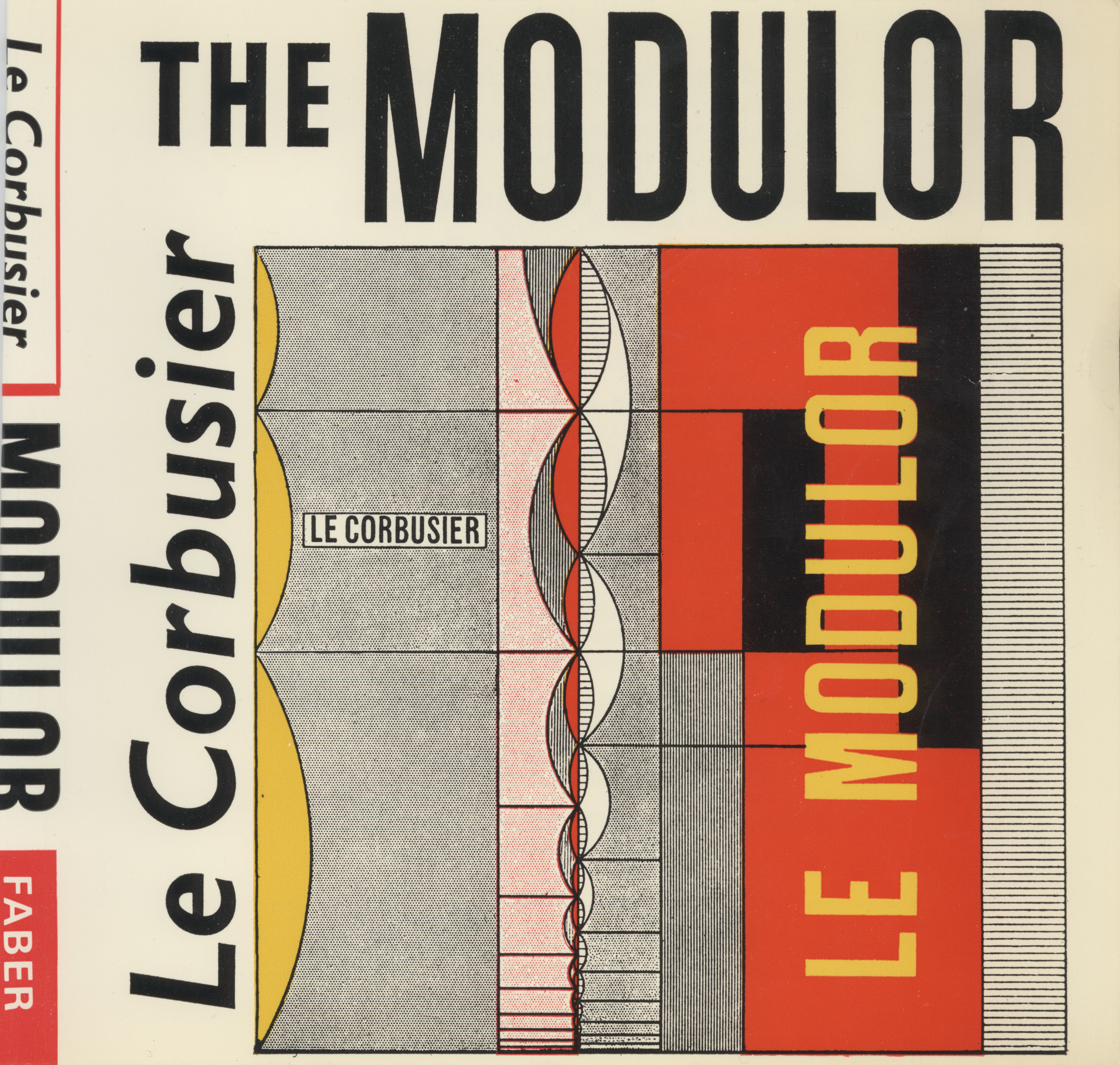
Berthold Wolpe’s cover design for the first UK edition of The Modulor by Faber & Faber was also used for the first US edition by Harvard University Press (1958). Le Corbusier’s name is set in Gill Sans Italic.
Source: www.the-saleroom.com License: All Rights Reserved.
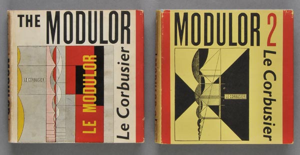
The Modulor and Modulor 2, 1st English edition, Faber & Faber
Faber & Faber, 1954
Source: www.amazon.co.uk License: All Rights Reserved.
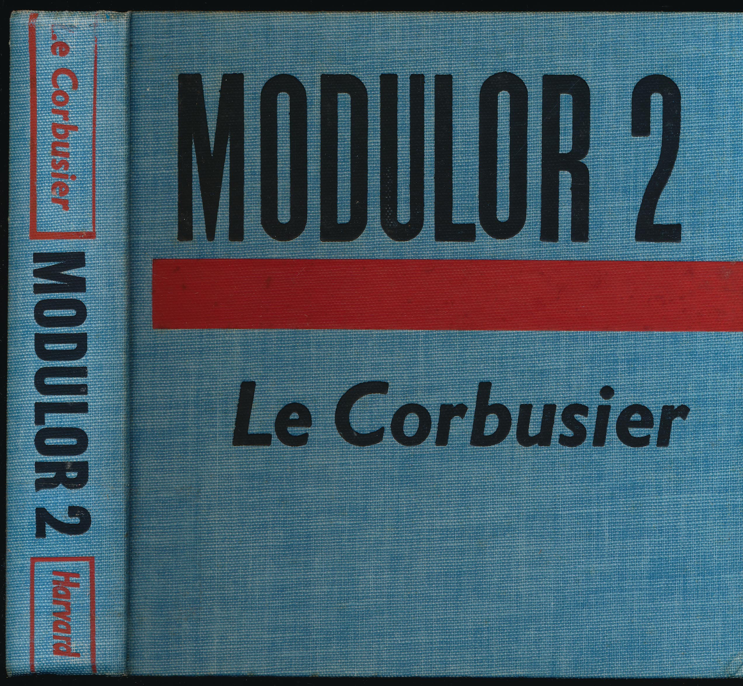
Modulor 2, Harvard

Source: www.amazon.co.uk License: All Rights Reserved.
Paperback, 1961, 2nd UK edition. “Faber paper covered editions” is in reversed Albertus.

Source: www.kupindo.com License: All Rights Reserved.
The Modulor and Modulor 2, Faber & Faber, 1973


")


 logo and opening titles")


")


")
")
")


4 Comments on “The Modulor by Le Corbusier, Faber & Faber”
Can anyone tell me which typeface The MODULOR is written in above? I can see that Corb’s name is written in Gill Sans, but not the title, as far as I can tell. The closest I can find is Compacta, but that’s not really it.
Many thanks!
Martin, I don’t think these letterforms stem from a typeface. They look constructed and drawn on a grid, with unbalanced widths and no overshoots – note how ‘O’ appears to be shorter than its neighbors due to the lack of optical compensation. In this regard, they are similar (but not identical) to the reproduced French title in yellow.
I have the French edition of this book, edited in 1950 by L’Architecture d’Aujourd’hui. Let me know if you want me to take some pictures.
Pierrick, thanks for the offer. Yes, if the design is typographically interesting, I’d love to see images. Does it look like this one? Keep in mind that our focus is fonts in use. If the cover uses lettering (custom-made letterforms), it wouldn’t warrant a separate post. You could still add images in a comment here, though.