Stranger to Town by L.P. Davies
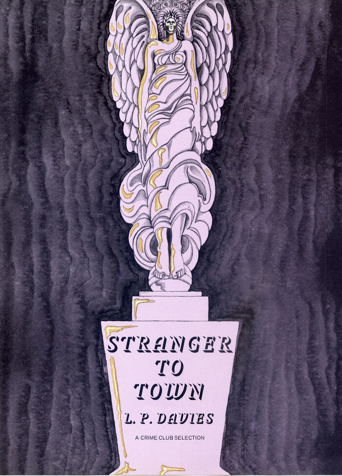
Book jacket for Stranger to Town, a detective story by British novelist L.P. Davies (1914–1988), published in 1969 in Doubleday’s Crime Club imprint.
Julian Midwinter, a stranger to Harmsley Cosset, seems to know a great deal about the town and the victim of an auto accident. When he steps into the victim’s shoes, taking over his business and the same habits, he begins to have accidents. When he realizes the accidents were planned, he’s determined to find the murderer.
The jacket illustration and design is by Emanuel Schongut, who comments:
L.P. Davies was my favorite author to do covers for. His books always had a lovely sort of creepiness, crime, science fiction, fantasy, or a mixture of all. In this book the murder weapon was an award trophy.
For the typeface, Schongut chose Phoebus, one of the earliest typeface designs by Adrian Frutiger, originally released as foundry type by Deberny & Peignot in 1953. The shadow-only letterforms here take on an ominous look. In the monograph edited by Heidrun Osterer and Philipp Stamm, Frutiger comments on the design:
I started to sketch a titling face with deep shadows, but it looked somewhat banal standing straight up, so I tried an italic. The typeface gained a lot in dynamic thanks to the slanting character shapes against the slant of the deep shadows. I saw the letter shapes in my inner eye and sketched those deep shadows directly, off the cuff. It worked – a larger shadow would have been too bulky, anything thinner and the letters wouldn’t have stood out enough. It was really a matter of feeling, of intuition. It was clear that it had to be with serifs, and equally that it was to be a Latin-style typeface, serifs slanting right at the bottom and left at the top. The capital I for example would collapse without the little triangle at the top. Phoebus, being without contours and whose shapes are completed by the eye itself, was quite to [Charles] Peignot’s taste. He liked the fact that the typeface was entirely composed of shadows and seemed somehow to hover in the air.
Formats
- Books (4181)
Topics
- Literature (1992)
Designers/Agencies
- Emanuel Schongut (7)
Tagged with
- Leslie Purnell Davies (1)
- Doubleday (29)
- hardcovers (649)
- book jackets (548)
- Crime Club (imprint) (3)
- crime (58)
- detective (18)
- novels (372)
- fiction books (197)
- purple/violet (239)
- illustration (922)
- trophies (5)
- all caps italics (221)
- shadow effects (738)
- type integrated with image (266)
Artwork location
- United States (6629)
- New York City (1774)
- Garden City (10)

