
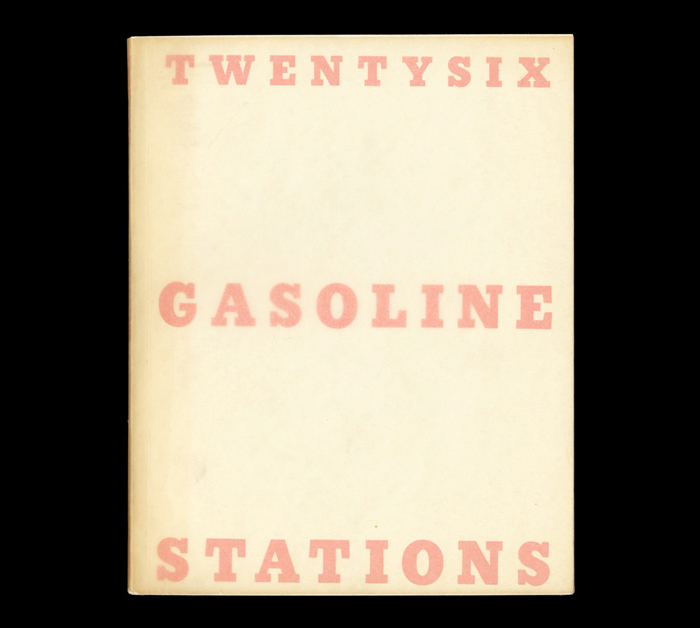
Twentysix Gasoline Stations by Ed Ruscha
Contributed by Florian Hardwig on Dec 16th, 2012. Artwork published in
.
For sale at Oliver Wood. Rare books, photographs and archives:
First edition, one of just 400 copies of the first and most important book in ‘the most renowned series of artist’s books in the history of the genre’ (The Photobook). This copy signed and dated by Ruscha in 1966. Twentysix Gasoline Stations was published 1963, the year that he staged his first solo exhibition at Ferus Gallery, Los Angeles.


")


![<cite>andersw[oh]er</cite> by Katja Pilisi](https://assets.fontsinuse.com/static/use-media-items/157/156325/thumb/61f7d0b2/@2x/Insta_Poster_square.webp "<cite>andersw[oh]er</cite> by Katja Pilisi")


2 Comments on “Twentysix Gasoline Stations by Ed Ruscha”
That’s not Stymie. The A is different.
Hi Brian,
You are right that ATF’s Stymie as well as most digital versions are distinguished by an A with top bar. But there’s also Monotype’s version of Stymie. From Mac McGrew’s American Metal Typefaces of the Twentieth Century:
Among the differences in Monotype’s Stymie Extrabold are a straight-legged R, a descending J, a single-sided serif on q, a t with curved exit stroke—and a barless A (an A with top bar and a flat-bottom t were available as alternates). Ed Ruscha used (a version) of Monotype’s Stymie Extrabold.
Scangraphic’s Stymie SB Bold Cond is a digital Stymie with barless A, but it’s not a faithful revival of Stymie Extrabold as depicted in McGrew. Their Stymie SB Bold comes closer in regard to some glyphs like R, t or the lighter middle bar in E, but isn’t a perfect match either.