
Miriam Cahn. Das genaue Hinschauen

In 2019 the contemporary Swiss artist Miriam Cahn is honored with exhibitions in important museums worldwide – one in the Kunsthaus Bregenz (Austria). The accompanying catalogue is the first comprehensive bilingual monograph about Miriam Cahn’s work to be published for some years.
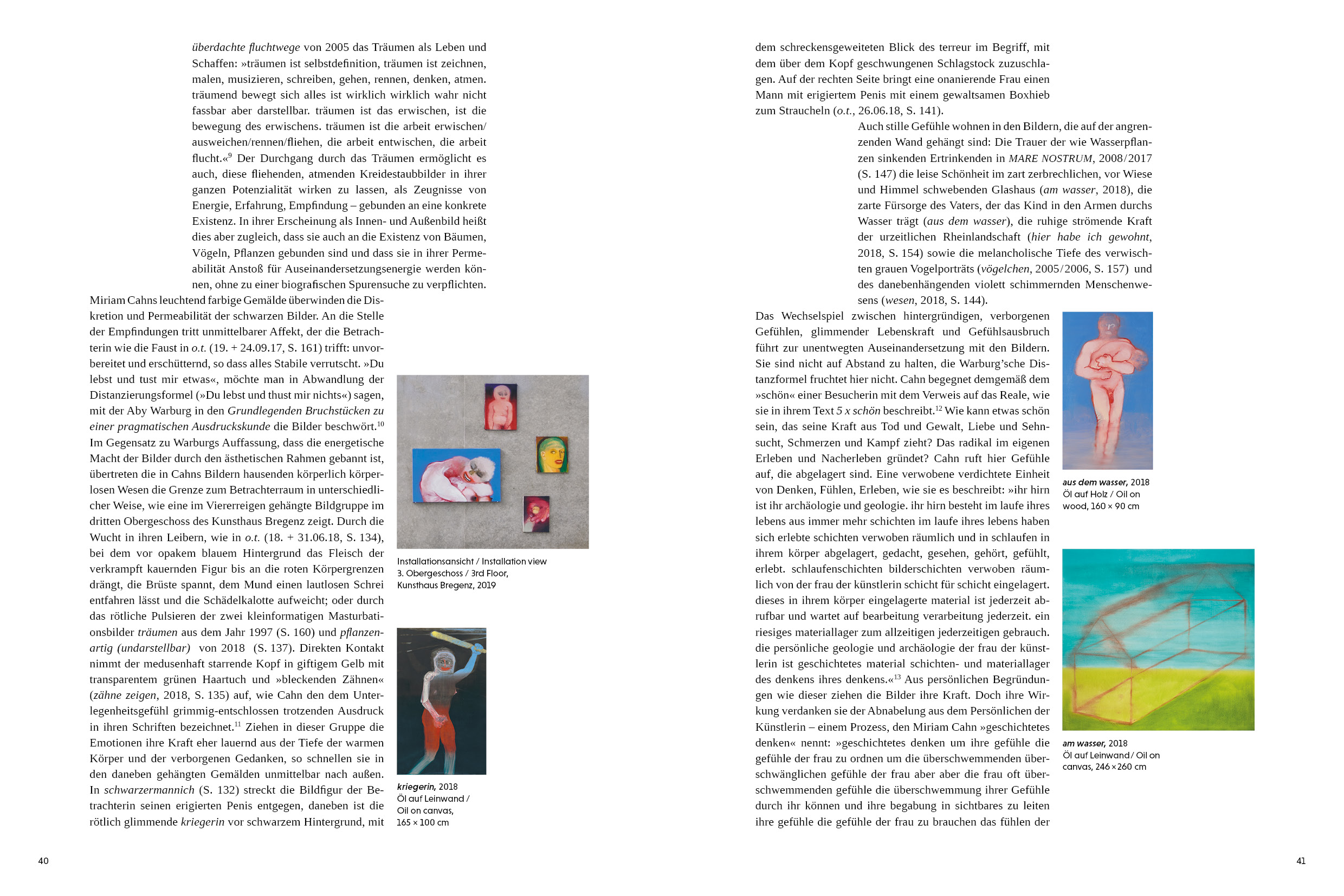
How can one give her often large-format work – hung by herself in the four floors of the Kunsthaus – adequate place (and space) in a book? How can one do her fast, expressive style justice, how her radical approach to such issues as violence and love, escape and security, the gender struggle and loneliness, how her way to point out something uncomfortable?
On the one hand with restraint:
* The Swiss-style brochure with free spine links to Cahn’s fast work and the often visible working tracks.
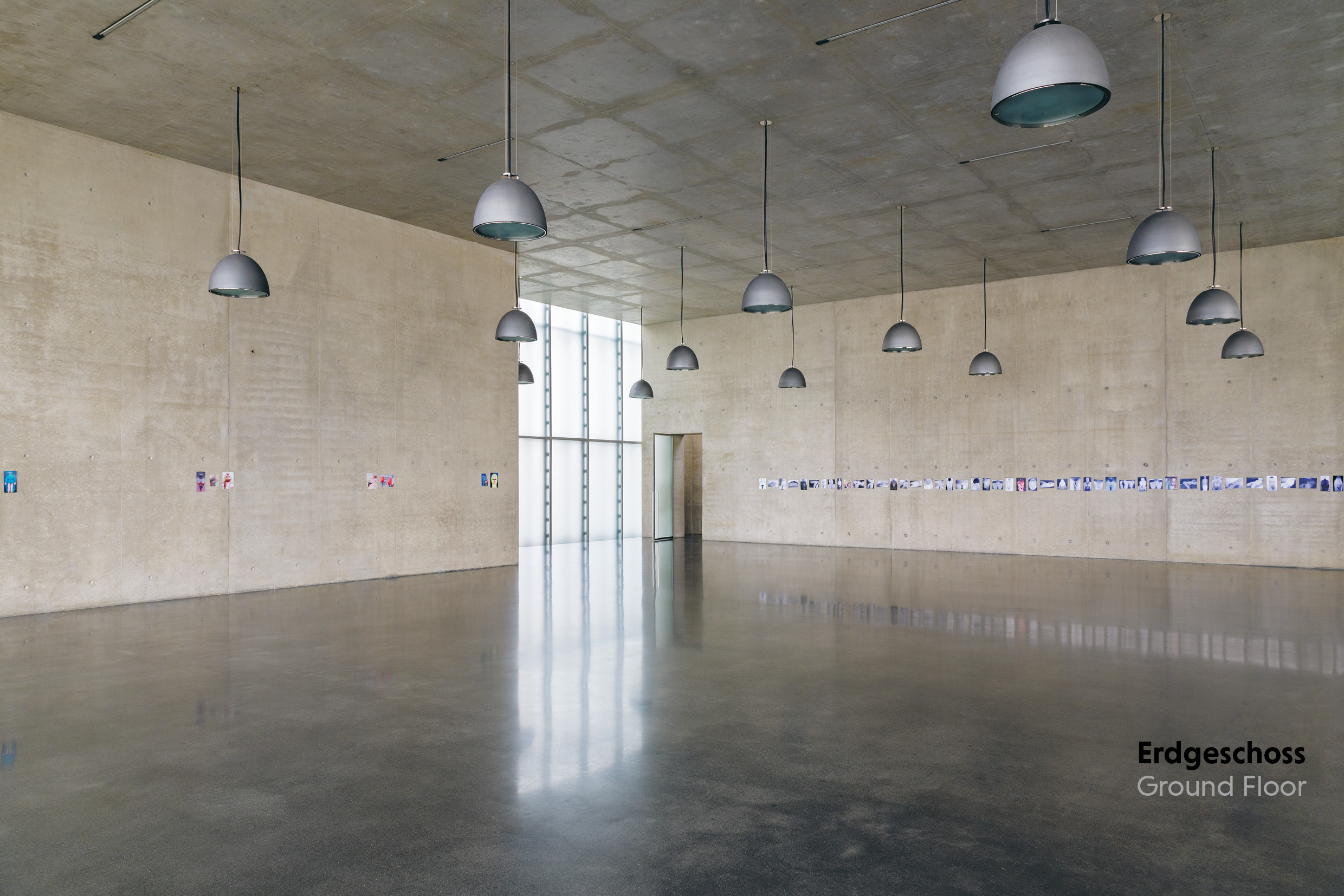
* The rhythm of the hanging is mirrored, the paintings are presented with a lot of space to let them work for themselves.
On the other hand with tension:
* Pictures of the staircases lead through the virtual exhibition. Installation views, details and fold-out pages animate to turn the pages back and forth: animation to look at the pages thoroughly
* Shifting paragraphs creating a strong rhythm, requiring energy as thinking and discussing difficult or complex subjects.
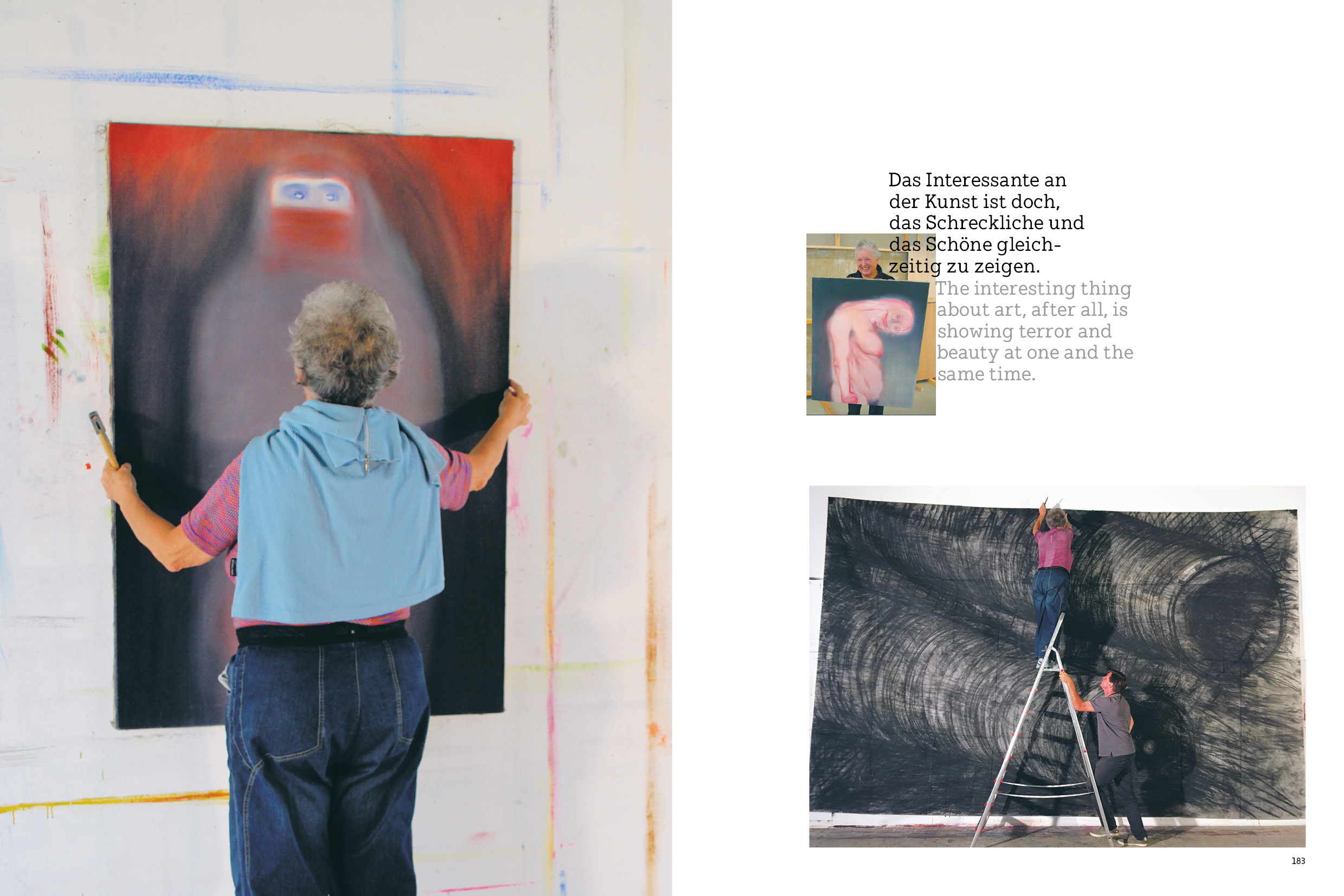
*A photo gallery of Miriam Cahn in action
Client: Kunsthaus Bregenz (Austria)
Concept, design: designreiche
Swiss-type brochures, free spine: 210×180 mm, 224 pages (German, English)
Typeface: Tinos (Steve Matteson), Niveau Grotesk (Hannes von Döhren), Hellschreiber Serif (Jörg Schmitt)
Print: Eberl Print
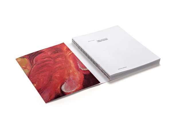
Swiss-style brochure; softcover with flaps, exposed binding.
Tinos is used for body copy, with Niveau Grotesk for captions.
Hellschreiber Serif is used for quotes.
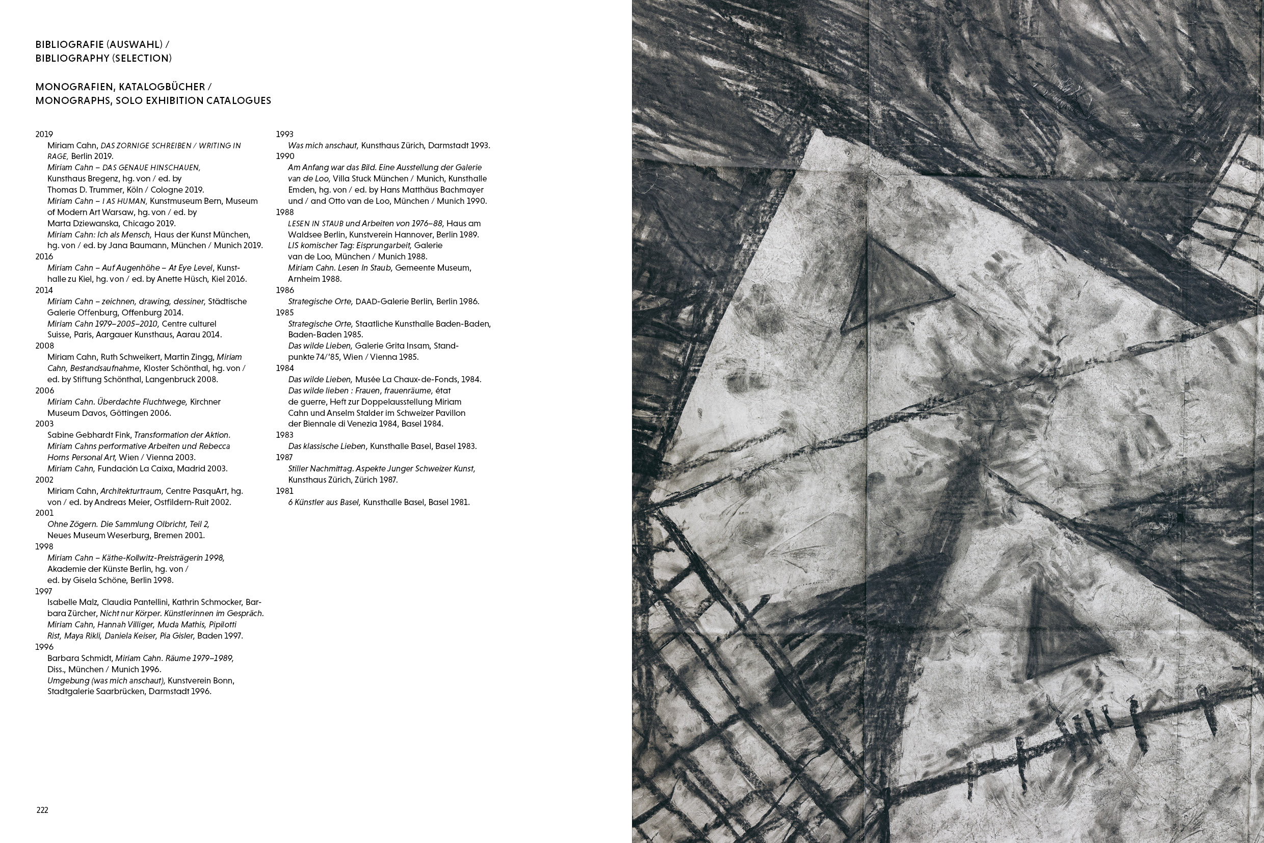
Niveau Grotesk for the bibliography.


")


")


1 Comment on “Miriam Cahn. Das genaue Hinschauen”
[translated from German, with text links extended by moderator]
An interesting typeface that is supported by a serif variant in 18 styles. Further examples of the sans in applied design include the Bacardi Ron Dean label and the sign for Pets Deli, a pet food store in Berlin.