
Grafika series, Clip Books of Line Art, Volk (1970–1972)
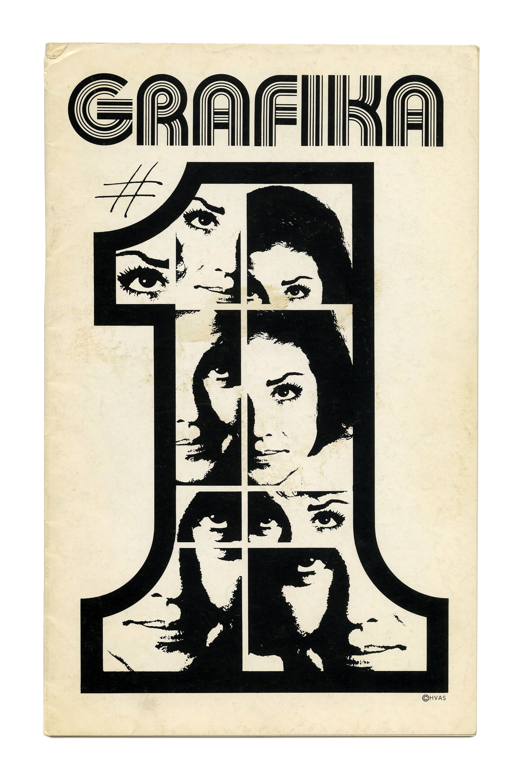
Grafika 1 (1970), ft. Bauhaus Prisma K from Ed Benguiat’s Bauhaus Prisma & Prisma Bauhaus. This series of multiline faces was introduced in the same year and showcased in PLINC’s Art Deco-themed Alphabet Directions No. 11.
Covers for various clip books of line art issued by Harry Volk Jr. Art Studio, Pleasantville, New Jersey. See the previous post about the clip books issued in 1955 for more information on Harry Volk Jr. Art Studio.
These booklets belong to a subseries titled Grafika. It was introduced in 1970. Until 1972, 18 numbered issues were produced. From No. 19 on, the number was no longer shown prominently, and Grafika were merged into the regular series of clip books. Collector Bart Solenthaler comments:
Volk published several titles in addition to the regular clip books – including Grafika – that started out with a distinct mission, but they all eventually became interchangeable in content to their other offerings.
Although not yet used for the first issues, ITC Fat Face soon emerged as the identity typeface for the Grafika series, and was maintained for later additions, see e.g. No. 113 from 1980. Like ITC Avant Garde Gothic and ITC Ronda, ITC Fat Face is the work of Herb Lubalin and Tom Carnase. These three typefaces were all released in 1970.

Grafika 2 (1971) ft. ITC Avant Garde Gothic, with the numeral 2 from Craw Modern or similar tucked into the counter of the monocular a.

Grafika 3 (1971) appears to use a solid, filled-in modification of Bauhaus Prisma. When compared to Bauhaus Alpha or Bauhaus Geometric (PLINC’s precursors of ITC Bauhaus), the differences are most notable in the counters of R (not round) and A (much larger), as well as the K with more even arms. G was trimmed for tighter spacing.
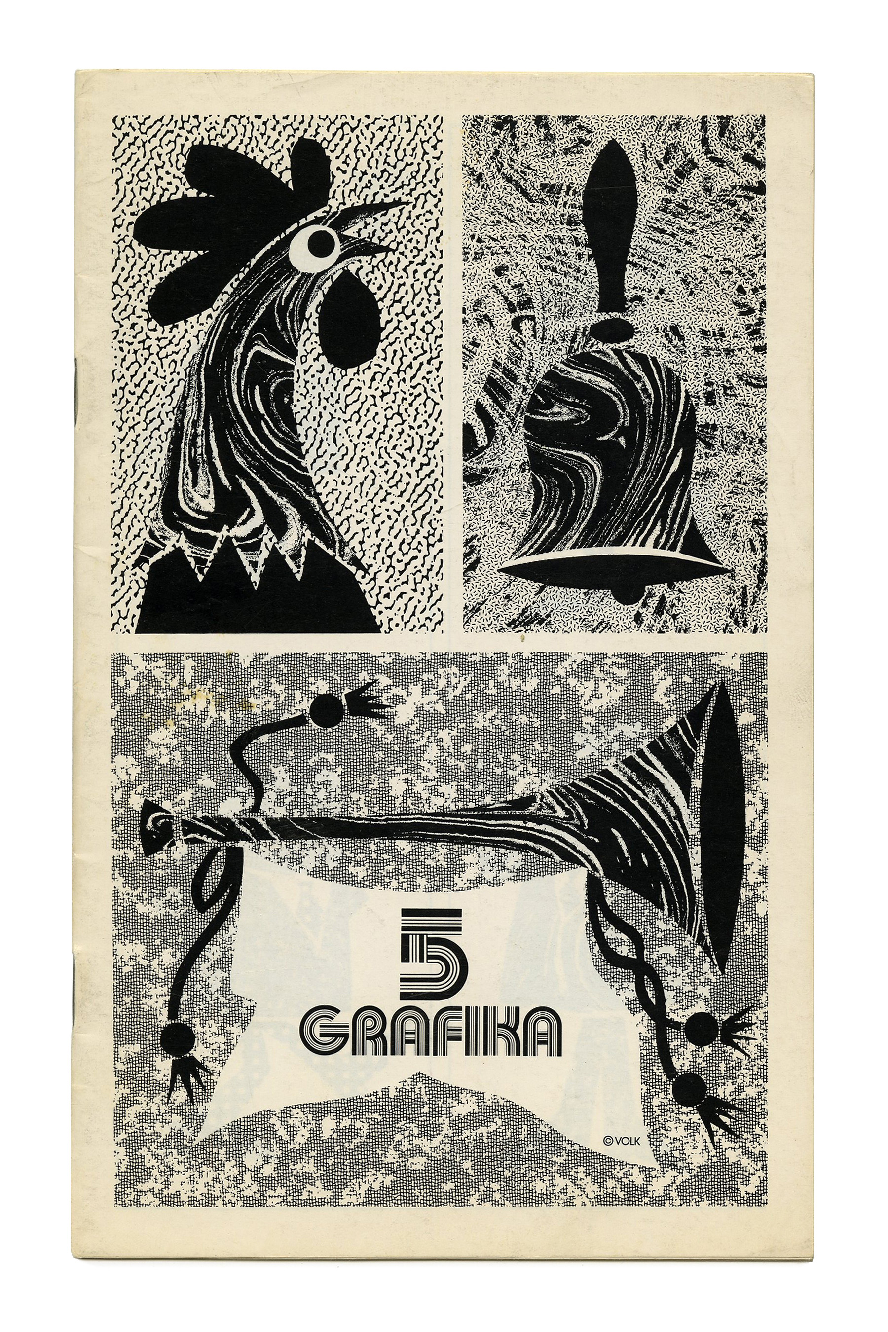
Grafika 5 sees a return of Bauhaus Prisma K, here with an “Arabic” numeral. This thick-thin-thin-thick-thin face is also used for No. 7.
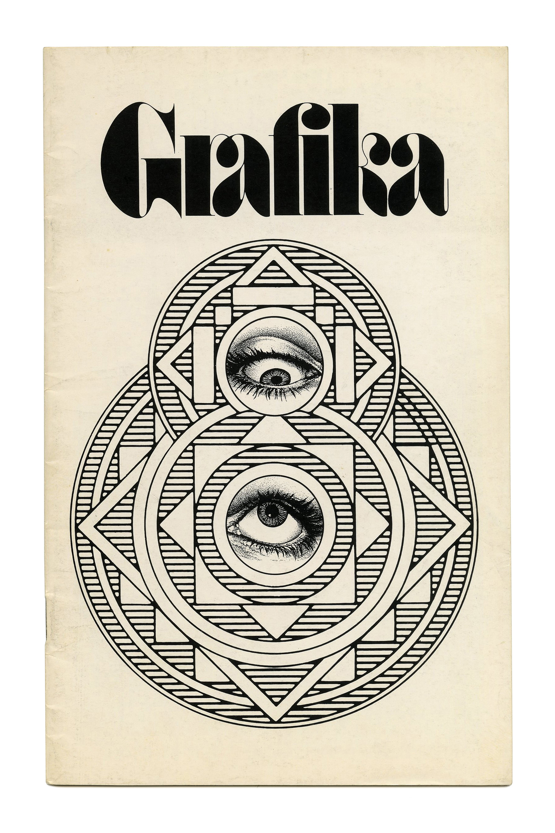
Grafika 8 (1971) proudly features ITC Fat Face, with ligatures for ra and fi. While the latter was included in the font, the former appears to be a clever custom invention. This eventually became the de facto logo of Grafika.

Grafika 9 (1971) uses a phototype version of Clearface. According to the One Line catalog (1971), Photo-Lettering, Inc. offered the design in 4 weights and 2 widths, plus italics. In 1978, ITC released a version in 4 weights, credited to Victor Caruso. ITC Clearface is narrower than the variant used here. The text in light lowercase letters inside the counter is set in ITC Avant Garde Gothic.
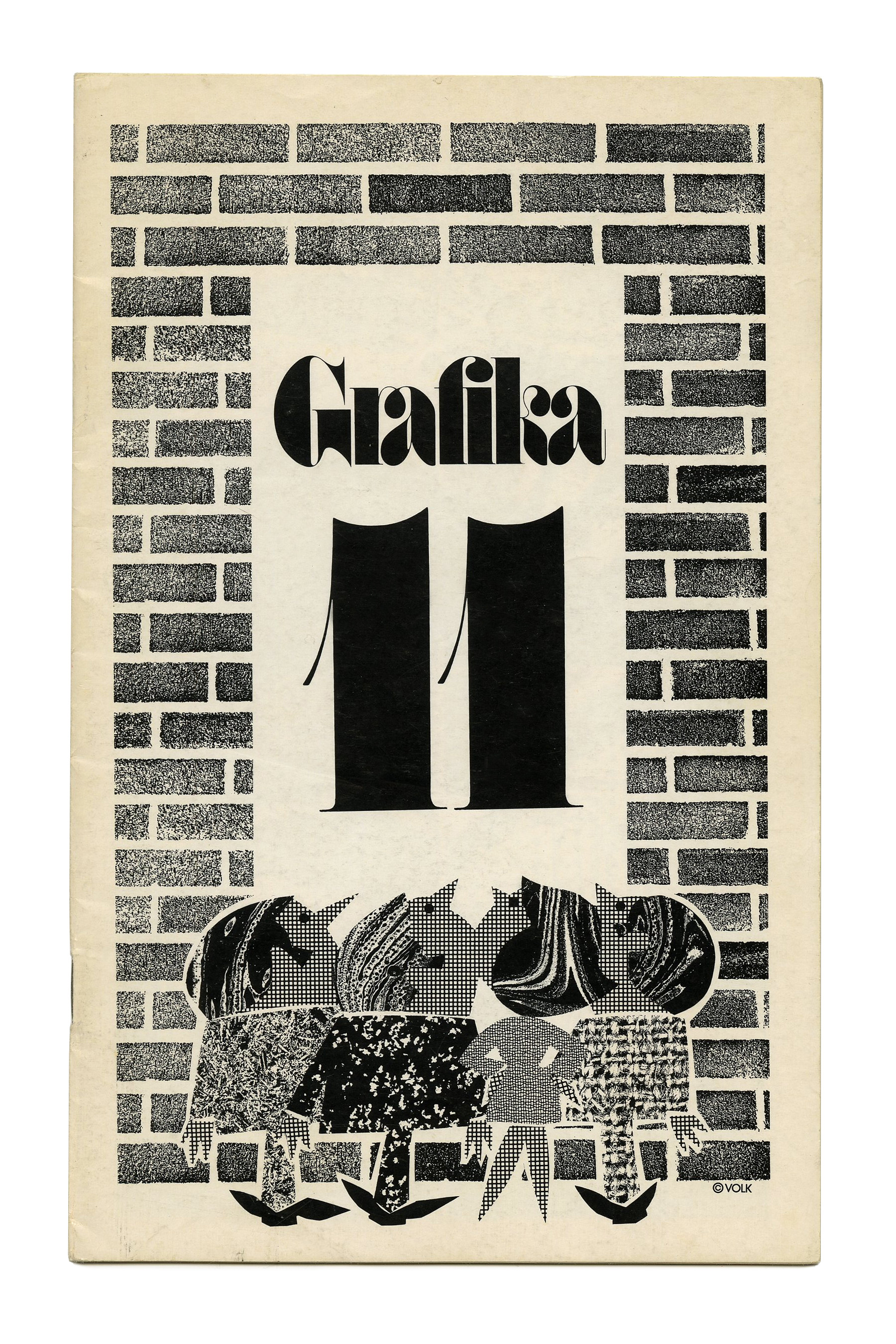
Grafika 11 (1971).
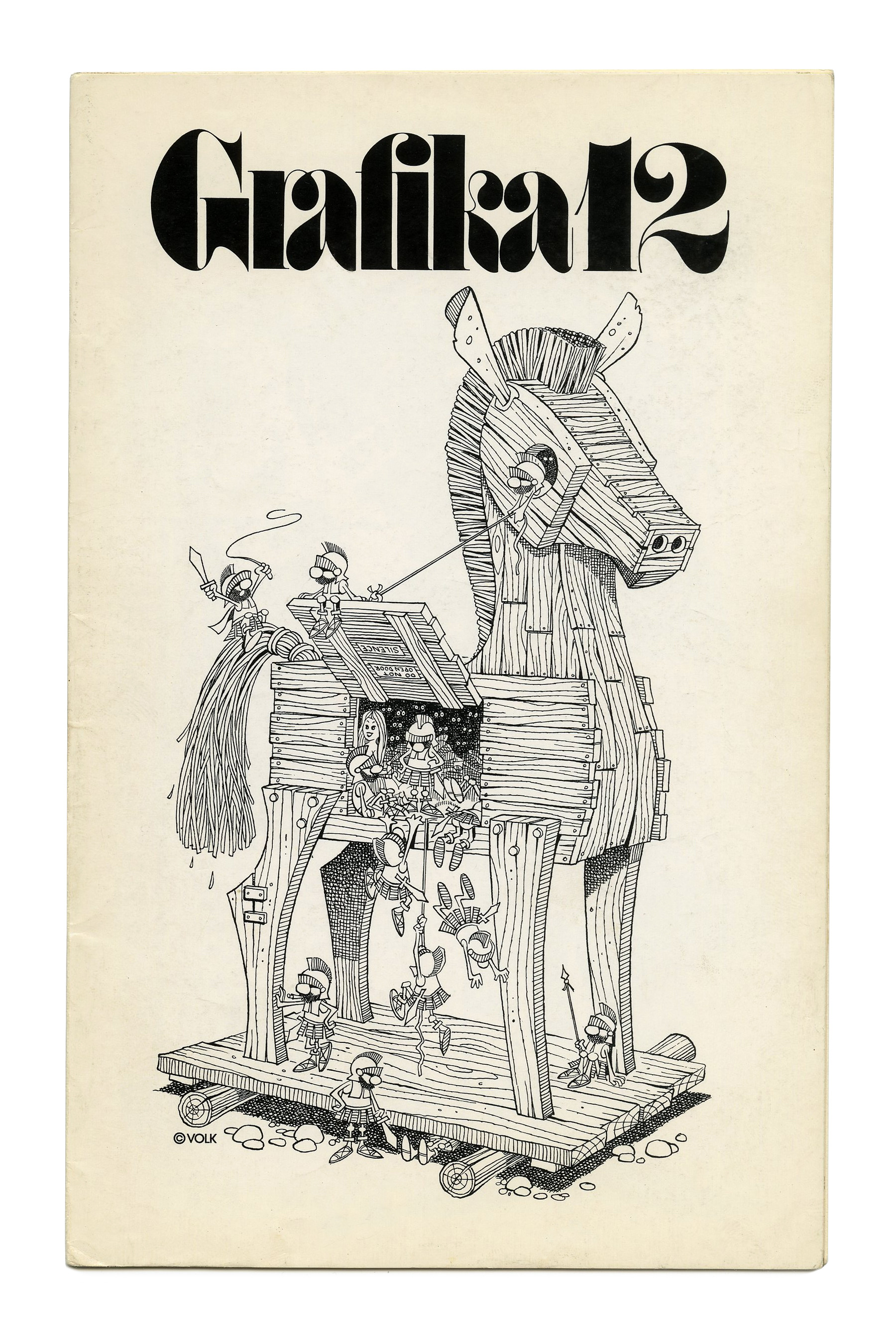
Grafika 12 (1971).


Grafika 14 (1972). “A Gallery of Contemporary Art” is in tightly spaced ITC Ronda.

Grafika 15 (1972).

Grafika 16 (1972).
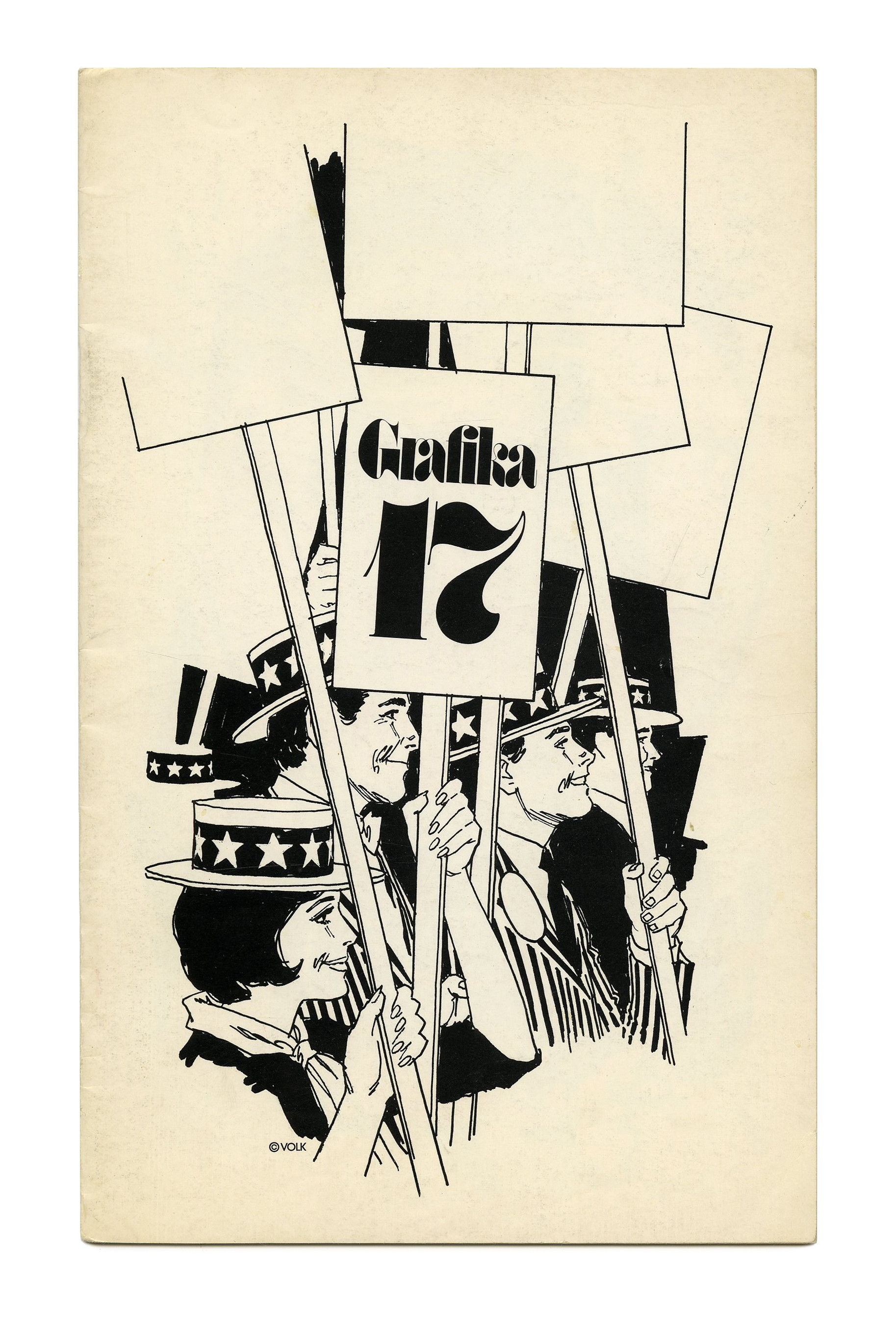
Grafika 17 (1972).
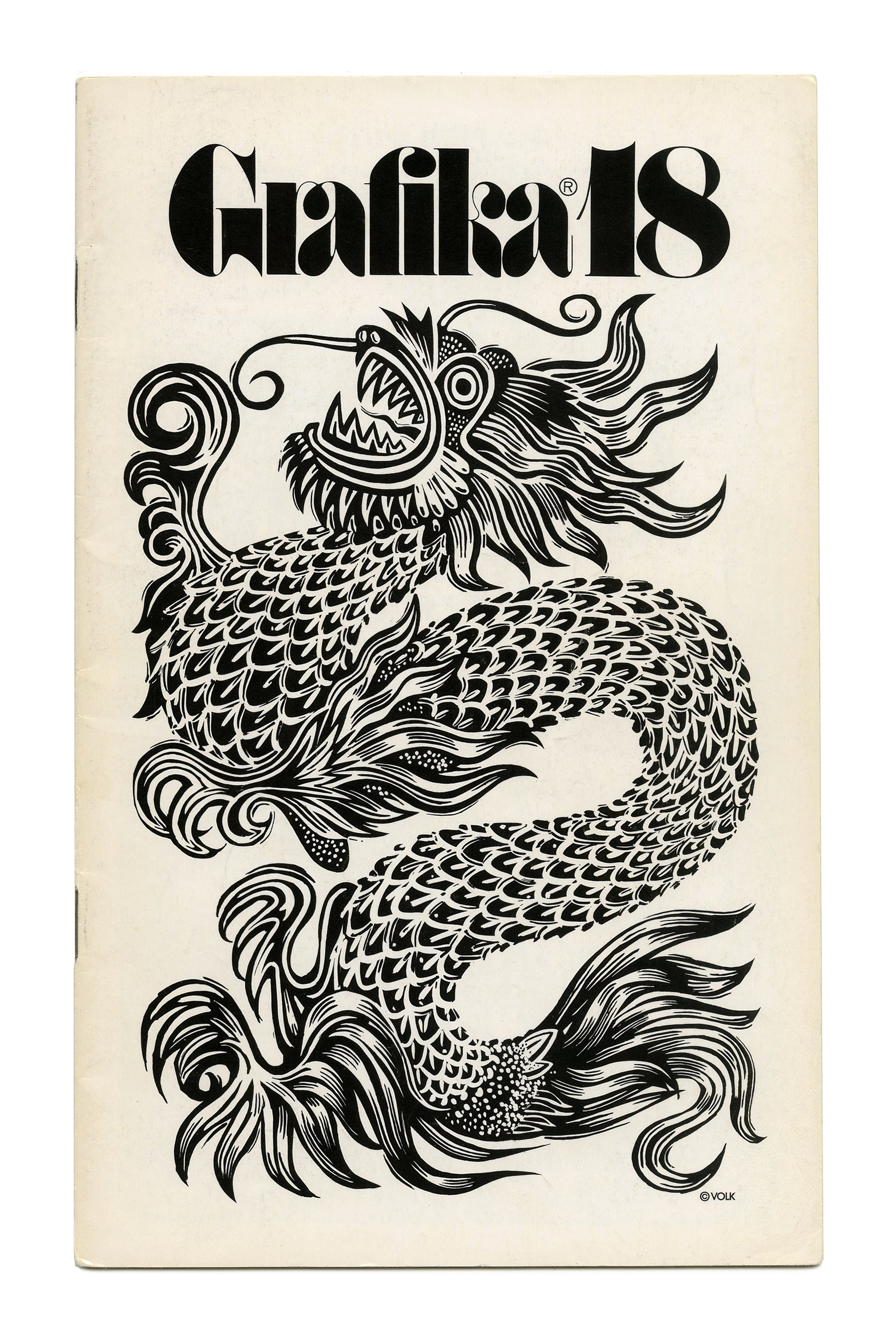
Grafika 18 (1972).

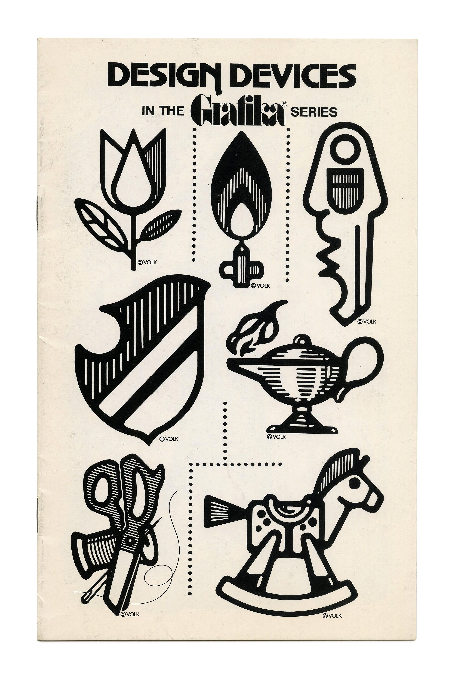
“Design Devices” (No. G22, 1972) ft. Advertisers Gothic.
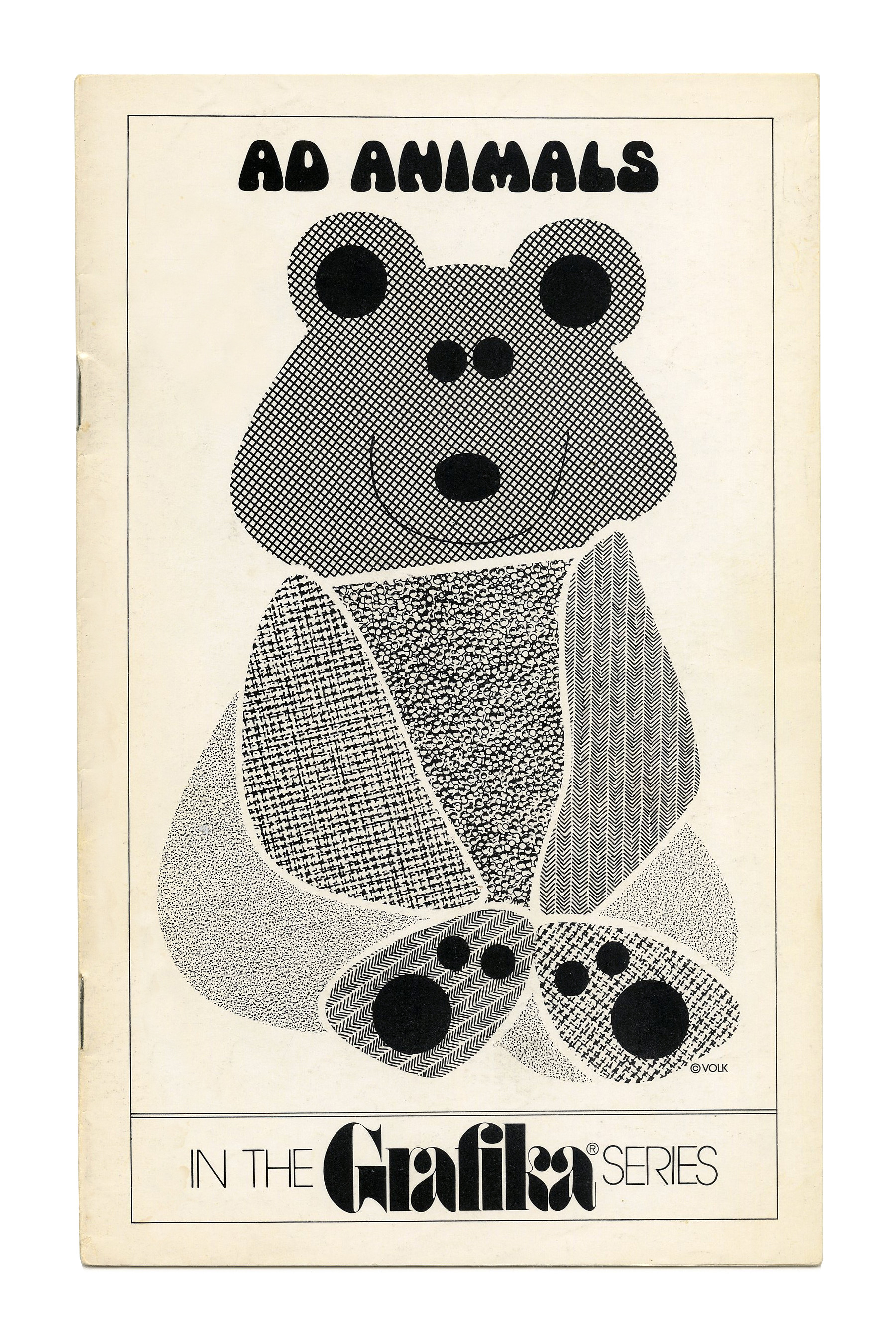
“Ad Animals” (No. G25, 1972) ft. Mania.


")


1 Comment on “Grafika series, Clip Books of Line Art, Volk (1970–1972)”
These are fascinating … I especially love that custom ligature for “ra” in Fat Face — gorgeous!
The stroke contrast in this phototype version of Fat Face seems much higher to me (thinner thin strokes) than the currently available digital version. Which makes wonder if there were multiple versions of the original phototype version, for use at different sizes.