
Clip Books of Line Art, Volk (1980)
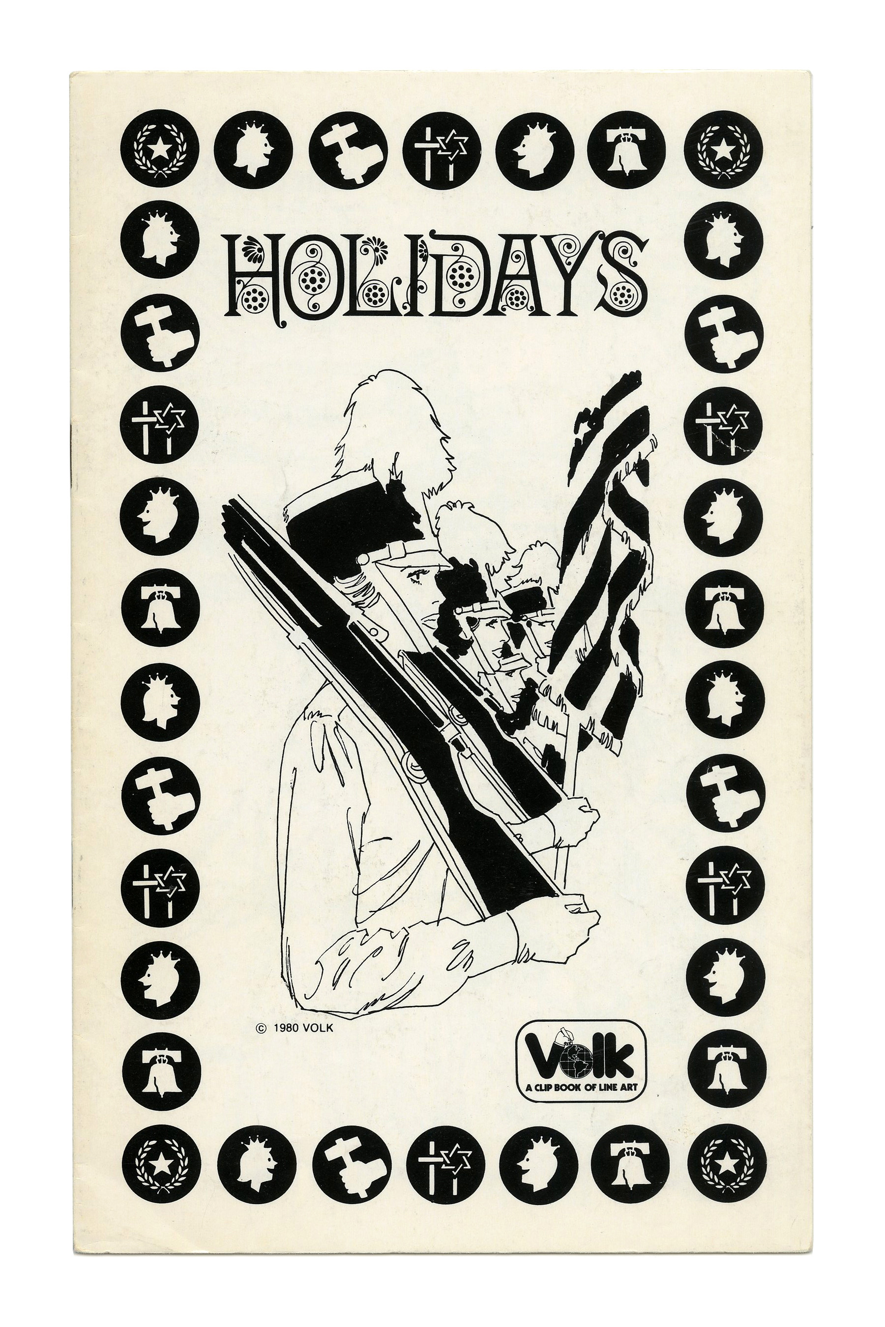
“Holidays” (No. 329) ft. Aesthetic. Having been issued by the Dickinson Type Foundery in 1882, the Victorian face with the ornate caps is the oldest one in the mix. In 1980, it was available from Photo-Lettering, Facsimile Fonts, VGC, and others.
Covers for various clip books of line art issued in 1980 by Harry Volk Jr. Art Studio, Pleasantville, New Jersey.
The booklets from this volume exemplify the dominance of ITC for display typography in the United States in this period. There are nine different typefaces from the library of the International Typeface Corporation, including less common ones such as ITC Uptight Neon (1970) and ITC Quorum (1977).
Letraset (the company that would acquire ITC in 1986) was also influential: There are two originals by the British manufacturer of dry transfer lettering sheets, Compacta (1963) and Cathedral (1978). Many other faces were available from Letraset (as well as from various phototype providers), too, among them revivals like Harrington, Tintoretto, Dynamo, and Peignot, or adaptations of designs that originated in phototype like Tonight, Yagi Double, Checkmate.
Exclusive designs by Photo-Lettering are less frequent than in the late 1960s and 1970s. They are still represented by Benguiat Caslon and Hasler Circus. Filmotype faces – which used to be omnipresent on Volk booklets in the 1950s and 1960s – have largely disappeared, with the exception of Filmotype Quiet (1954), a stencil design that by 1980 had been copied by PLINC, VGC, and others.
All covers feature the logo designed by Herb Lubalin and introduced in 1976, here with the subline in caps from Kabel Black.
See the previous post about the clip books issued in 1955 for more information on Harry Volk Jr. Art Studio.
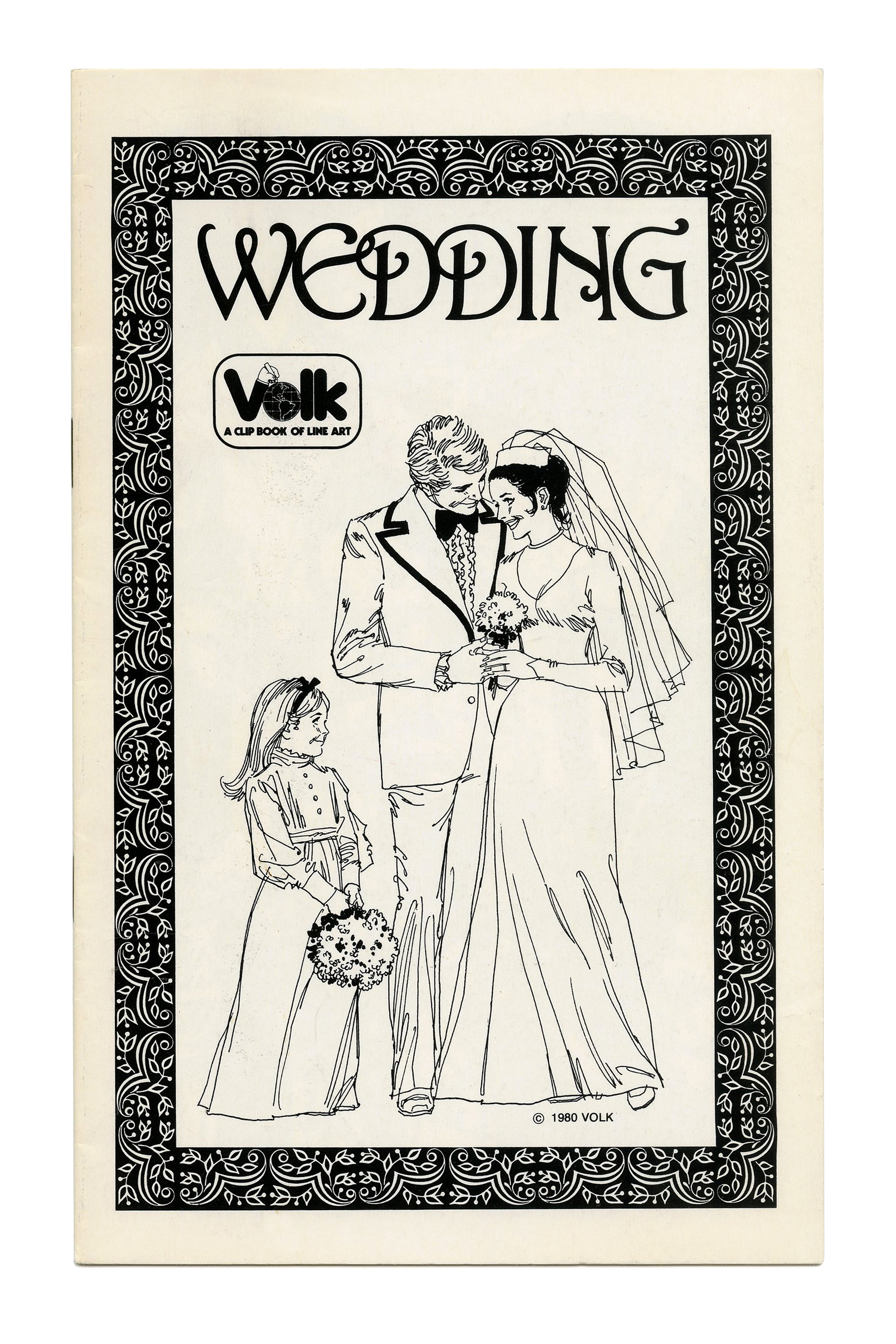
“Wedding” (No. 328) ft. partly overlapping caps from Harrington. The typeface was first issued by John Haddon & Co. in 1899.
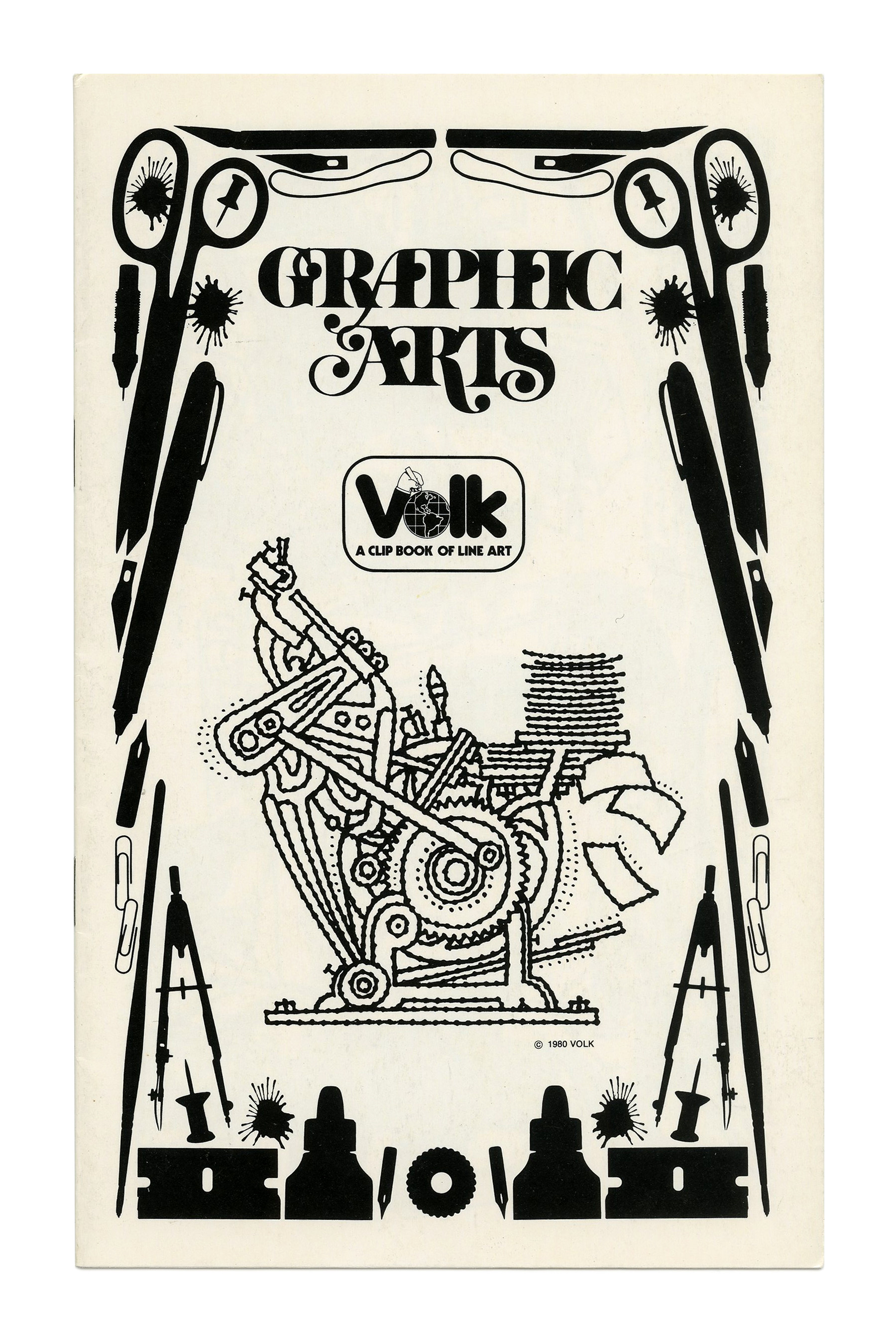
“Graphic Arts” (No. 331) ft. Benguiat Caslon. Because nothing says Graphic Arts like overlapping swash caps.
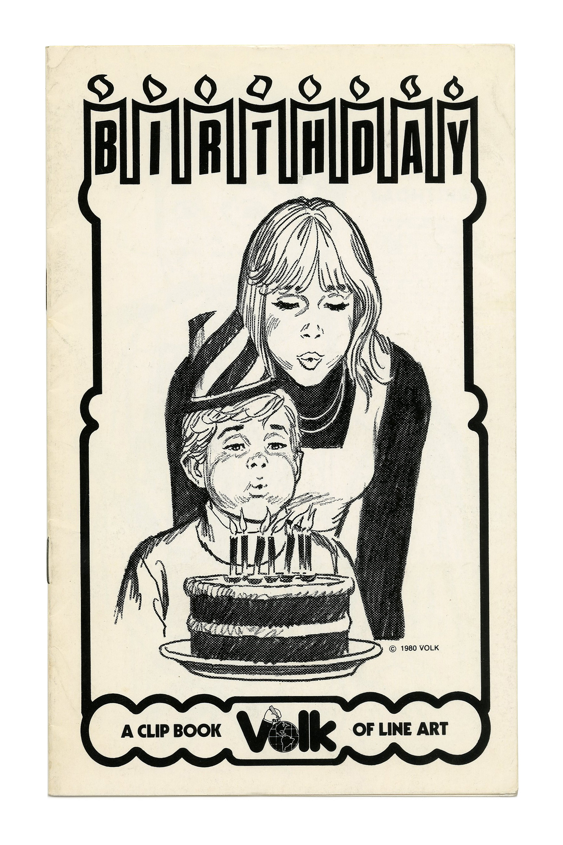
“Birthday” (No. 332) ft. skewed caps (a contra-rotalic?) from Compacta on candles. Illustration by Tom Sawyer.

“Religion” (No. 334) ft. Cathedral for a cover on a cover.

“Winter” (No. 335) ft. the snow-capped letters of Igloo.
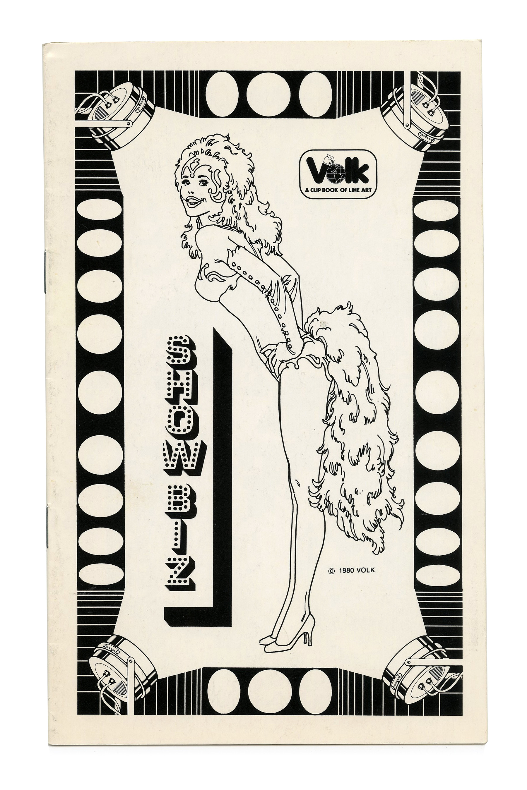
“Show Biz” (No. 336) ft. stacked glyphs from Tonight.
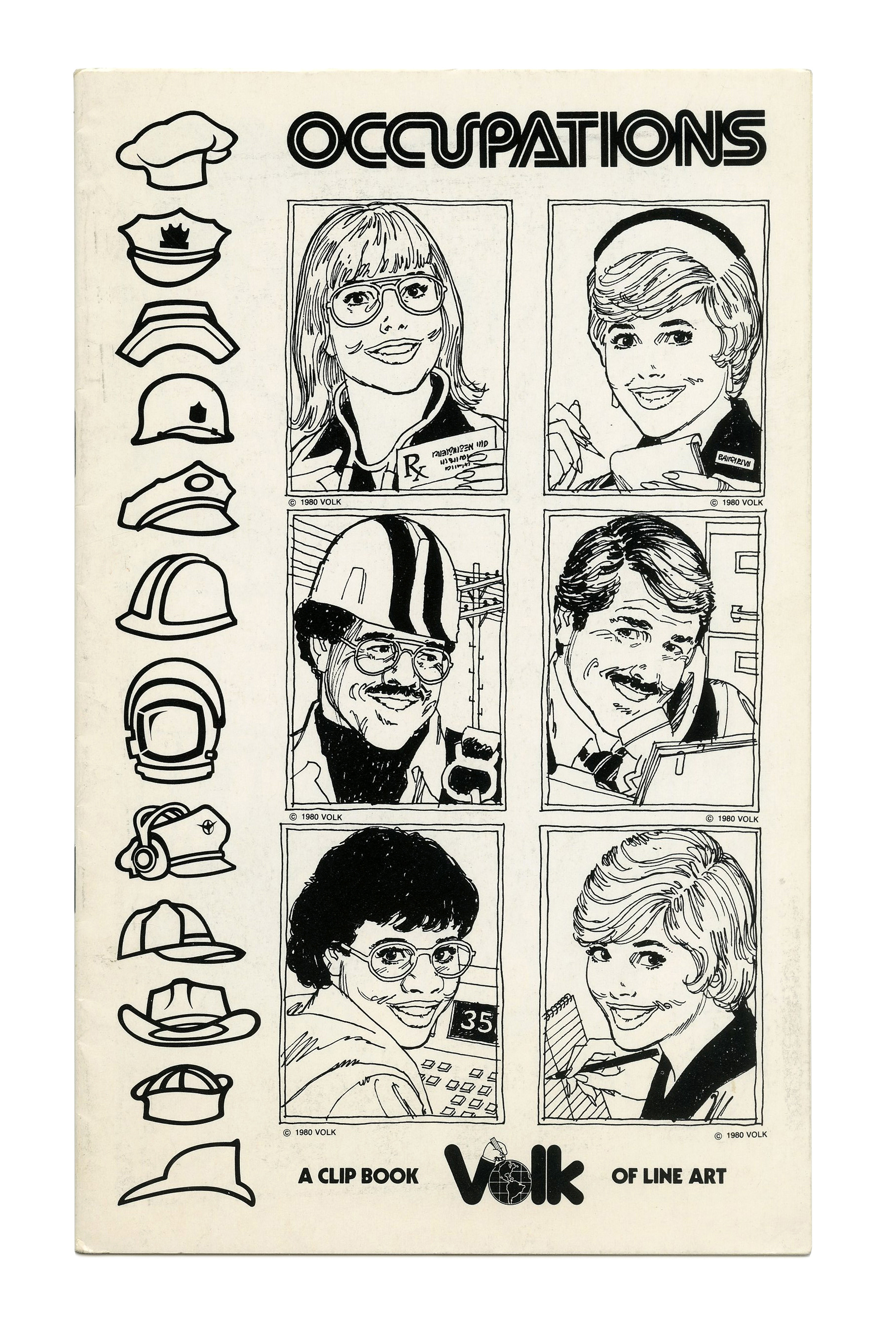
“Occupations” (No. 338) ft. Yagi Double.

“Communications” (No. 340) ft. ITC Benguiat Bold Condensed Italic (1979) and the comeback of the landscape format which would become the standard in subsequent years. The Volk logo is now shown in reverse on a black triangle. “Clip Book of Line Art” is set in ITC Avant Garde Gothic.

“Fitness” (No. 748) with caps from ITC Uptight Neon, set on a curve.
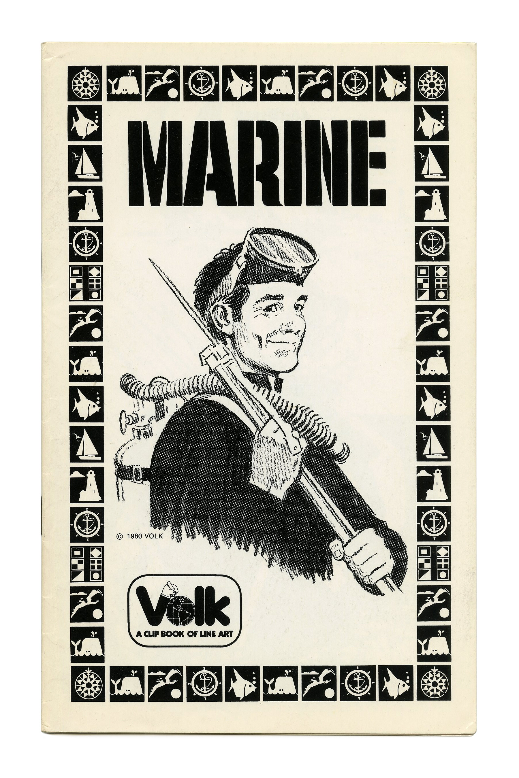
“Marine” (No. 749) ft. Filmotype Quiet. Illustration by Tom Sawyer.
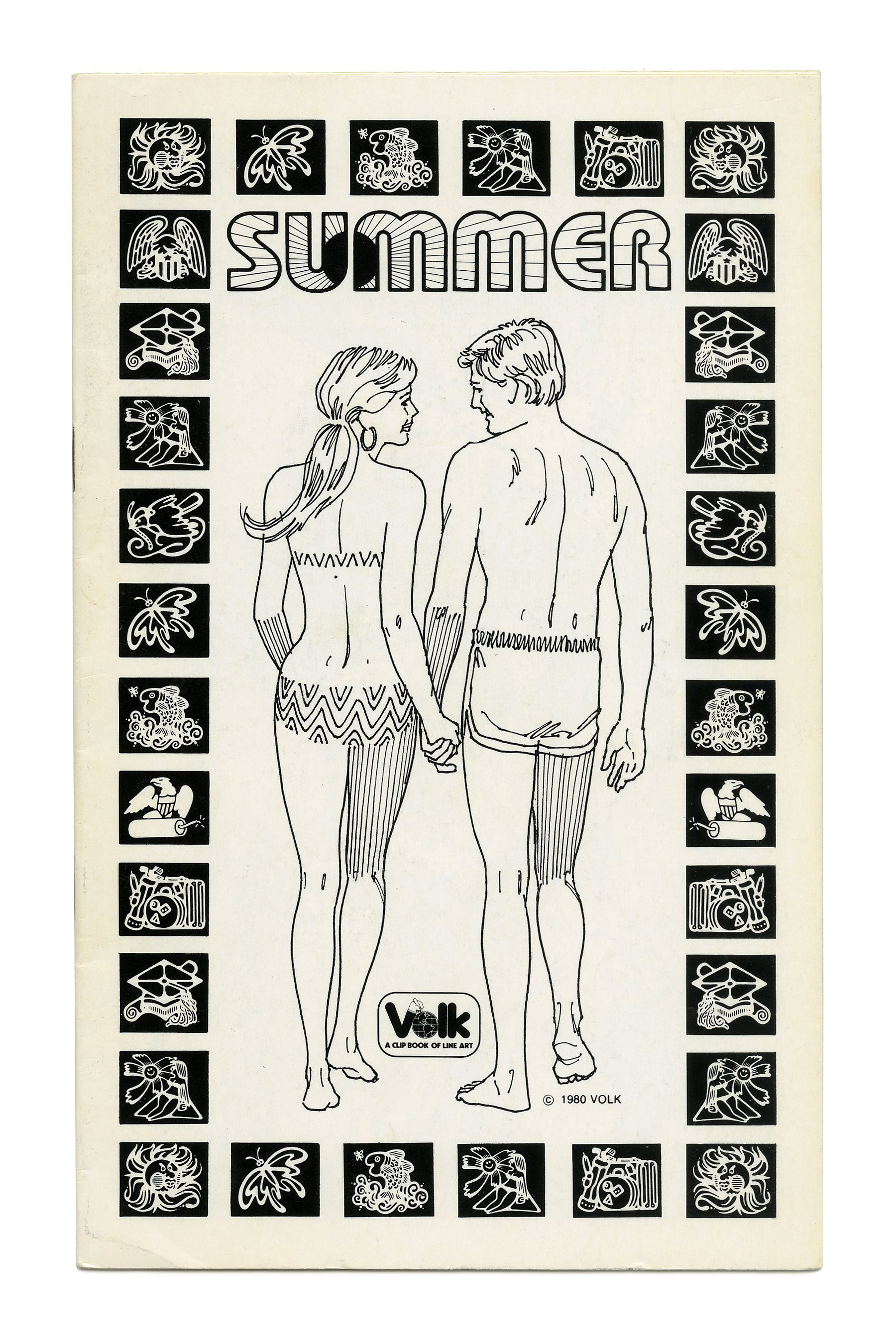
“Summer” (No. 750) ft. ITC Bauhaus Outline with the alternate M, filled with sunbeams.
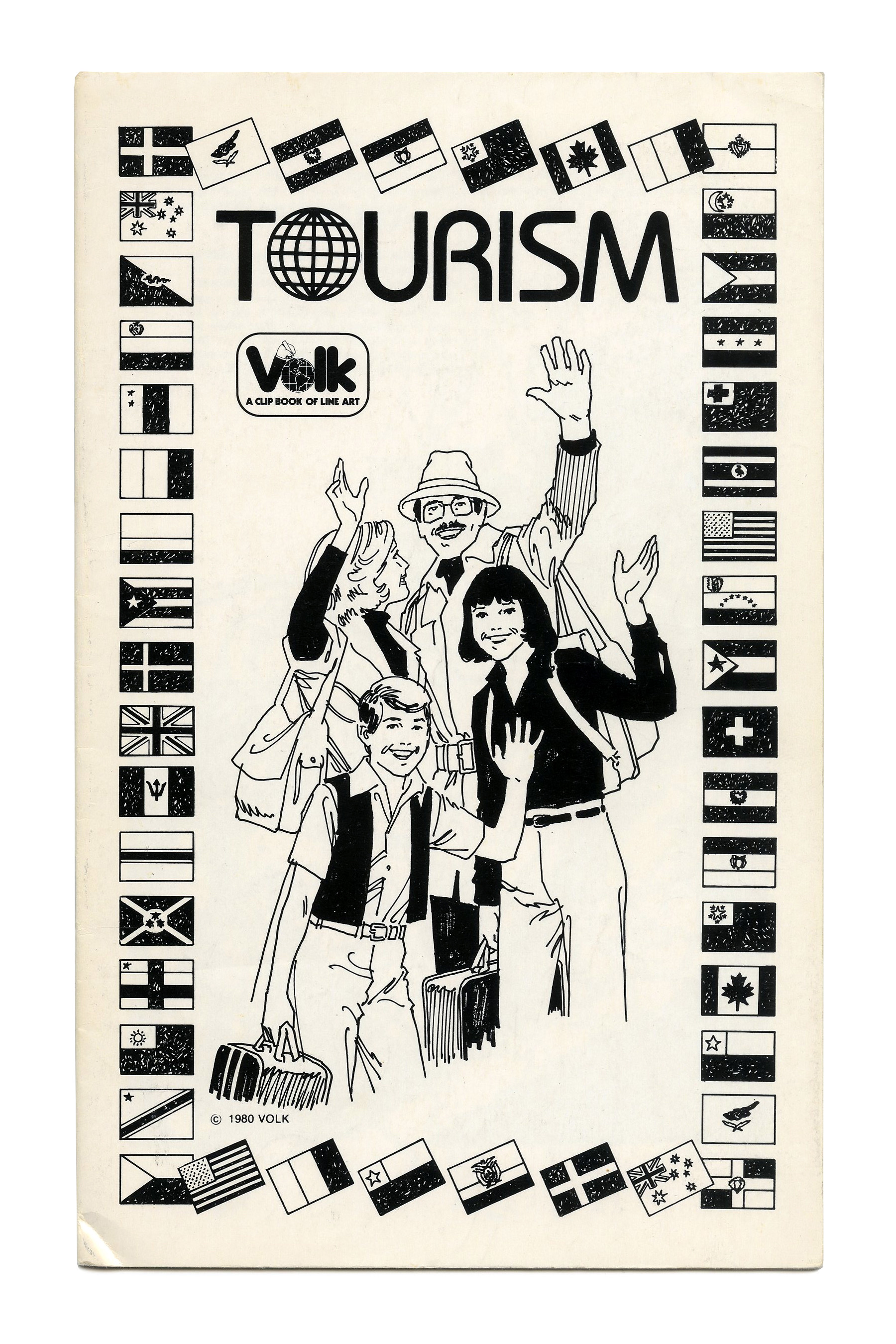
“Tourism” (No. 751) ft. ITC Bauhaus.
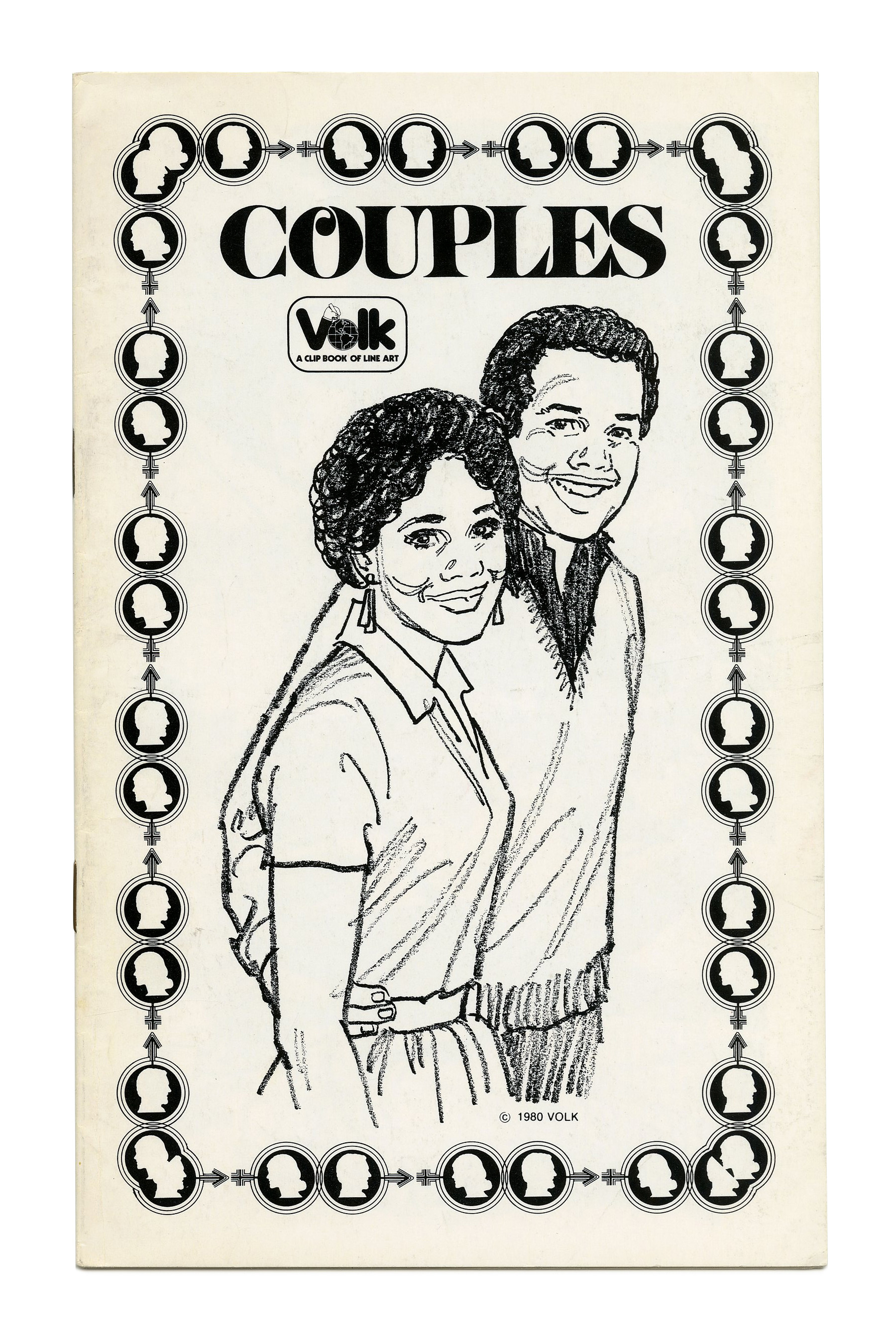
“Couples” (No. 752) ft. tightly spaced caps from Benguiat Caslon, here just with a single swash O and no overlaps. Primary Illustration by Tom Sawyer.

“Executives” (No. 754) ft. Peignot and a border full of handshakes.
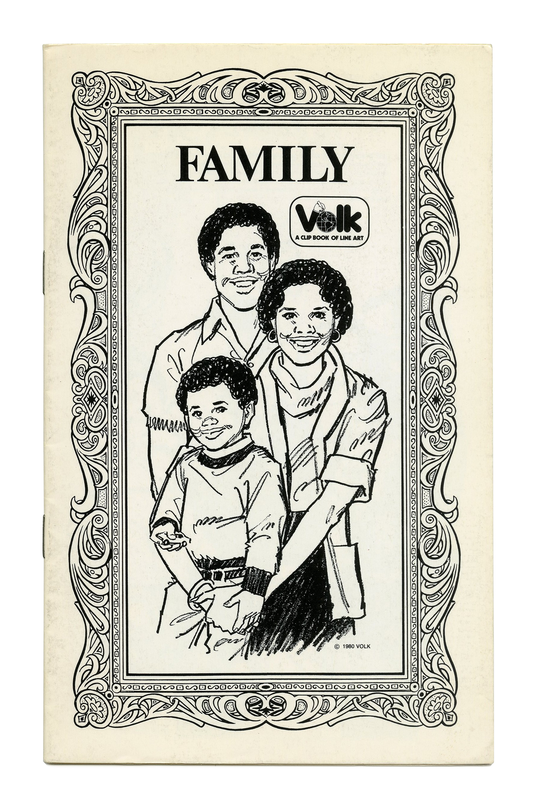
“Family” (No. 755) ft. Times New Roman.

“Autumn” (No. 756) ft. ITC Serif Gothic.
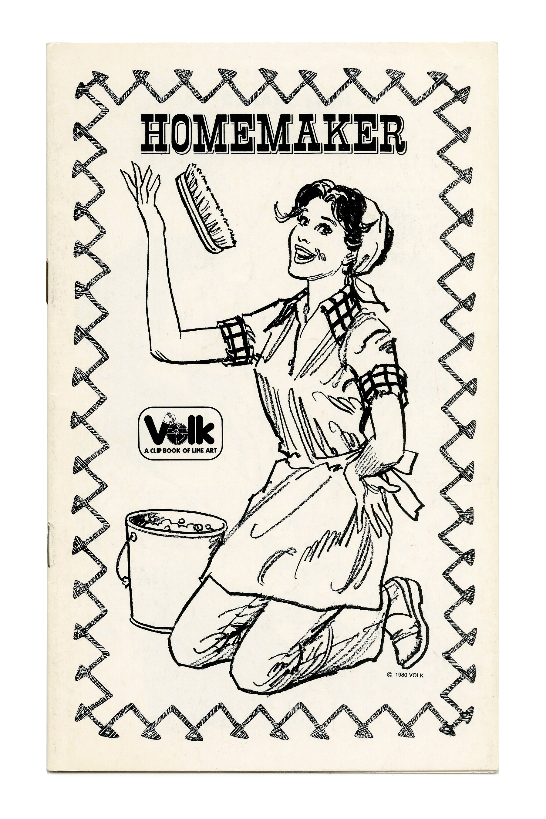
“Homemaker” (No. 757) ft. Circus.
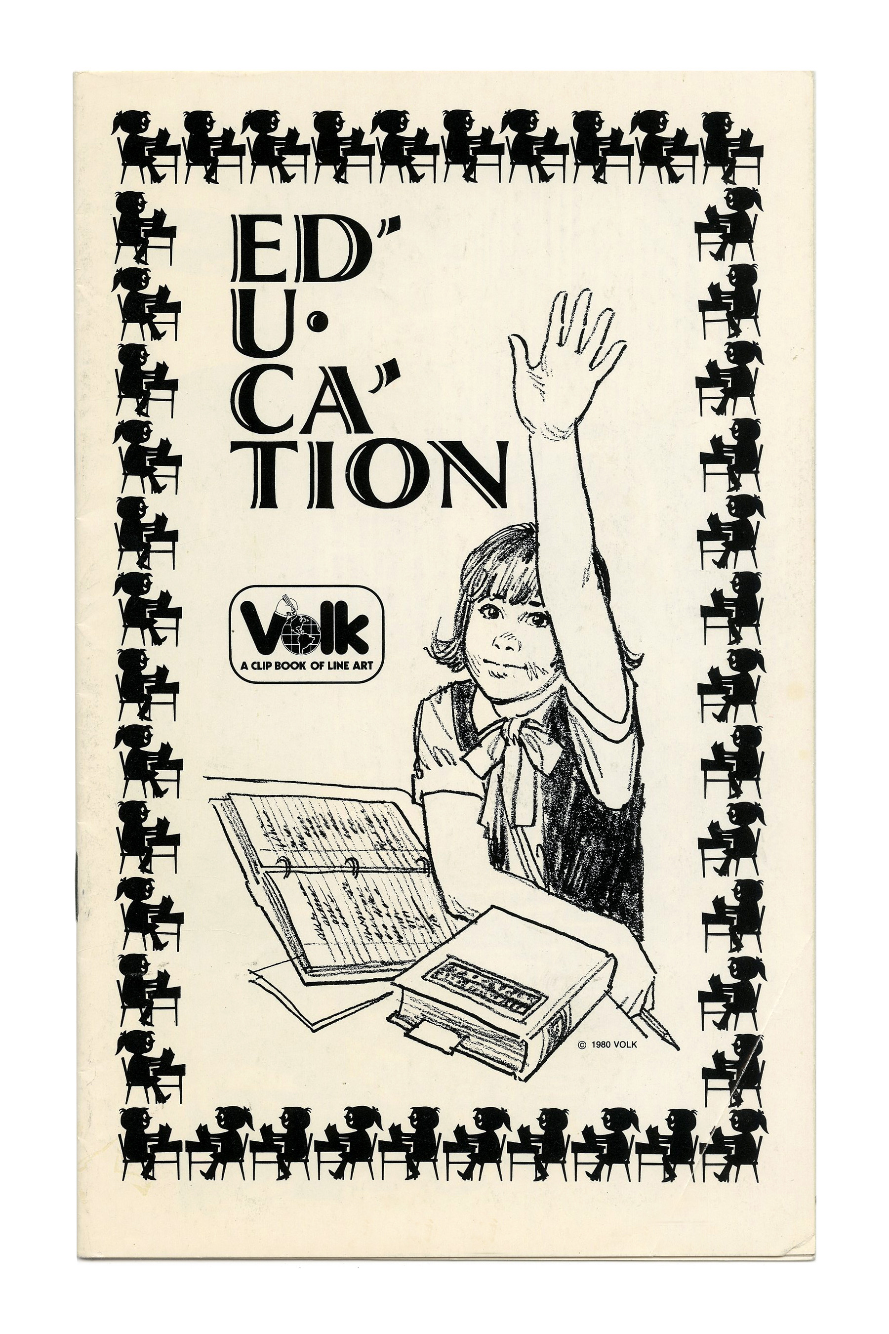
“Education” (No. 758) ft. Atrax with middle dots, apostrophes, and mid-word linebreaks.
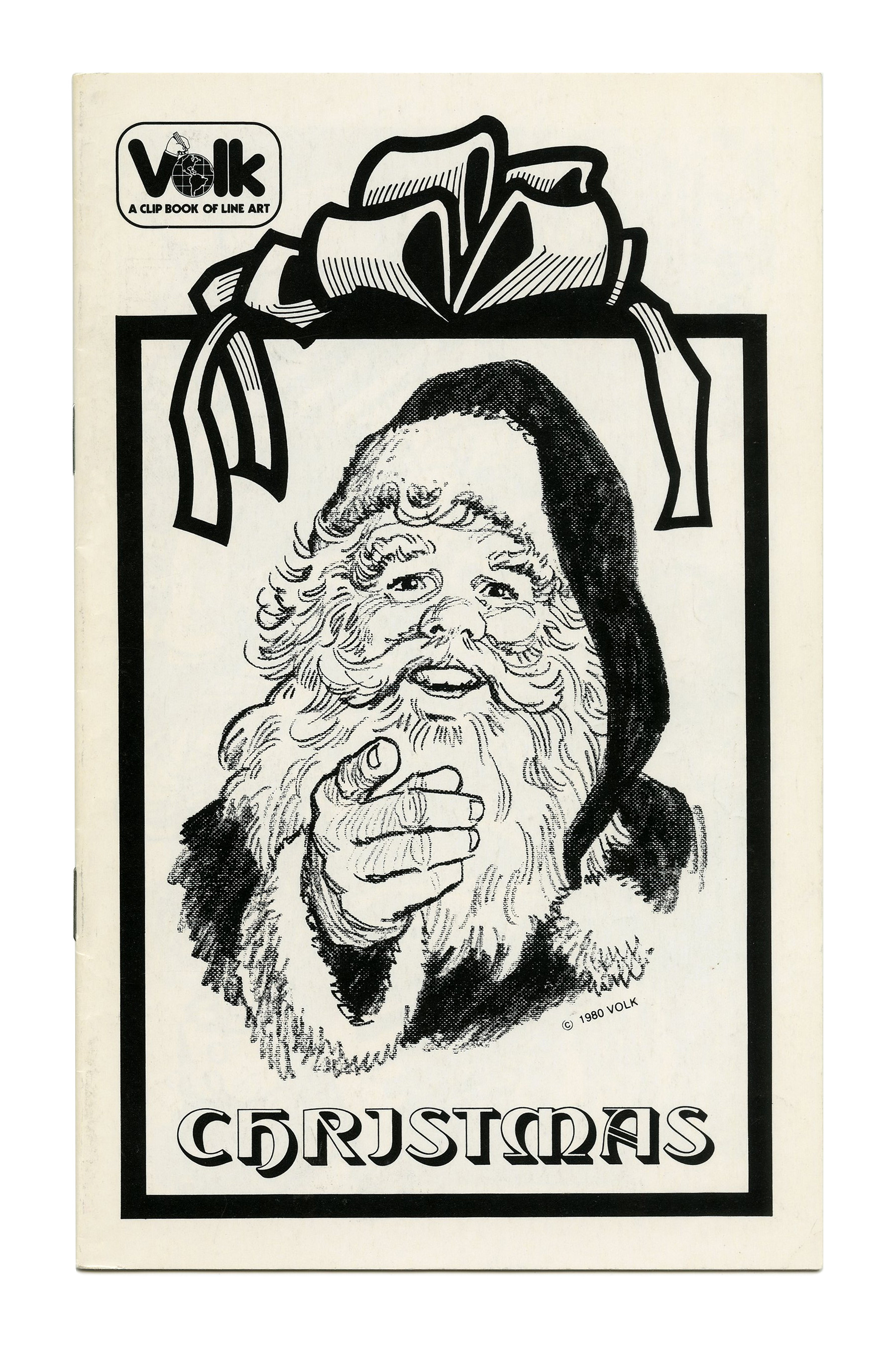
“Christmas” (No. 760) ft. Tintoretto, a typeface that was not made to be used in all caps, as the letter I shows: The J-like form works OK in initial form, but sticks out like a sore thumb in the middle of a word.

“Energy” (No. 762) ft. stacked caps from Dynamo.
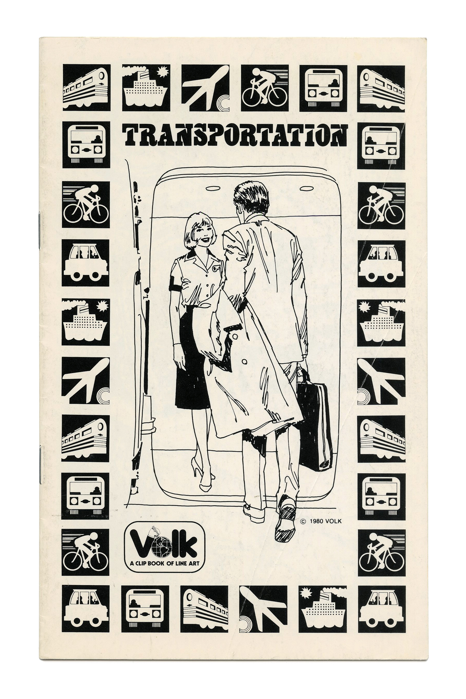
“Transportation” (No. 763) ft. caps from Wedge Bold by Lettergraphics, which is Egyptienne Bold Condensed customized with triangles cut from the letterforms.
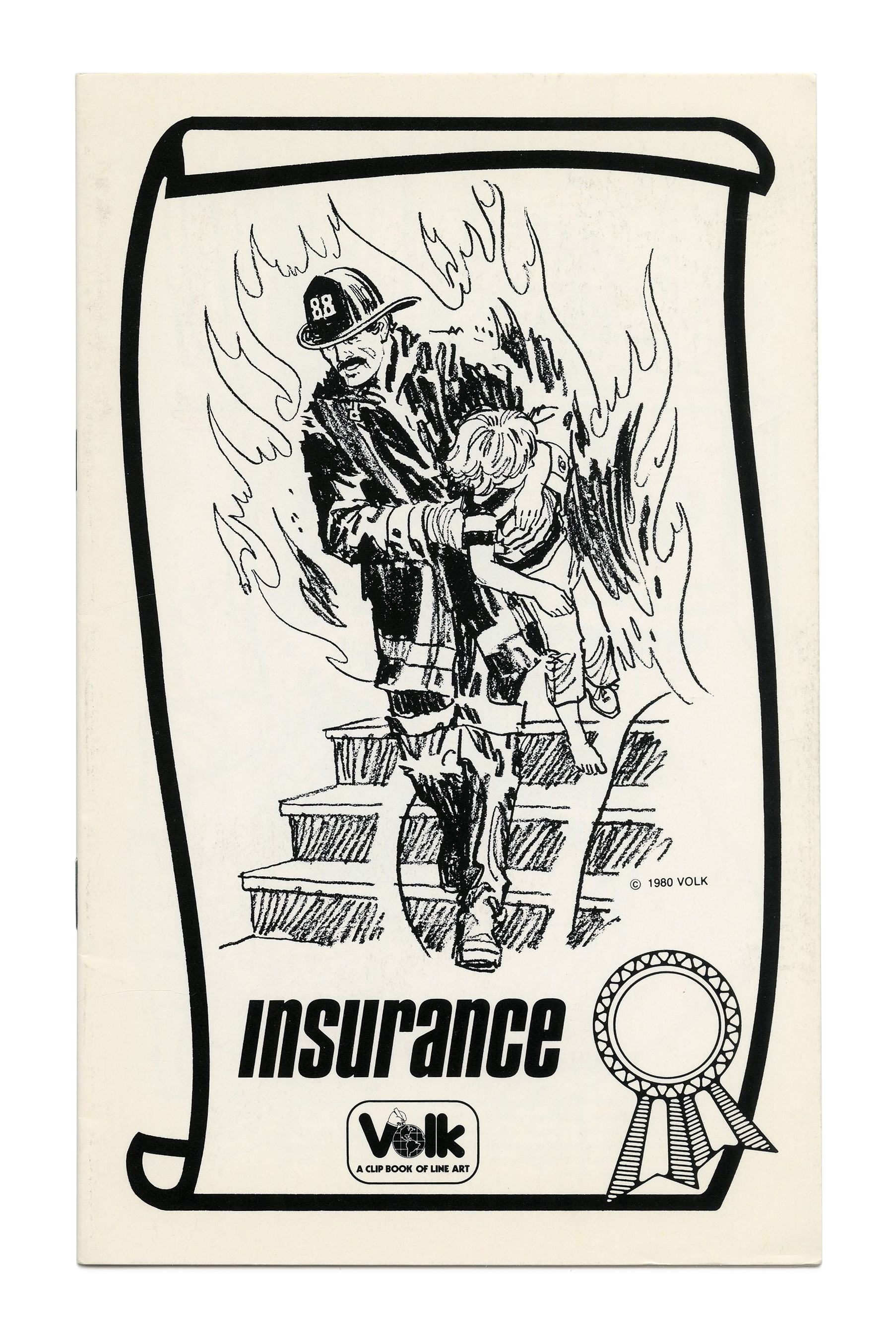
“Insurance” (No. 764) ft. Compacta Bold Italic in lowercase, with an omitted i dot.

“Senior Citizens” (No. 765) ft. all-caps ITC Souvenir with initial and terminal swash forms.
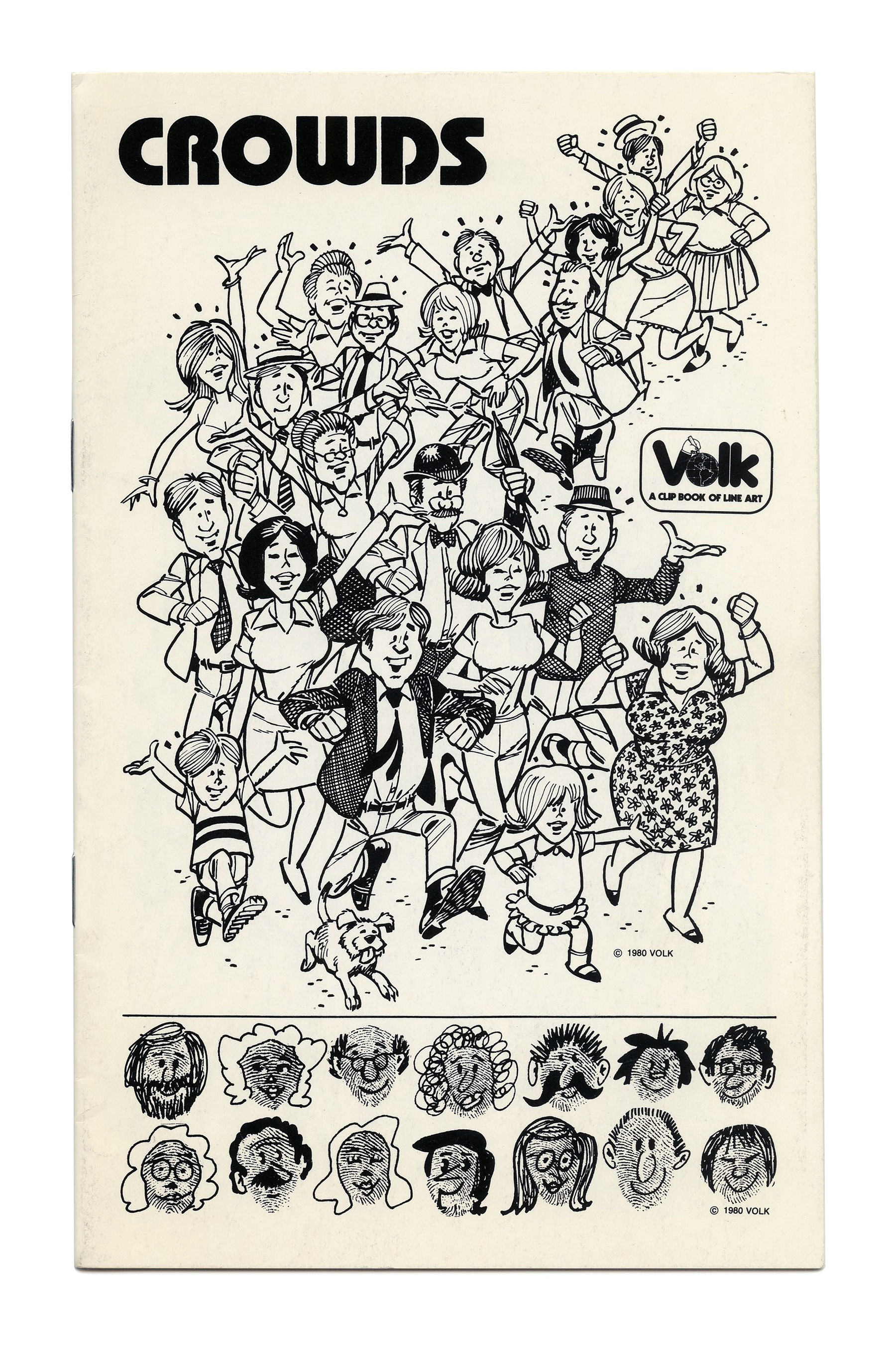
“Crowds” (No. 766) ft. ITC Bauhaus.

“Human Relations” (No. 767), again with oblique Compacta in all lowercase and no i dot.
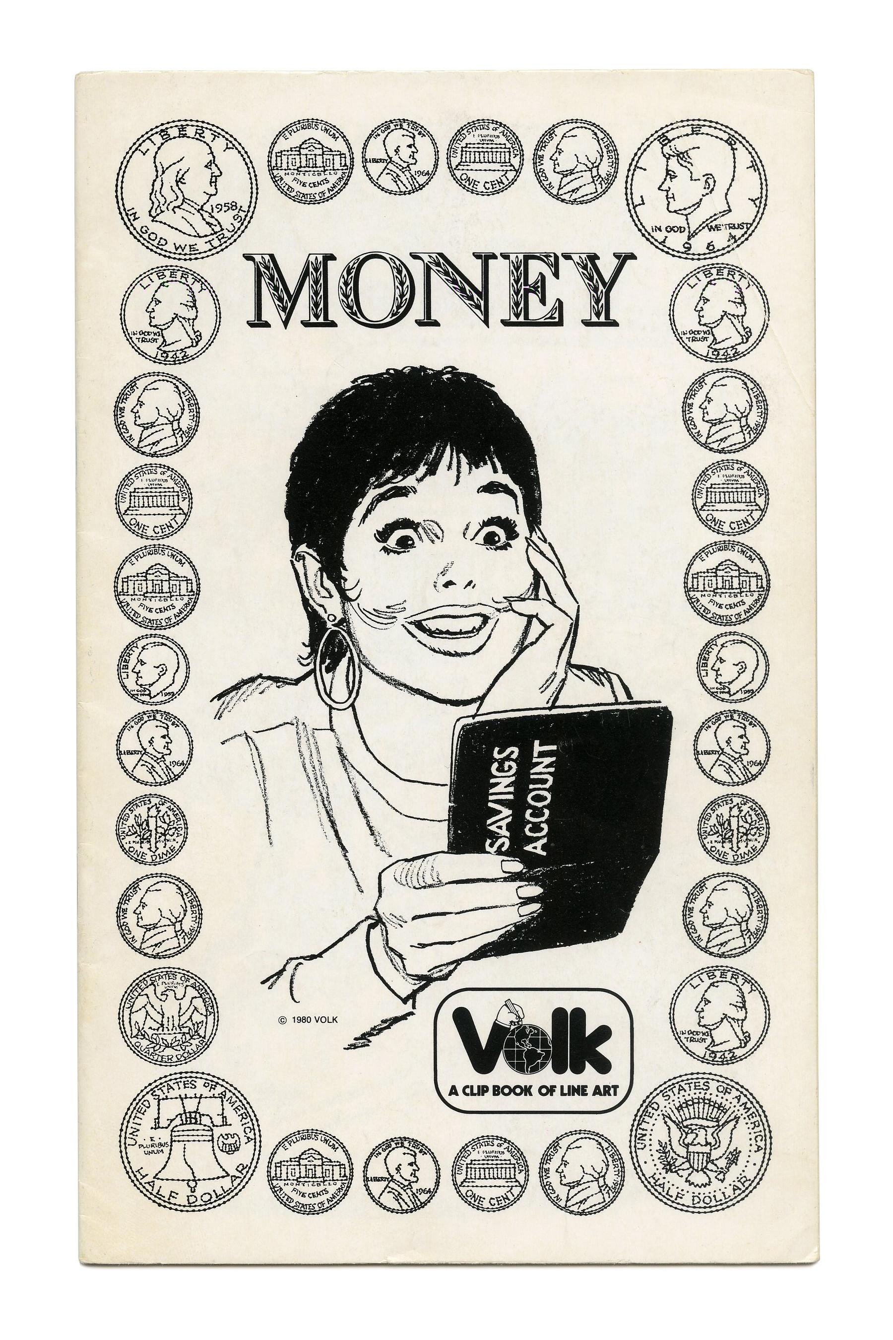
“Money” (No. 769) ft. Molé Foliate. Primary Illustration by Tom Sawyer.

“Circus-Fair” (No. 770) ft. Hasler Circus.
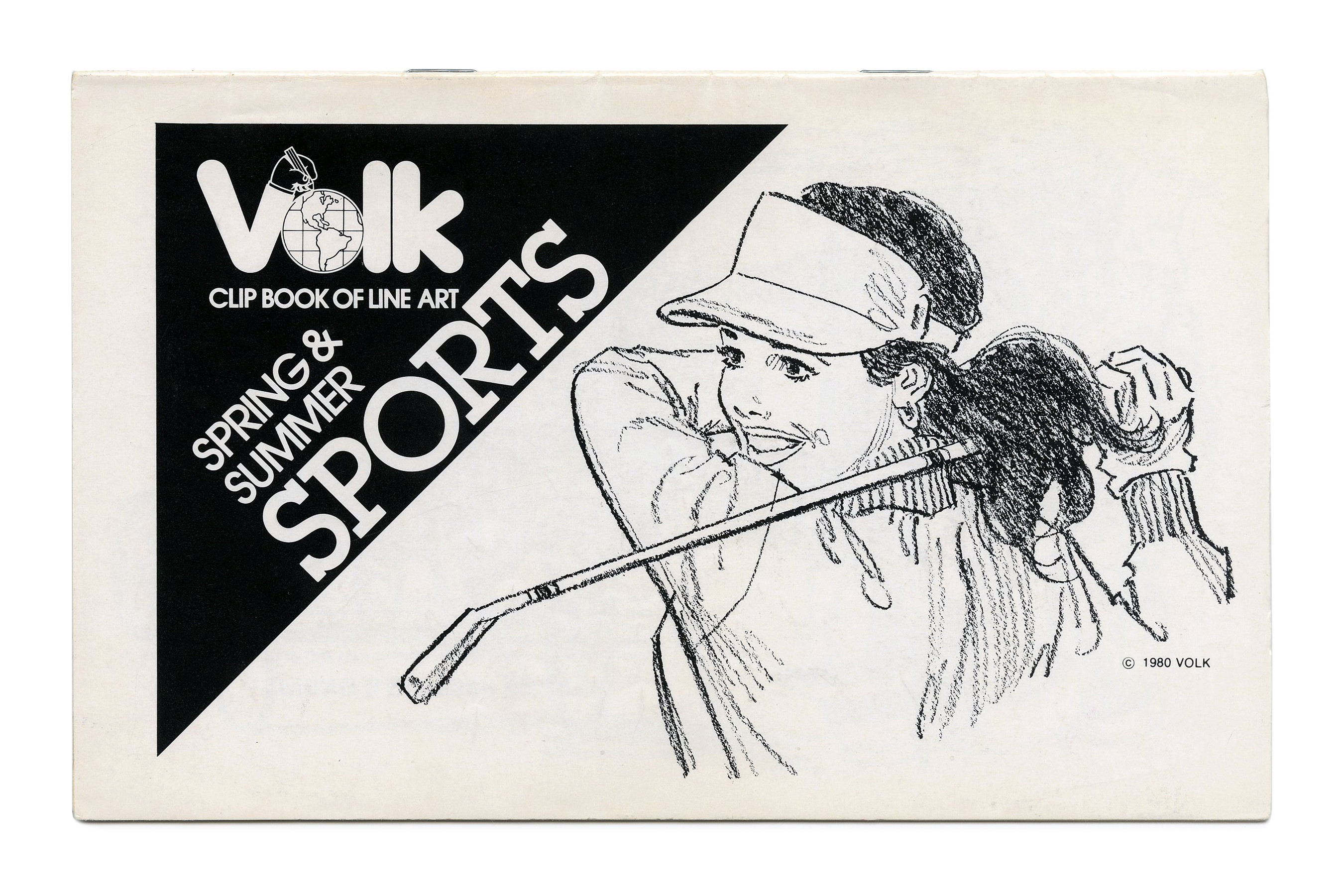
“Spring & Summer Sports” (No. 771) ft. ITC Lubalin Graph and its sans-serif sibling ITC Avant Garde Gothic.
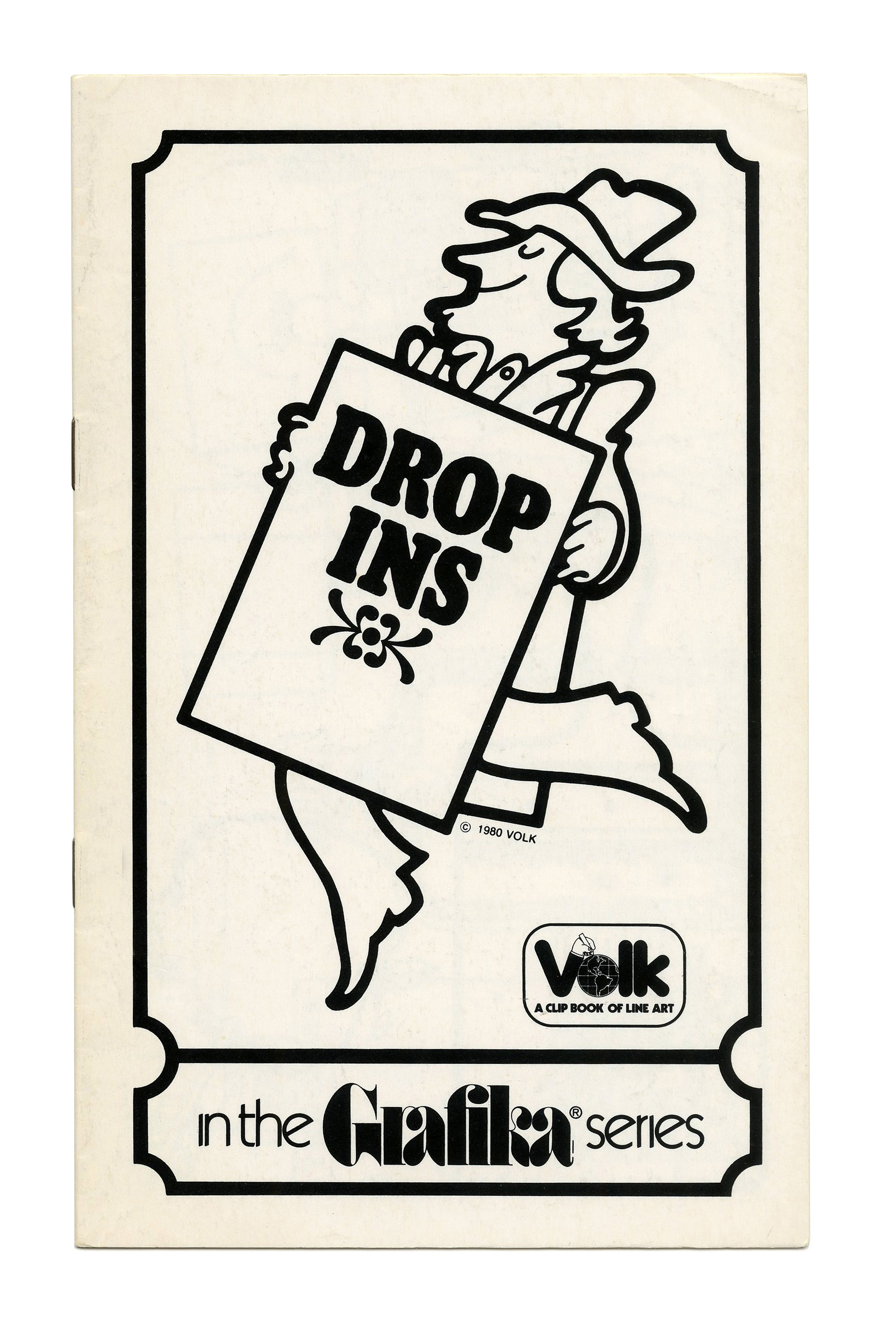
“Drop-Ins” (No. G111) ft. Pabst Extra Bold Condensed. The logo of the Grafika subseries is in ITC Fat Face with ligatures for ra and fi, accompanied by Kabel Light with omitted tittles.
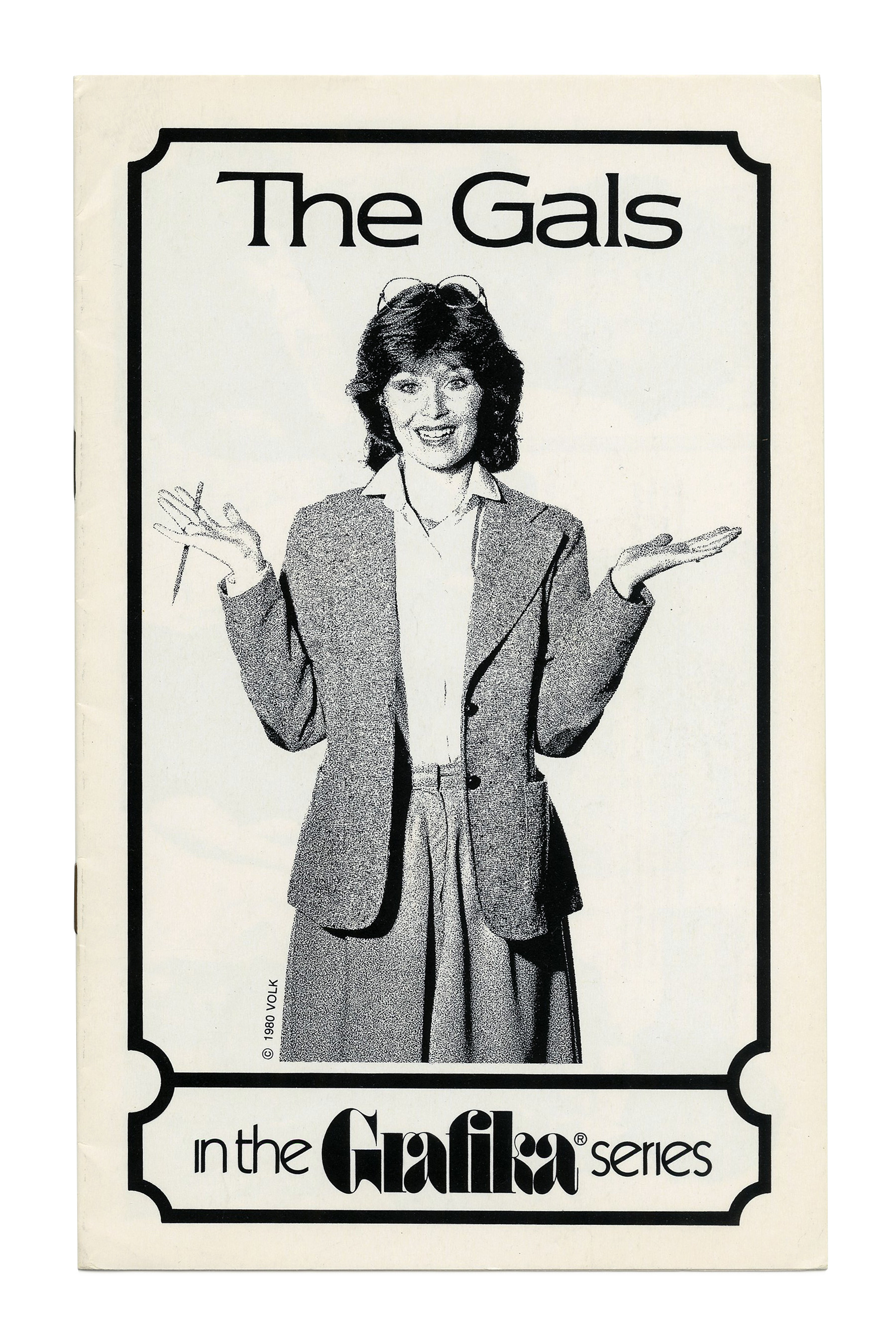
“The Gals” (No. G112) ft. ITC Newtext and a rare photographic cover.
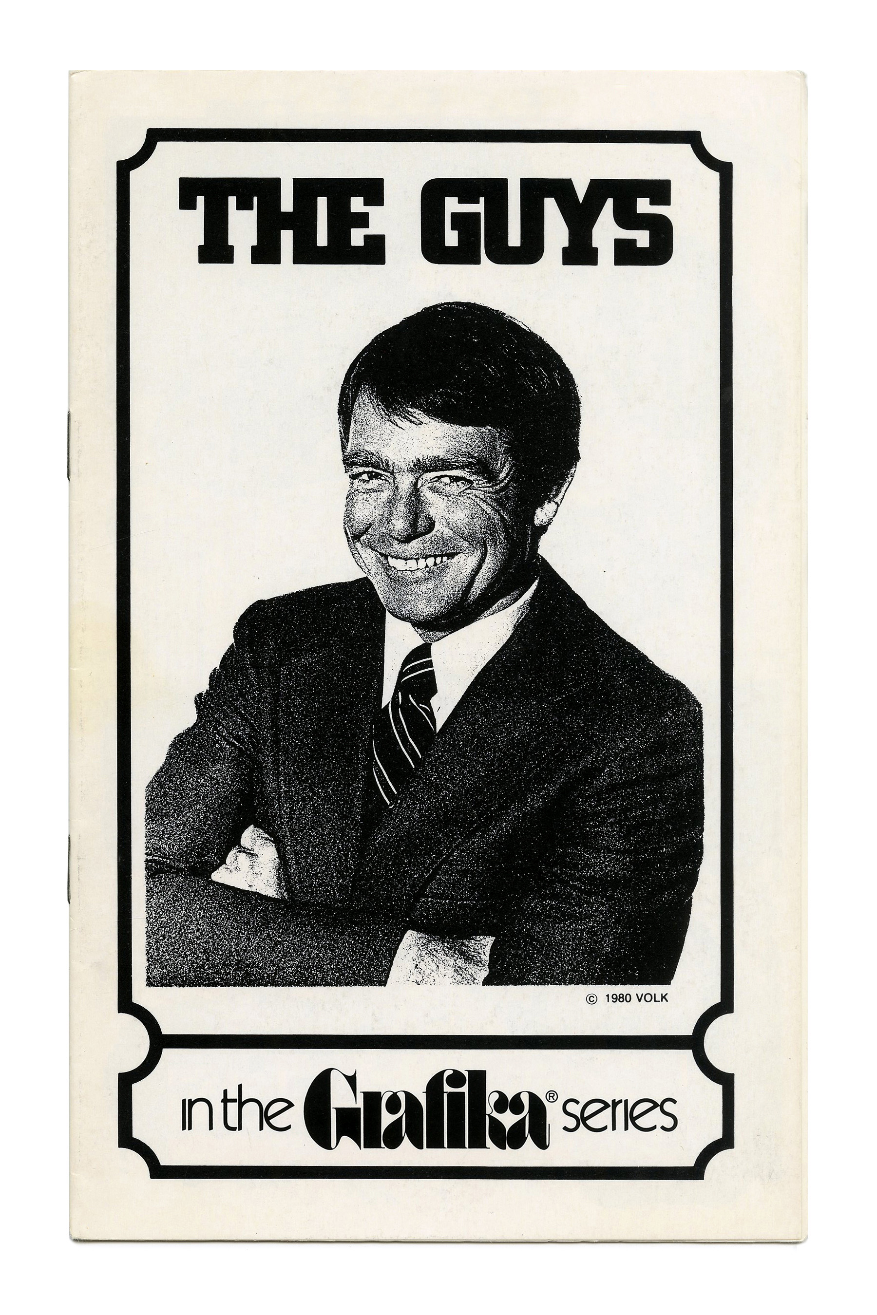
“The Guys” (No. G114) with tightly spaced City caps.
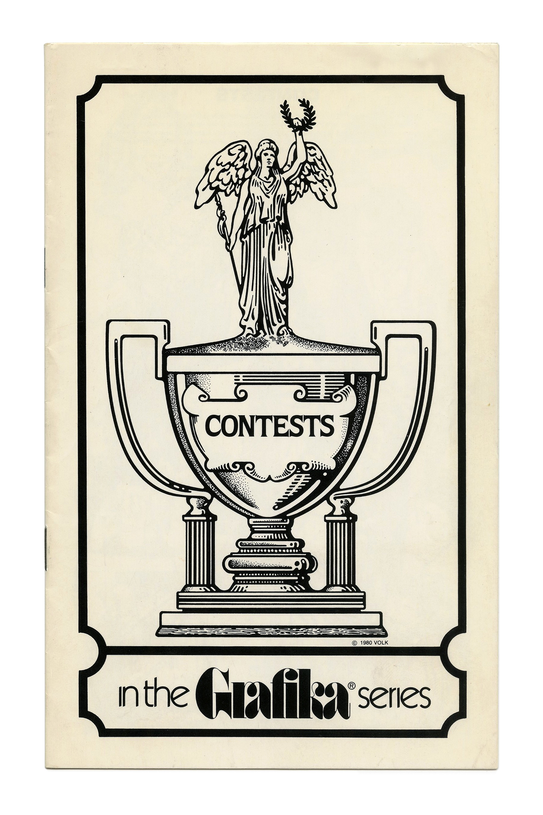
“Contests” (No. G116) ft. ITC Quorum.
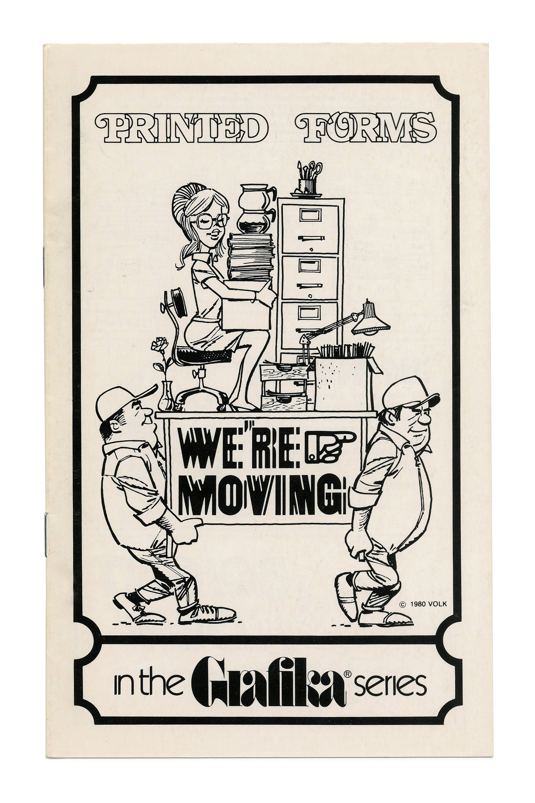
“Printed Forms” (No. G117) ft. overlapping caps with swash initials from ITC Bookman Outline. “We’re moving” is in an unidentified (homemade?) variation on the Electric Circus theme, see also Electus.

“Gimmicks” (No. G119) ft. a fairy tale castle à la Neuschwanstein and caps from Checkmate.


")


")


")

")


2 Comments on “Clip Books of Line Art, Volk (1980)”
The Mecanorma Circus appears to be similar to Filmotype Quilt: https://www.flickr.com/photos/28813954@N02/9144581042/in/album-72157634337086325/
Yes! Thanks, Jay. I think it’s not only similar, but a direct copy. In their early years, Mecanorma adopted several Filmotype faces, without giving credit. This included Filmotype Quentin (as Gay Nineties) and Filmotype Quaker (as Jet). Filmotype Quilt has an entry now.