
Clip Books of Line Art, Volk (1976)

“Spring” (No. 291), ft. all-caps Benguiat Caslon with swash alternates, set on an angle. The small type in the arrows is in reversed Helvetica caps.
Covers for various clip books of line art issued in 1976 by Harry Volk Jr. Art Studio, Pleasantville, New Jersey. This year marked their silver anniversary, see the “Spring” booklet above, indicating that the company was established in 1951. The celebration continued in the following year, see the covers from 1977. According to Bart Solenthaler, Volk went out of business sometime in the 1980s.
See the previous post about the clip books issued in 1955 for more information on Harry Volk Jr. Art Studio.
Coinciding with the silver anniversary, Volk introduced a new logo, featuring rounded sans-serif letterforms. The right arm of V extends to a hand holding a pencil and drawing on the o, turning it into a globe. The Herb Lubalin Study Center points out that this logo was designed by Herb Lubalin – “not his greatest logo, but charming”.

“Vote” (No. 280) ft. Pacella Monitor. The new Volk logo here is framed by tightly spaced caps from Kabel Light.
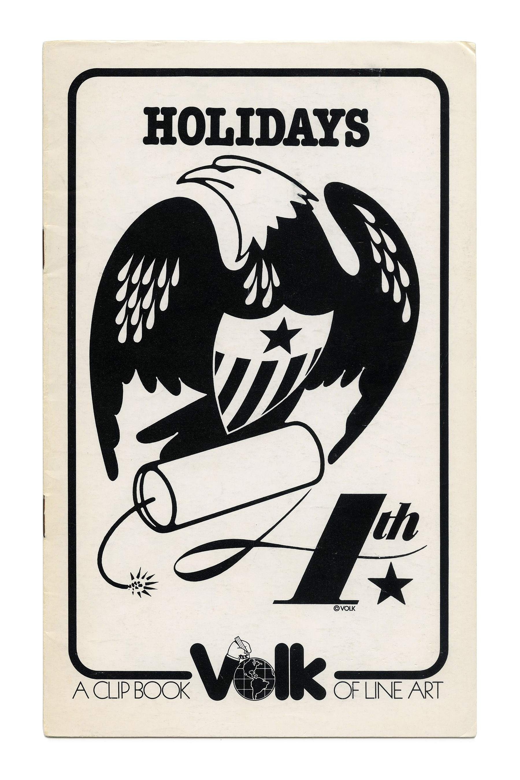
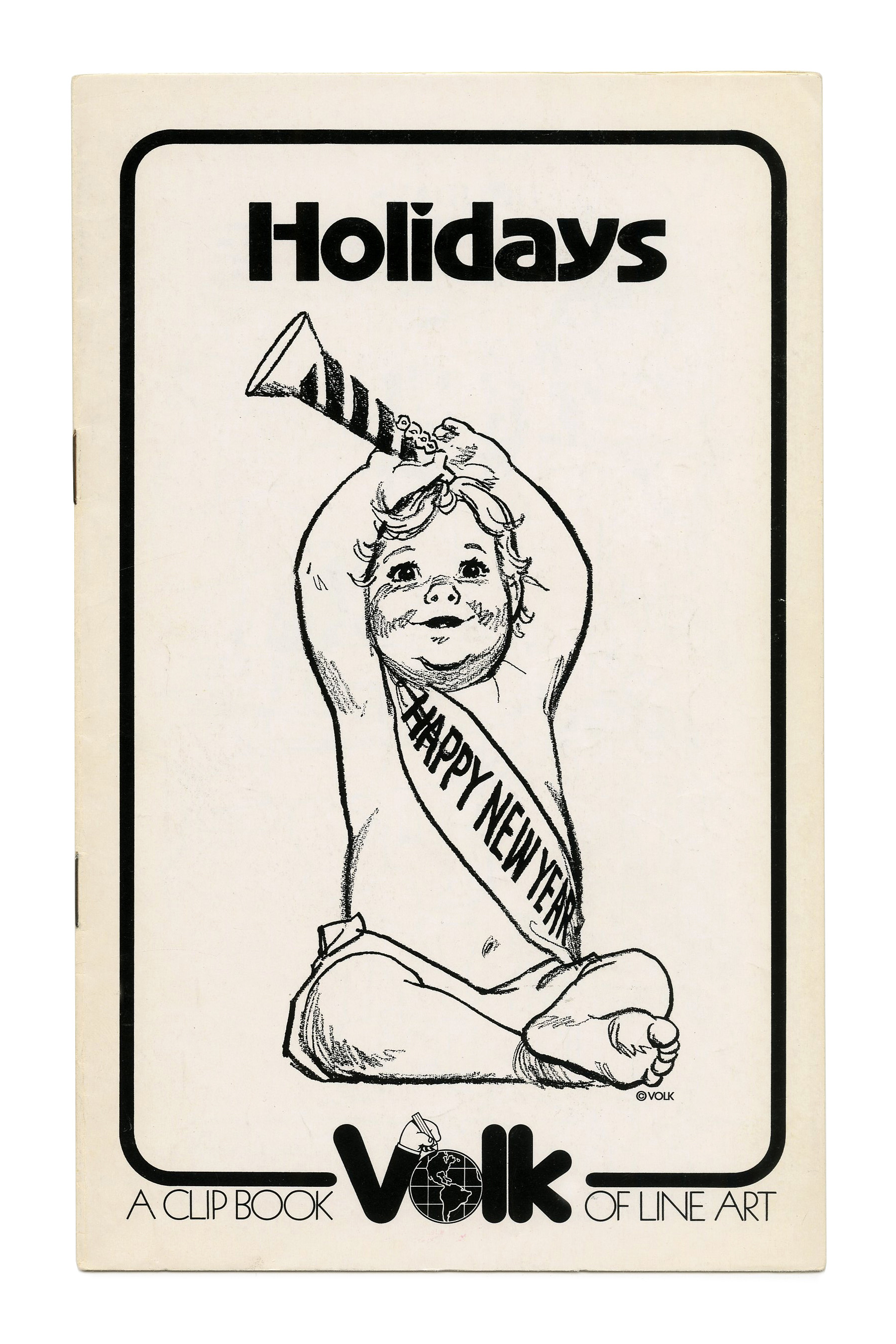
“Holidays” (No. 281) ft. ITC American Typewriter.
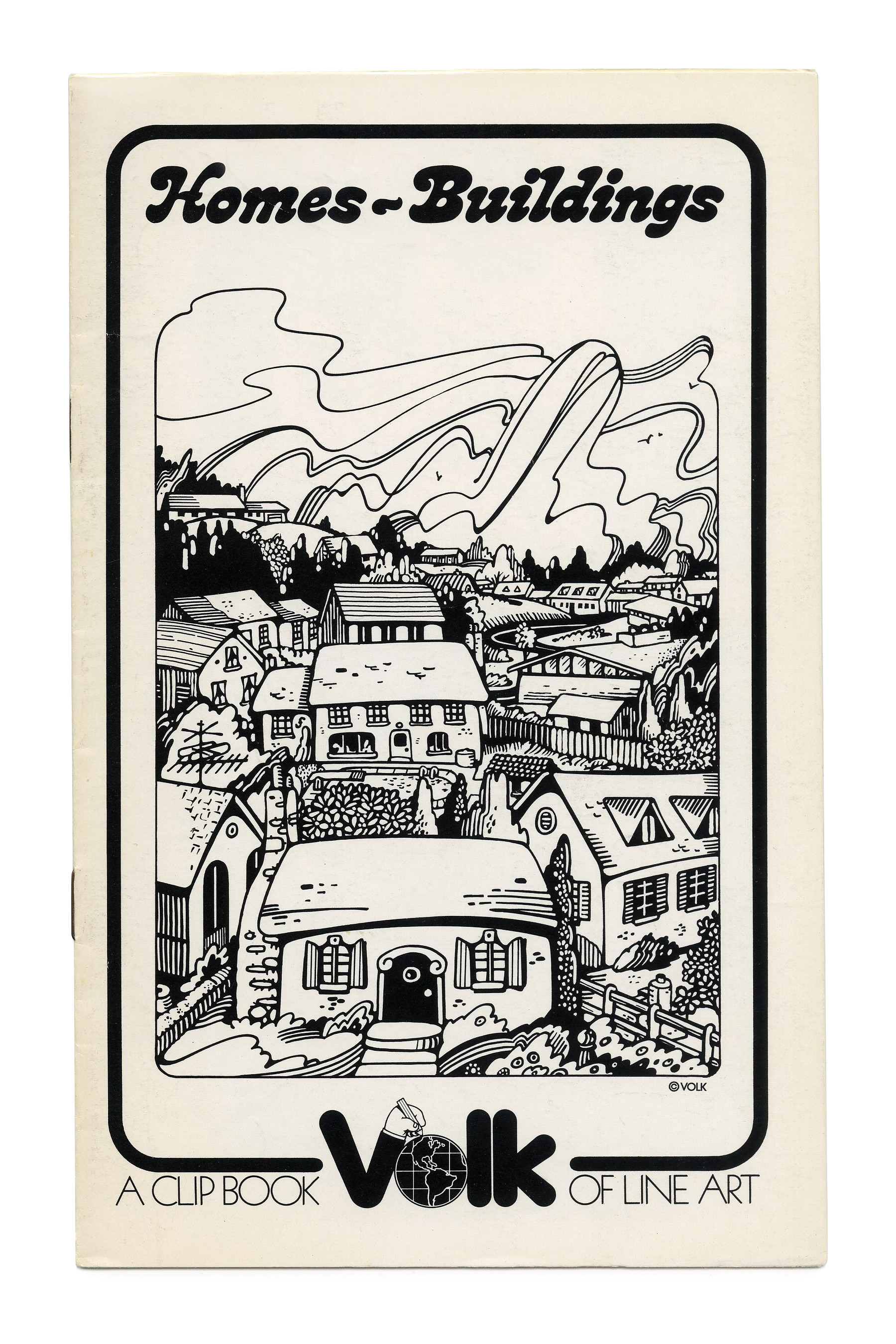
“Homes – Buildings” (No. 282) ft. Bronstein Bold. Like Letraset’s Lazybones, this bold script by FotoStar/Facsimile Fonts is a close follower of PLINC’s West Cooper Nouveau Swash Bold.

“Birthday” (No. 284) ft. Davida.
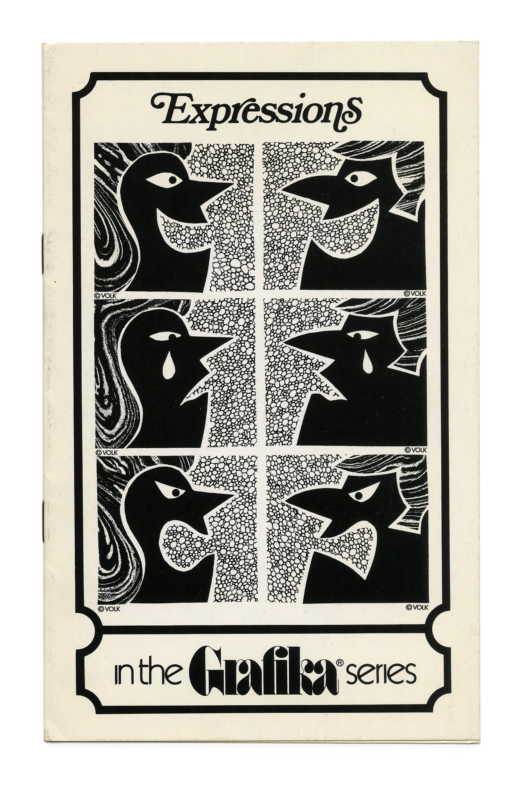
“Expressions” (No. 285). ft. Bookman Italic with swash alternates.
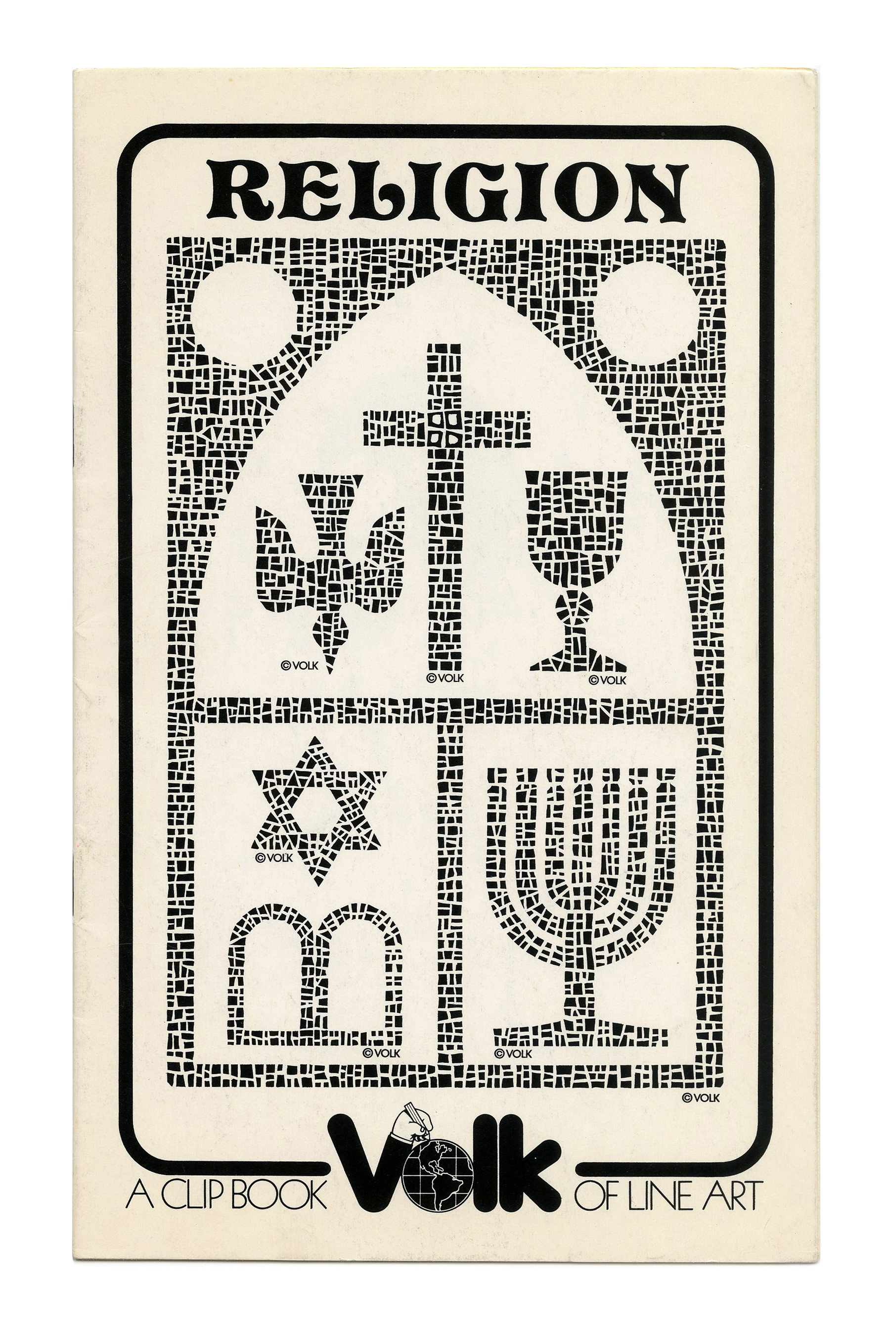
“Religion” (No. 286) ft. Pretorian.
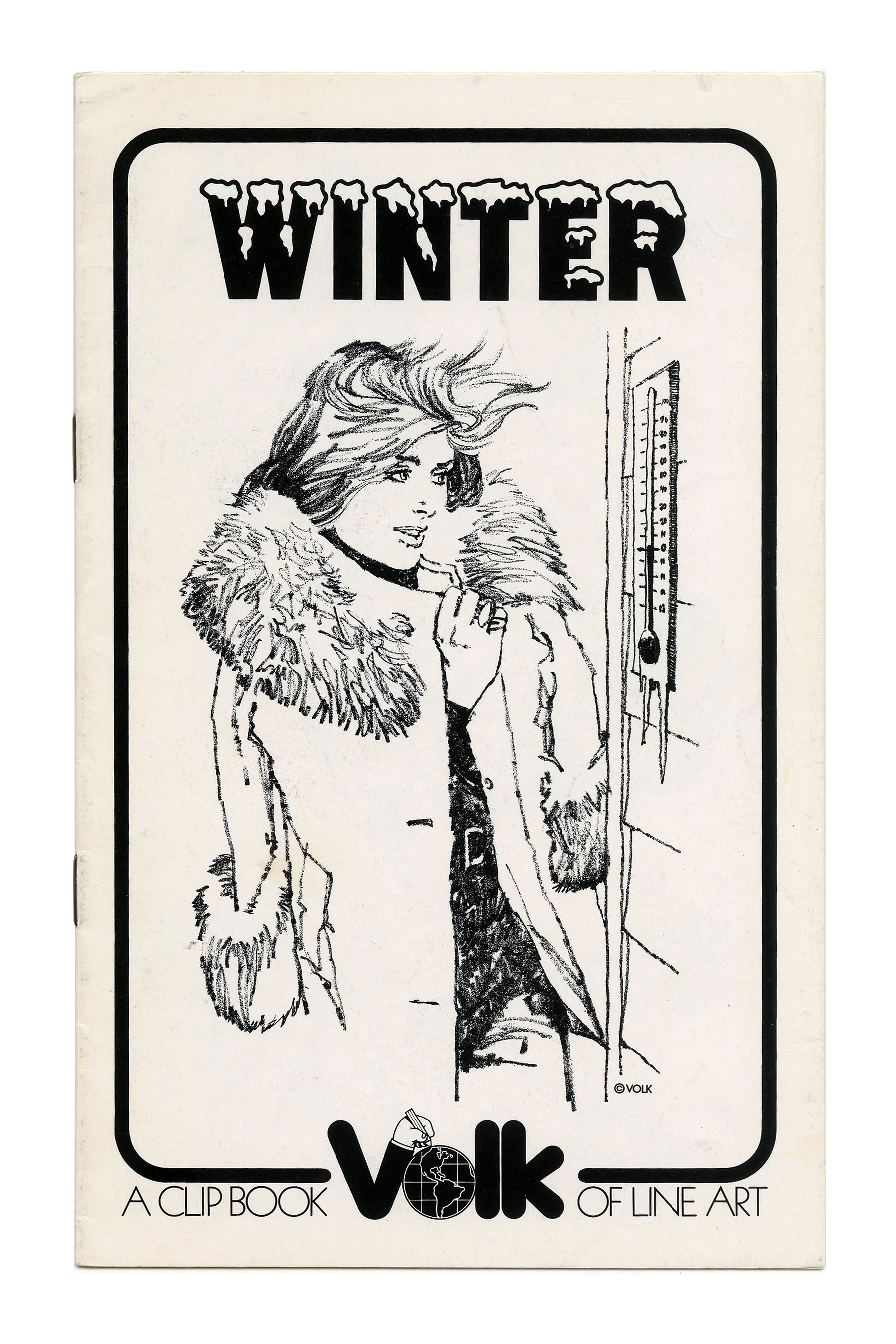
“Winter” (No. 287) ft. Norton Chocolate Frosted, a snow-capped variant of S.E. Norton’s series of bold grotesque caps for Photo-Lettering.
“Holidays” (No. 289) ft. Advertisers Gothic.
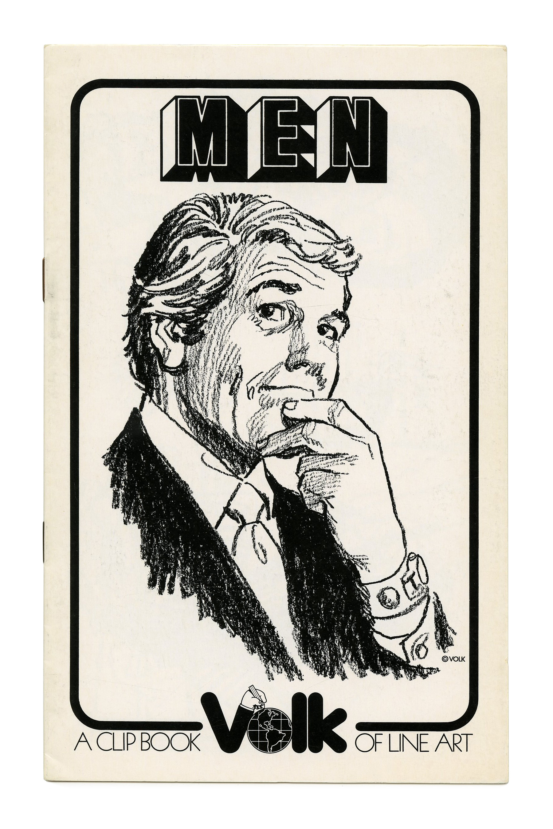
“Men” (No. 290) ft. Buxom, again by FotoStar/Facsimile Fonts, a copy of Baby Fat, distinguished by less deep notches in M and N.
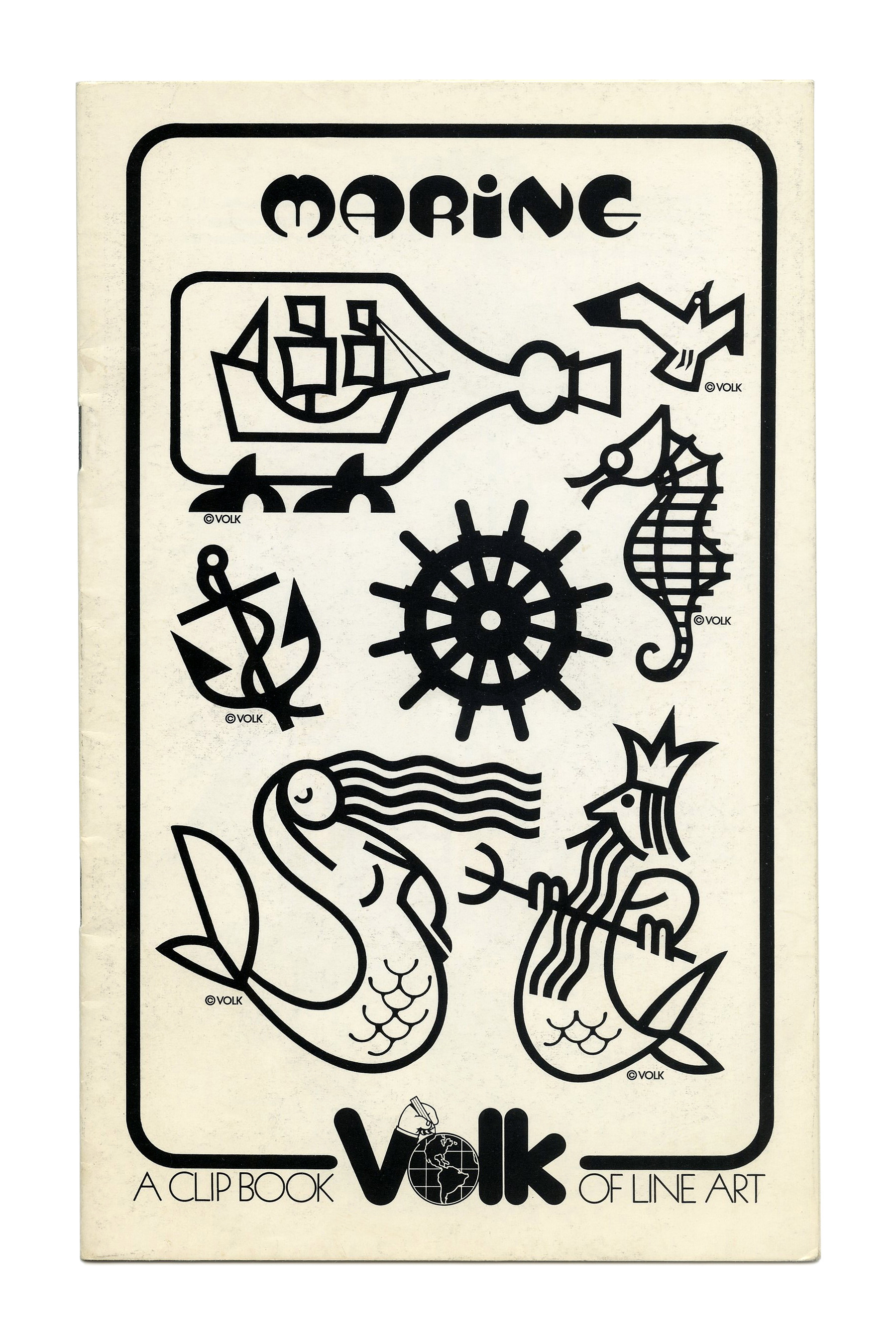
“Marine” (No. 652) ft. Bobo Bold.
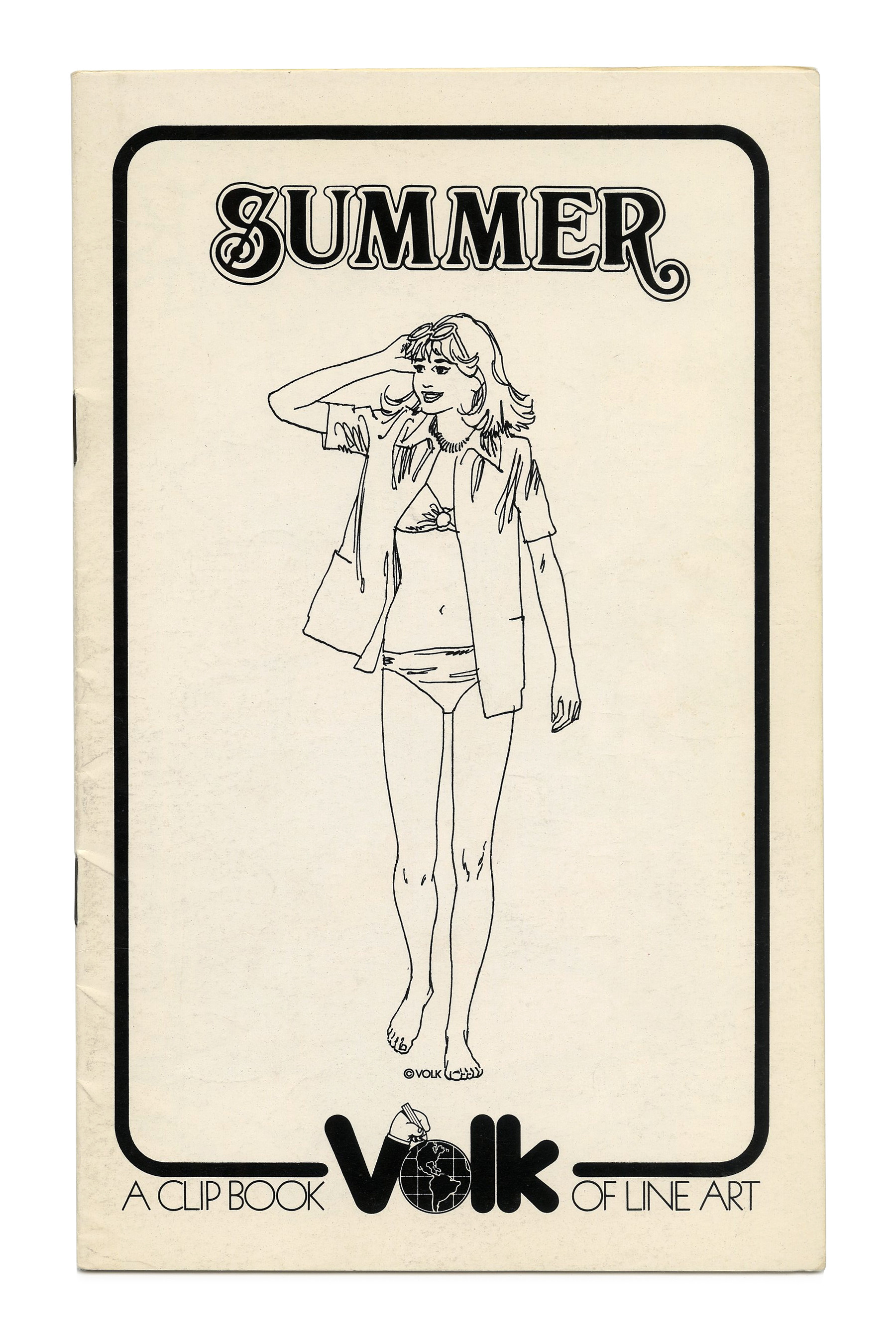
“Summer” (No. 655) ft. Abbey Scroll.
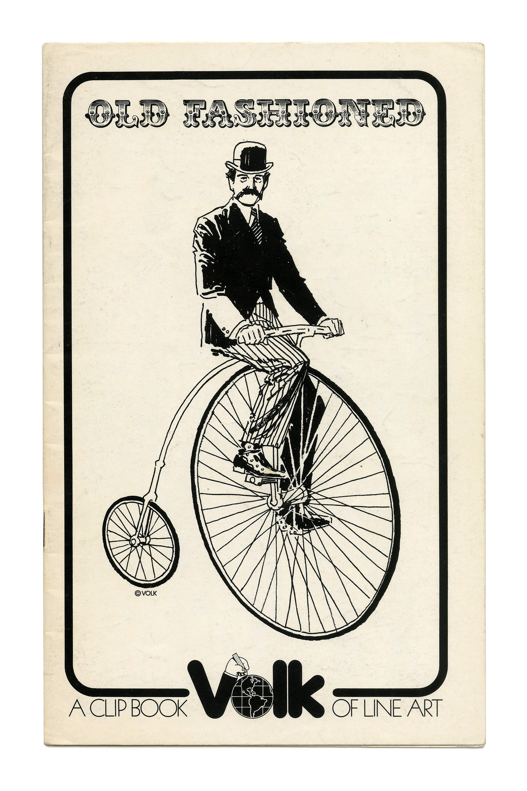
“Old Fashioned” (No. 656) ft. Romantiques No. 5 / Bracelet.
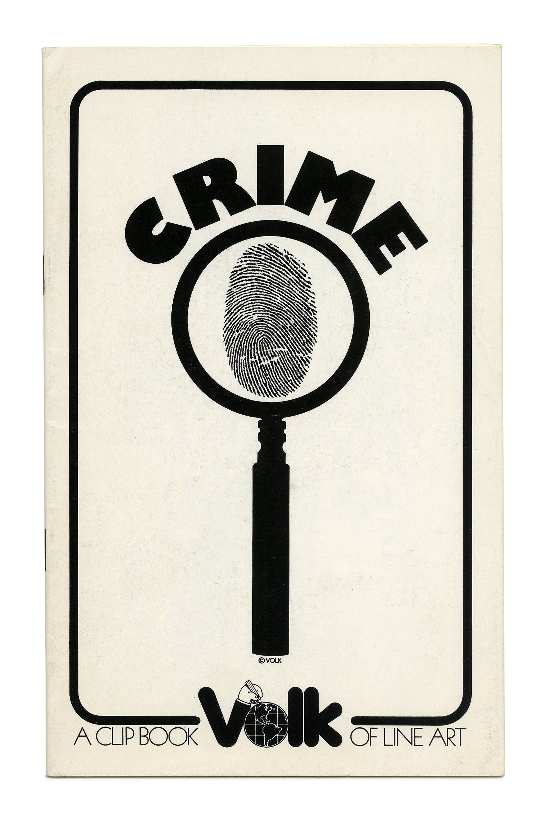
“Crime” (No. 658), with Gill Kayo caps set on a circle.

“Transportation” (No. 659) ft. Dynamo.
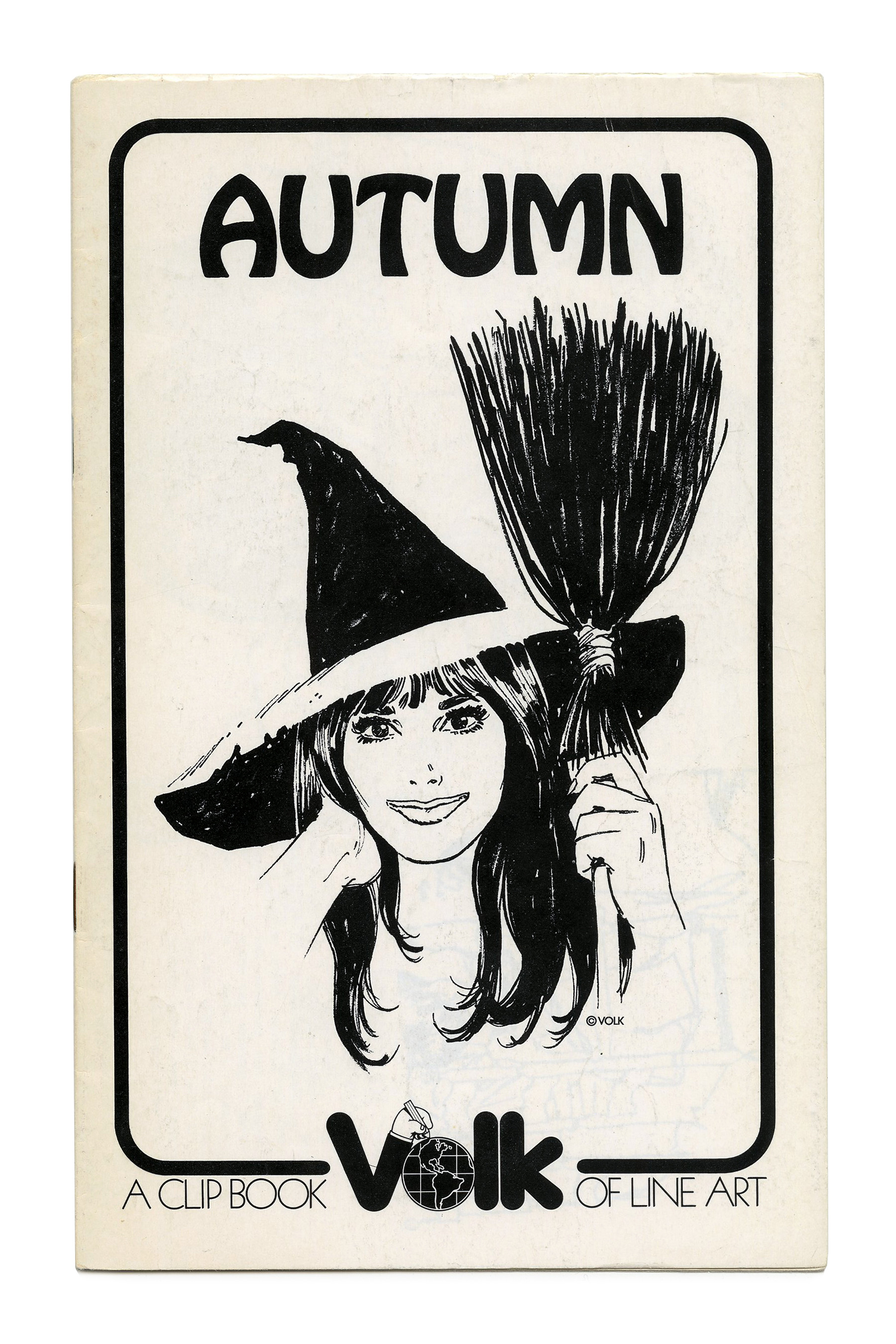
“Autumn” (No. 660) ft. Hobo.
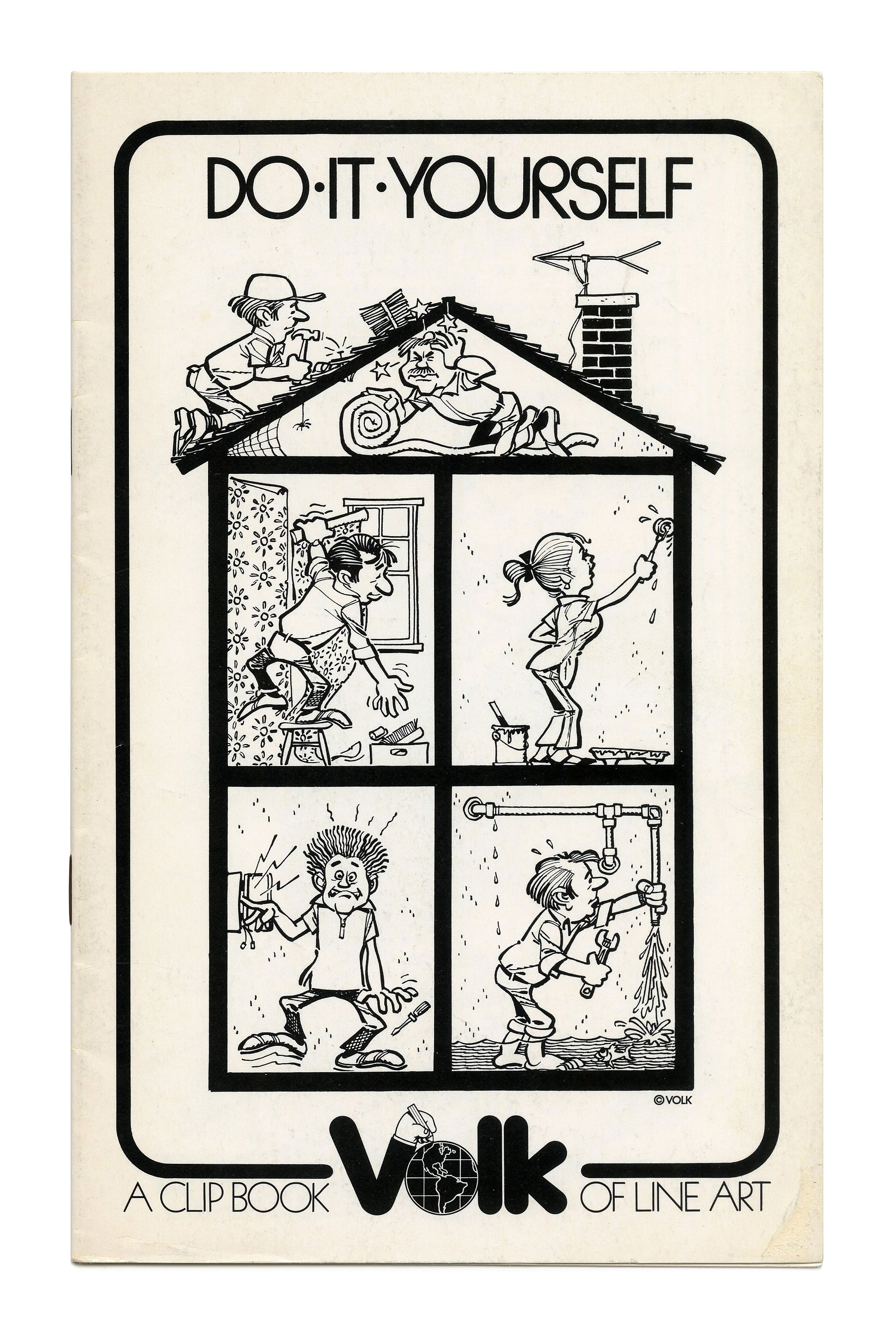
“Do-It-Yourself” (No. 661) ft. ITC Ronda.
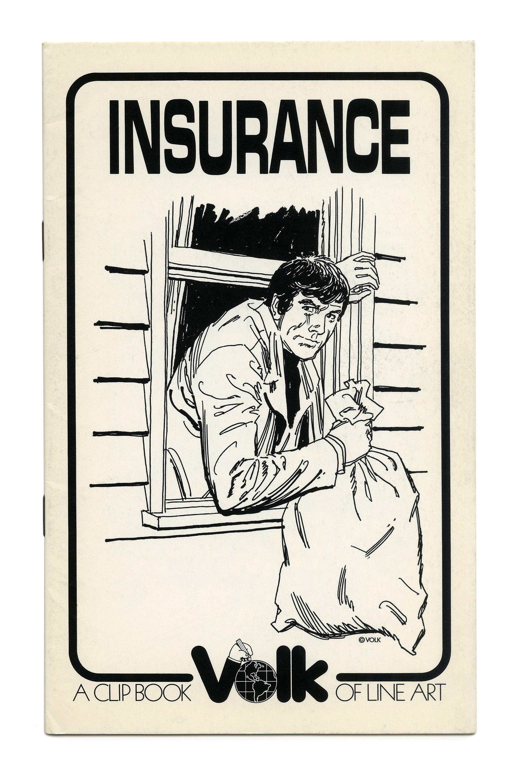
“Insurance” (No. 662) ft. Microcircus.
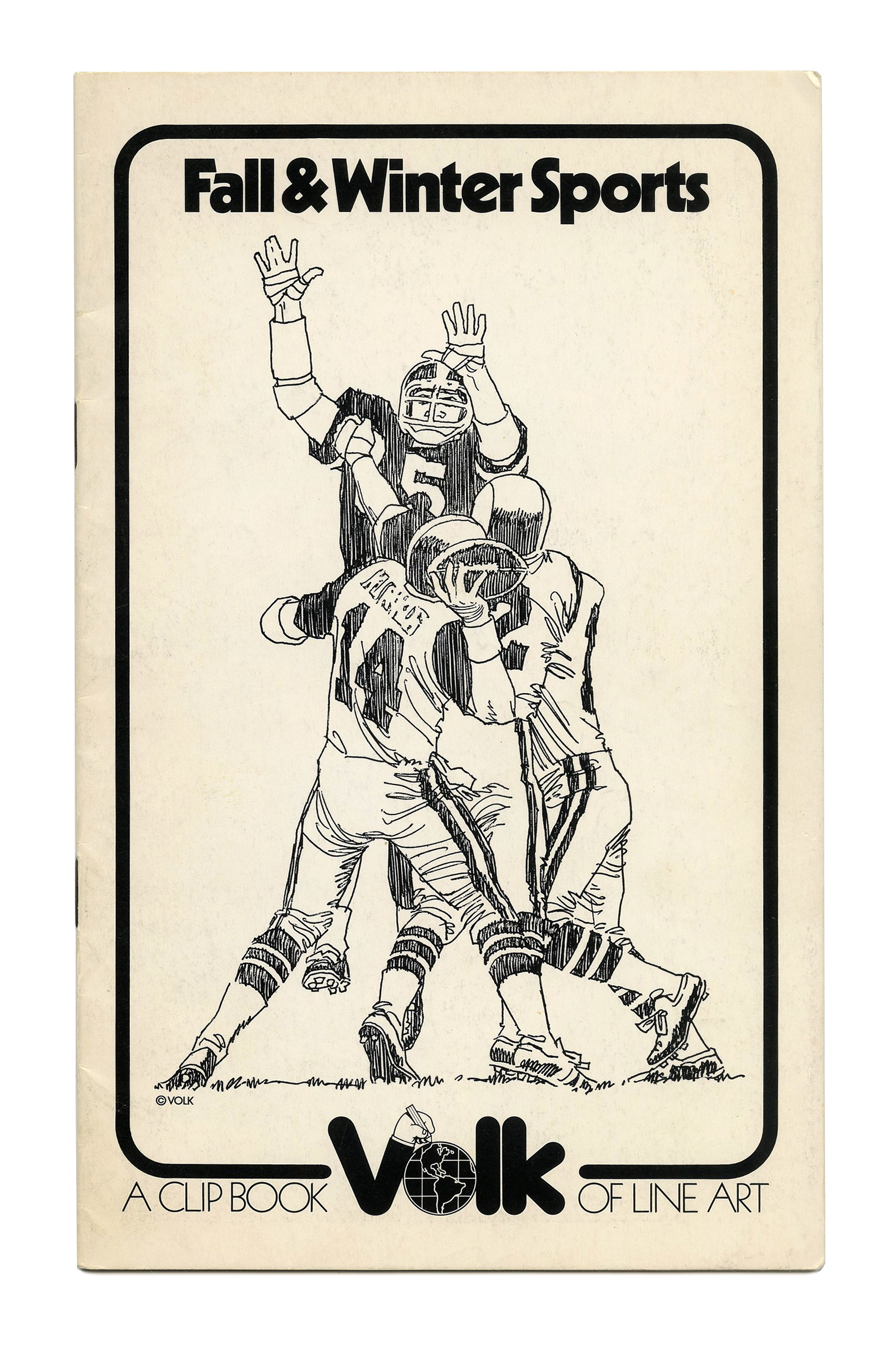
“Fall & Winter Sports” (No. 663) ft. Kabel Black.
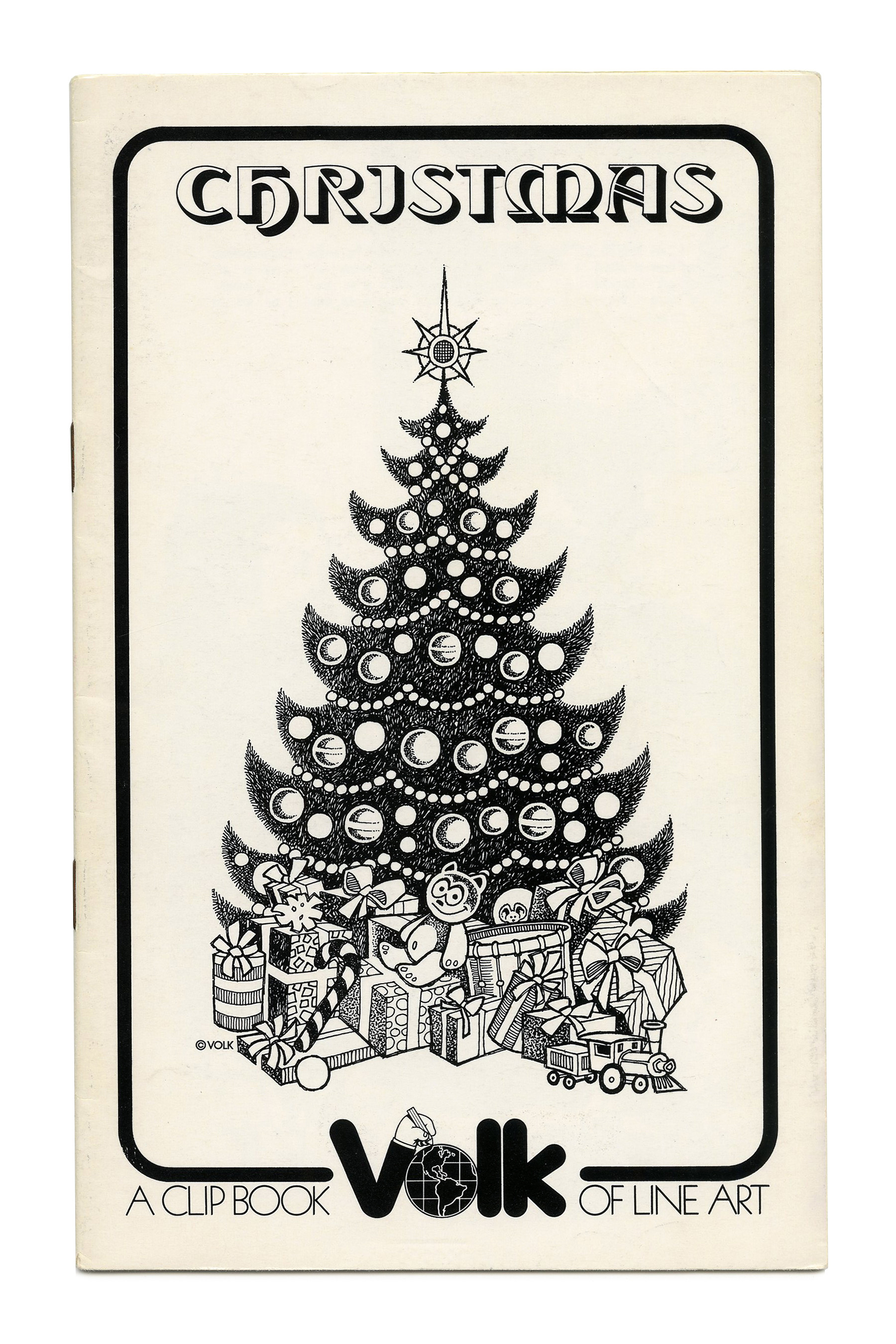
“Christmas” (No. 664) ft. Tintoretto. The hooked I reveals that this face was not intended for all-caps settings.

“Menu” (No. 665), ft. Bookman Italic in all caps, with an initial swash M.
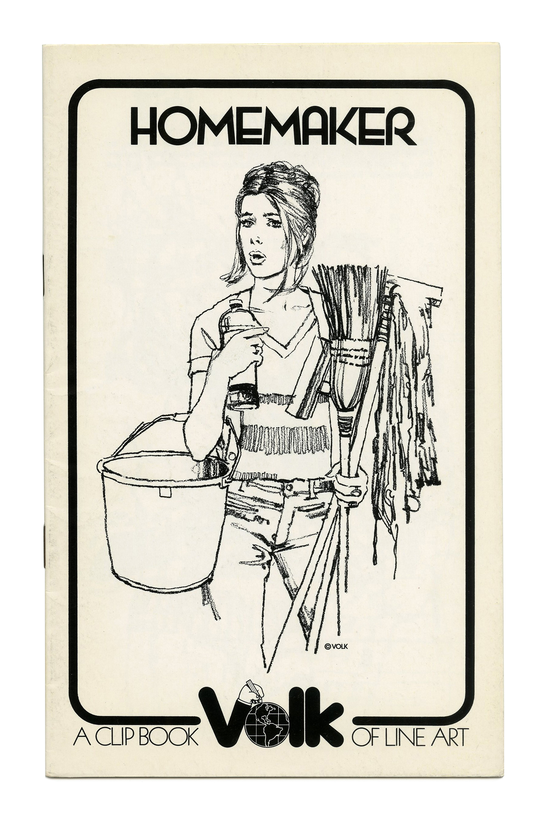
“Homemaker” (No. 666) ft. Wexford.
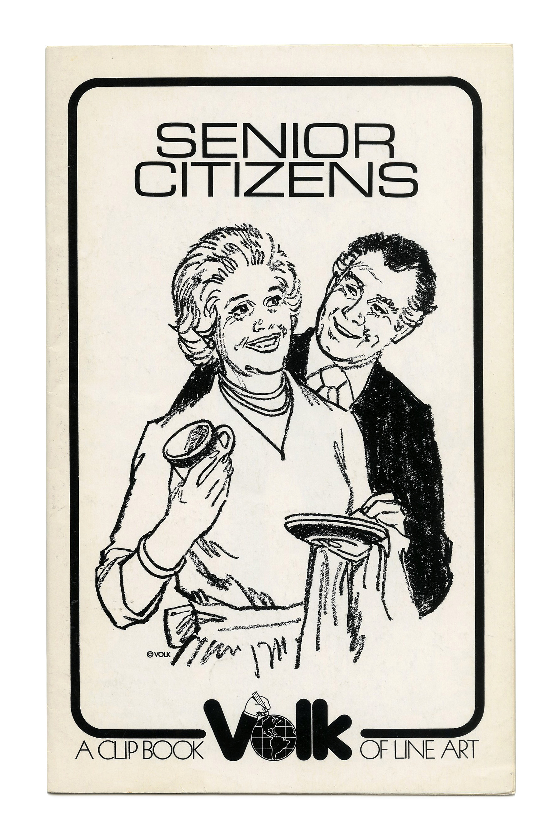
“Senior Citizens” (No. 667) ft. caps from Eurostile Light Extended.

“Save!” (No. 669) ft. Mania.
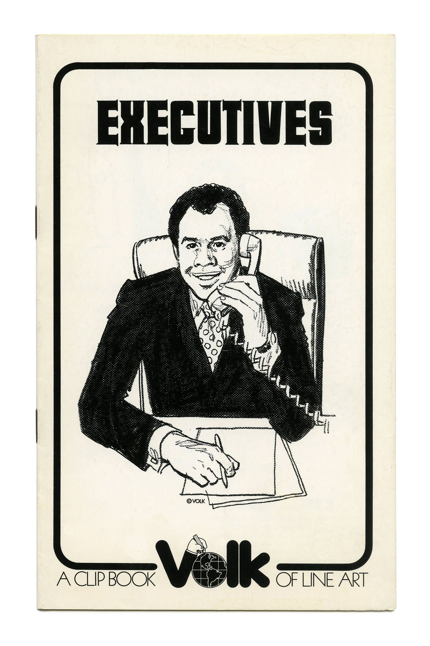
“Executives” (No. 670) ft. Hess Neobold.
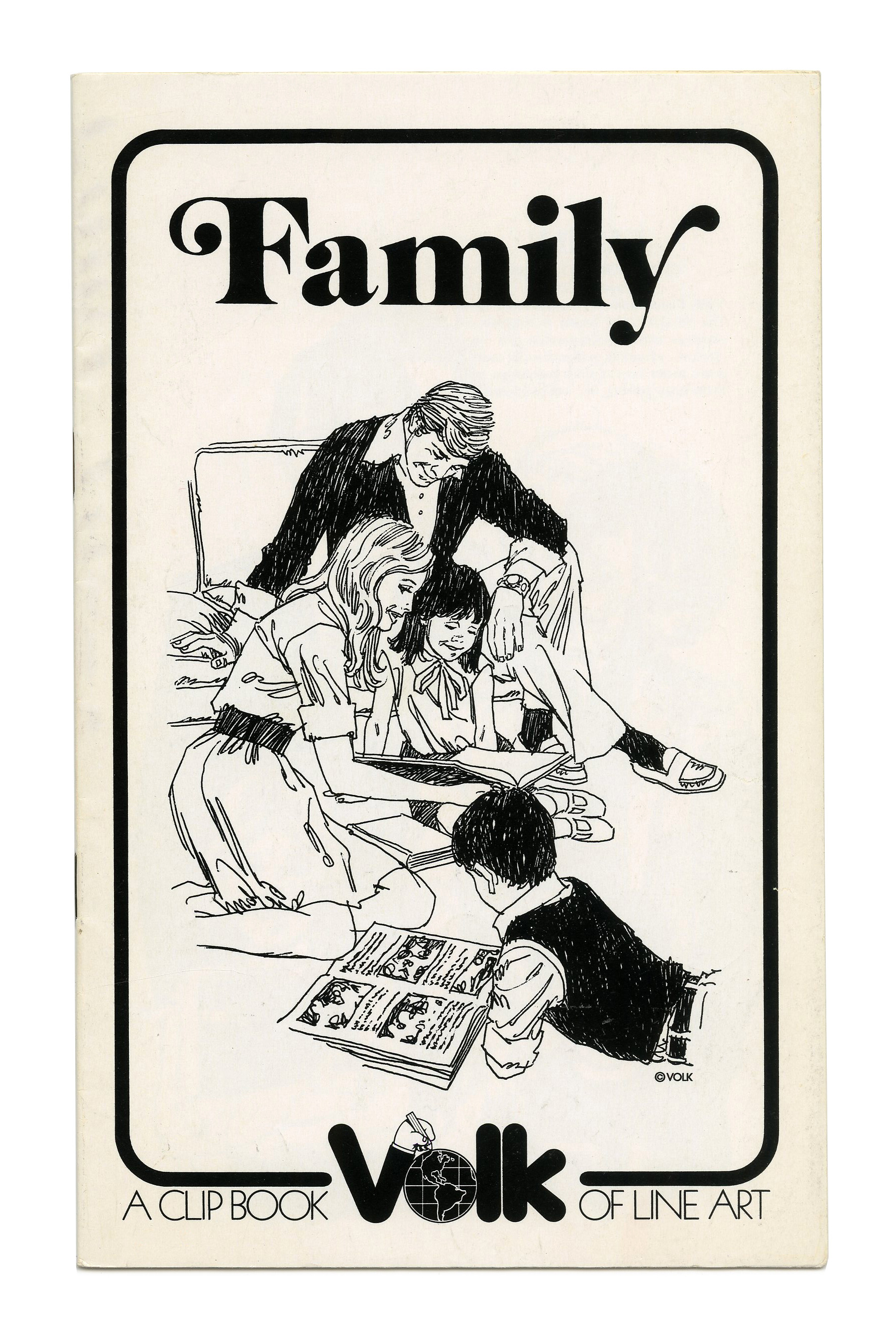
“Family” (No. 671) ft. more Benguiat Caslon.
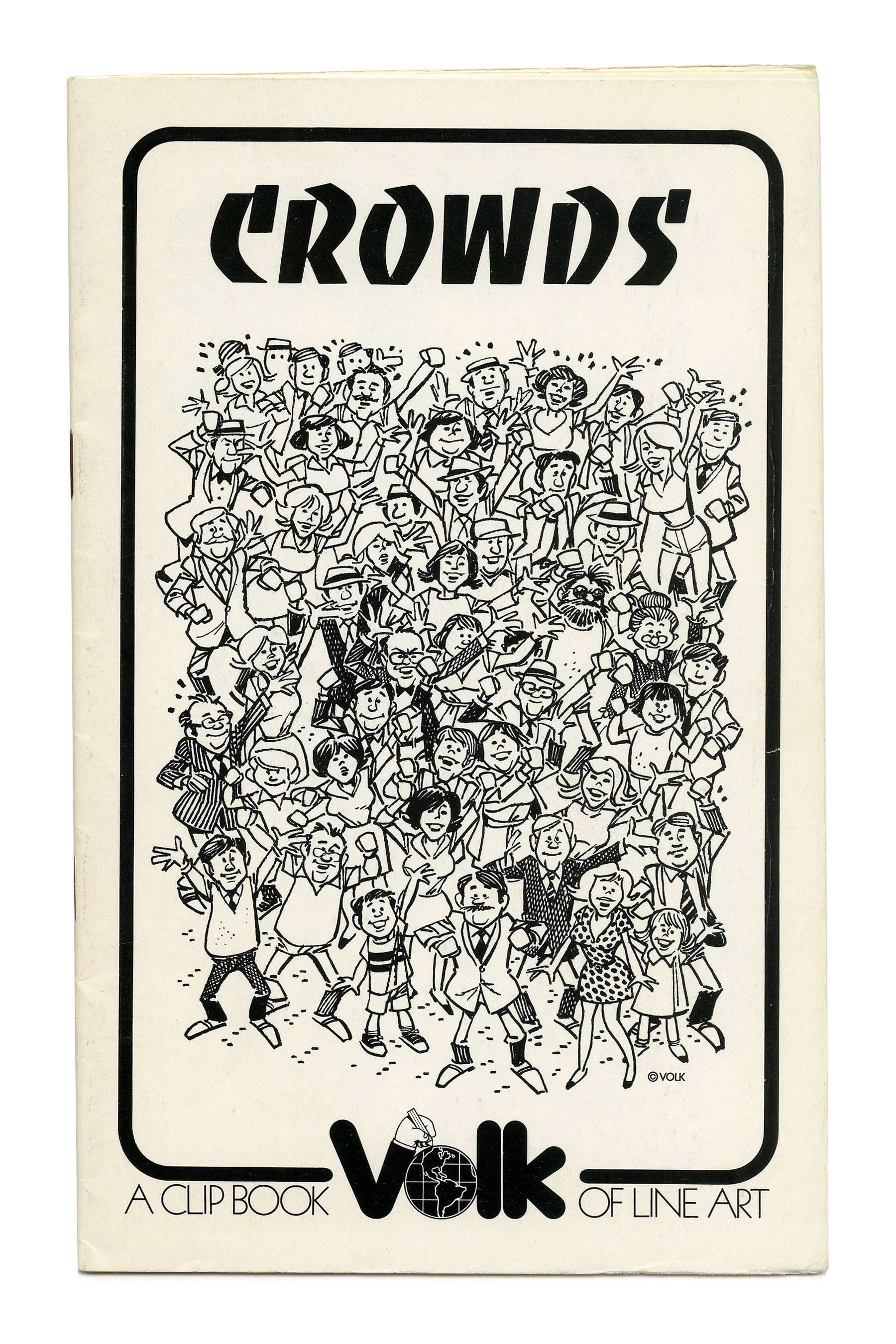
“Crowds” (No. 672) ft. Banco.
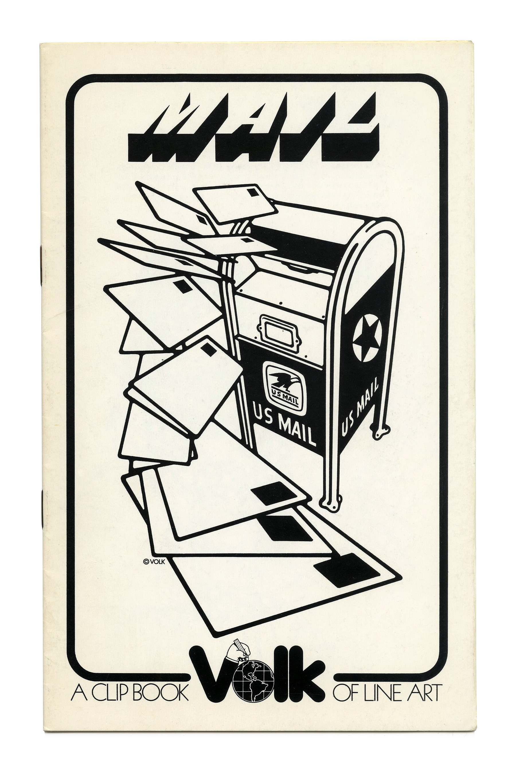
“Mail” (No. 673) ft. Buster.
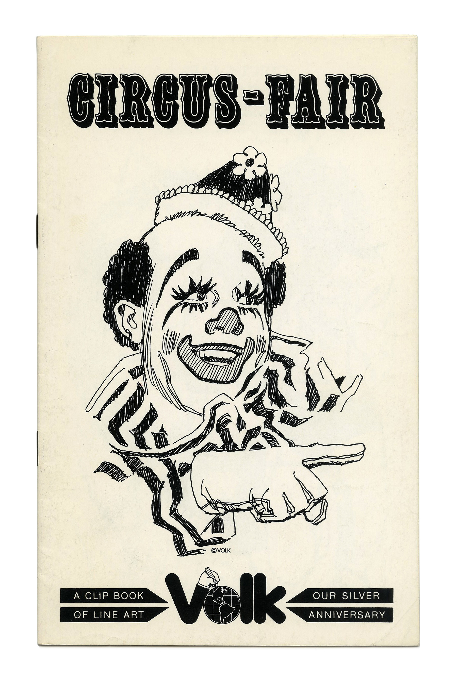
“Circus-Fair” (No. 674) ft. Filmotype Van Horn.
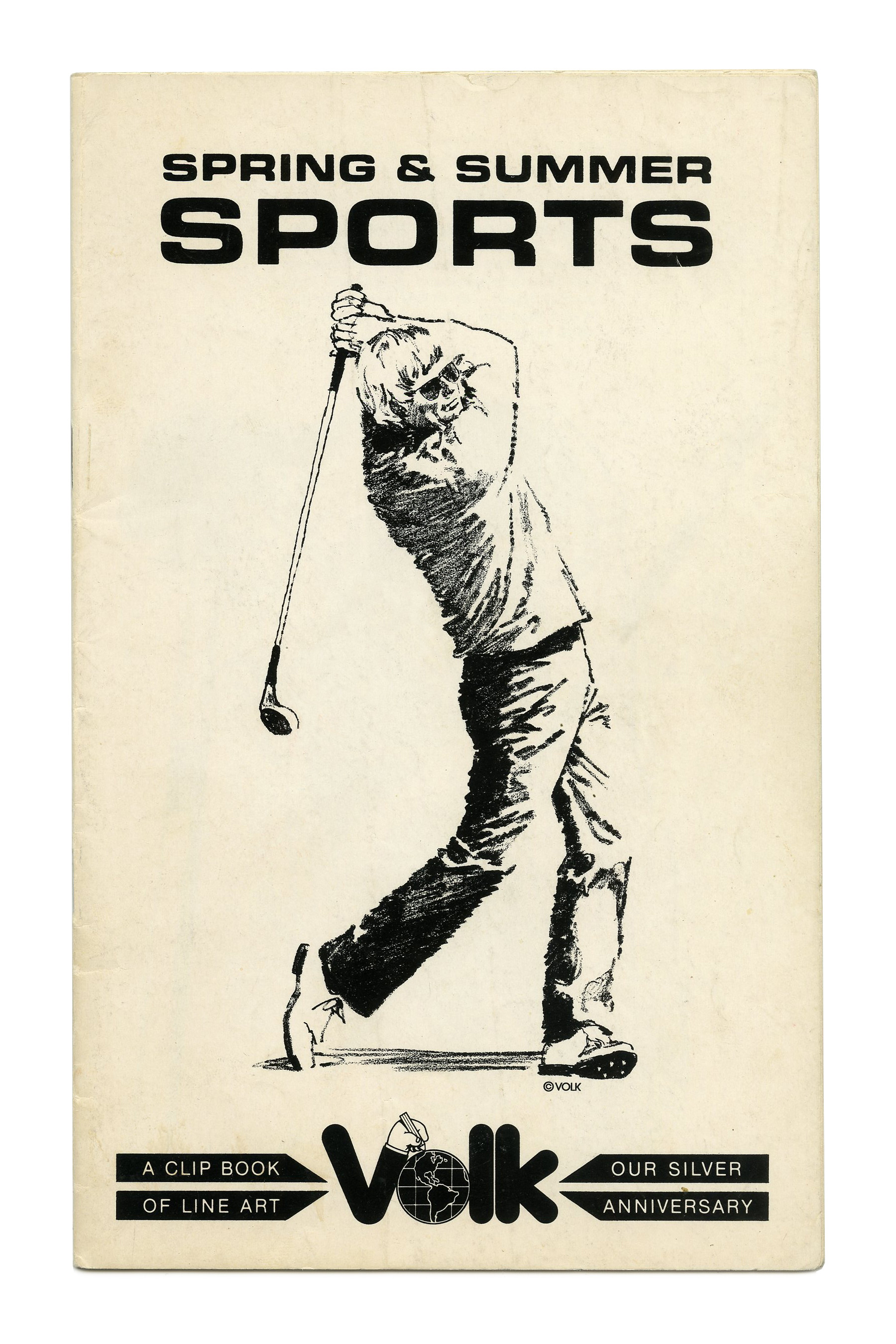
“Spring & Summer Sports” (No. 675) ft. Eurostile Bold Extended in all caps.

“The Little Patriot” (No. G62) ft. Caslon Antique. The logo of the Grafika subseries is in ITC Fat Face with ligatures for ra and fi, accompanied by Kabel Light with omitted tittles.

“Sly Sayings” (No. G63) ft. Paprika.
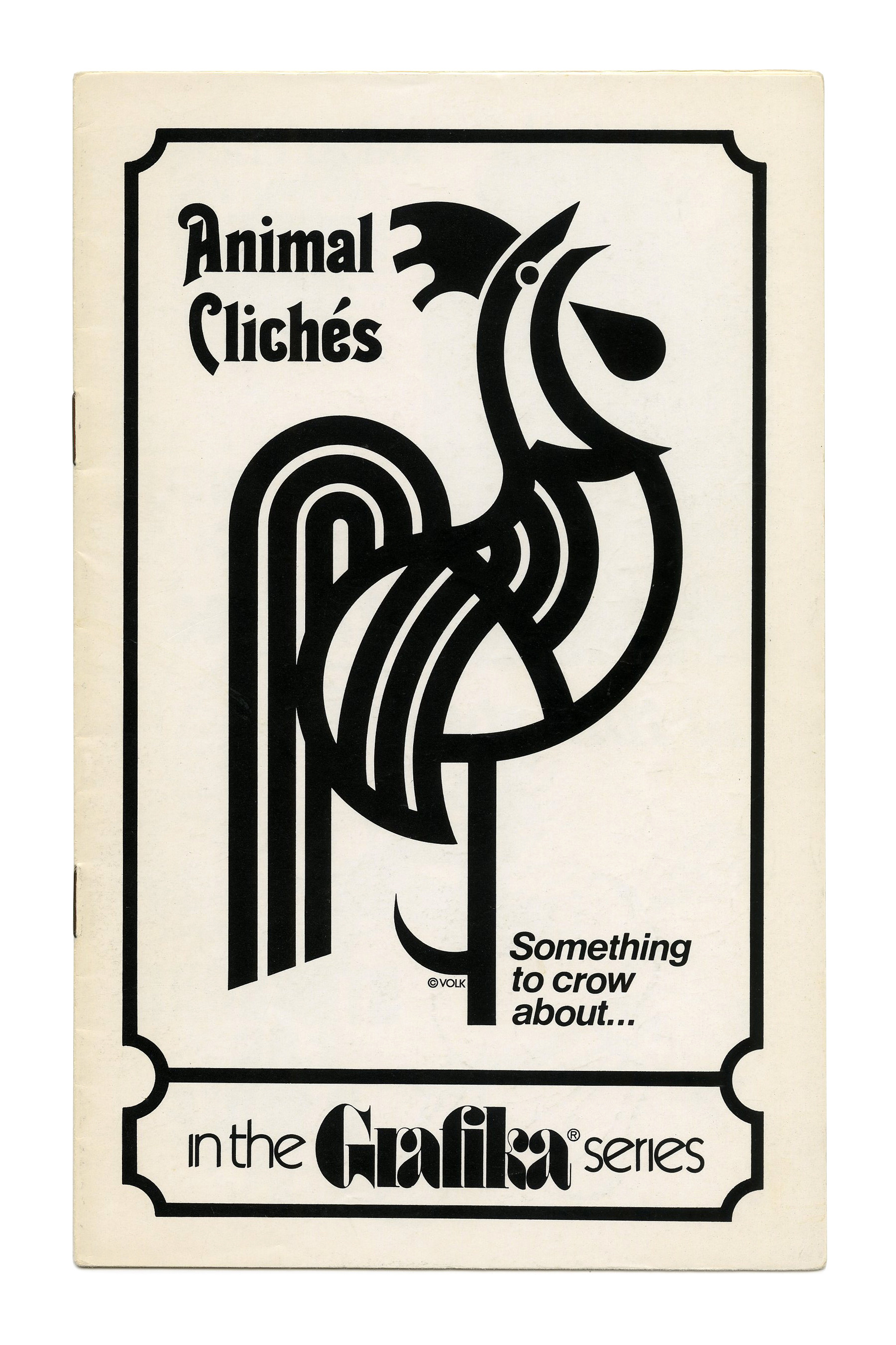
“Animal Clichés” (No. G64) ft. Thalia.
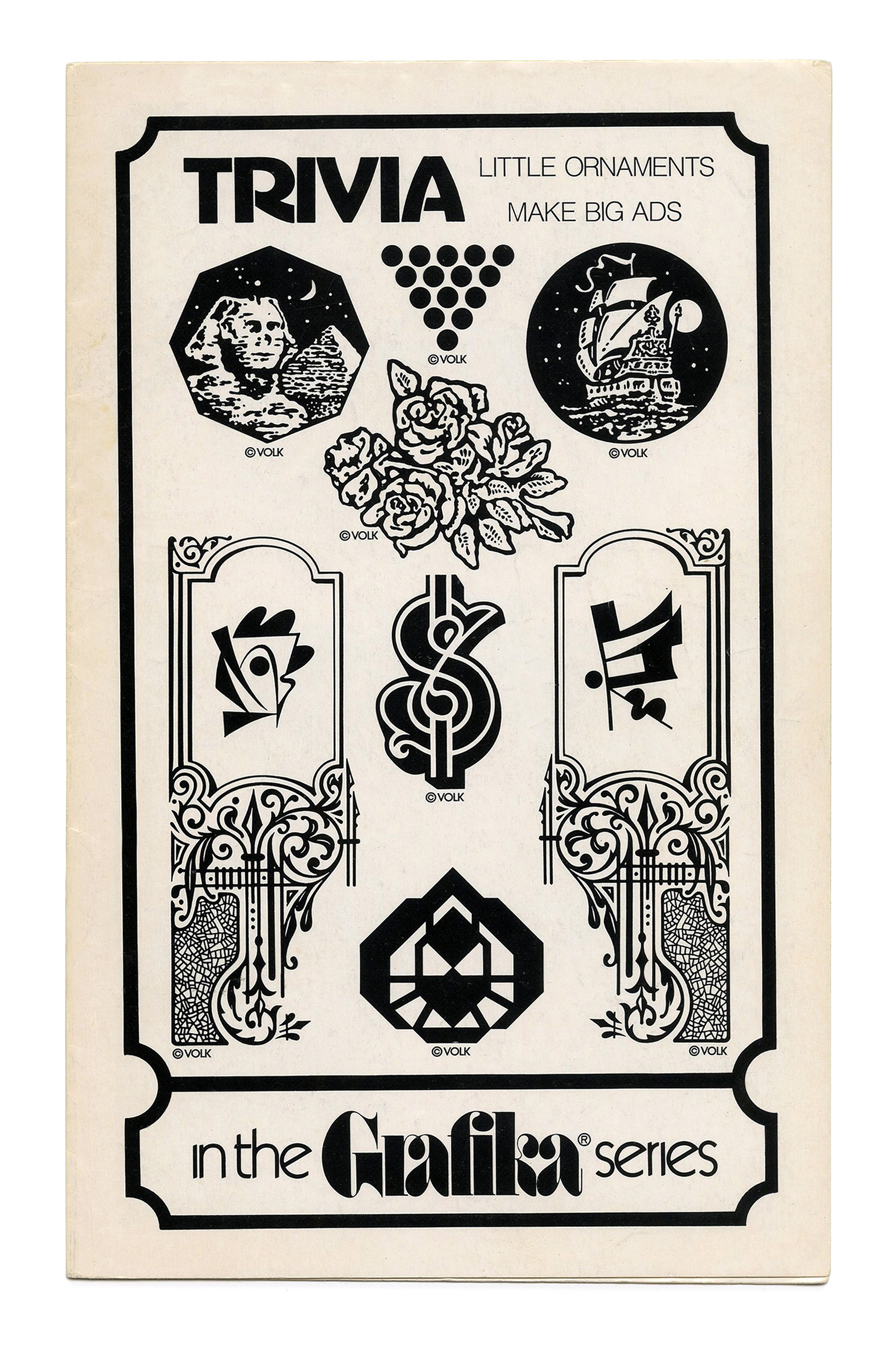
“Trivia” (No. G65) ft. Advertisers Gothic.
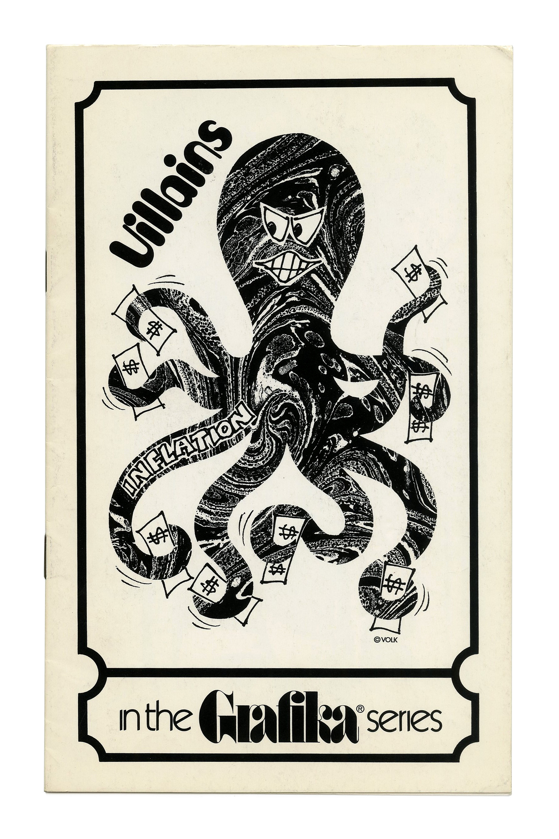
“Villains” (No. G67), ft. a money-grabbing octopus and Bob Quinzel’s Cucumber typeface.
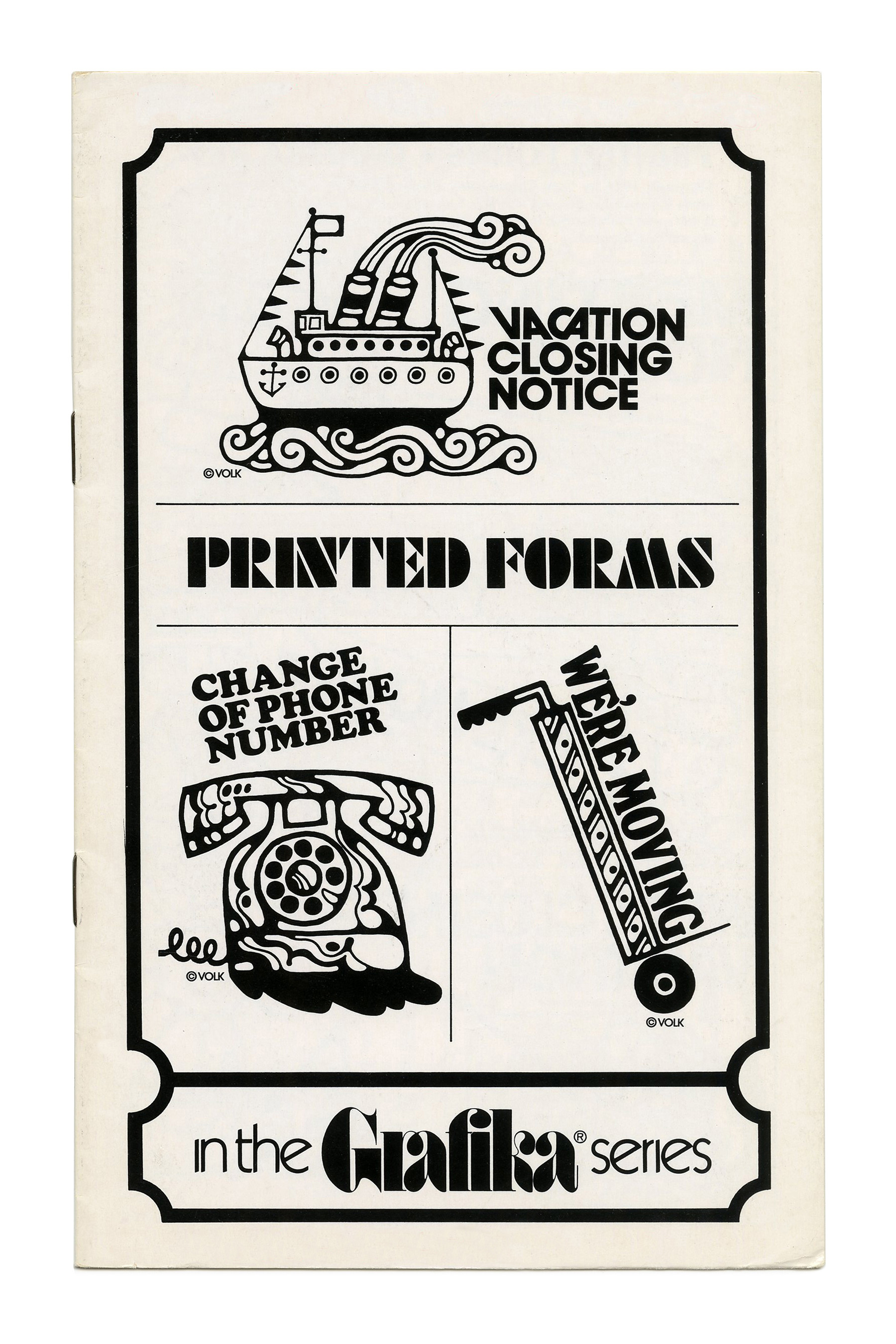
“Printed Forms” (No. G69) ft. Futura Black, ITC Avant Garde Gothic (with alternates), Cooper Black, and Windsor.

“Drop-Ins” (No. G68) ft. Davida complete with its ornaments.
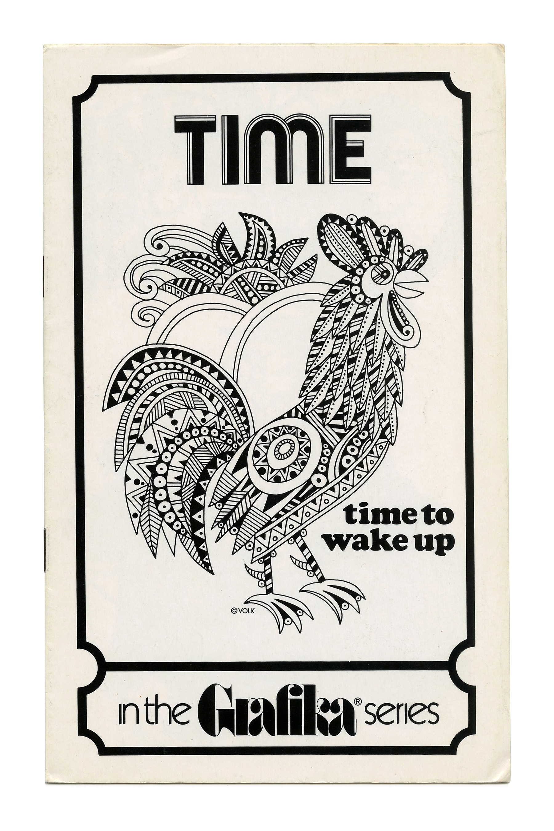
“Time” (No. G70), ft. Optex and Cooper Black.

“Impact!” (No. G71), featuring a version of the triline face designed by Lance Wyman for the 1968 Mexico Olympics, see Mexico Olympic. This is probably Photo-Lettering’s adaptation that went under the name Olympic, or the Lettergraphics version known as Hotline. Note how the type echoes the vibration caused by the jackhammer.
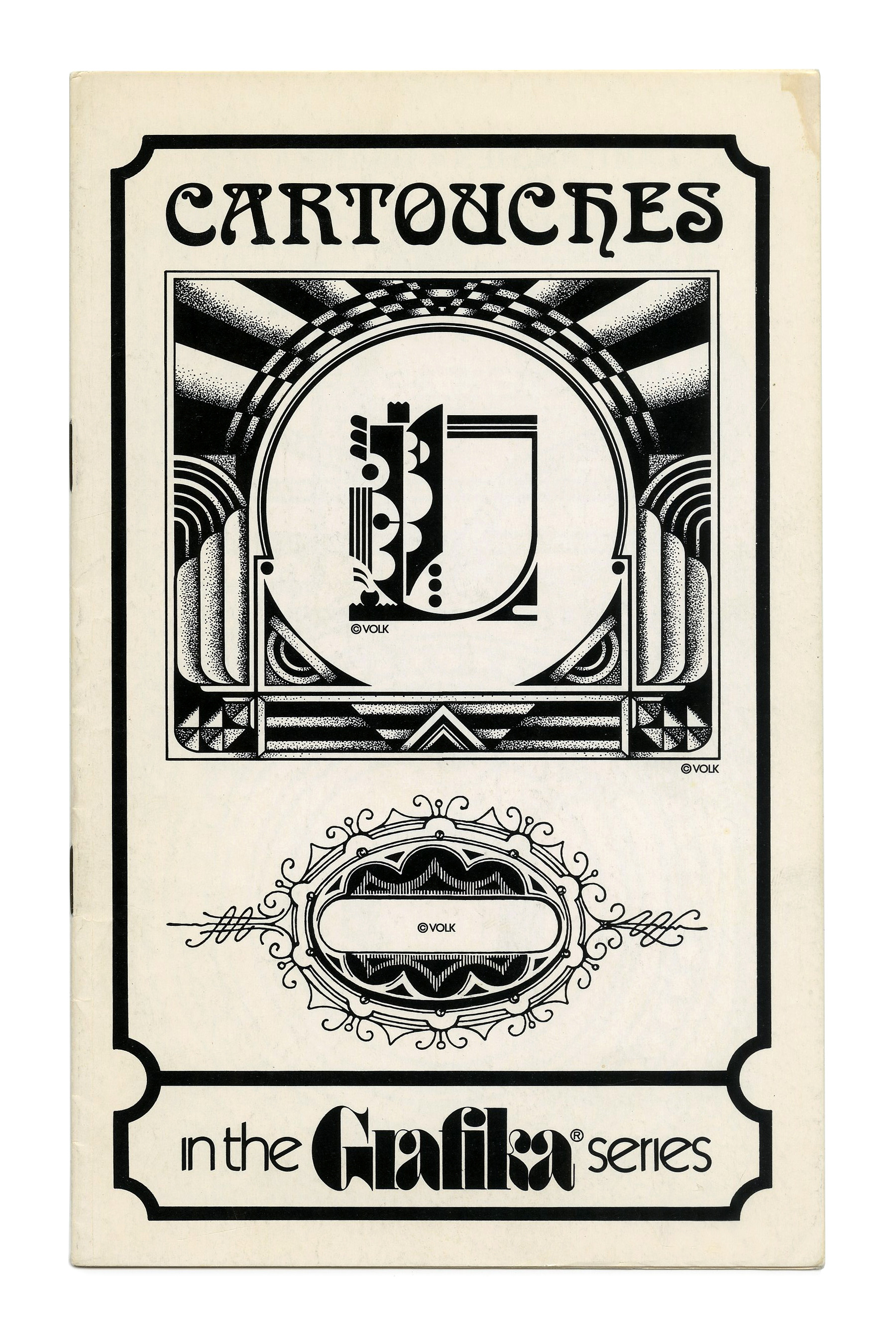
“Cartouches” (No. G72) ft. Arnold Böcklin in all caps.

“Ad Animals” (No. G76) ft. more Thalia.
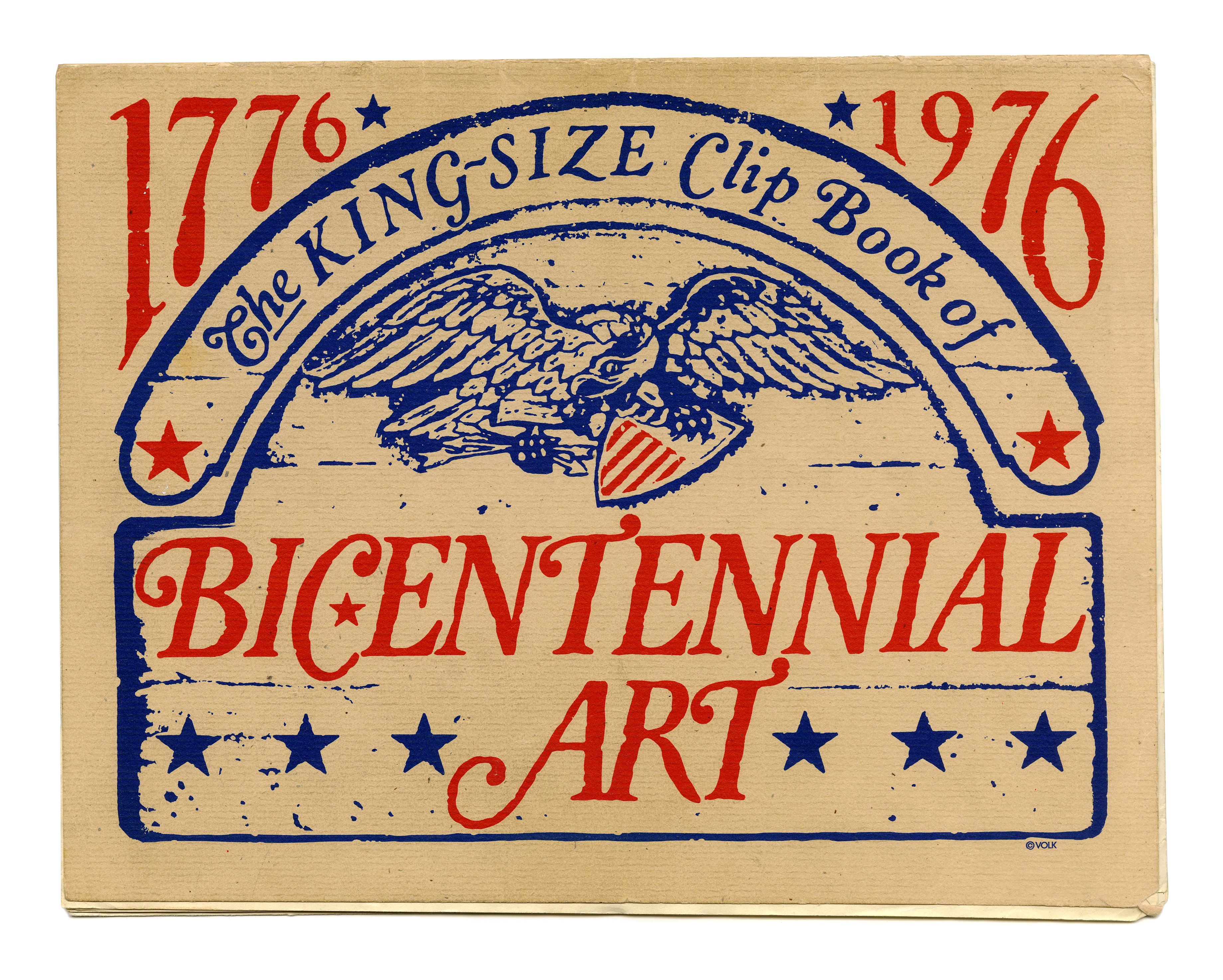
A rare cover in color, celebrating the United States Bicentennial. “The King-Size Clip Book of Bicentennial Art Volk Corporation” appears to use lettering, or heavily modified type. Several details like the swash caps for G and Z suggest that a version of Cloister (Bold) Italic was involved. Other glyphs don’t match a showing of the Monotype cut, and might come from different sources.


 and <cite>L’Heure des Sorcières</cite> (<cite>The Witching Hour</cite>)")


 album art")


