
Buddah Records logo and sleeves (1967–1972)
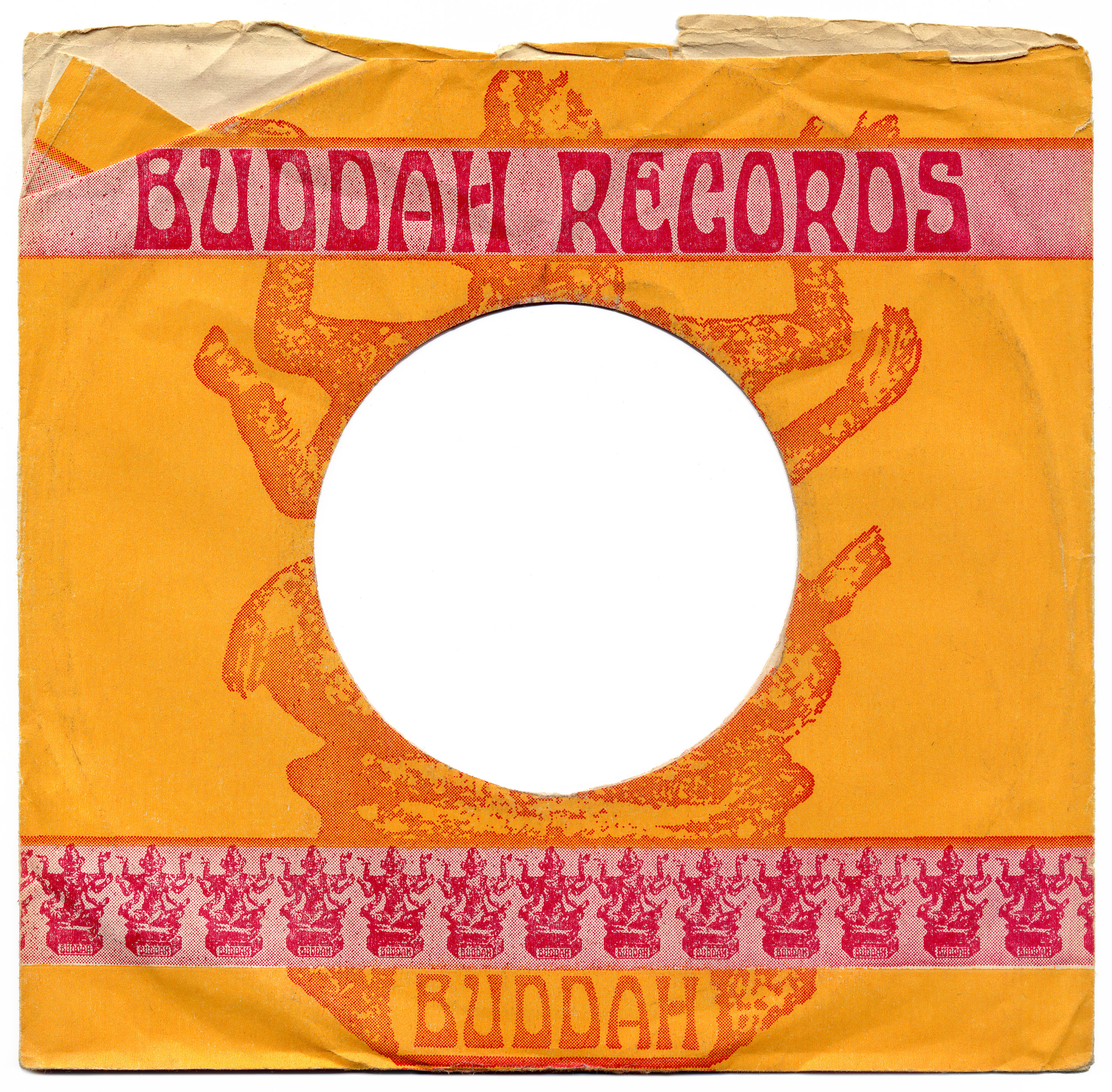
Buddah Records was a record label founded in 1967 in New York City as an offshoot of Kama Sutra Records. The logo used in the early years features a depiction of the Hindu deity Shiva (and not Buddha as one might expect). It’s paired with a wordmark set in caps from Staudel Xenotype K.
This weirdly named face is a phototype interpretation of an untitled “modern alphabet” drawn by Chicago-based lettering artist J.M. Bergling and reproduced in his book Art Alphabets & Lettering from 1914. The design with convex bowls alternates between bottom-heavy and top-heavy forms. It’s part of Photo-Lettering’s “Xenotypes”, a series of revivals of alphabet designs that originated in the Art Nouveau period. While “xeno” describes their otherwordly look – which was very much in fashion again in the 1960s – I have yet to find out what “Staudel” might stand for. The face is listed as Staudel Xenotype K in Photo-Lettering’s 1971 catalog. It was already shown in Art Nouveau Xenotypes 1895–1905 from 1962, there under the name Xenotype 3487. Ringling Brothers appears to be a looser interpretation of Bergling’s lettering, also made at Photo-Lettering around that time.
One of the earliest album releases by Buddah Records to feature this logo is Safe As Milk by Captain Beefheart & His Magic Band.

Untitled “modern alphabet” by J.M. Bergling as shown in his Art Alphabets & Lettering (1914).

The generic sleeve designs by Buddah Records came in a range of colors.
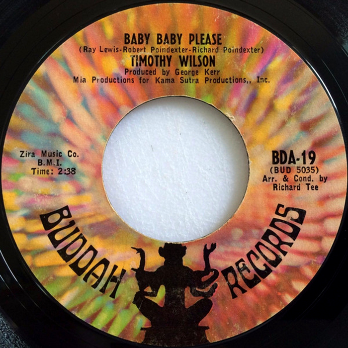
Buddah’s iconic “kaleidoscope” label, here for a 7″ record by Timothy Wilson from 1967. With almost all weight allocated to the tops and bottoms, the logo letterforms lend themselves to being set on a circle.

“Where In The World???” ad for Buddah Records, featuring the logo in Staudel Xenotype K and copy in Windsor Elongated, with the small print in Helvetica caps.
![set on a curve on the cover of Buddah’s 360 Degree Dial-A-Hit, a label compilation from 1969. The design is by Silver & Morris, Inc., with art direction from . [More info on Discogs]](https://assets.fontsinuse.com/static/use-media-items/125/124271/full-925x930/5f99db61/16196906971_f3af02d88e_o_d.jpeg)
Staudel Xenotype K set on a curve on the cover of Buddah’s 360 Degree Dial-A-Hit, a label compilation from 1969. The design is by Silver & Morris, Inc., with art direction from Acy Lehman. [More info on Discogs]


")


