
Kraftwerk – Electric Café LP & “Musique Non Stop” single
Contributed by Garrison Martin on May 7th, 2020. Artwork published in
.

Source: www.bestbuy.com License: All Rights Reserved.
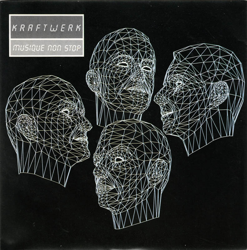
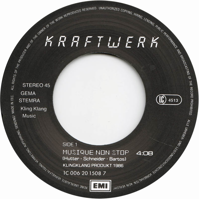
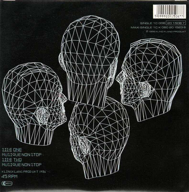
After a production period of nearly five years, the album Electric Café was released in late 1986. The single “Music Non-Stop” was Kraftwerk’s first number one on the Billboard Hot Dance Club Play chart in the United States. The single record cover shown here was used for the European market release.
LCD (Alan Birch, 1981) was used for other Kraftwerk releases in the 1980s, 1990s and 2000s, making it kind of their unofficial logo typeface. [editor’s note: It looks more like Quartz, see the comments] The album cover was designed by Hubert Kretzschmar; the “computer graphics” are credited to no less than 15 individuals and organisations.
License: All Rights Reserved.
Source: www.discogs.com License: All Rights Reserved.


 movie logo and opening credits")


")
")


2 Comments on “Kraftwerk – Electric Café LP & “Musique Non Stop” single”
Thank you, Garrison! Good memories. I got this album from our local library, as Klingklang-Musikkassette – the only way that was available for me in the 1990s. Hooray for public libraries!
The letterforms are certainly based on (some typeface inspired by) nine-segment displays, and some later Kraftwerk covers might indeed use LCD. However, the covers shown here don’t use the typeface named LCD as drawn by Alan Birch for Letraset. The differences are most striking in W and M, which occupy double the width, in the middle stem in M that reaches the baseline, the leg in R that doesn’t meet the stem. See also the stroke terminals which are chamfered on one side only. Although not a perfect match either, it’s closer to an oblique Quartz, with a modified W (to better resemble the glyph in Die Mensch-Maschine?) and an L without exit stroke. See a visual comparison of (upright) Quartz and LCD on Identifont.
On Twitter, John Coulthart posted images of the UK cassette version of “Pocket Calculator” (“Taschenrechner”) from 1981, housed in a flip-top calculator card box. It also features seven-segment display letterforms, even different ones for the box and for the cassette, but neither is a match for Letraset LCD or Quartz. I’d assume it’s simply lettering inspired by pocket calculator displays.