
Clip Books of Line Art, Volk (1968)
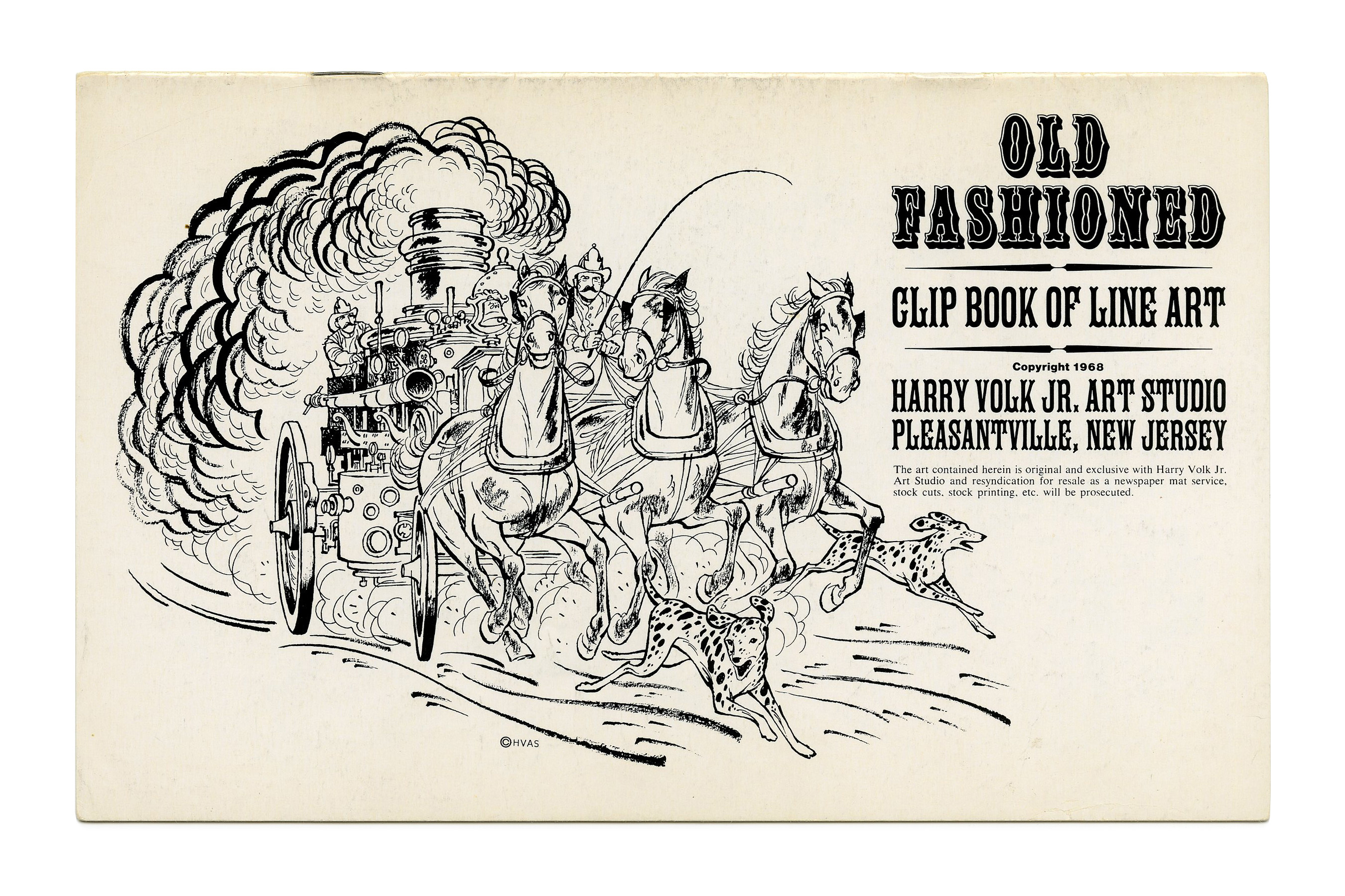
Covers for various clip books of line art issued in 1968 by Harry Volk Jr. Art Studio, Pleasantville, New Jersey. See the previous post about the clip books issued in 1955 for more information on Harry Volk Jr. Art Studio.
The bottom lines use Alternate Gothic Compressed and Univers.
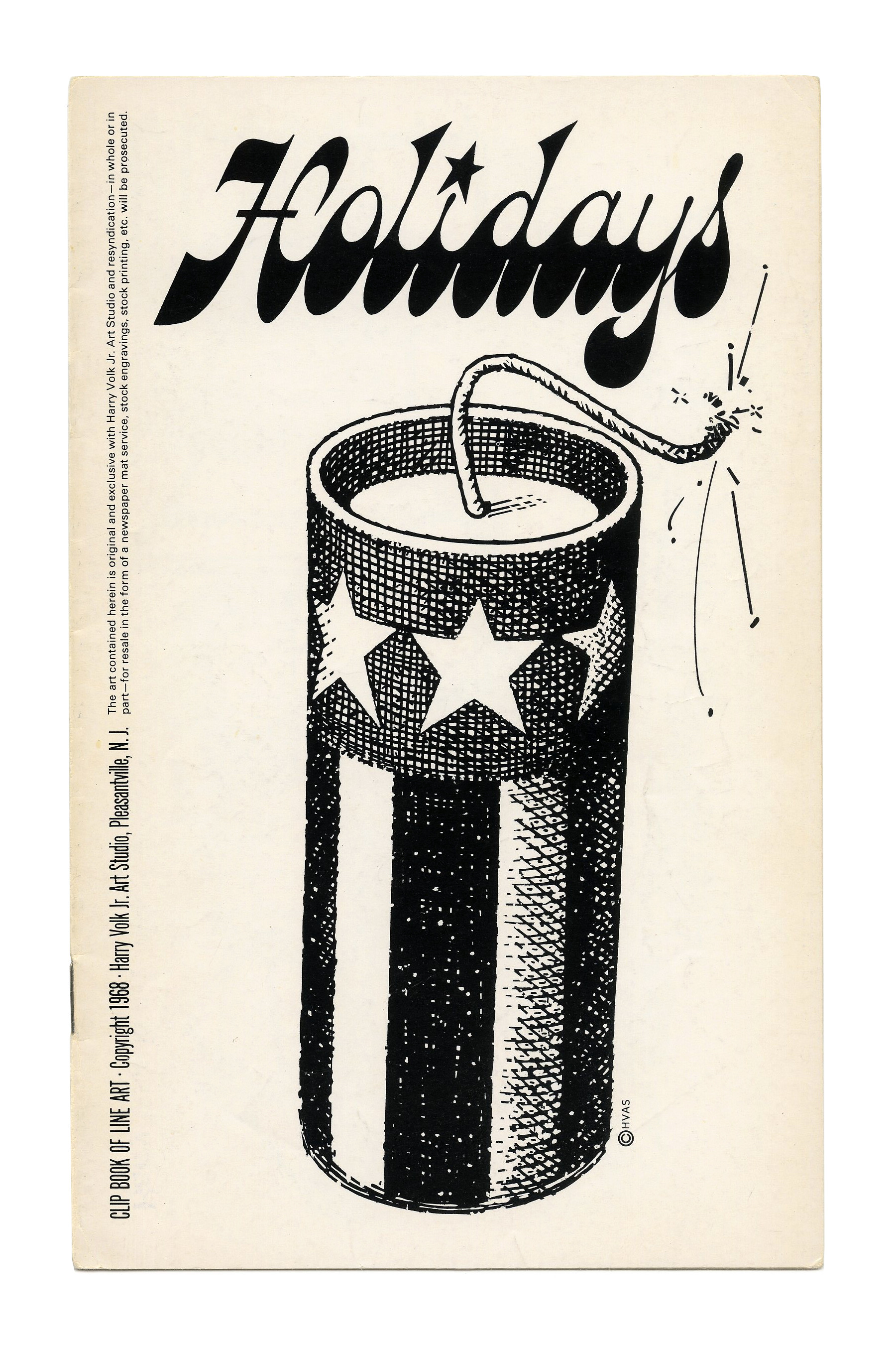
“Holidays” (No. 167) ft. Gonzales Jeanette with a custom star dot that echoes the fuse.

“Expressions” (No. 168) ft. Reklame. This old German typeface was adopted by Photo-Lettering and shown in their 1971 catalog as Reclame. The punctuation is from Pistilli Roman, see the comments.
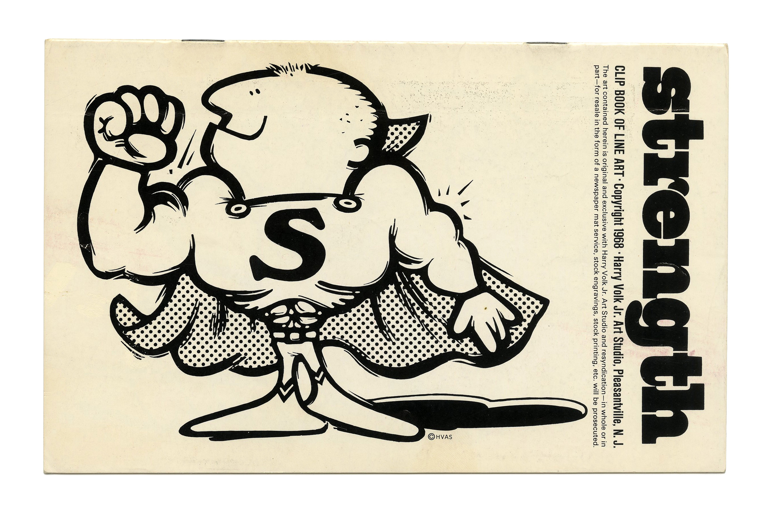
“Strength” (No. 170) ft. West Behemoth with tight and overlapping spacing and the monocular g.

“Telephones” (No. 171) ft. Filmotype Gamma.

“Religion” (No. 172) ft. Baker Chalone.
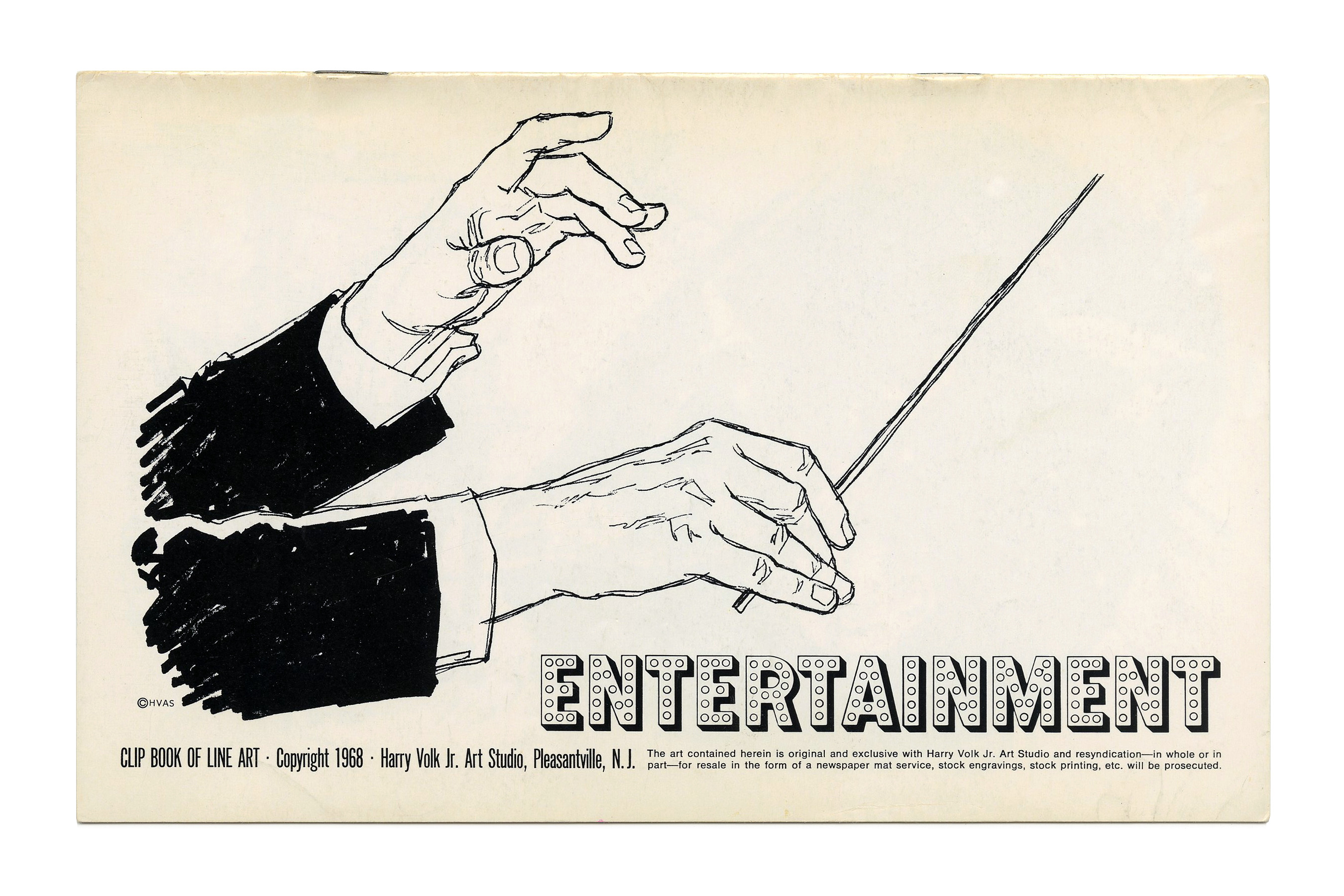
“Entertainment” (No. 174) ft. Norton Vaudeville.
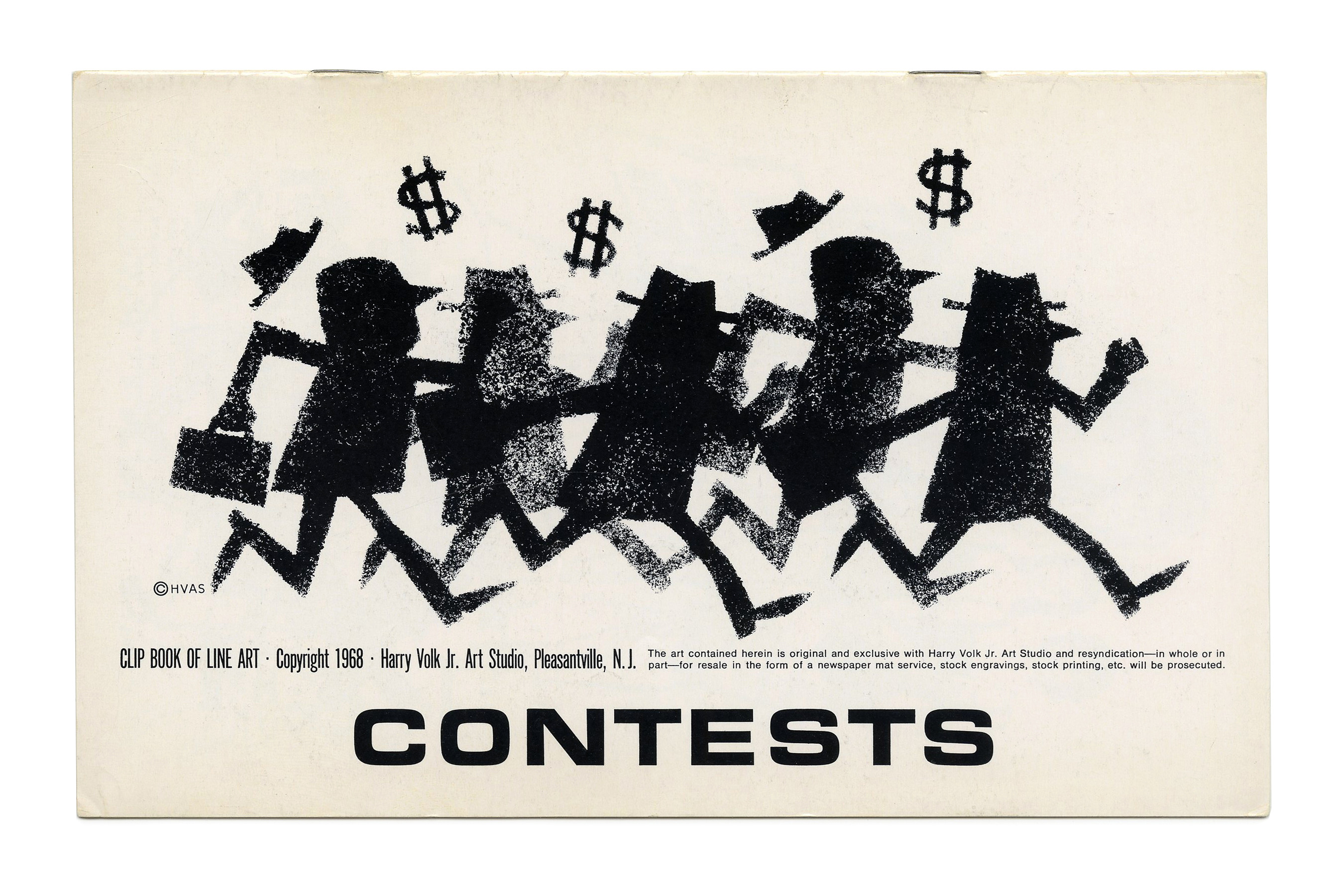
“Contests” (No. 175) ft. Eurostile Bold Extended.
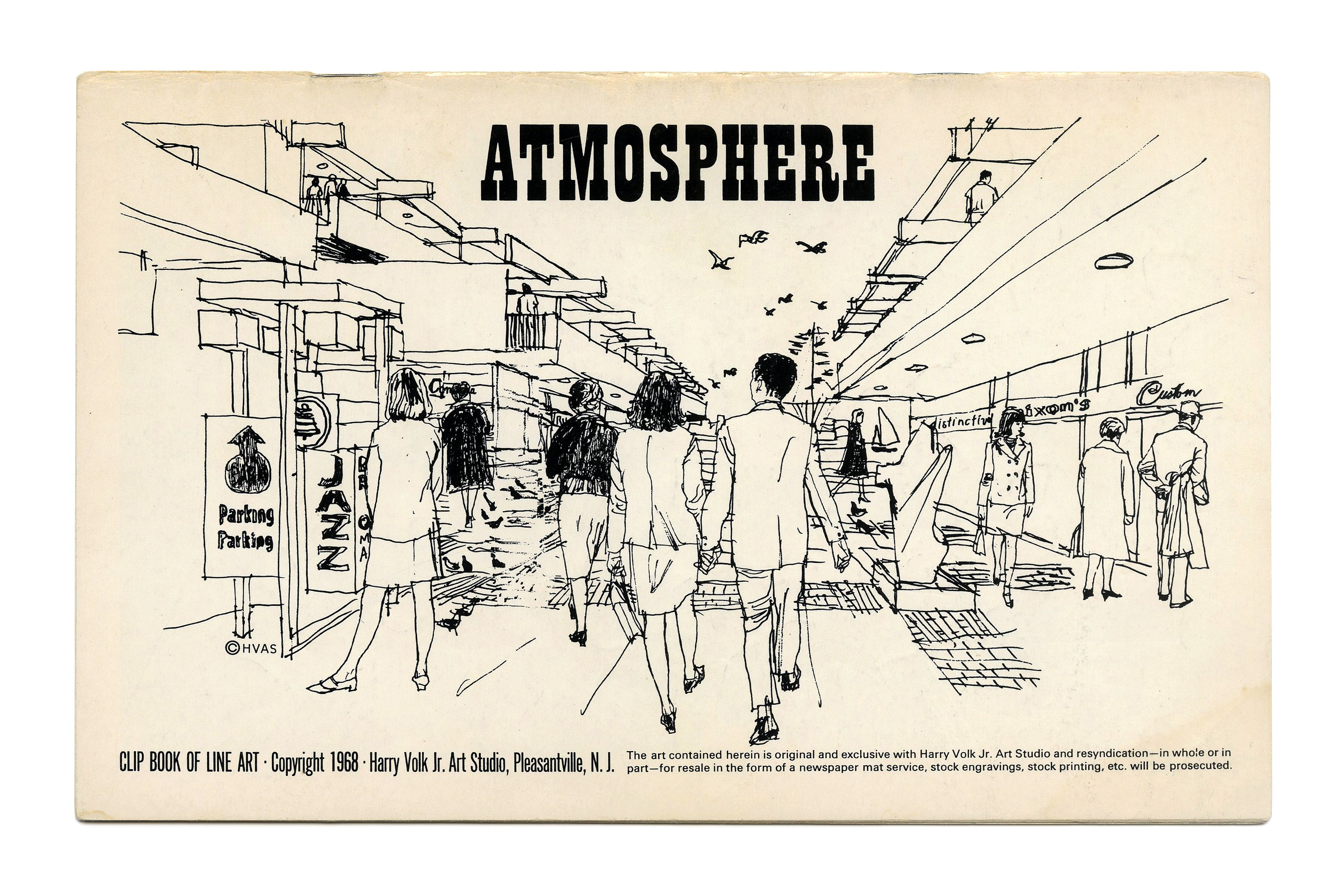
“Atmosphere” (No. 480) ft. Playbill.

“Direct Mail” (No. 481) ft. Univers, Venus Extended, and Franklin Gothic Wide.
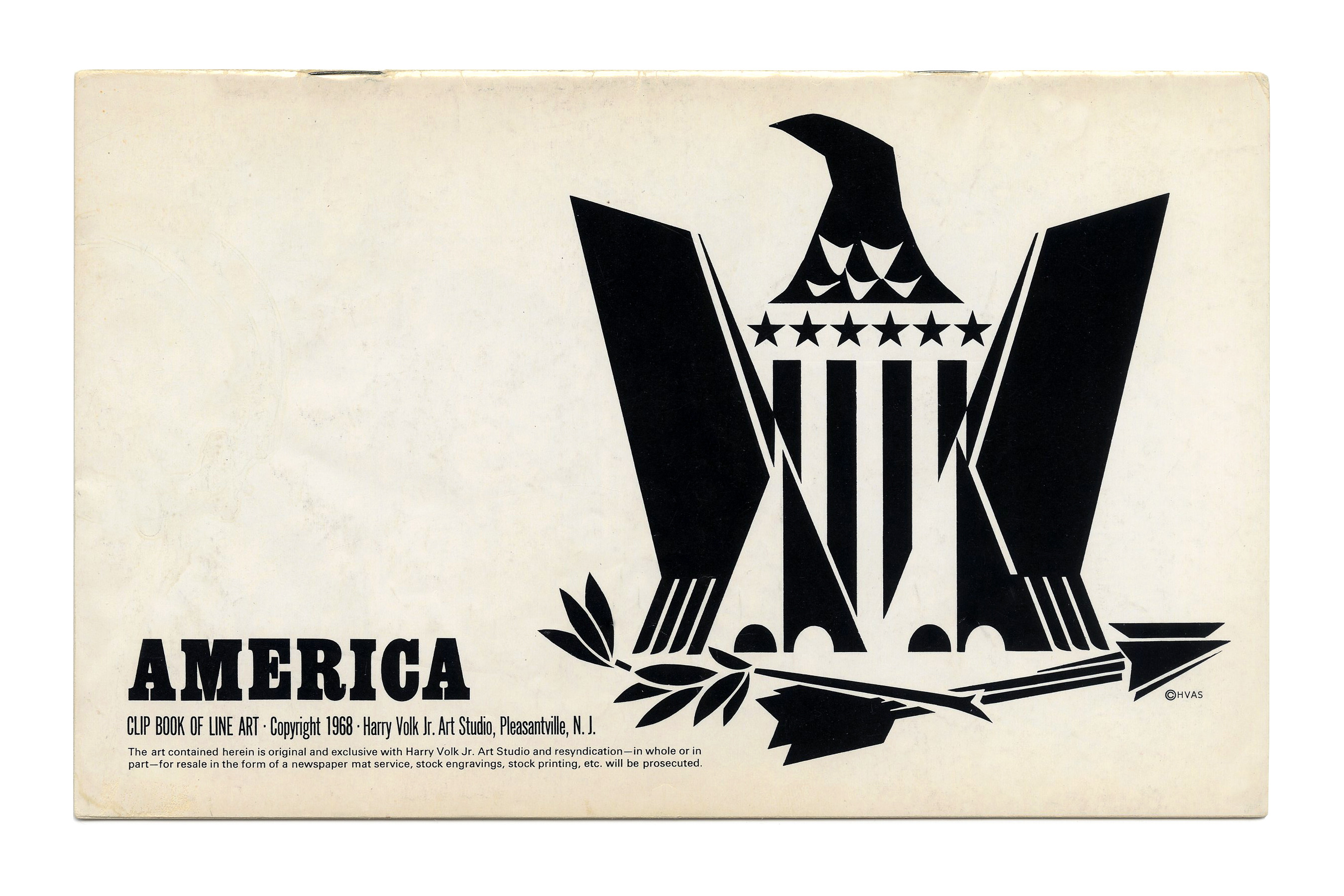
“America” (No. 482) ft. Egyptienne.
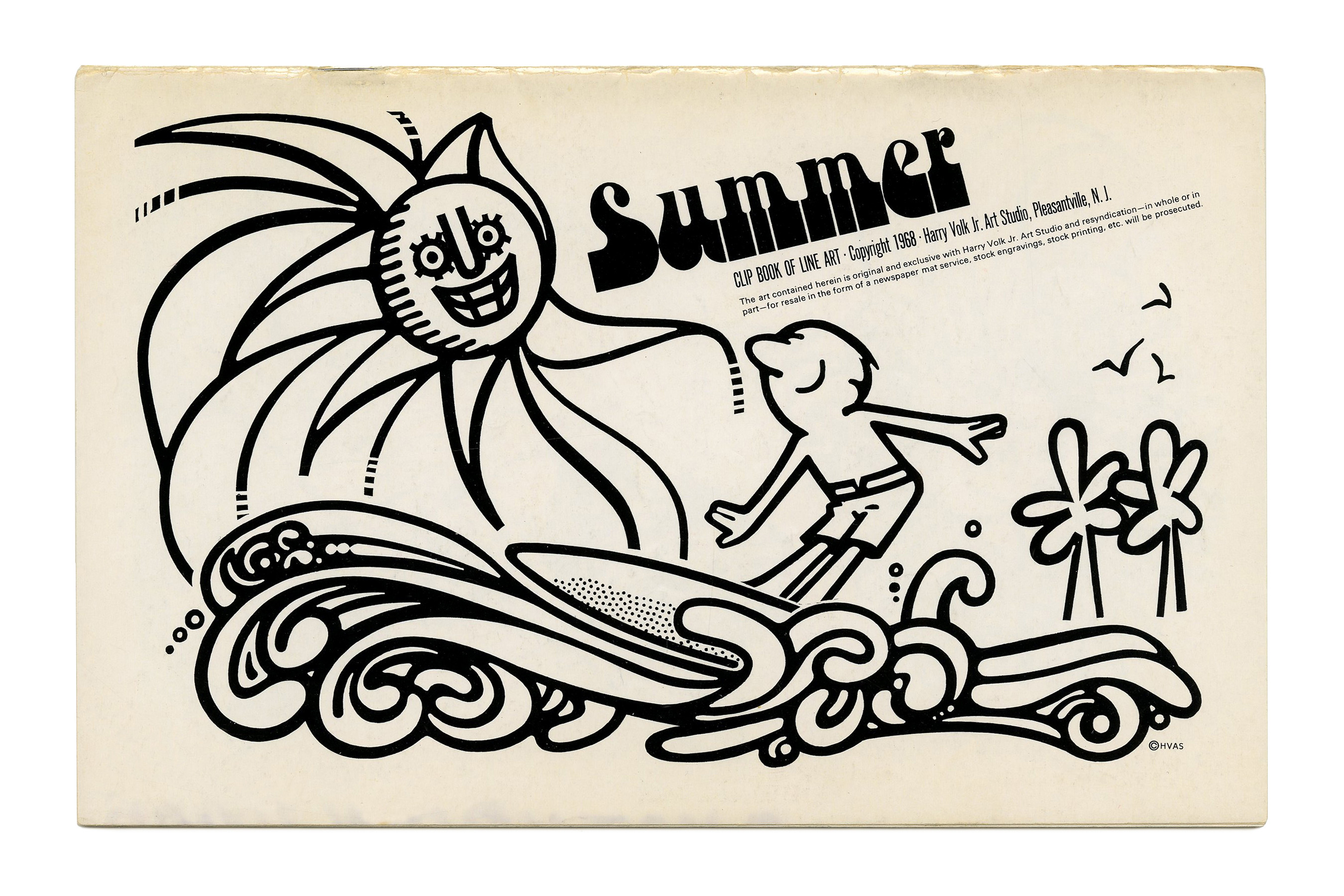
“Summer” (No. 483) ft. Chwast Art Tone on an angle.
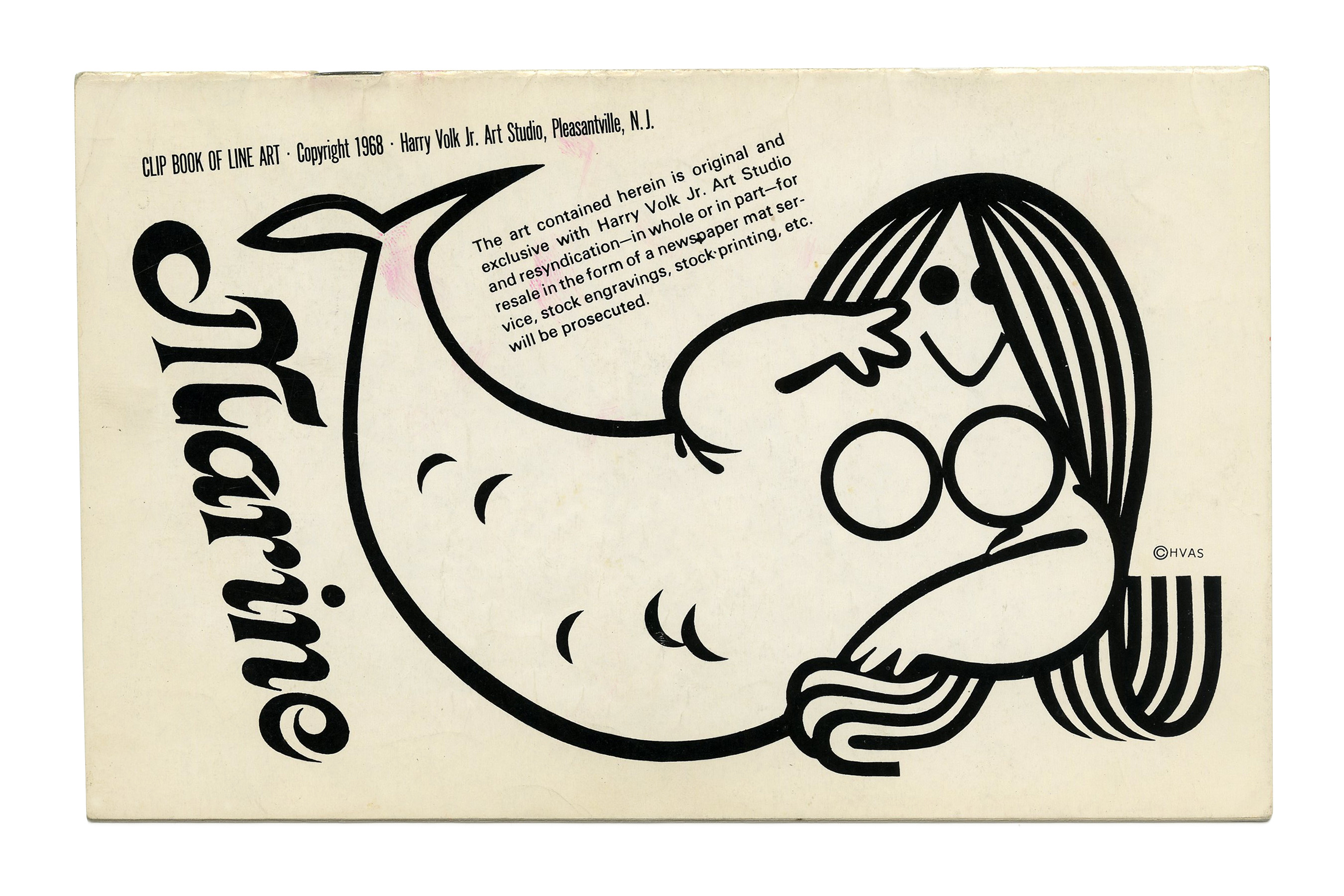
“Marine” (No. 484) ft. Kalligraphia.
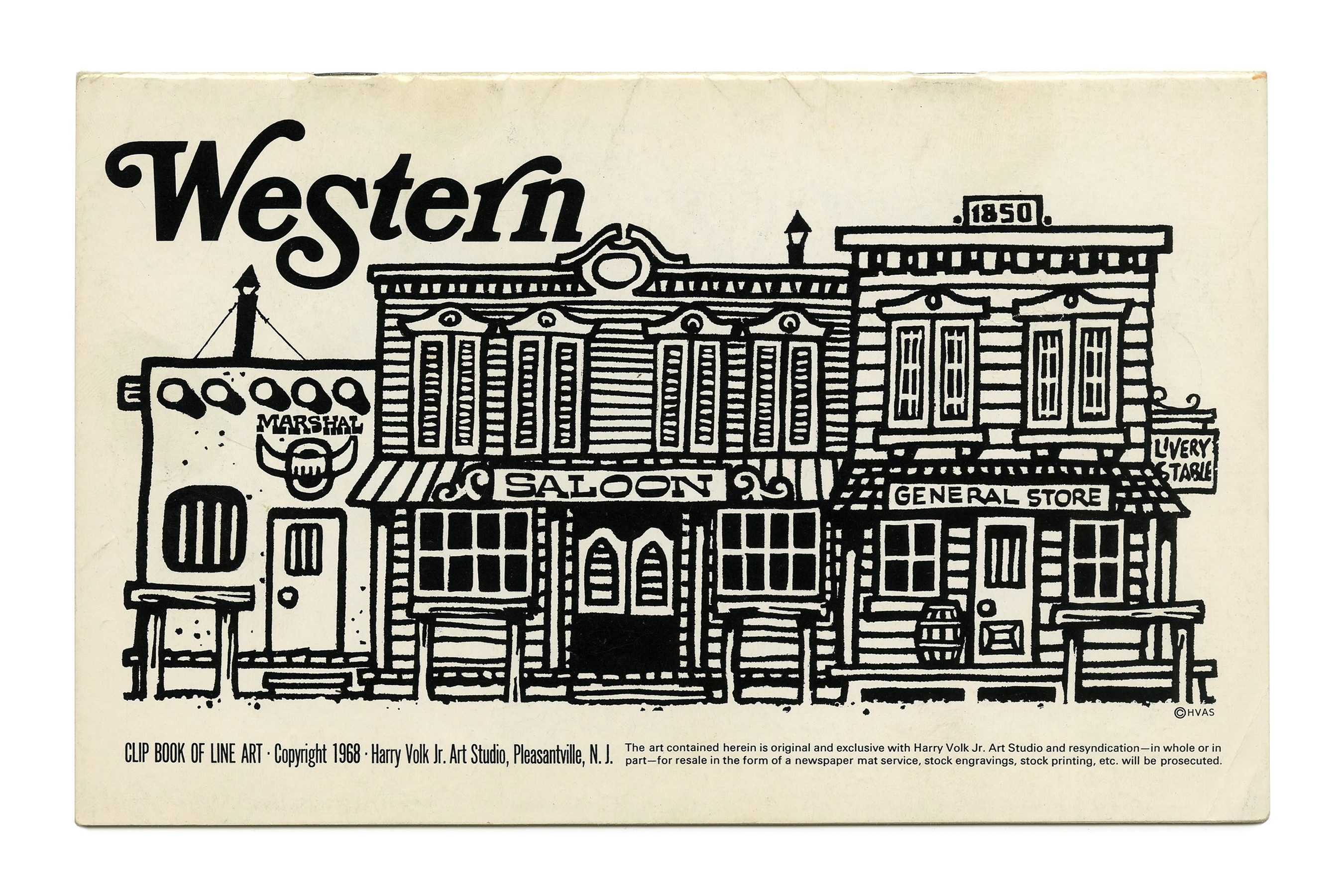
“Western” (No. 485) ft. Bookman Italic with swashes.
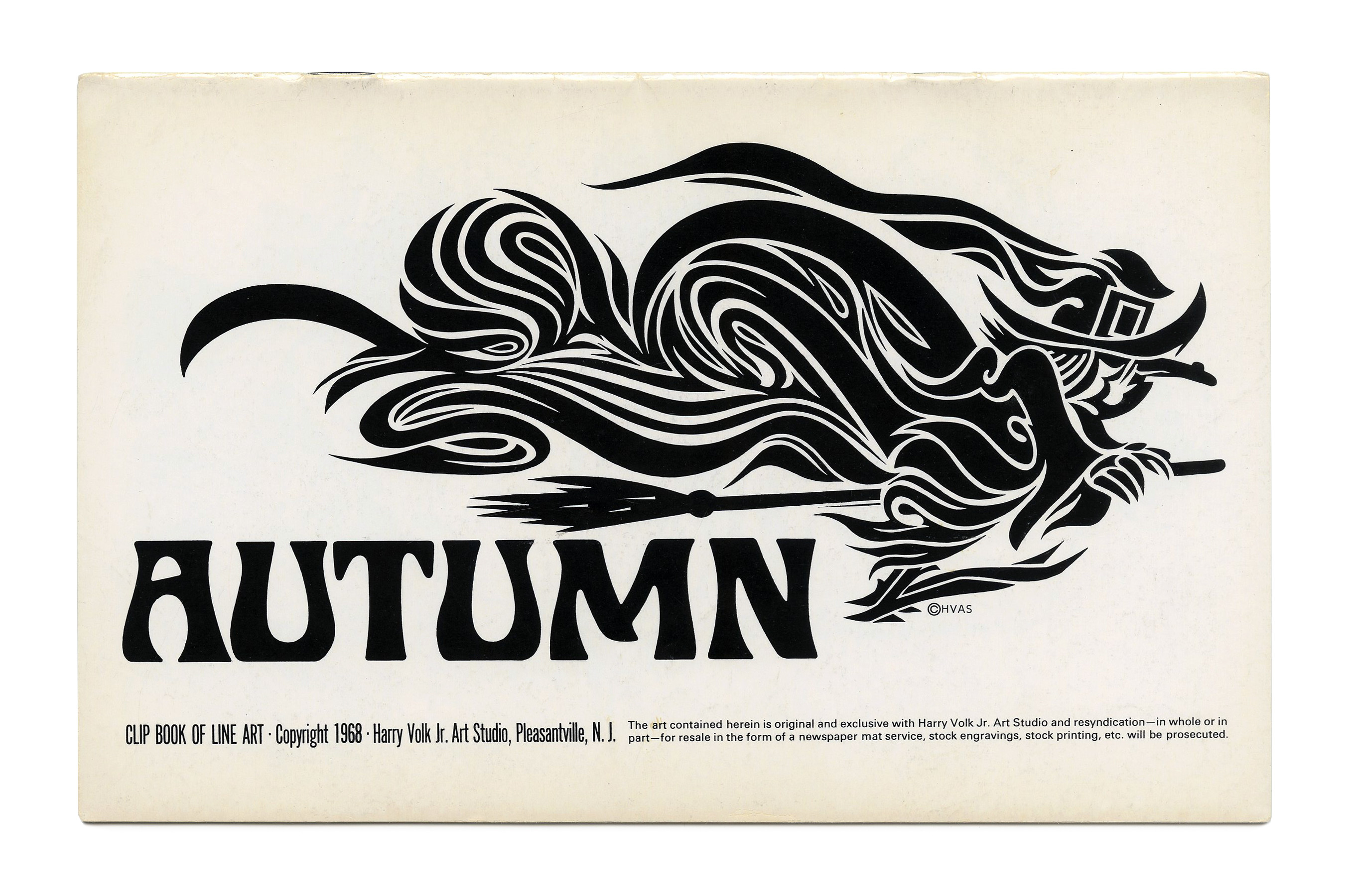
“Autumn” (No. 486) ft. Staudel Xenotype J.
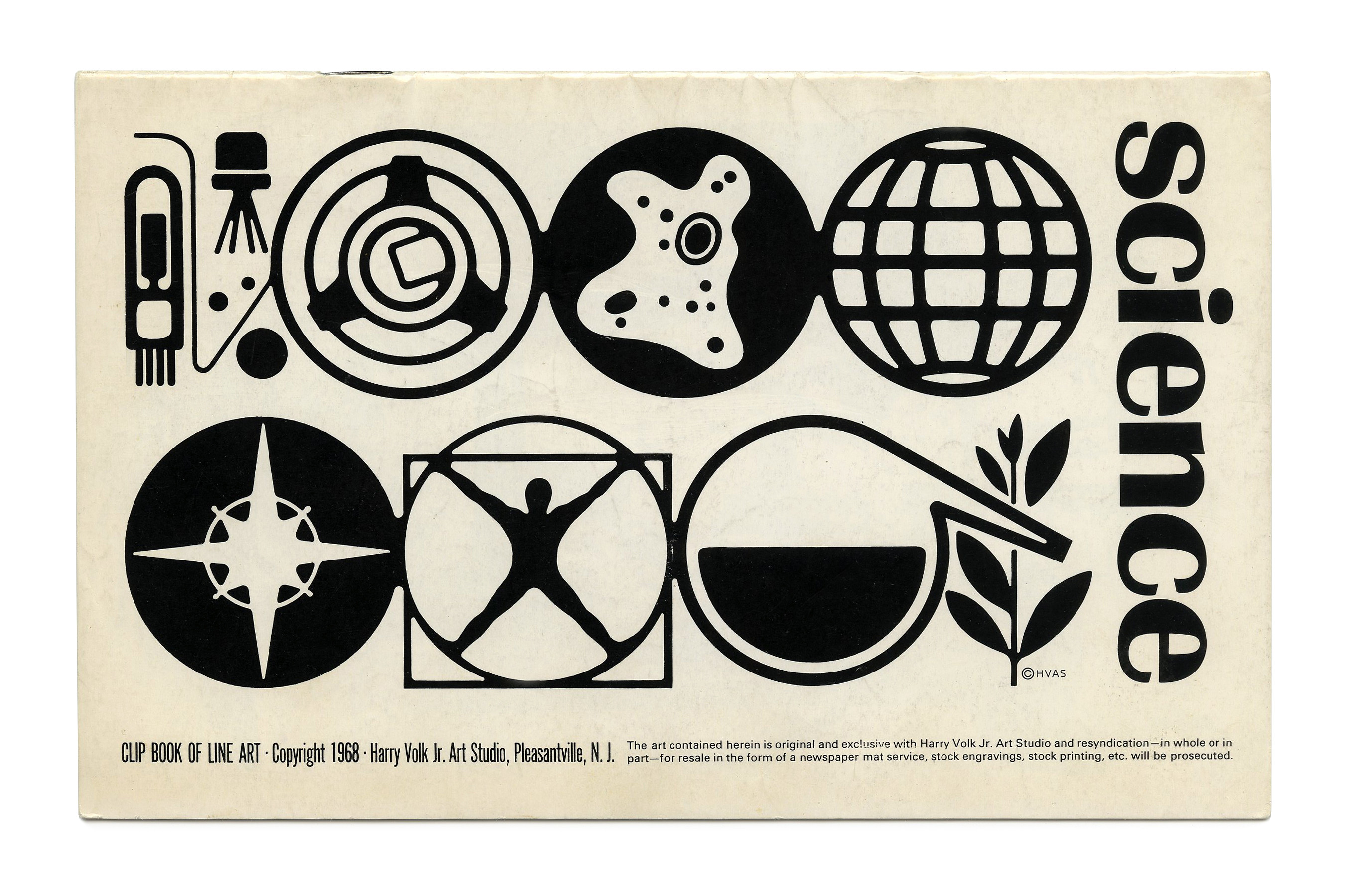
“Science” (No. 487) ft. Britannic.
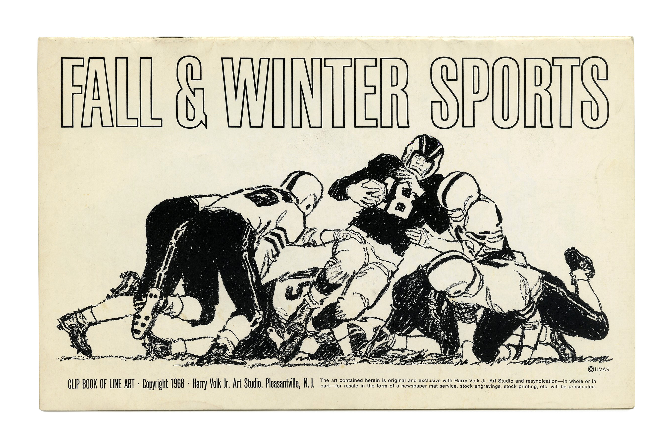
“Fall & Winter Sports” (No. 488). This narrow grotesk looks a lot like an outlined version of Schmalfette Grotesk, or maybe PLINC’s adaptation Swiss Gothic, but it seems the ampersand doesn’t match. Any insights are welcome. The same outlined style appears on Volk covers from 1964 and 1974, while the “Law & Order” booklet from 1966 uses the similar Permanent Headline.
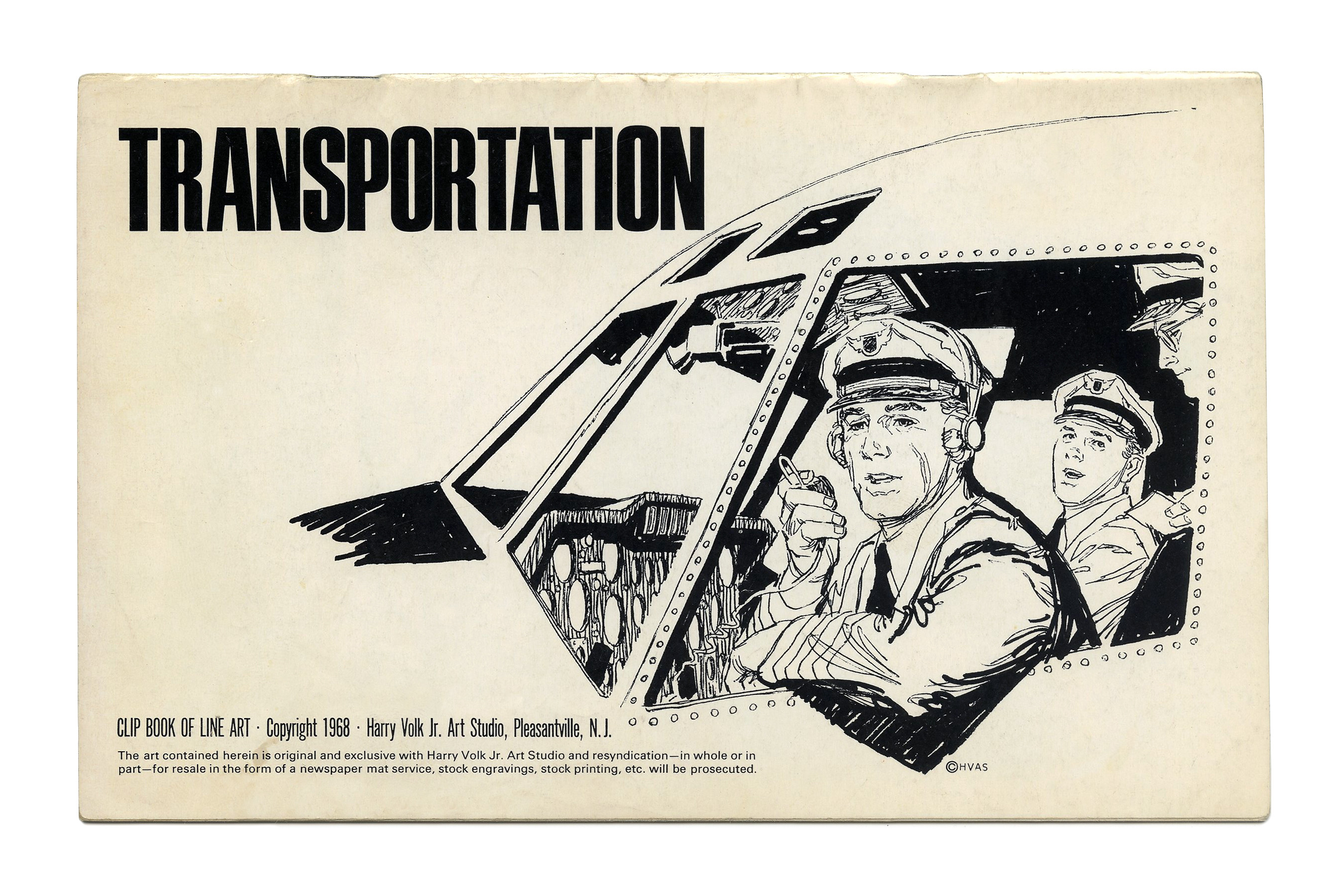
“Transportation” (No. 489) ft. Permanent Headline.
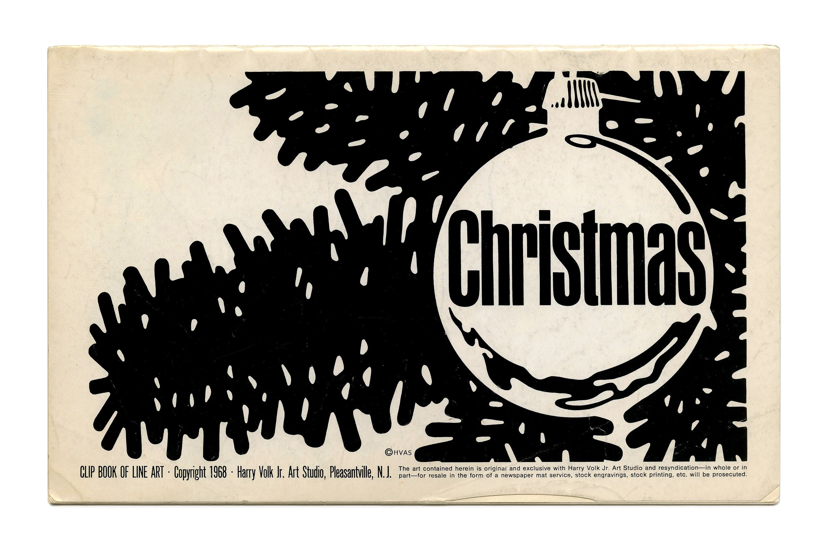
“Christmas” (No. 490) ft. Inserat-Grotesk.
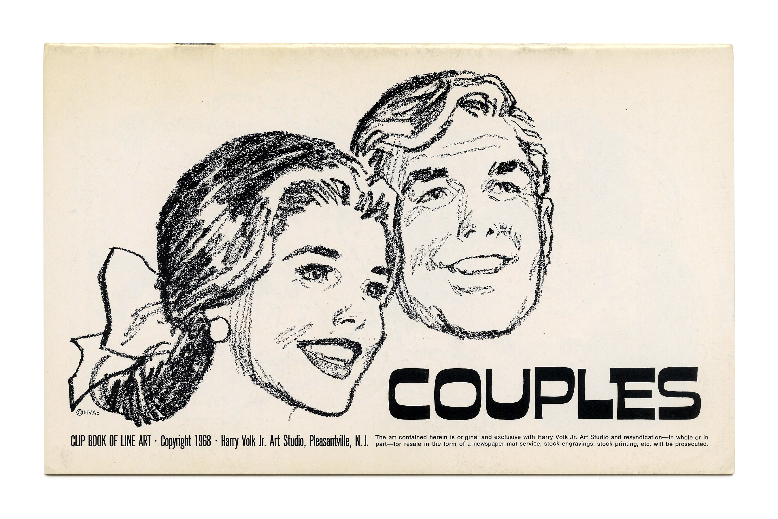
“Couples” (No. 492) ft. Whimzitype 3600. Illustration by Tom Sawyer.
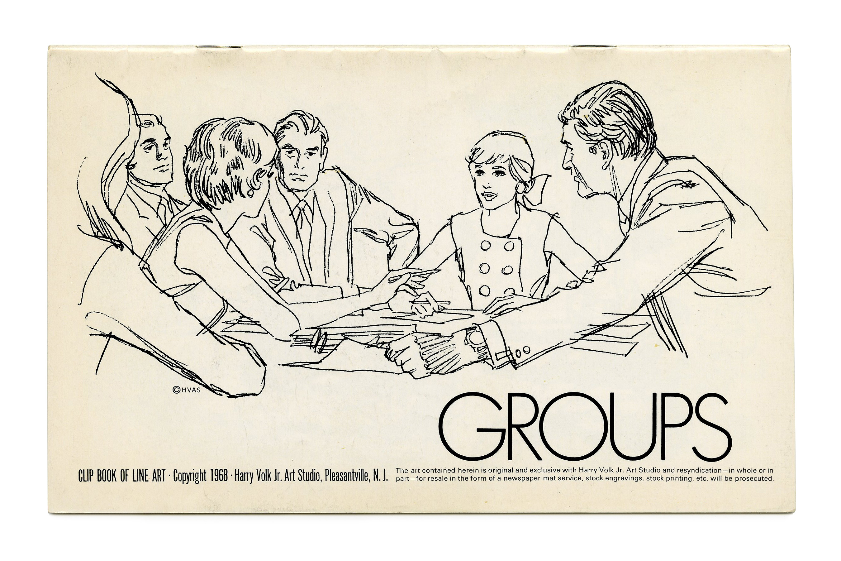
“Groups” (No. 494) ft. Futura Light.
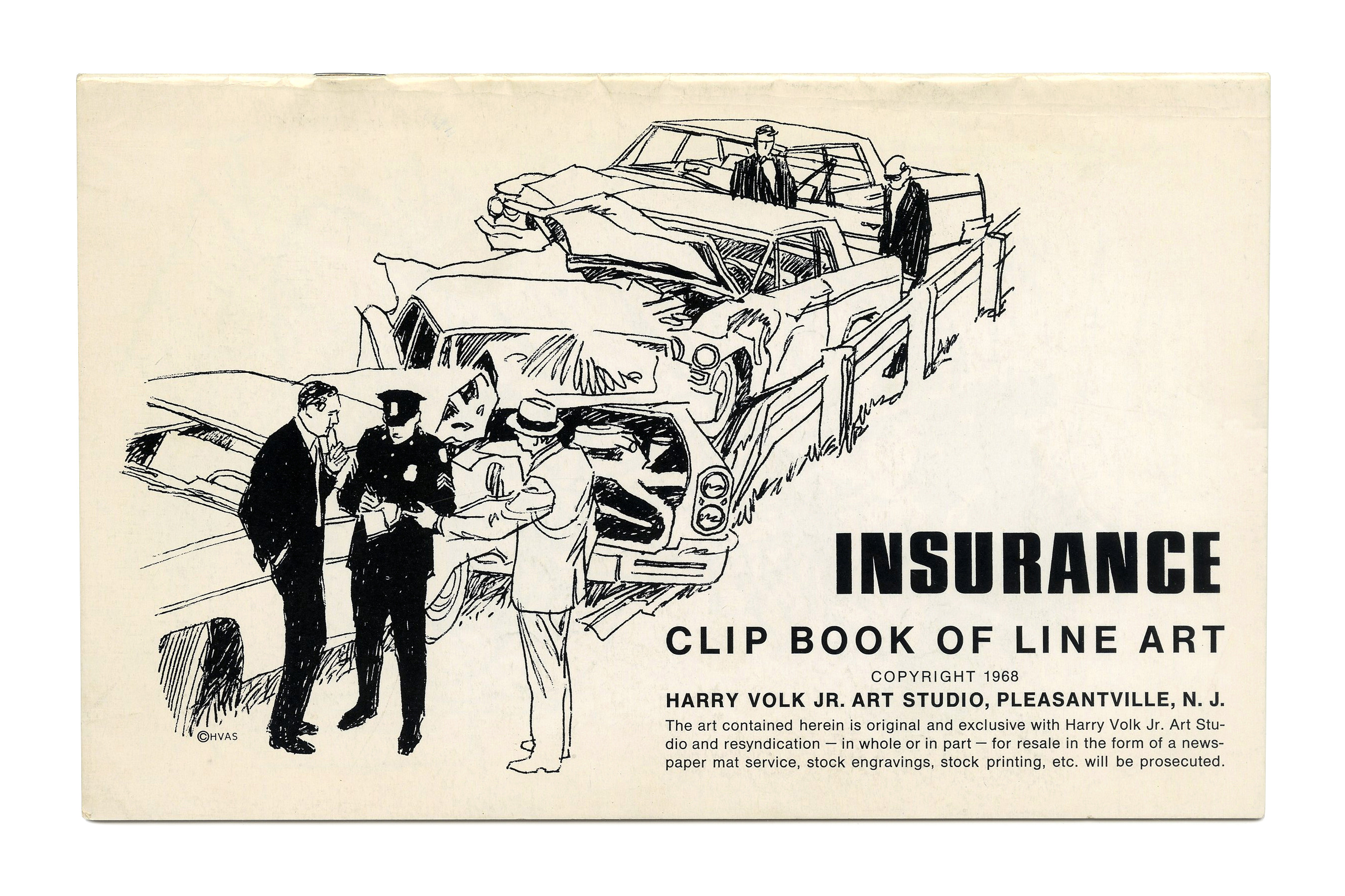
“Insurance” (No. 495) ft. Permanent Massiv. The small text on this cover is set in Helvetica.
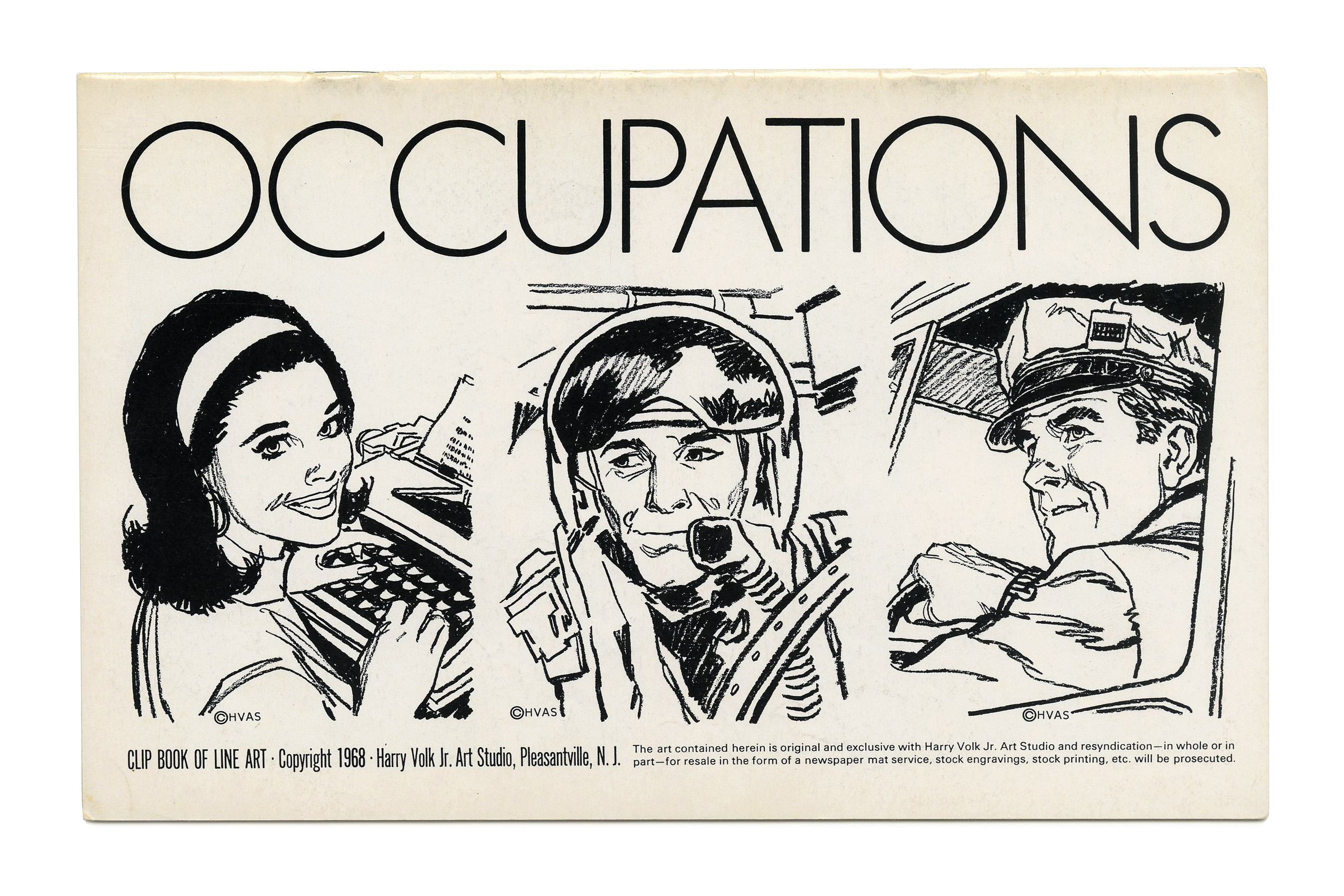
“Occupations” (No. 497) likewise shows light caps from Futura. Illustration by Tom Sawyer.

“Women” (No. 499) ft. Smoke in all caps.

“Money” (No. 500) ft. more Futura Light.
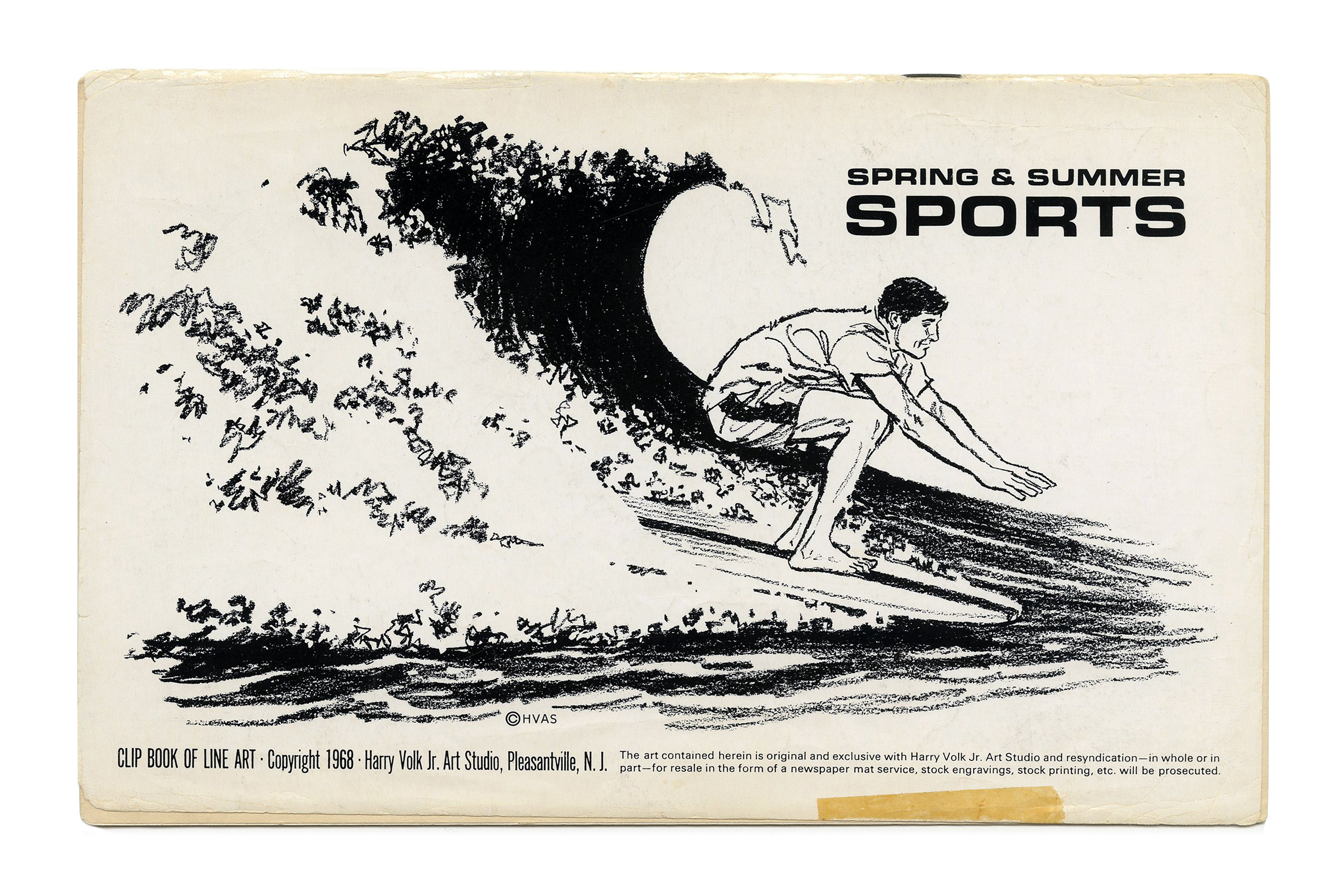
“Spring & Summer Sports” (number unknown), ft. Eurostile.

“Register and Vote” from the Paste Pot & Scissors subseries (No. PP 105), ft. Pacella Monitor and Franklin Gothic. The small type at the bottom is in Eurostile.

“Announcers” from the Paste Pot & Scissors subseries (No. PP 107), ft. Photo-Lettering’s West Behemoth Italic with swash alternates and overlapping glyphs.
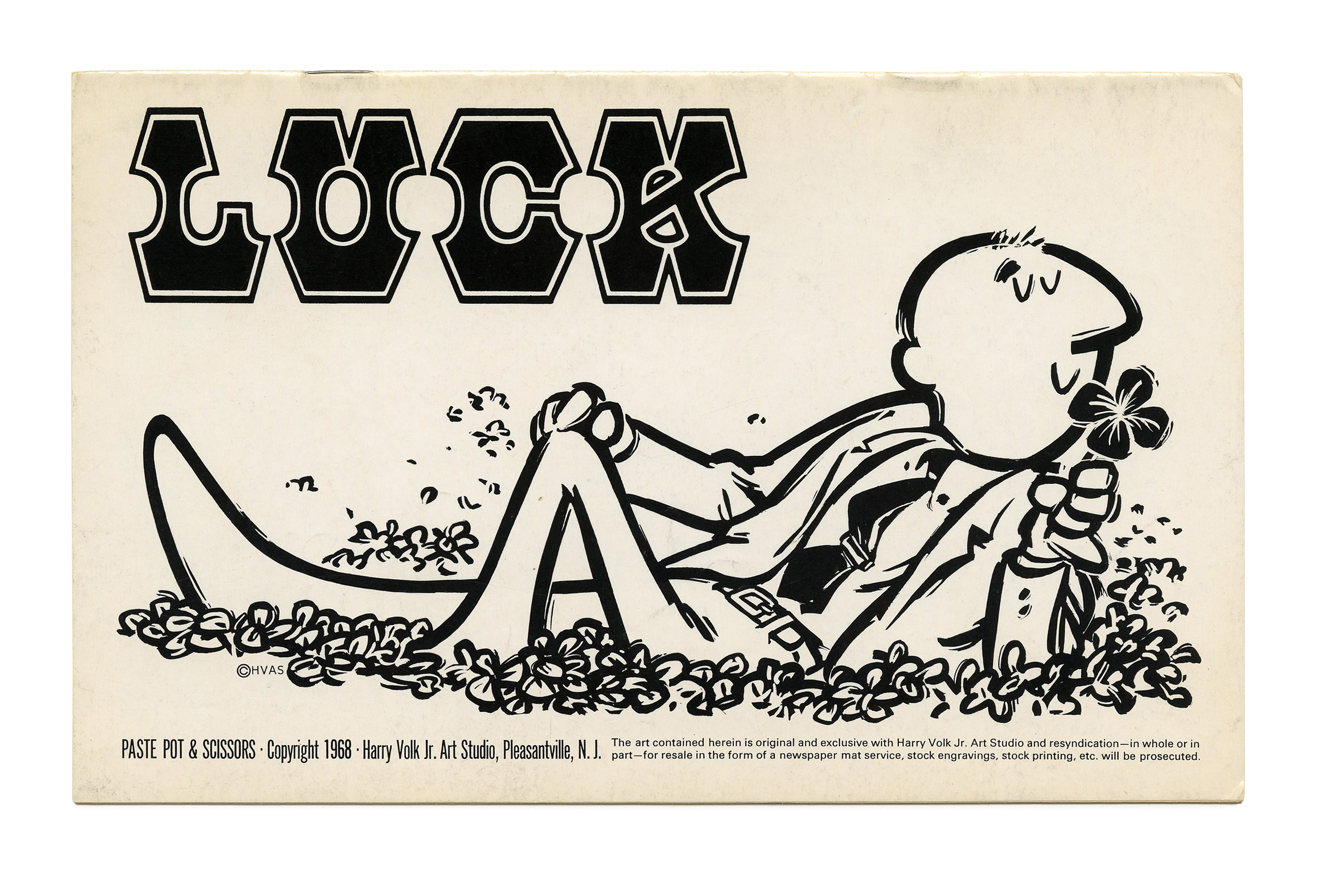
“Luck” from the Paste Pot & Scissors subseries (No. PP 108), ft. Mansard (with contour), another face available from Photo-Lettering. It might also be Jim Dandy, a contoured variant of Slim Dandy by Lettergraphics.
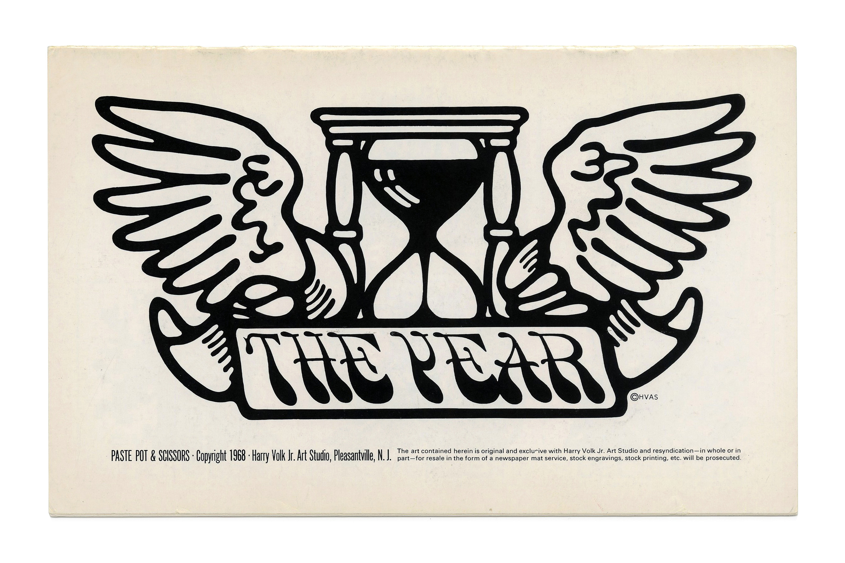
“The Year” (No. PP109) ft. more all-caps Smoke, here with its peculiar Y.

“Borders” (No. PP115) ft. Clarendon caps.


")


, vol. 2")
")


2 Comments on “Clip Books of Line Art, Volk (1968)”
When compared with other Volk booklets from other years, it’s interesting to see that this volume appears to mark the change from Filmotype faces (see e.g. the covers from 1960) to Photo-Lettering.
The pile of assorted accents and punctuation used in “Expressions” as a typographic equivalent of cursing appears to be taken directly from a specimen for Pistilli Roman, designed by Herb Lubalin and used to announce the International Type Face Competition sponsored by the Visual Graphics Corporation in 1965. Here’s the announcement as shown in Graphis No. 121.
Pistilli’s punctuation was again prominently featured on the cover of the 1977 reprint of You Have A Point There: A Guide to Punctuation and its Allies.