Nuits sonores 2011–2013
Nuits sonores is a festival held every year in May in the French city of Lyon. It is dedicated first and foremost to electronic music, but it remains very open on its fringes, including neighboring musical genres as well as featuring visual arts and performances. It provides a stage for local musicians and at the same time has a European and international outlook, inviting musical groups and DJs from around the globe – not only with the intention of listening to them, but also for talks, workshops and networking.
The event was first organized in 2003, initiated by Arty Farty, a non-profit association devoted primarily to furthering youth cultures. In that sense the festival is well placed in the city of Lyon. It is the third largest city of France and the second largest metropolitan region with over two million people, and what it more: Lyon’s numerous universities draw a student crowd as big as 200,000 which makes it a very young city. As the number of spectators almost increased tenfold over the past twenty years, it is safe to say that Nuits sonores enjoys a wild success and represents a beacon in Lyon’s cultural calendar.
In an earlier post we featured the visual identity of Nuits sonores’ 2023 edition designed by studio Superscript². In this post we will show the designs that this studio realized for the editions of 2011, 2012, and 2013.
2011
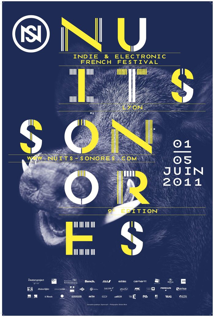
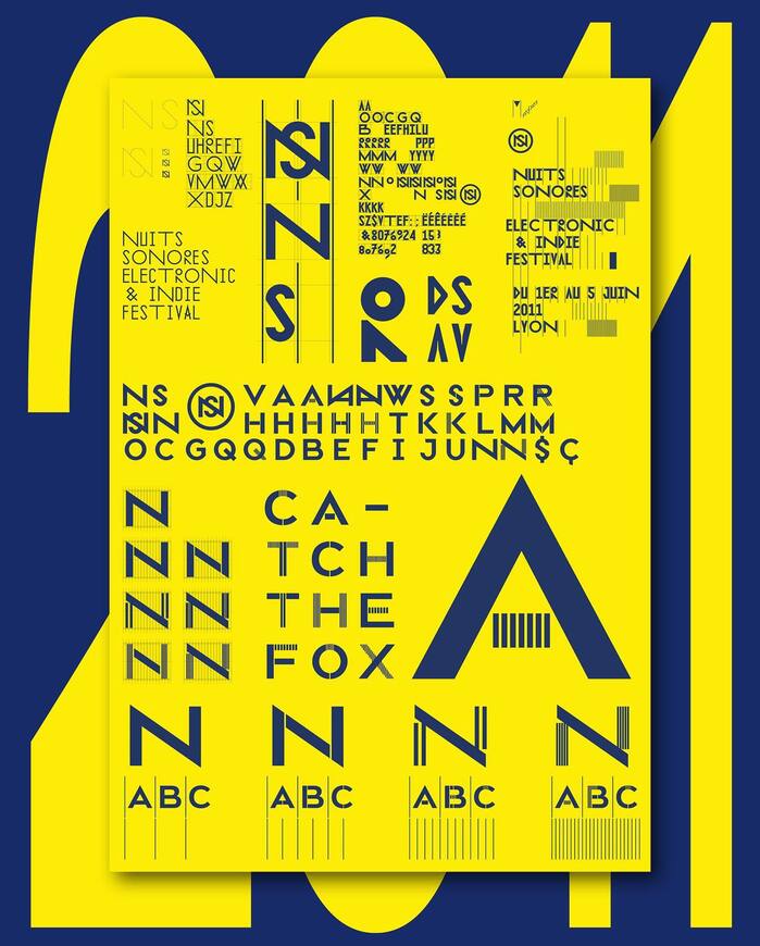
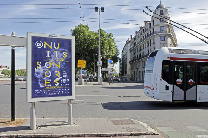
When Patrick Lallemand and Pierre Delmas Bouly of Superscript² were first commissioned by the festival, they decided to take a clearly typographic approach and began working on a custom typeface, NSType, on which they elaborated further the following two years. What started with a geometric all-caps sans-serif skeleton evolved into a graphic experimentation on stroke variation for the 2011 edition. The typeface displays thin strokes that rhythmically interrupt the letters and provide them both with a sense of distortion and of adornment. In many of the 2011 media this play on interruption is carried further in the applications in which duotone photographs are overlaid by the typeface and fields of thin lines. In its modular approach NSType bears similarities with Acier by A.M. Cassandre. The alphabet’s plain variant was the starting point for the NS logotype that is in use ever since.
2012
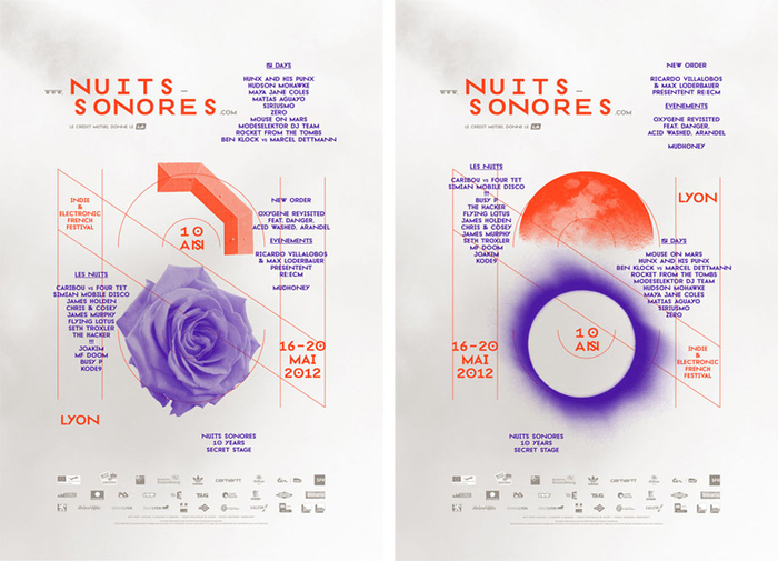
While the 2011 edition made the letters shine in yellow and white over a midnight blue backdrop, the general appeal of the 2012 edition was all different: white and spacious were the backgrounds, with midnight blue and yellow replaced by purple and red. On posters, letter segments were substituted by duotone photographs of found objects. Additionally, the shapes of objects were stylized and introduced into the typeface itself. This way, they explored the border between typography and illustration.
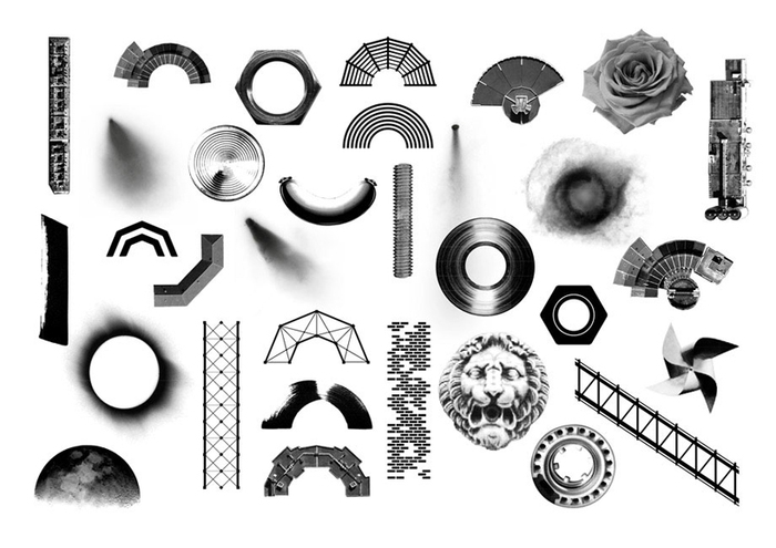
For the 2012 edition, Superscript² sought inspiration in found objects from the festival grounds as well as Lyon’s cityscape.
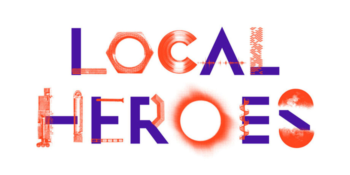
These pictorial elements were mixed with the geometric letterforms.
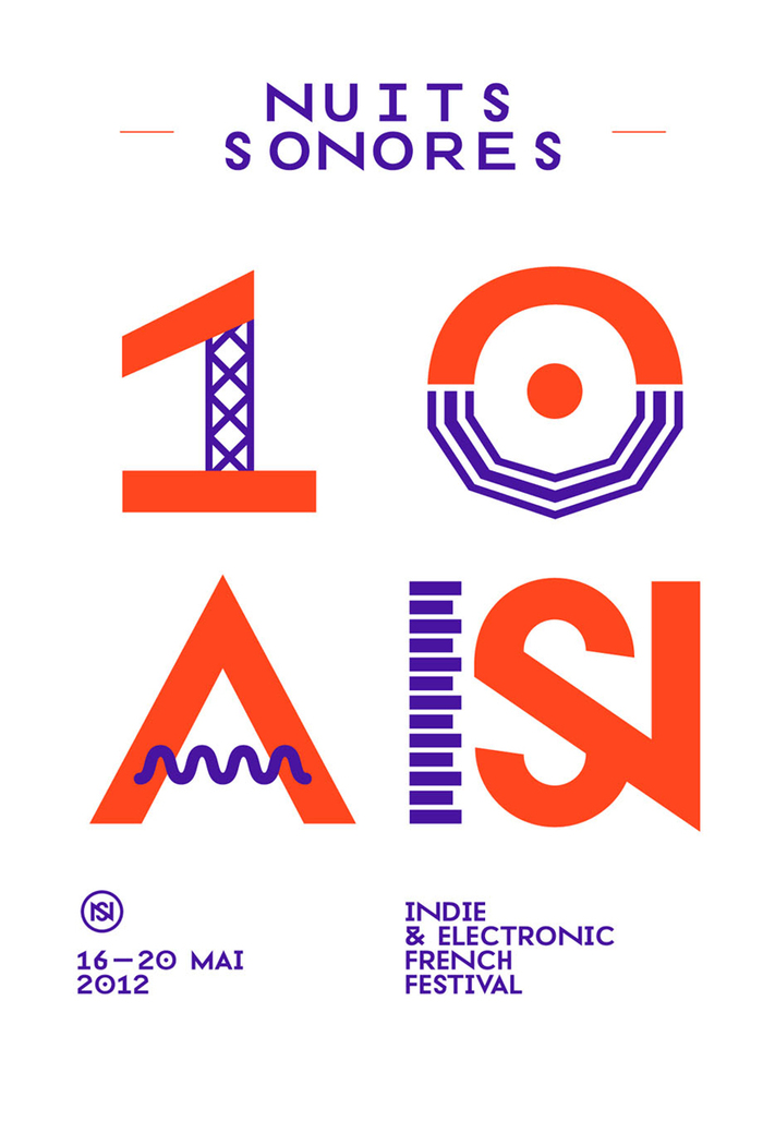
In a second step, some of the found elements – like scaffolding and cables – were incorporated in a stylized form into the typographic glyphs.
2013
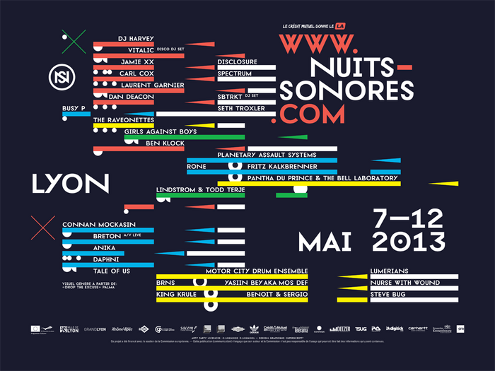
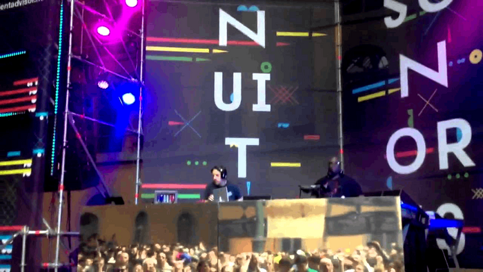
The 2013 edition took a whole different path again: this time the designers relied fully on the plain variants of their letters. The supporting thought now was a reference to interfaces of music editing software and generative design methods.
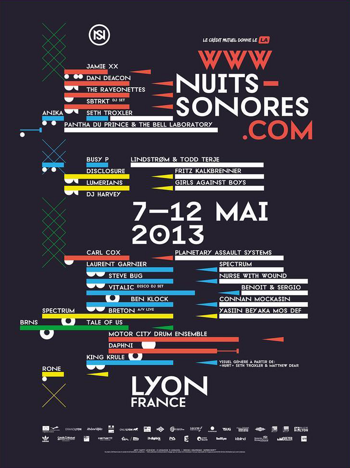
The 2013 edition plays with bars, triangles, and other geometric shapes.
NSType was released as a small family in 2016 by Production Type. It is available in a monospaced and a normal subfamily. Each comes in two styles, A and B, that offer in sum eight different variations of how exactly the letters are designed. Check them out on Production Type’s website and make sure to play around with the setting for upper- and lowercase display.
Formats
- Branding/Identity (6600)
- Posters/Flyers (4686)
Designers/Agencies
- Superscript² (4)
Tagged with
- Nuits sonores (4)
- music festivals (283)
- custom typefaces (655)
- uses by the typeface’s designer (1005)
- first use (353)
- typeface profile (82)
- identities (1593)
- logos (3838)
- initialisms/monograms (334)
- modular type (33)
- alternate glyphs (1125)
- chromatic (605)
- poster series (630)
- nightlife (52)
- wild boars (4)
- badgers (1)
- yellow and blue (162)
- programs (499)
- purple and red (25)

