

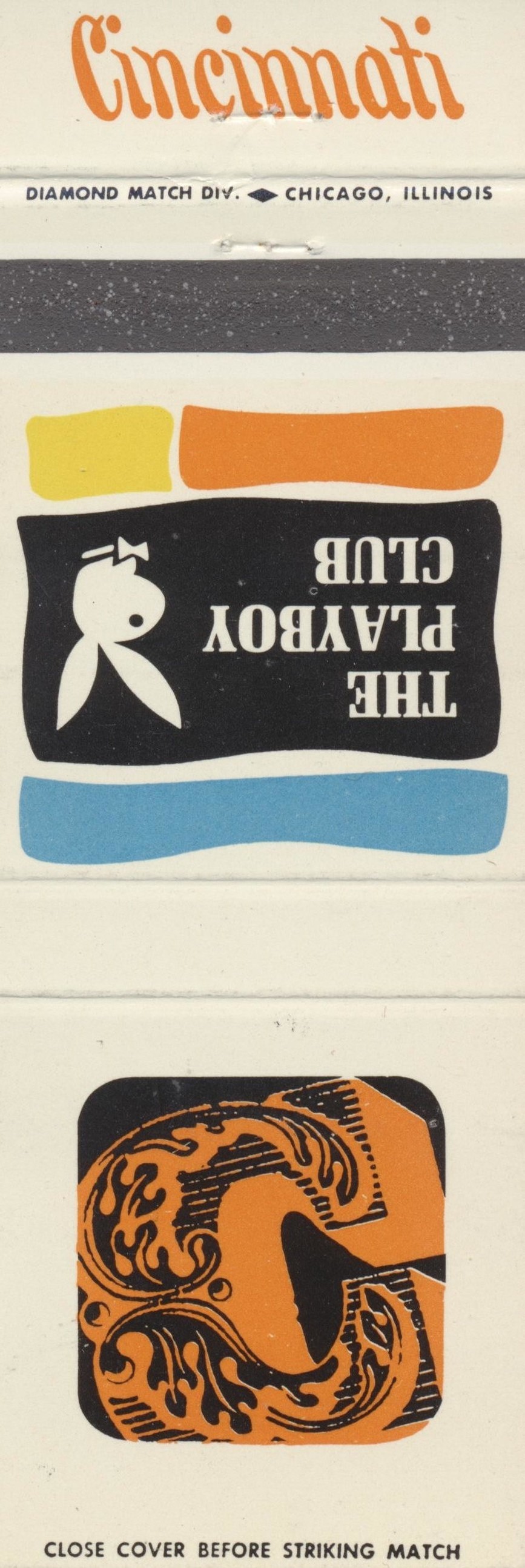
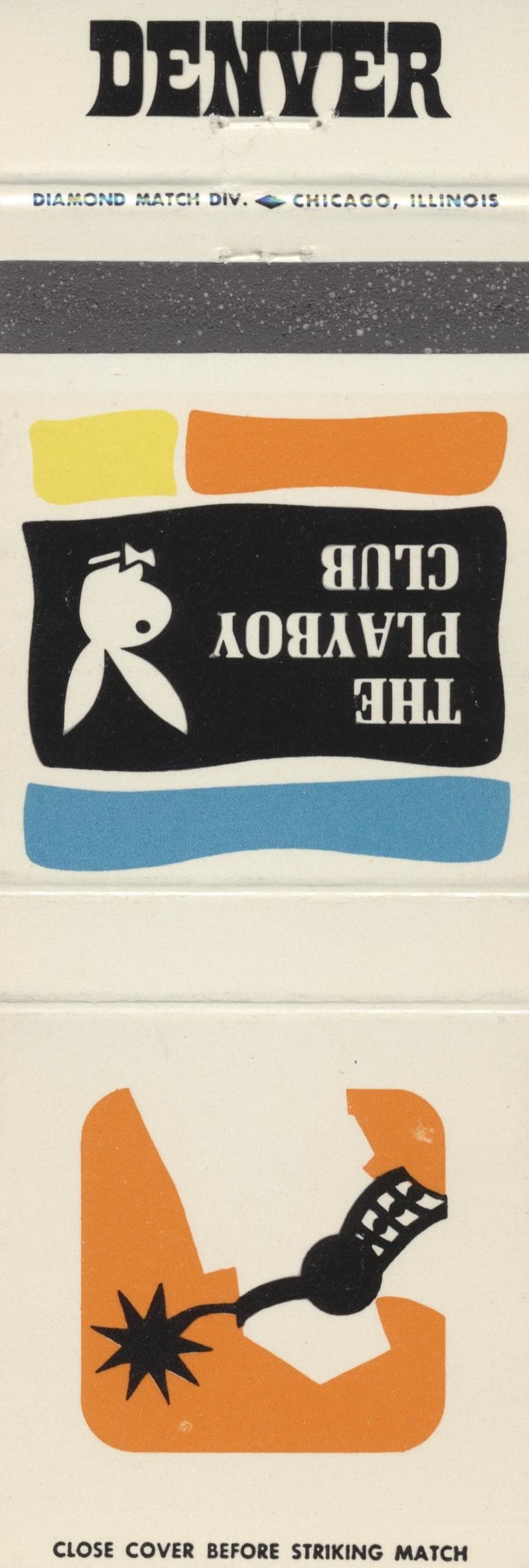
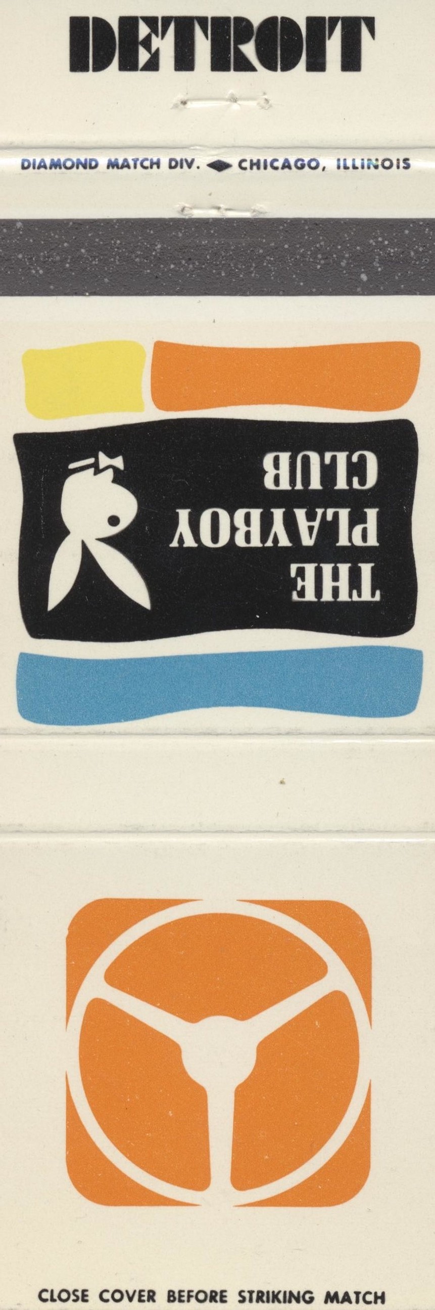
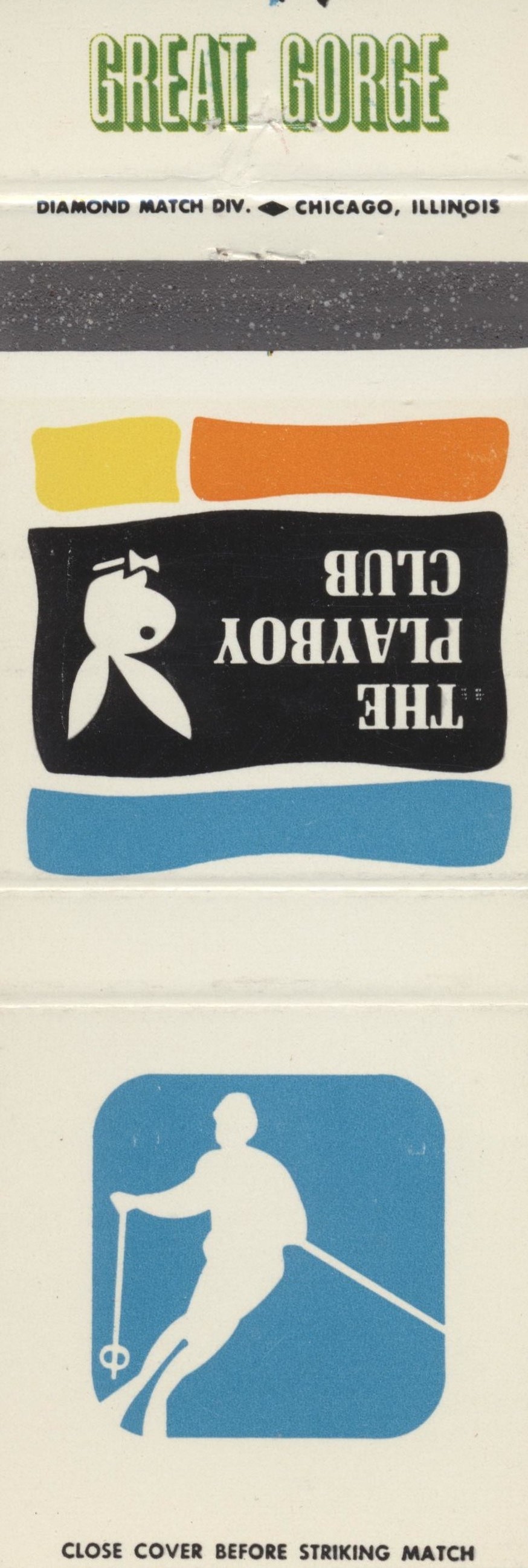
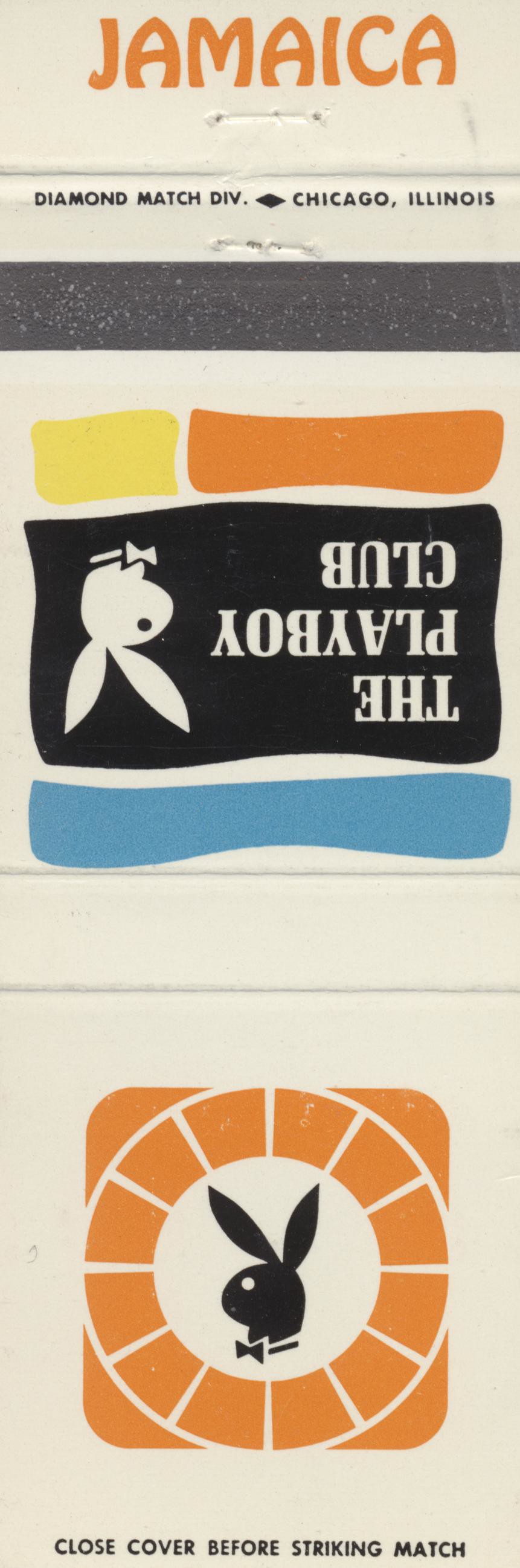
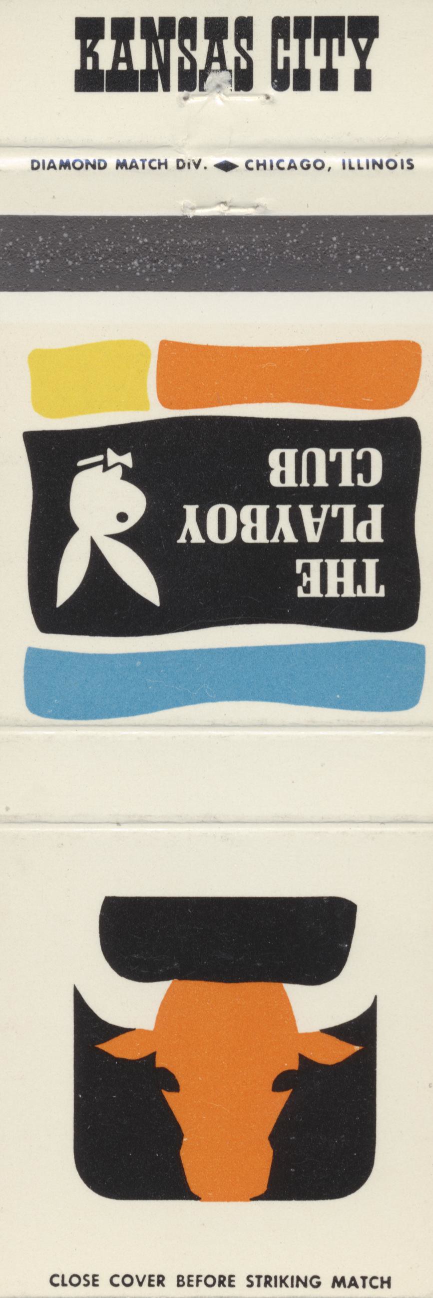
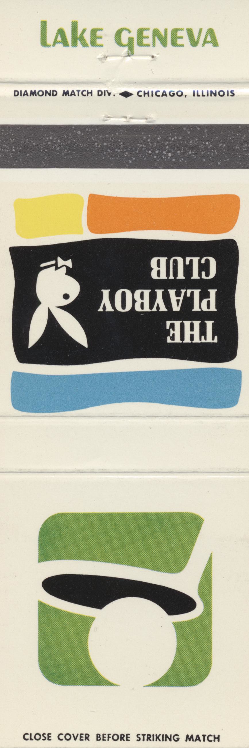
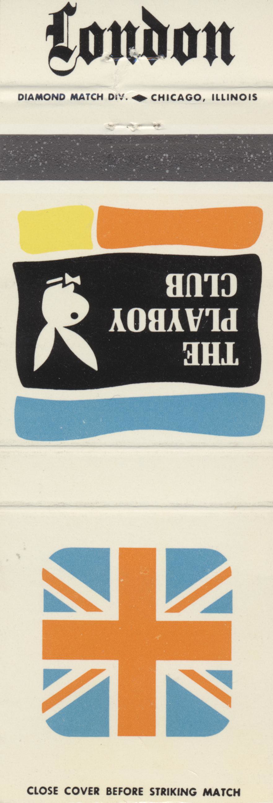
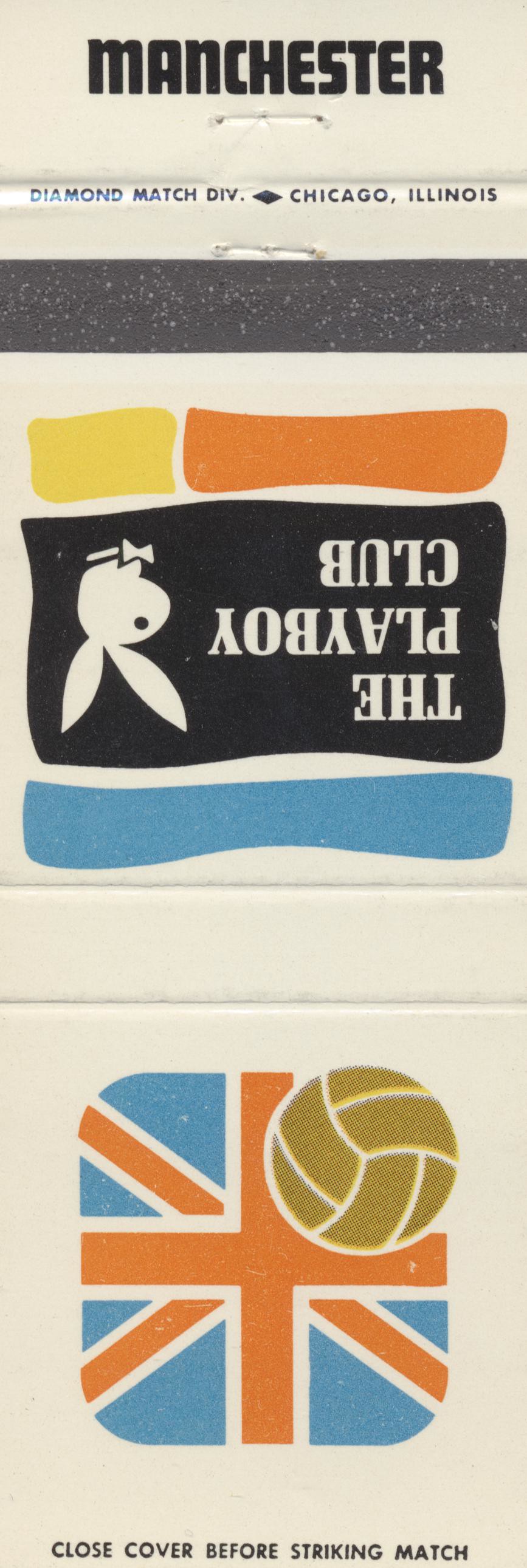
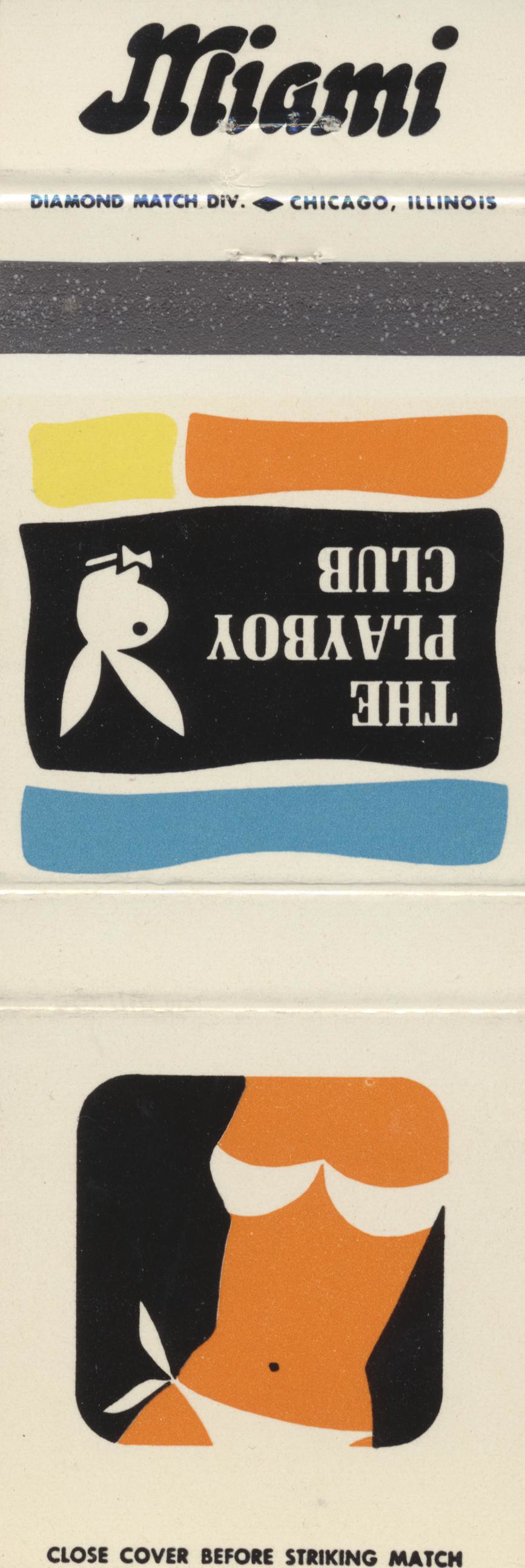
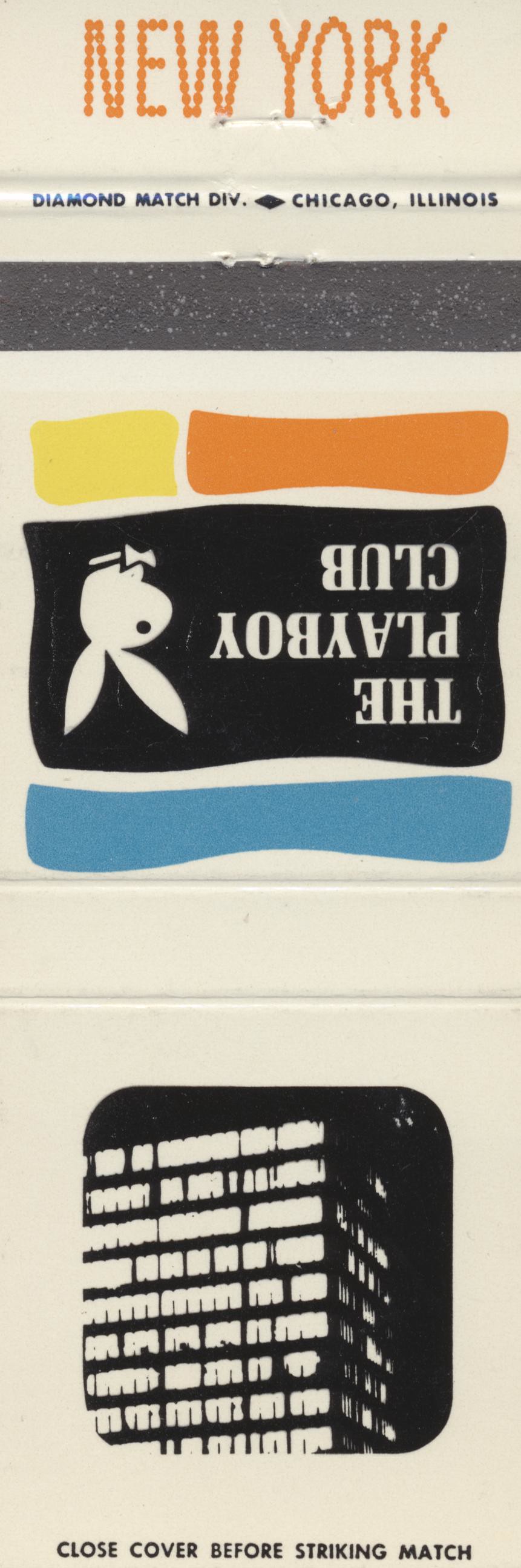
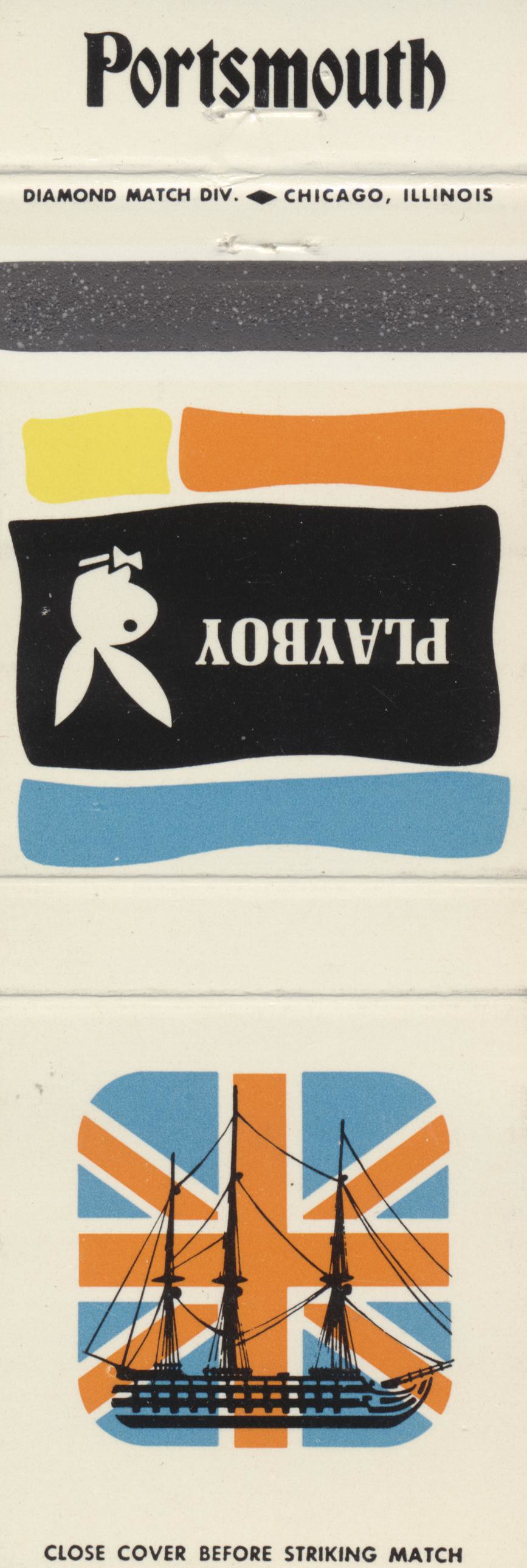
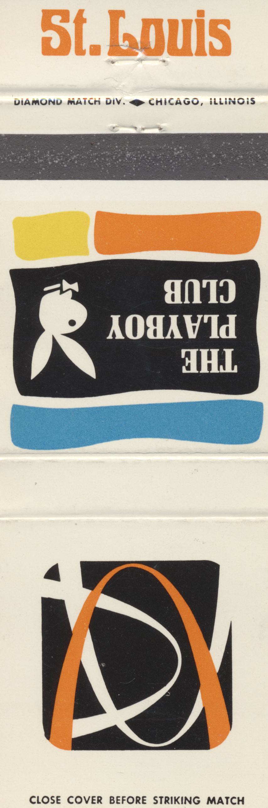
The Playboy Club city matchbook covers
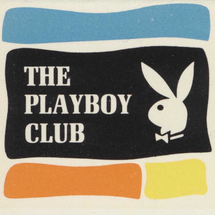
With the imminent closure of Playboy’s flagship magazine in the news, here is a set of matchbook covers for The Playboy Club, the related chain of nightclubs that have already been closed for some time.
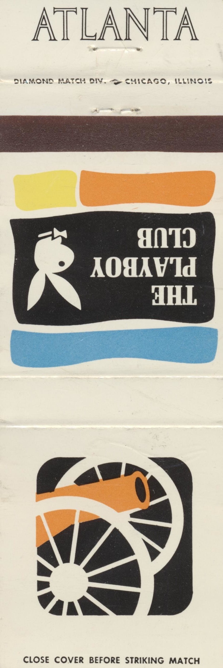
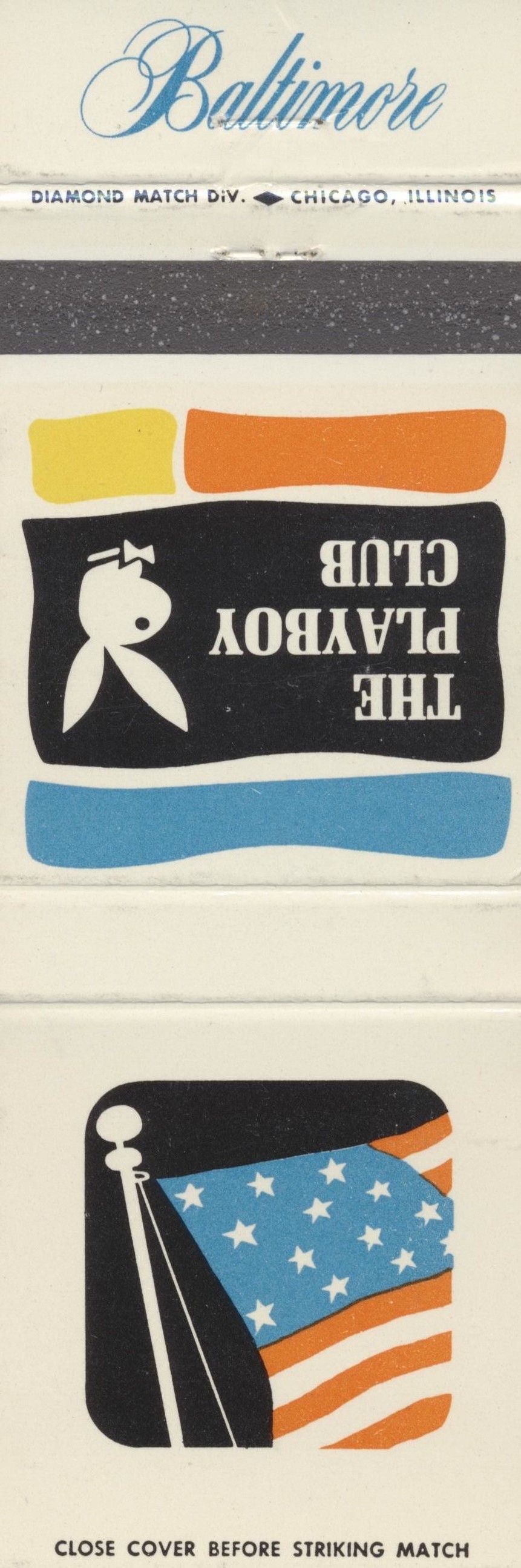
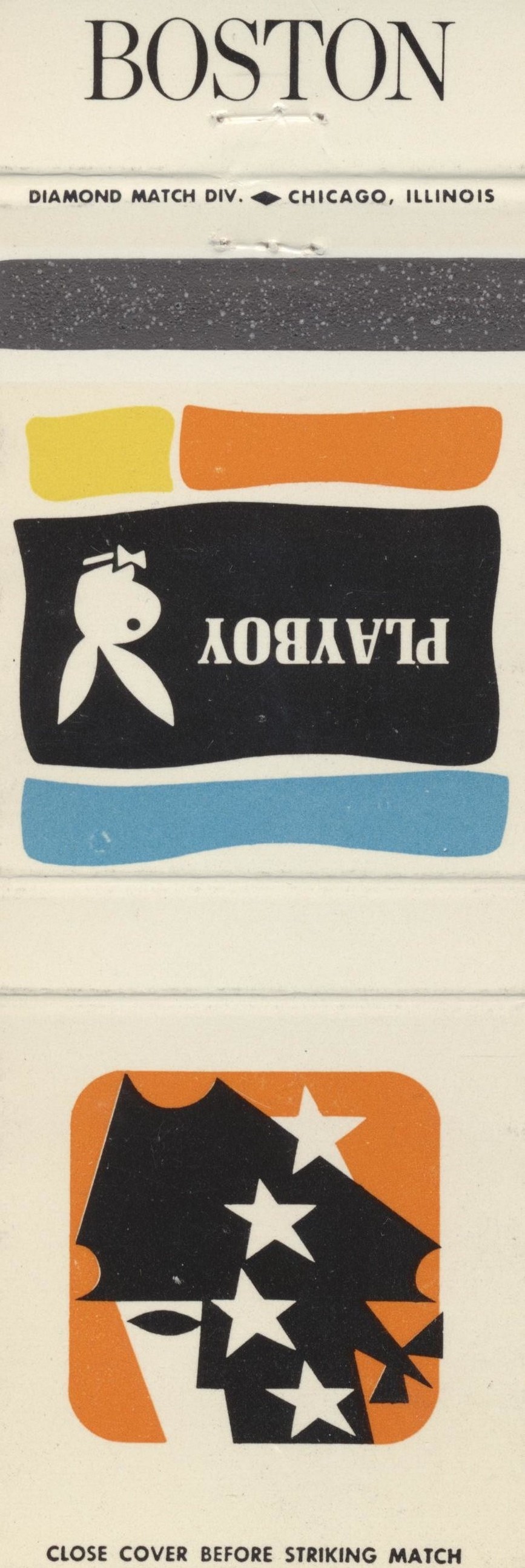
The matchbook for each club shows its related city name in a different unique typeface, including several uncommon typefaces that haven’t been recorded on Fonts In Use before. The accompanying Playboy branding uses a condensed version of Melior. All the settings appear to be from Photo-Lettering.
Assuming all the different matchbooks were printed around the same time, the opening and selling dates of the Great Gorge club – 1971 and 1981, respectively – would mean the covers are very likely from the 1970s (as if the funky design style wasn’t already enough of a clue). One could probably get a more accurate date by cross-referencing the different opening and closing dates of each club and/or the dates each typeface was available.
The matchbook images are from the excellent archive of 20th-century ephemera shared by Jordan Smith (a.k.a. Cardboard America) on Flickr.


")
")


8 Comments on “The Playboy Club city matchbook covers”
I would guess more from the earlier end of your 1971–81 range. This is partly based on the style, but also fact that they don’t feature any ITC faces. By the mid-seventies, it’s very likely there would have been at least a few in use among all of these these.
The Backhand Xenotype appears to be shown in a 1964 Morgan Press catalogue as W-372, and also in a 1966 Tri-Arts Press “Frederic Nelson Phillips collection of antique exotic ancient typefaces” as Backhand (No. 205).
Thanks, Jay! I’ve added this info to the typeface page.
I’ve put in a sample for Backhand from a 1945 book entitled Phillips’ old fashioned type book which is also shown.
The glyph set for this font has no capital letters B and Z.
Oh, that’s terrific! Thanks for the effort, Jay! I’m adding the sample from Phillips below, for easier access. So where does the B in the sample come from?
I did it by myself for example, modifying the D.
Wow, that’s dedication!
There’s a copy of the Backhand as seen in Specimens of Wood Type by Vanderburgh, Wells & Co. in New York from 1889 as Bulletin Condensed: https://bookporn.tumblr.com/post/120162716469/specimens-of-wood-type-manufactured-by