The Secret People by John Wyndham (Fawcett)
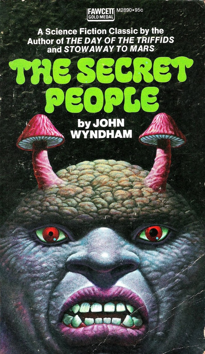
1973 paperback edition of John Wyndham’s The Secret People, a science fiction novel first published in 1935 under his early pen name, John Beynon.
The title typeface is one of the lesser known designs by Ed Benguiat. Benguiat Bravado is shown in Photo-Lettering’s 1971 catalog in two weights plus Open and Contour variants. It’s sorted in the section of Art Nouveau High Key Xenotypes, which are “influenced directly or indirectly by the amoeba or modified pear shape with a tendency, in many cases, toward emphasis on the horizontal strokes”.
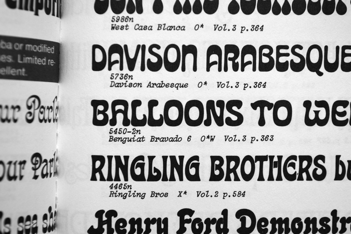
Benguiat Bravado 6 as shown in Photo-Lettering’s One Line Manual of Styles, 1971, sandwiched between Davison Arabesque and Ringling Brothers. The cover design uses the bolder Benguiat Bravado Black 10.
While Benguiat Discotheque, another face from this genre, appears to be loosely modeled after a set of capitals shown in J.M. Bergling’s Art Alphabets and Lettering (1914), I’m not aware of any historical models for Bravado. This style is to be seen in the light of the Art Nouveau revival that was still going strong in the early 1970s, and of the general interest in outlandish letterforms in pop culture at the time. Bravado didn’t see a lot of use. Chances are it was picked here for its T which resembles a mushroom. The position of the two T’s to the left and right of the title further echoes the ogre’s antennae in the illustration by Don Ivan Punchatz.
On Good Show Sir, a site dedicated to “only the worst Sci-fi/Fantasy book covers”, Phil comments:
At first I thought that this cover couldn’t possibly be appropriate for this novel. Then I read the plot summary on Wikipedia, and it seems the book is as kooky as its cover. Pygmies! Fungi! Caves!
Formats
- Books (3988)
Topics
- Literature (1910)
Designers/Agencies
Tagged with
- John Wyndham (2)
- paperbacks/softcovers (885)
- book covers (3479)
- science fiction (264)
- Fawcett Gold Medal Books (6)
- novels (347)
- monsters (40)
- mushrooms (13)
- weird (40)
- green (492)
- type/image similarity (43)
- 1970s (1109)
Artwork location
- United States (6361)

