Moonstrips Empire News
Contributed by Stephen Coles on Mar 27th, 2016. Artwork published in
.
18
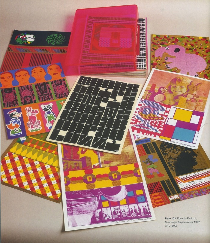
Moonstrips Empire News is a portfolio of 100 (or 98) photo-lithographs and screenprints by Sir Eduardo Paolozzi, a forerunner of British pop art. The prints are contained in a pink Perspex (acrylic) box.
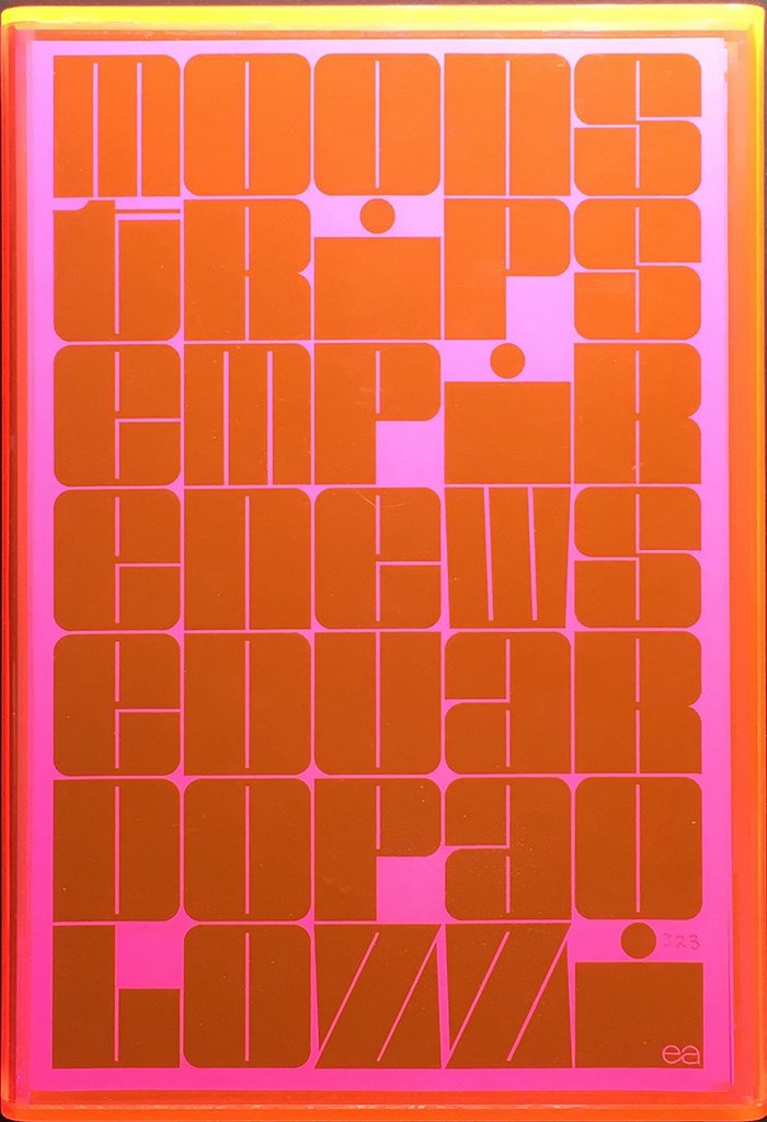
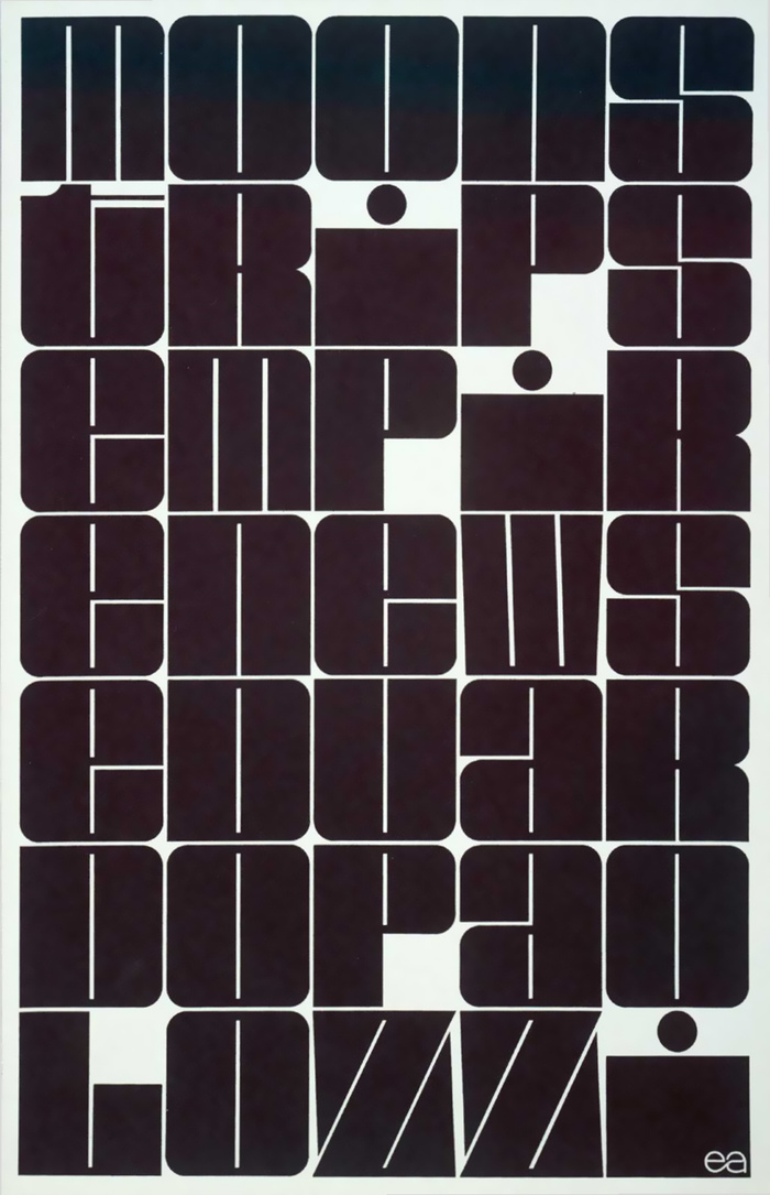
The lettering on the title page appears to be inspired by Deutsch Black (or perhaps it is the other way around, but the font was designed a year earlier, in 1966). Alterations include wider, monospaced glyphs, and a ‘t’ with more coverage.
Formats
- Art/Illustration (397)
Topics
- Art (2779)
Designers/Agencies
- Eduardo Paolozzi (1)
Tagged with
- stacked and justified (455)
- lettering derived from typeface (484)
- orange (349)
- pink (307)
- tight-not-touching (186)
- tight letterspacing (536)
- tight linespacing (204)
- screen printed (211)
- wall of type (237)
Artwork location
- United Kingdom (2155)
- Scotland (25)















3 Comments on “Moonstrips Empire News”
I am the designer of the font “Deutsch Black”. The design was a winner of the 2nd World Typeface Competion in 1965 – by the International Typeface Corporation (ITC) which was run by Aaron Burns. The face portrayed here has been altered from my “original” design… which was not influenced by Sir Palolozzi… but by the classic, Futura Black font and some design work by Herb Lubalin. Just setting the record straight.
Indeed — thanks for chiming in, Barry! Please allow me to correct a minor slip: The competition was indeed organised by Aaron Burns, but this was still in his role as consultant to the Visual Graphics Corporation (VGC). It was not before 1970 that Burns co-founded ITC.