The Sound of Harlem album art
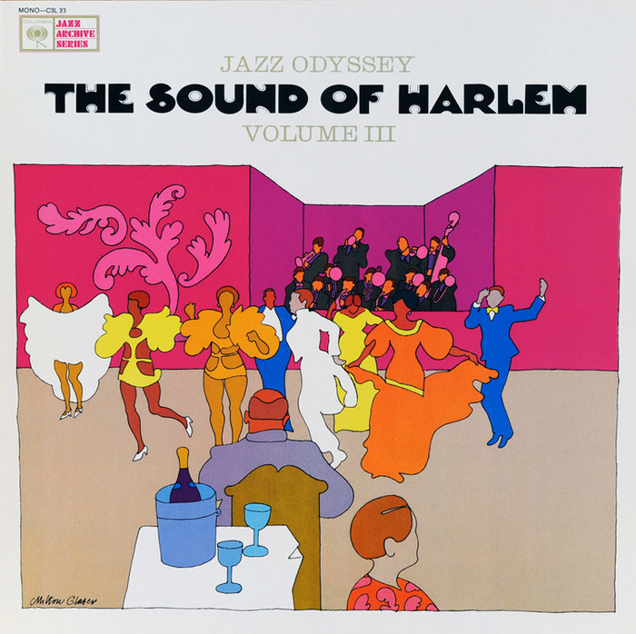
The Sound Of Harlem is the third and final volume of a series titled Jazz Odyssey. Released by Columbia Records in 1963/1964, each box set comprises three LPs and a booklet with extensive liner notes, photos, and credits.
All covers were designed by Milton Glaser. This one has the most interesting type. The title represents the earliest in-use example of Halloween that I’ve come across so far. This all-caps face is shown in the section of “pop type” inspired by the 1920s in the second volume of Photo-Lettering’s Alphabet Thesaurus from 1965. The designer is unknown. In the One Line Manual of Styles, it’s listed as “original handlettered design”. The relatively low catalog number 1694–4 suggests a design date that’s considerably earlier (1950s?) – by 1965, Photo-Lettering’s count was already in the 5000s. As far as I know, Halloween hasn’t been digitized yet. The rights to the Photo-Lettering assets lie with House Industries.

Halloween as shown in Photo-Lettering’s One Line catalog (1971).
Glaser’s Baby Teeth is similar in style, see especially the S made from two semicircles. He designed it around this time, in 1964 or 1966, depending on which source one trusts. Baby Teeth is inspired by a hand painted sign spotted in Mexico City. I’d like to believe that Glaser’s familiarity with Halloween was a minor influence, too.
The series name is set in caps from a light, low-contrast Clarendon. It’s probably Consort Light, a style that originated in metal at Stephenson Blake. Photo-Lettering carried an adaptation. The logo for Columbia’s Jazz Archive Series uses Futura Black.
Typefaces
Formats
- Album Art (2606)
Topics
- Music (3893)
Designers/Agencies
- Milton Glaser (42)
Tagged with
- album records (1562)
- Columbia Records (98)
- jazz (305)
- compilations (130)
- box sets (23)
- 1960s (498)
- illustration (868)
- colorful/multicolored (783)
- stretched type (292)
- all caps (4061)
- Roman numerals (142)
- vinyl records (2237)
Artwork location
- United States (6375)
- New York City (1706)





















3 Comments on “The Sound of Harlem album art”
Thanks to Nick for confirming that Halloween was listed already in the first volume of Photo-Lettering’s Alphabet Thesaurus from 1960! This supports my assumption that the face was drawn in the 1950s.
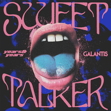
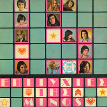
For a similar style of illustration, see also the work of Sandy Hoffman.
Jay Mellor found out that Halloween is an adaptation of an alphabet by lettering artist A. Bardi, reproduced as La Boule in Publicité Vignettes Lettres Chiffres Monogrammes et Rehauts Modernes (Les Editions Guérinet, Paris, 1931). This book was reprinted as Authentic Art Deco Alphabets by Dover Publications, 1986.