
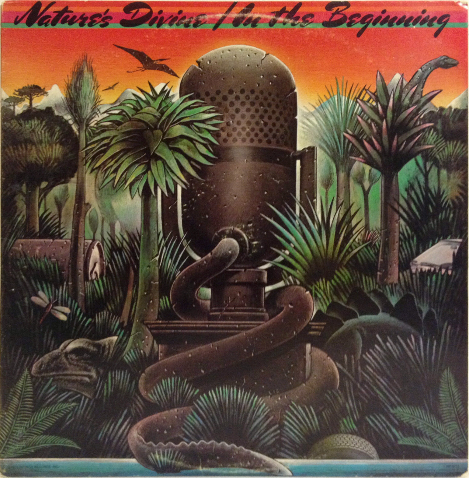
Nature’s Divine – In the Beginning album art
In 2004, Argentinian type foundry Sudtipos released Mrs Sheppards by Alejandro Paul. In the same year, Spiece Graphics issued Kolinsky Sable SG by Jim Spiece. The underlying design is much older, though: It originated with Charles P. Bluemlein (1891–1944), a lettering artist from New York, and is shown in Script and Manuscript Lettering as one of thirty-two script alphabets. This booklet was published by the Higgins Ink Company of Brooklyn in the 1940s, in order to promote their inks. From the book’s introduction (via MyFonts):
For years Mr. Bluemlein would ask friends and acquaintances for their signatures. He carefully studied the most outstanding of these seeking unusual manipulations of the pen and relationship of lines and curves which gave them character. Sometimes a single letter would be the key to a complete alphabet. Mr. Bluemlein interpreted the signatures, changed, organized and embellished them into a series of 32 script alphabets. He did this by projecting the signatures to a large size thus enabling him to pick out the character notes.
The script alphabet titled Mr. Ronald G. Sheppards was made into a typeface long before 2004: Photo-Lettering adopted it for phototypesetting. Their version is called Fourth of July, and is shown in the Alphabet Thesaurus, vol. 1 from 1960.
It’s probably this version that was used for the cover of the only album release by Nature’s Divine from 1979. The 10-member funk/soul group with roots in Detroit had a Top 10 R&B hit with “I Just Can’t Control Myself”.
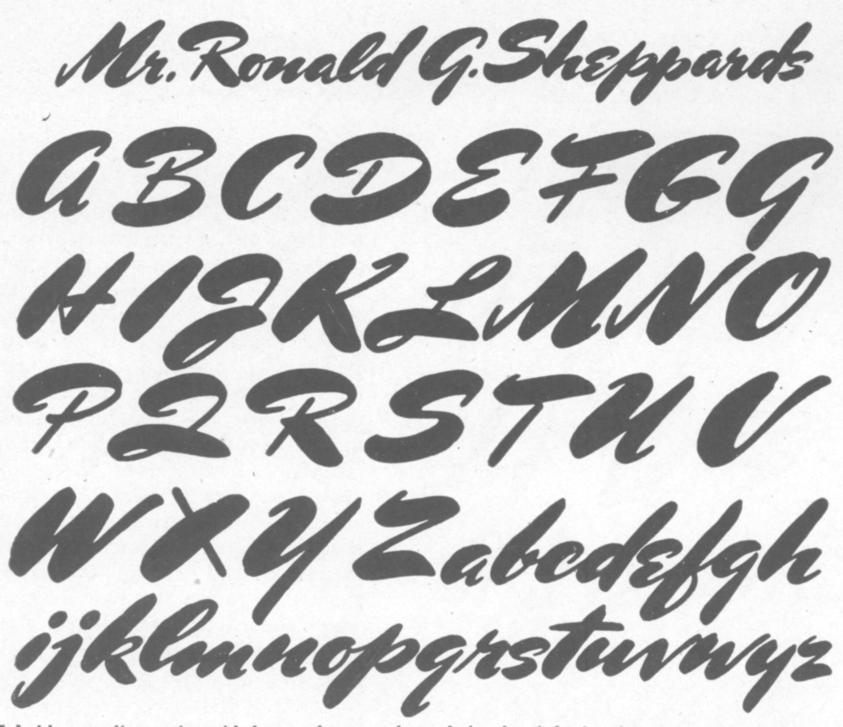
Charles Bluemlein’s script alphabet as shown in the 1944 edition of Script and Manuscript Lettering, titled Mr. Ronald G. Sheppards.
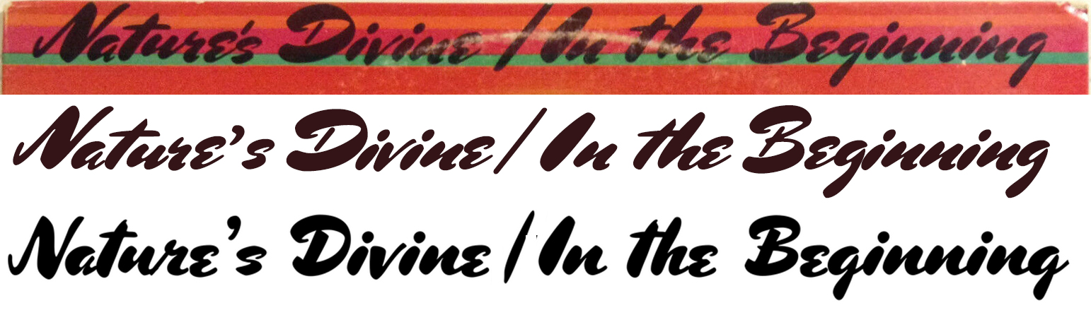
From top to bottom:
1. The album title, probably set in PLINC’s Fourth of July.
2. A resetting using Mrs Sheppards by Sudtipos. Note the curved descender in g.
3. A resetting using Kolinsky Sable Two by Spiece Graphics. This interpretation of Bluemlein’s design takes more liberties. It’s less inclined and dynamic, and has a few unconvincing connections.
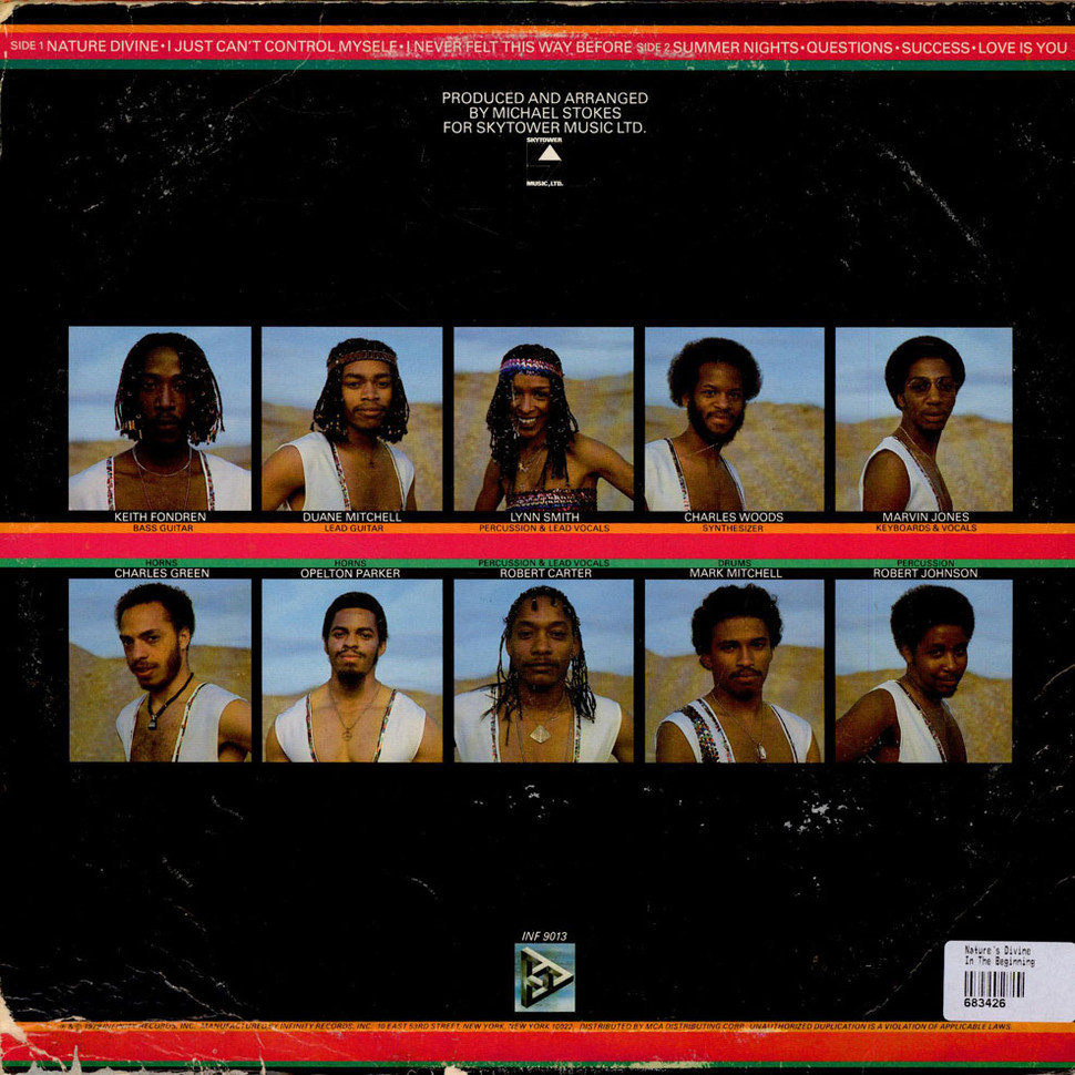
Back cover.


")

")


 playlist by cura.fm")


")

")
")


