Weyland-Yutani Corp logo and slogan in Aliens (1986)
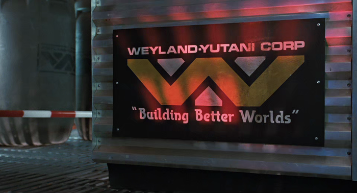
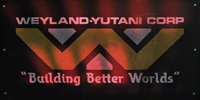
Logo and slogan of Weyland-Yutani Corp, as seen in Aliens (1986) at time stamp 17:21. The corporation plays a central role in the science fiction action film written and directed by James Cameron as the sequel to Ridley Scott’s Alien from 1979. Speculative Identities credits the original Weyland-Yutani identity from the 1979 film to John Mollo, Ridley Scott & Ron Cobb, and adds:
Weylan-Yutani is a large British/Japanese multinational conglomerate that is heavily involved in space colonization and the myriad technologies that both support and result from human expansion to the stars.
In the sequel, the logo with a pair of wings rendered in a style reminiscent of Native American art made way for a new one consisting of the entwined letters W and Y. While the wordmark uses all-caps Eurostile (or Microgramma) Bold Extended, the slogan “Building Better Worlds” is lettering derived from a typeface named Transmission.
The slogan features Transmission without the stripes, and introduces some minor changes. For example, B is made narrower and rounder, and W has straight diagonals with outward-pointing serifs (cf. City).
The horizontally striped semi slab was designed by Martin Wait and issued in 1983 in Letraset’s Letragraphica range. In 1978, Letraset had released a related typeface with solid letterforms, Company, also by Wait. Transmission is not just Company with stripes, though, but exhibits a number of differences. Some letterforms like the s/S with horizontal spine were optimized for the striped treatment. Other striking differences include the open bowls for e b d g p q, or the monocular a. In 2012, shortly before his death, Wait published a digital version of Company. His Transmission remains unavailable in digital form.
Jacob Tender, who has brought this use to my attention and kindly provided the still images, comments:
Although the Weyland Yutani logo and use of Microgramma are found throughout the movie, this is the only use of Transmission that I’ve ever noticed in the franchise.
For further reading on the typography and design of the Alien franchise, Jacob recommends the Alien edition of Dave Addey’s fantastic Typeset In The Future and several posts by film legend Ron Cobb, see Alien, Aliens, and “Alien Nostromo” – The story behind the design.
Formats
- Branding/Identity (4733)
- Film/Video (643)
Topics
- Film/TV (1219)
Designers/Agencies
- unknown (2140)
Tagged with
- Alien (franchise) (2)
- film props/set design (49)
- logos (2679)
- slogans/claims (64)
- lettering derived from typeface (479)
- sign painters’ quotes (30)
- 1980s (429)
- science fiction (262)
Artwork location
- United States (6349)


















5 Comments on “Weyland-Yutani Corp logo and slogan in Aliens (1986)”
Thank you again for your assistance in identifying this typeface. I am forever in your debt!
De nada! Thanks for giving me a good excuse to watch the Alien films again … it’s been a while.
Florian knows Portuguese!!! bem legal!!! Love Alien.. and Aliens too!
Lúcio, I’m afraid I have to disappoint you. I can add bacalhau com natas, but that’s about where my Portuguese ends already.
Great post. Typeset in the Future is truly a fantastic book, perfect for the niche intersection of Sci-Fi/Typography nerds. Dave Addey is funny and obsessive in a good way, and his journey (starting with Eurostile) makes for a real page-turner.