
Juliette Gréco – 4ème Série album art
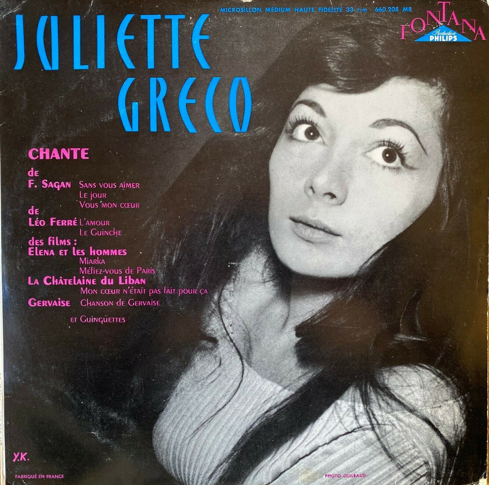
Juliette Gréco – 4ème Série (1956), front cover. The pink text is in two weights from Peignot.
The fourth album by French actress and singer Juliette Gréco was released in 1956 by Fontana Records. The cover features her name in condensed blue capitals made from straights and arches. These letterforms are taken from an alphabet design by Swiss graphic artist Walter Haettenschweiler (1933–2014), which he simply named Grotesk.
It was reproduced in the first volume of Lettera. Edited by Armin Haab and Alex Stocker, this “standard book of fine lettering” was published by Niggli in 1954. Graphic designers used Lettera as a source of inspiration, but also in a direct way, making settings from reproductions of the depicted letterforms. The showing of Haettenschweiler’s Grotesk consists of a full capital alphabet, complemented by an application of a matching lowercase.
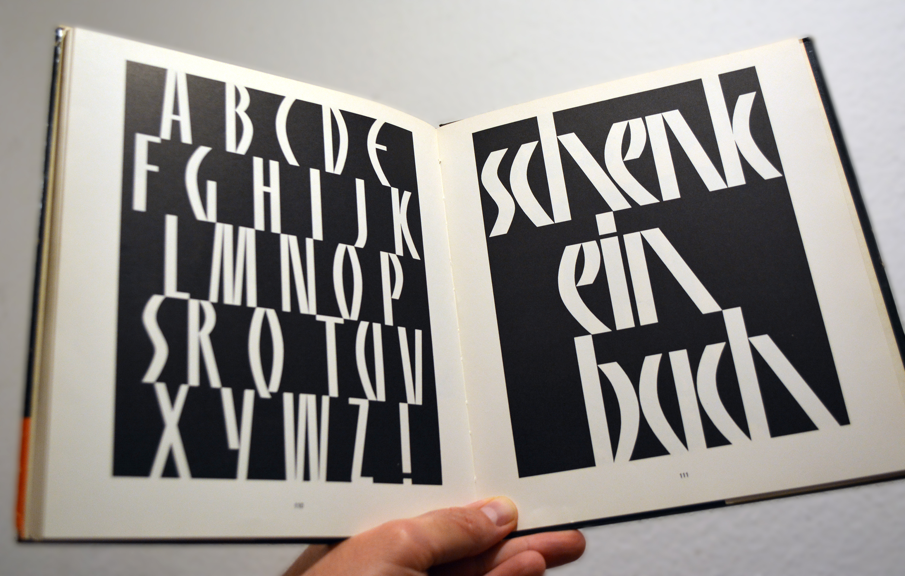
Walter Haettenschweiler’s Grotesk as shown in Lettera 1 includes a capital alphabet (A–Z plus exclamation mark) and a partial matching lowercase (“schenk ein buch”), both shown in reverse.
In the preface to the third edition, Armin Haab tells the genesis of this design, which he here refers to as Lettera-Grotesk. It goes back to a lettering style used by Pierre Gauchat (1902–1956) in 1953 for a poster advertising books. This style was further developed at the School of Applied Arts (the Kunstgewerbeschule) in Zurich, amongst others by Walter Haettenschweiler, who referenced Gauchat’s lettering in a student project. When Haab saw this work, he asked Haettenschweiler to draw a full alphabet for the projected lettering source book. “Thanks to LETTERA this type rapidly attained great popularity not only in Switzerland but also abroad.”
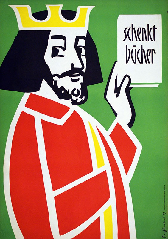
Poster design by Pierre Gauchat for the SBVV (Swiss Booksellers and Publishers Association) from 1953, titled Schenkt Bücher (“Give books”). This appears to be the poster mentioned by Haab.

Gauchat had used this style of lettering already in 1951 for a similar poster design. Note the use of a macron-like bar for the umlaut, a form that was promoted by Walter Käch, long-time teacher at the Kunstgewerbeschule.

Gauchat applied this style to capital letters, too. His seal for the City of Zürich was designed in 1953. Reproduced from Armin Tschannen / Walter Bangerter: Grafik einer Schweizer Stadt, Zürich, 1963.
With its horizontally cropped tops and bottoms, Lettera-Grotesk is similar to Kino, a typeface designed by Martin Dovey for Monotype in 1930, but more slender and less stiff. Lettera-Grotesk almost looks like the result of a modular approach; the letterforms are composed of few simple, separate strokes. In this regard, it’s also related to Banco. Thanks to its slope and the bold tapered stems of varying height, Roger Excoffon’s popular design from 1951 is much more dynamic, though.

From left to right: Kino (1930), Lettera-Grotesk (1954), Banco (1951).
A phototype adaptation of Lettera-Grotesk – very likely unauthorized – is shown as Maharaja in Dan X. Solo’s Condensed Alphabets: 100 Complete Fonts (Dover, 1986). I’m aware of two amateur digital interpretations; Panelite by Thomas E. Harvey (1993), with added numerals and a few punctuation and currency glyphs), and HFF Sultan of Swat (2010), based on Maharaja and named after the sample text used in the Solotype catalog from 1992, with a few added capital glyphs.
The French word gréco refers to Greece. I wouldn’t be surprised if Haettenschweiler’s caps were chosen for Juliette Gréco’s album cover for their archaic look, which is evocative of ancient Greek letterforms. The name in Lettera-Grotesk is set on a black-and-white photograph by Guibaud. In the bottom left corner, there are the initials “Y. K.”, which appear to be the designer’s signature. The cover was printed by F.G. Richir, Paris.
In memoriam Juliette Gréco, who died this week at the age of 93.


")


")


2 Comments on “Juliette Gréco – 4ème Série album art”
Addendum: Van Sabben Auctions show a related poster (“schenk ein buch”, gouache, 90×128 cm) and credit the design to Ernst Keller, ca. 1950. I haven’t been able to verify this claim – any insights are welcome.
Image: Van Sabben Auctions.
Ernst Keller (1891–1968) was an influential figure at the Kunstgewerbeschule Zürich, where he taught from 1918 to 1956. His students include both Pierre Gauchat and Walter Haettenschweiler (in addition to many others like Hermann Eidenbenz, Walter Herdeg, Armin Hofmann, Richard Paul Lohse, Gérard Miedinger, Josef Müller-Brockmann, or Jean Widmer). Triest Verlag has recently published a monograph about Keller, titled No Style.
Keller did design a poster for the Swiss Association of Booksellers in 1948, and he used a related style for an undated piece of lettering. See also the Münchener Kalender created by Doris Matter in Keller’s class in 1939.
The dust jacket and spine lettering for a ca. 1960 edition of Thomas Mann’s Buddenbrooks by G.B. Fischer uses a related style. I’d assume it’s inspired by Lettera Grotesk, with a custom lowercase that’s lighter and narrower, including an n that has no splayed leg but the same form as u, and a k with straight legs. The jacket is signed “wdz”, which might stand for Wolf Dieter Zimmermann, a graphic designer active in the mid 20th century in Düsseldorf, Germany.