
Woodstock (1969) poster
The official poster for the Woodstock festival was designed by Arnold H. Skolnick (February 25, 1937, Brooklyn, New York). He is an American graphic artist and book publisher.
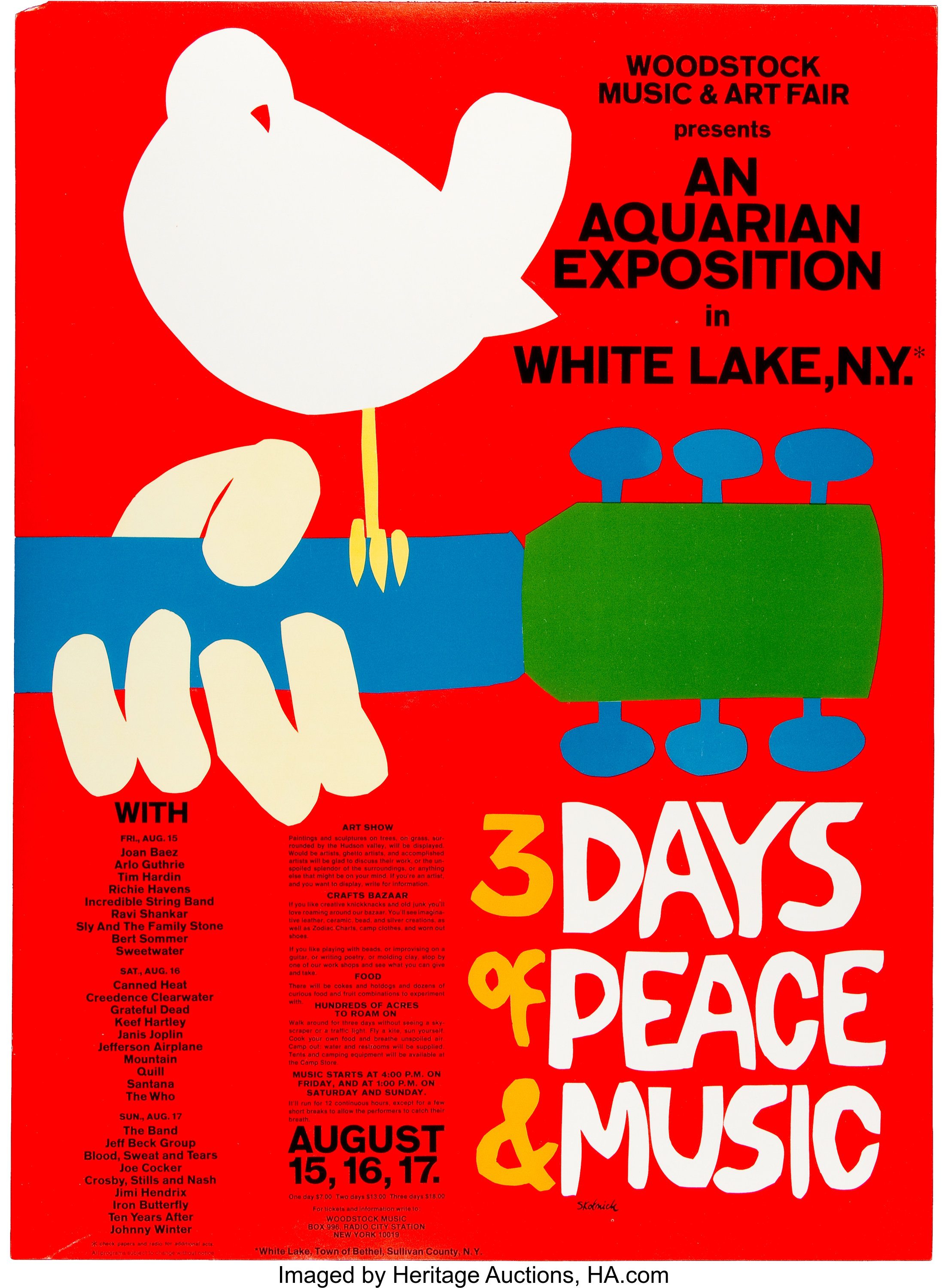
Skolnick was approached on very short note, and received only little information about the festival. He had a mere three days to complete the job. From an interview conducted by John Voci in 2019: “[Woodstock’s organizer] said, ‘We’re going to have a festival with arts and crafts and music,’” Skolnick said. “And I turned it around to say ‘three days of peace and music.’ So, it started with the words.”
It was the era of elaborately designed posters for rock concerts. “Everybody was doing psychedelic posters, which I think are awful,” he said. “A poster is supposed to be so simple that if you’re driving by slowly in a car, you can see it.”
Skolnick’s straightforward design features a white catbird perched on the neck of an acoustic guitar. While “3 Days of Peace & Music” is custom made, with letterforms that were cut out and pasted (just like the illustration), all other text is set in Akzidenz-Grotesk. This typeface was known in the United States under the name Standard. “An Aquarian Exposition” and other large elements use Standard Bold.
Skolnick received one royalty check of about $15 for his work.


")


 fictional book covers")


