
Gandalf magazine covers

Gandalf 7, vol. 2, 1965
via @BooksLoveLiza
The alternative culture magazine Gandalf that was published between 1964 and 1971 played a taboo-breaking role in the Netherlands. — nl.wikipedia.org
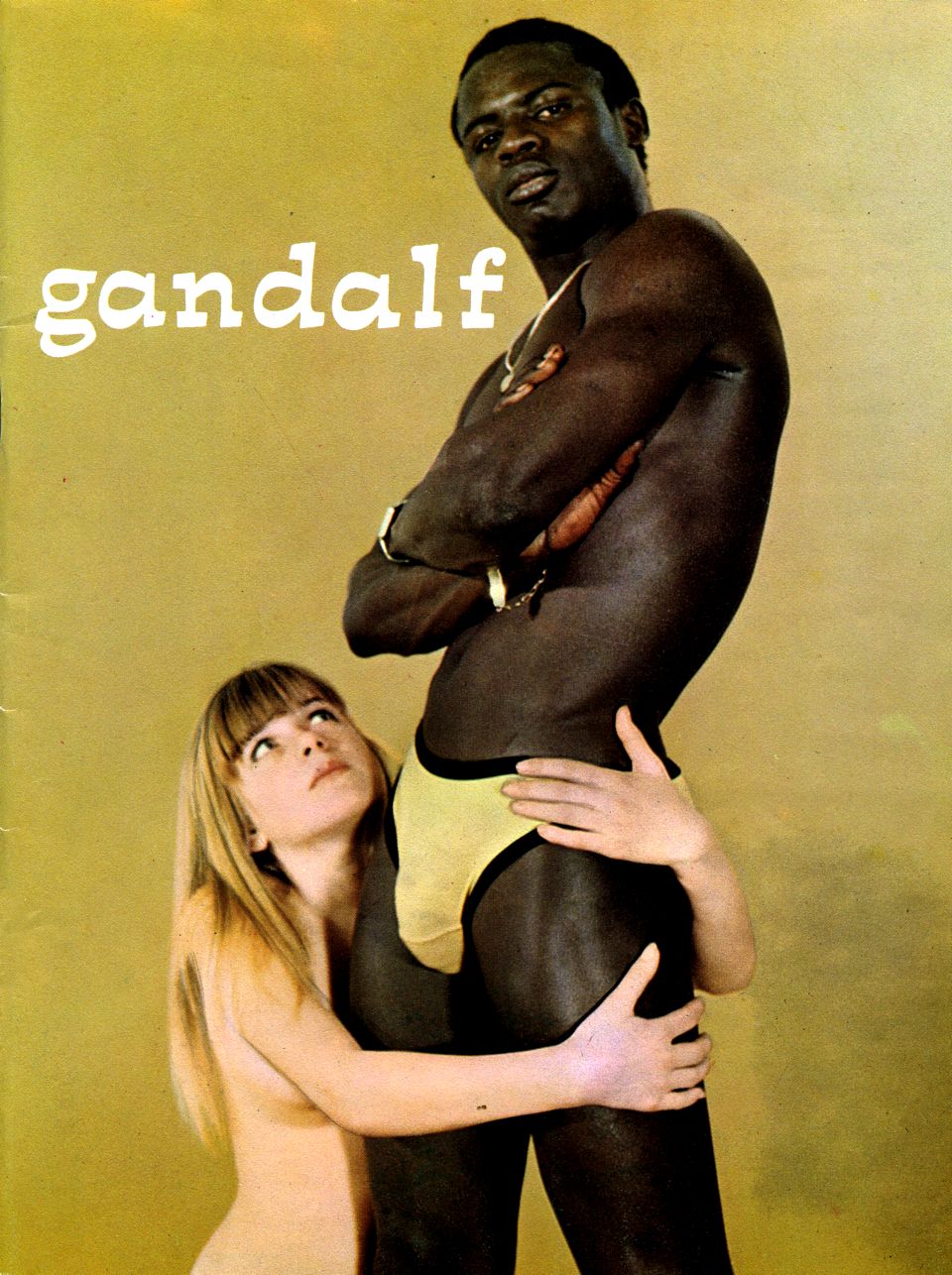
It was not that easy anymore in the more liberal sixties, but Gandalf still succeeded [to provoke] in 1968: the magazine was convicted of publishing images that were offensive to public decency. It was about obscene nude photos, but in addition to that, a fiercely satirical, anti-establishment attitude of the magazine played a role, too. Especially royals, politicians and priests got theirs. Sacred cows were happily killed and the good taste was firmly put to the test. Publisher Guus Dijkhuizen characterized his magazine as “sexatiric”. — kb.nl
The cover typeface on the first eight issues is some unadorned bold condensed Helvetica. Most of the Gandalf covers feature Novarese’s funky Italienne Estro. This anarchically spaced nameplate lasted for five years and thirty-eight issues. In 1970, it was replaced by another typeface by Aldo Novarese: Eurostile Bold Extended. The covers of the last issues from the year after don’t use type, but rather some dilettante lettering.
Almost all of the 58 covers can be found on Het Verzameloord. As you may expect, most of them are not safe for work.
Gandalf 43, vol. 7, 1970

Gandalf 47, vol. 7, 1970


")


