

étapes: 219
Contributed by TypeTogether on Nov 6th, 2014. Artwork published in
.
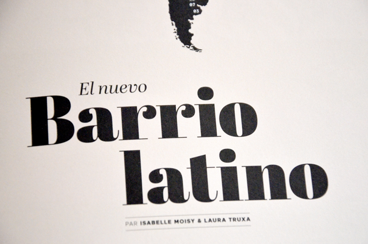
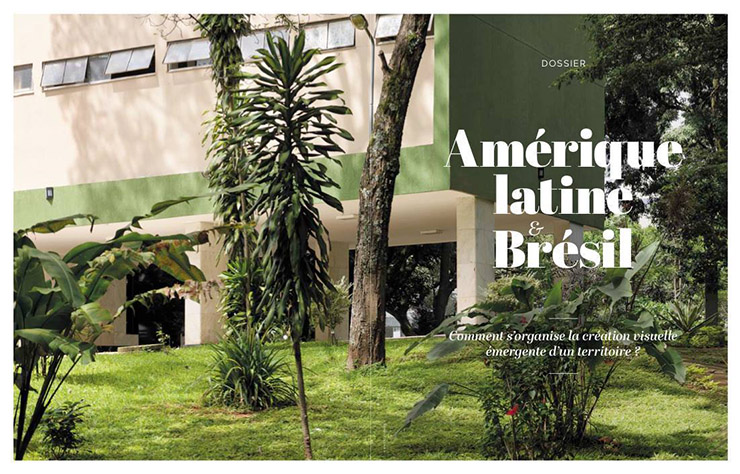
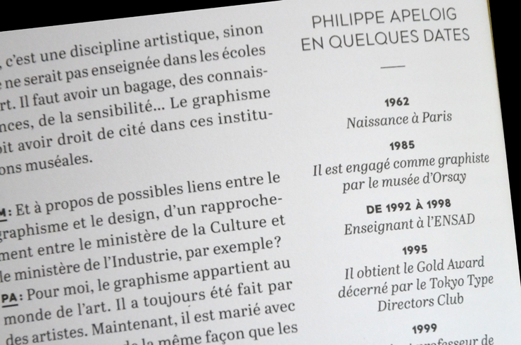
The month before the 2014 World Cup held in Brazil, French magazine étapes: published a special issue devoted to Latin American graphic and type design.
Abril Text and Abril Display, accompanied by a sans serif, were used to set the texts and headlines throughout this special issue, creating a warm texture on the coated paper. The display weights also give a touch of elegance to this one-off publication.
Source: type-together.com License: All Rights Reserved.

Source: type-together.com Photo: TypeTogether. http://type-together.com/index.php?action=portal/viewContent&cntId_content=3237. License: All Rights Reserved.


")


4 Comments on “étapes: 219”
Wait, is that Brandon Grotesque?
No, cf. ‘M’, among other things. Also note that the sans-serif in the fifth image is a different one.
the Grotesk: it is Maax from Damien Gautier.
Right you are! Thanks, Jakob. Maax is quite a chameleon. With its various stylistic sets, it can take on a number of different appearances. “Amérique Latine” in image 5 appears to be set in Set 1, while the dates in image 4 show the forms of Set 2.