Spora Health
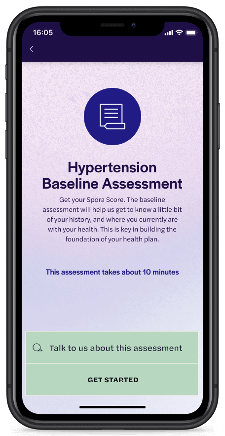
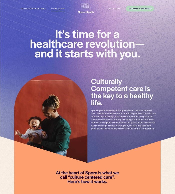
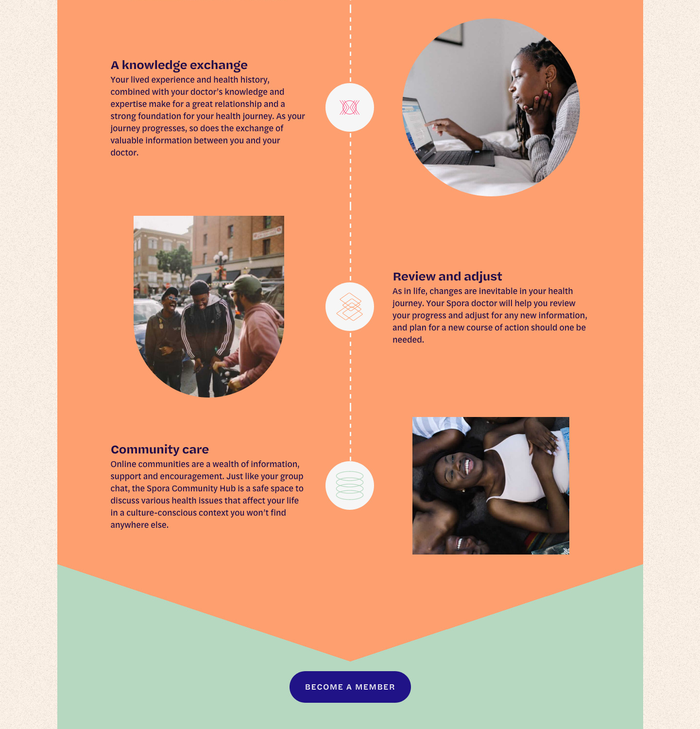
Spora Health has chosen Halyard as the typeface for their visual identity. The culture-centered healthcare provider makes use of all three subfamilies from the Grotesque Sans by Darden Studio, for the website, the mobile app, and other communication.
The startup that has set out to “redefine healthcare for the future” finds innovative ways also for working with optical sizes in their brand typography. While Halyard’s Display and Text styles are employed conventionally – the former for headings and other large type, the latter for body copy – Spora brings out Halyard Micro as their secret weapon whenever its extra crispness is called for. This applies to all navigational items, from header and footer menus to tags and button labels, which are rendered in tracked-out caps for superb legibility. Halyard Micro also serves for items that aren’t small at all, though: Especially on their social media channels, Spora relies on the Bold Italic style and the numerals for text slides. Here its pinched joins allow the typeface to exert a second function as attention-grabbing display prodigy.
Typefaces
Formats
- Web (3288)
- Branding/Identity (4753)
- Mobile (309)
Topics
- Health/Fitness (518)
Designers/Agencies
- Spora Health (1)
Tagged with
- healthcare (32)
- African American (91)
- People of Color (POC) (11)
- identities (814)
- logos (2687)
- websites (1353)
- apps (102)
- optical sizes (212)
- social media (271)
- startups (71)
- menus (UI) (158)
- buttons (UI) (67)
- type series (608)
Artwork location
- United States (6365)
- Virginia (19)


