
Dan Burrows portfolio website
Dan Burrows is a graphic designer based in Canterbury, England, with an interest in working with luxury brands. He specializes in user interface design and is avowedly “passionate about typography, identity, technology and Art Direction”.
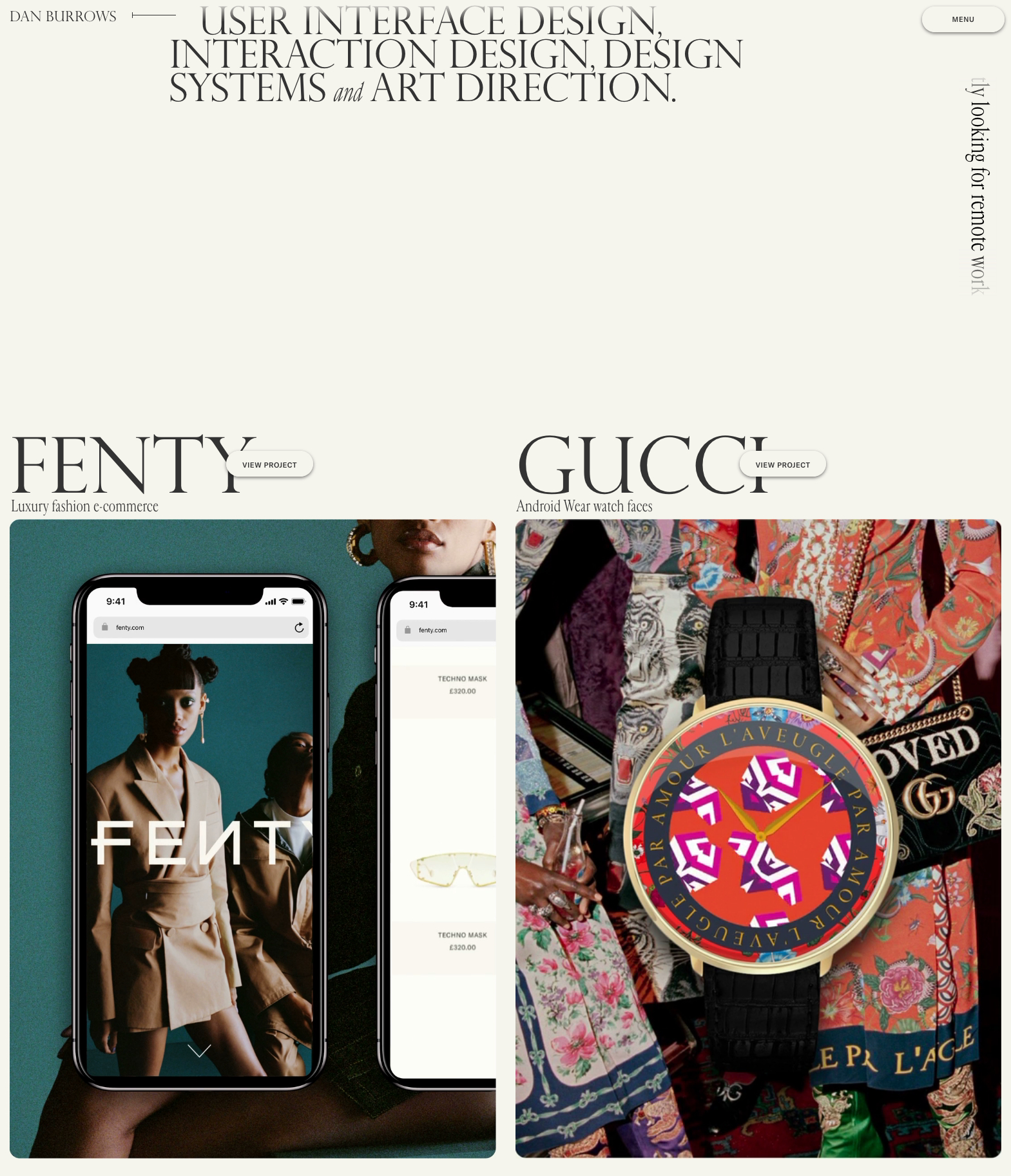
For his own portfolio website, Burrows skillfully paired premium images with text shown in contrasting sizes, enhanced with subtle gradient and shadow effects, and presented with generous amounts of white space. He composed a palette consisting of three different typefaces. The majestic caps of Perpetua Titling Light (Monotype, 1937) serve for titles and also for the text on the About and Contact pages.
In the intro text at the top of the page, Perpetua is interrupted by the cheeky italics from Cardinal Fruit (Production Type, 2018). The roman is specified for subtitles, project descriptions and meta data, and also appears for the rotated ticker text on the homepage. With its condensed proportions, Cardinal Fruit recalls computer advertisements from the 1980s, an association that is supported by the beige background color. While Perpetua’s role is to catch the eye and make an impression, the stylistically related but more approachable Cardinal takes over to lead the conversation.
The triple is completed by GT America (Grilli Type, 2016). Burrows uses the workhorse sans in slightly tracked caps, for labels and button text. Technically there’s a fourth typeface at play: since Perpetua Titling lacks characters like the at sign (@) and the copyright symbol (©), these are provided by a generic serif from the available system fonts (Times for the shown images).


")


")


")


")
")
