An independent archive of typography.
Made possible by sponsors like Mark Simonson.
Sign in to participate.
Topics▼ |
Formats▼ |
Typefaces▼ |




















3 Comments on “Dear Barber social media ads”
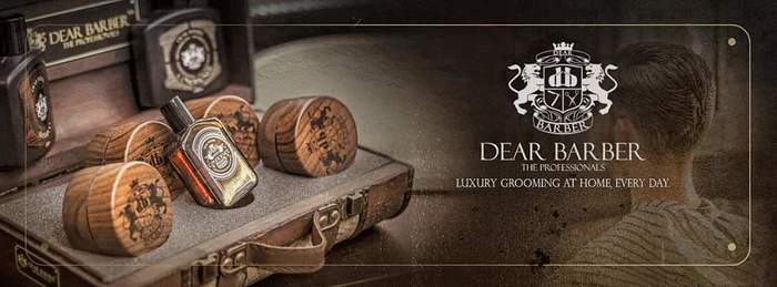
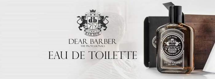
That’s an awkward combination. Felix and Perpetua Titling are way too similar to go together well. This looks like Felix wasn’t available and got replaced with the next best thing at hand.
Also, such lines in titling caps aks for a more airy spacing, and probably also some manual adjustments. Since you can’t do anything about the long tail in ‘R’ and the gap it causes, this detail will determine the overall spacing. There is more than one way to approach this, and the concrete solution also depends on factors like size or color, but here’s a quick demo: default (top), tracked and adjusted (bottom).
My own thought is that “The Professionals” is getting awfully small to use a font so skeletal font as Felix Titling in white-on-black. I don’t have numbers for Felix Titling, but Monotype didn’t make a metal type version of Perpetua Titling Light below 14pt, nor in bold below 10. And metal type is more forgiving at small size than digital because it has ink spread.
This is why many brands these days seem to use wide sans-serifs like Gotham or Druk Text Wide for smaller print, of course. Joanna might be fitting in this case, as well.
@Florian Perpetua is used as the option Felix was not available at that time. Please remember that the logo (Dear Barber + The Professionals) with the spacing choice was already developed as it is the brand and trademarked and can not be change.
@Blythwood Please take into consideration that it is part of the logo that is trademarked as it is. Also, the ads need to show well on mobile phone (different displays). At this size, it is well cropped and visible as seen in tests.