
The Sunday Times posters
Contributed by Tânia Raposo on Jun 21st, 2013. Artwork published in
.
Source: vintageposterblog.com License: All Rights Reserved.
Patrick Tilley replied to a post that Quad Royal made about his posters. Here is a bit more history behind them:
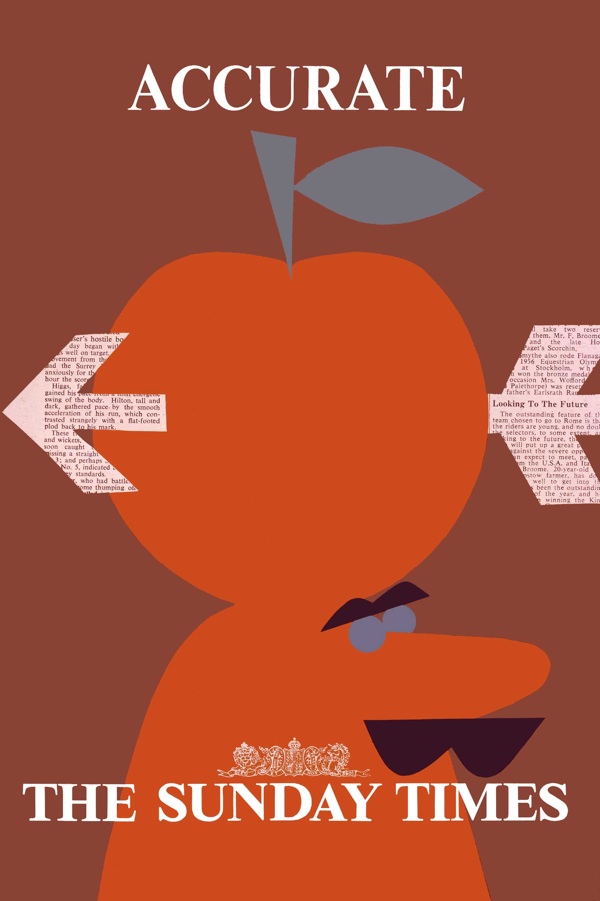
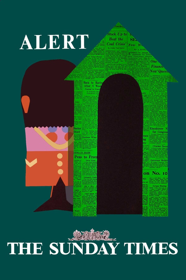
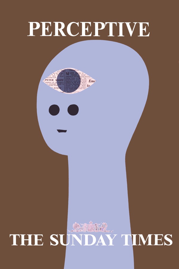
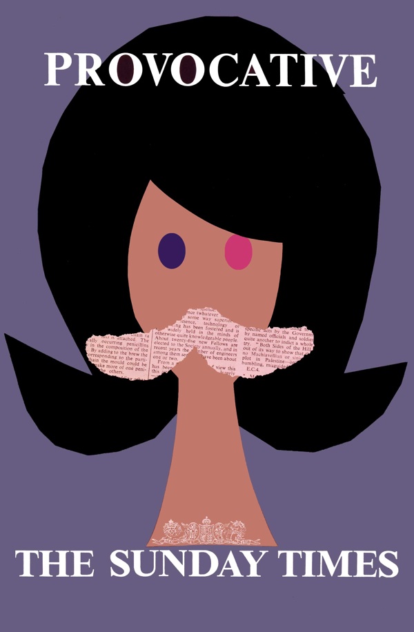
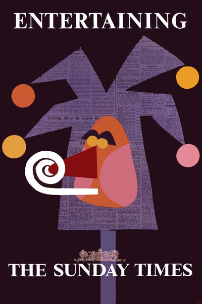
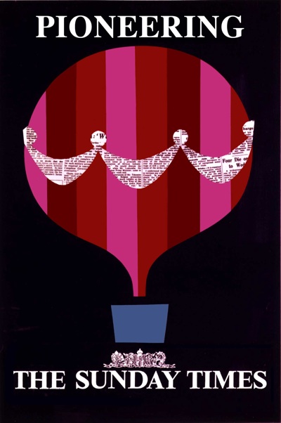
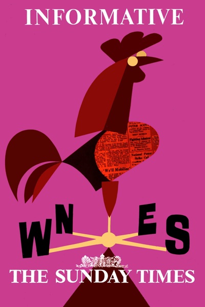
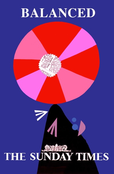
BBDO — the agency — commissioned me to design one poster using the line “You are more interesting to know when you read The Sunday Times”.
I thought this was a bit of a mouthful so came up with the idea of illustrating a desirable quality possessed by the newspaper and its readers and offered six roughs which were all commissioned.
They were reduced to their simplest form and made with cut out paper. BBDO won a prize. My name was removed from the printed versions. But they made quite an impact at the time.
The last six posters were commissioned but never used.
Source: vintageposterblog.com License: All Rights Reserved.
Source: vintageposterblog.com License: All Rights Reserved.
Source: vintageposterblog.com License: All Rights Reserved.
Source: vintageposterblog.com License: All Rights Reserved.
Source: vintageposterblog.com License: All Rights Reserved.

Source: vintageposterblog.com License: All Rights Reserved.

Source: vintageposterblog.com License: All Rights Reserved.
Source: vintageposterblog.com License: All Rights Reserved.

Source: vintageposterblog.com License: All Rights Reserved.
Source: vintageposterblog.com License: All Rights Reserved.


")


")


1 Comment on “The Sunday Times posters”
Very nice. Worth noting, incidentally, that the Sunday Times was at this time a totally separate newspaper to the Times (they merged in 1966, but still remain operationally independent – this is quite common in the UK for Sunday newspapers).
In fact, at this time the Sunday Times actually didn’t generally use Times New Roman - they used Intertype Royal (or at least they did by 1970, according to a paper on the topic by Allen Hutt). This was similar to Linotype’s “Legibility Group” Ionic faces of the 20s and 30s.
This picture of a 1962 edition shows they were using rather an odd mixture of fonts and capitalisations – and underlining too in some headings.