Sega logo (1976–present)
What does the video game manufacturer have in common with CNN? Both companies’ marks started with a typeface by Japanese designer Teruoki Yagi.

The Sega logo used since 1976, in its official color for the Japanese market.
Sega was founded by American businessmen Martin Bromley and Richard Stewart as Nihon Goraku Bussan on June 3, 1960. The name is derived from the first two letters of each word in its predecessor’s name, Service Games of Japan.
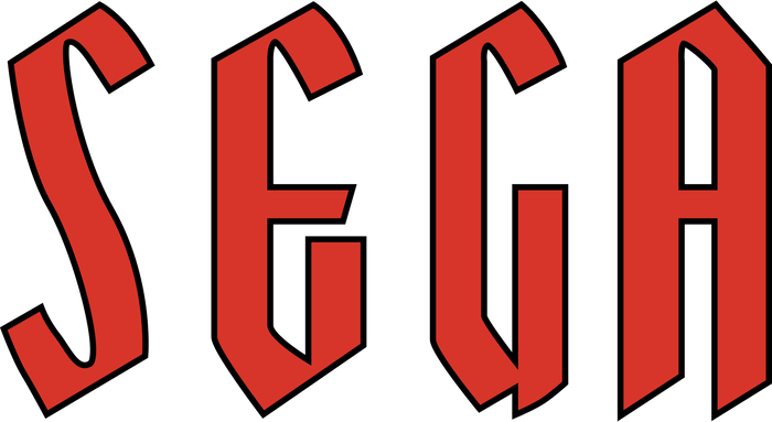
According to enthusiast wiki site, Sega Retro, Sega’s first standardized logo — a hand-drawn simplified blackletter — came into use in the late 1950s. While the exact date of its creation is unknown, early examples of its use include the Mini-Sega slot machine (thought to be released in 1958) and the Sega 1000 jukebox from 1960.
In 1976, the company switched to the higher tech logo that we recognize today. The letters — while all customized to some degree — are clearly based on Yagi Double, a typeface by Japanese designer Teruoki Yagi which was widely available from phototype suppliers by that time.
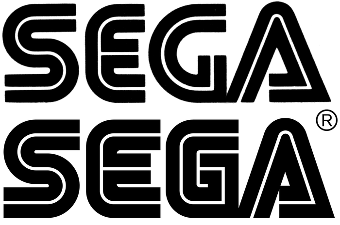
Yagi Double (Solotype specimen) compared with the Sega logo.
The logo designer (whose identity is apparently unknown) started with the standard S and alternate A from the font, widened the E to regularize the proportions with the other letters, and created a new G that reflects the flat-sided shape of the E. The lines are slightly heavier than Yagi Double’s, as well. In its first few years, the logo underwent other modifications, such as a narrower A, but has otherwise remained unchanged since the 1980s — except for the addition of optical size variations shown below.

The SG-1000, Sega’s first video game console, introduced in 1983.
After entering the game console market, for which the brand became internationally known, the logo was seen almost exclusively in blue. Sega Retro reports that Sega designates two official colors for its logos; “Sega Blue” (#008dd0) for Japan, and a darker blue (#0060a8) for international markets, including North America, Europe, etc. That said, the tint and hue varies due to the constraints of screen displays or printing — or simply a failure to follow the corporate style guidelines.
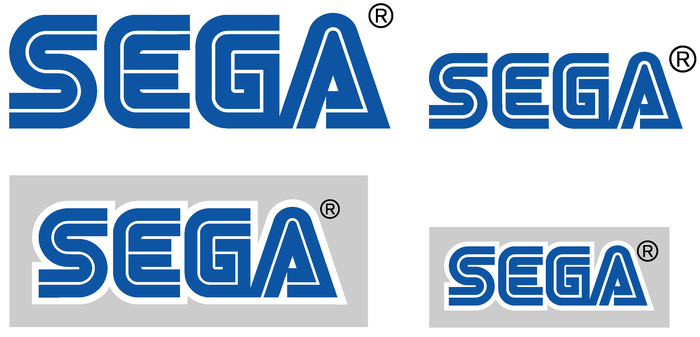
Two Sega logo variations: for uses over 7mm high (left), and for uses under 7mm high and screen printing (right). The heavier inline on the second option retains the correct optical appearance when printed ink might otherwise eliminate the inline. Unfortunately, the compensations don’t take into account other interior spaces, such as the counters between strokes and the triangle of the ‘A’.
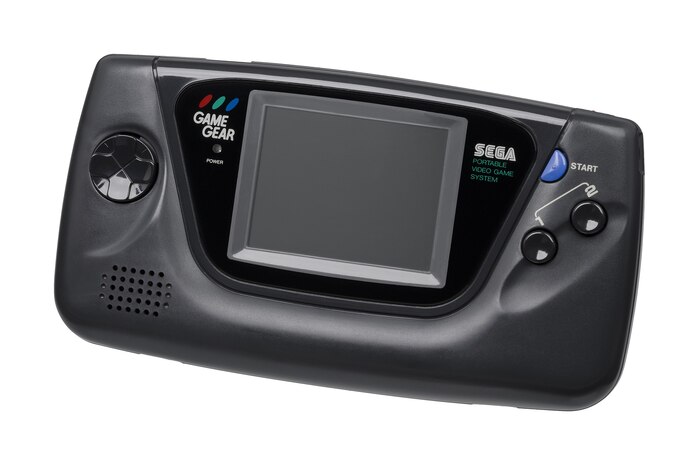
The Game Gear, a handheld video game system created by Sega and first released in 1990 demonstrates the ink-bleeding effect of a screen printed logo at a small size.

Sega logo versions in Chinese (世嘉, used briefly in Hong Kong during the Sega Master System’s lifespan) and Arabic.
The signature inline effect of Yagi Double allowed for fairly recognizable localizations of the Sega logo, regardless of script, including Chinese and Arabic.
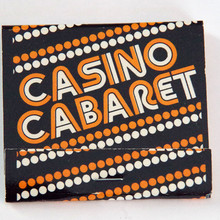
After Sega’s iconic use of Yagi Double, the typeface became a favorite of technology and entertainment brands, and was subsequently implemented by products such as the Mattel Electronics Portable Electronic Games and the Demolition Classic pinball machine, and most notably as the basis for the CNN logo.
Typefaces
Formats
- Branding/Identity (4744)
Topics
- Entertainment (998)
- Technology (894)
Designers/Agencies
- unknown (2140)
Tagged with
- Sega (15)
- logos (2686)
- video games (117)
- games (61)
- arcade games (19)
- vintage electronics (42)
- lettering derived from typeface (479)
- video game consoles (13)
- blue (605)
- optical sizes (212)
- iconic uses (88)
- high profile (511)
- critique of use (81)
Artwork location
- Japan (99)
















1 Comment on “Sega logo (1976–present)”
It’s worth noting that the Sega logo went through various changes over the years, as Stephen already mentioned, but didn’t illustrate in detail. In its earliest form, the letterforms were even closer to Yagi Double. In the comparison below, the middle row shows the Sega logo as used on the back of an undated US flyer for the Road Race game, which was released in February 1976. Note that the S and A match the glyphs in the Yagi Double typeface (top), unlike in the later logo version (bottom). The E is more similar, too, and was just made a little wider. The G is the only major modification. If you look at the top line in unmodified Yagi Double, you can see how this intervention makes sense: it closes the gap, increasing the logo’s impact.
Fun fact: the front cover of that flyer still shows the previous logo with blackletter caps. This suggests that it dates from 1976, shortly after the new logo was introduced.
Storm of emotions, nostalgia and joy. There are a bunch of cartridges with games. Many years have passed, and the game delays and adult and child.
I think we can safely say that not only is this logo really iconic, but it has perfectly stood the test of time. Well after the 70s anyway! The colours, shape and simplicty of it all just continue to work. Just like Nintendo.