The Partridge Family (1970–1974) titles
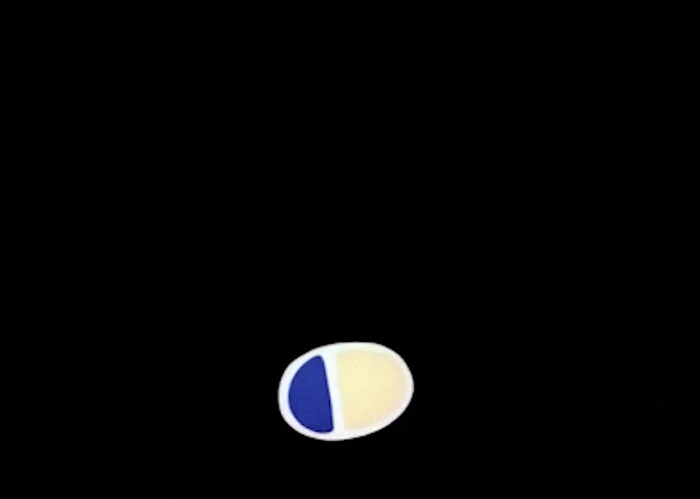
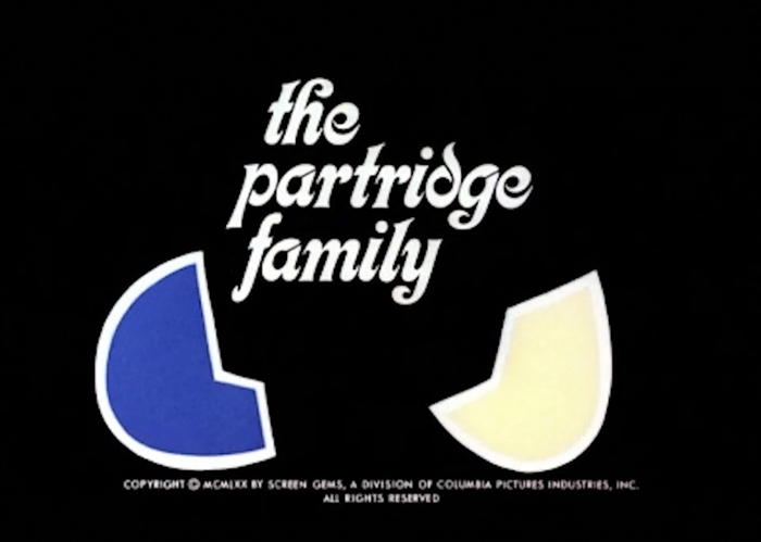
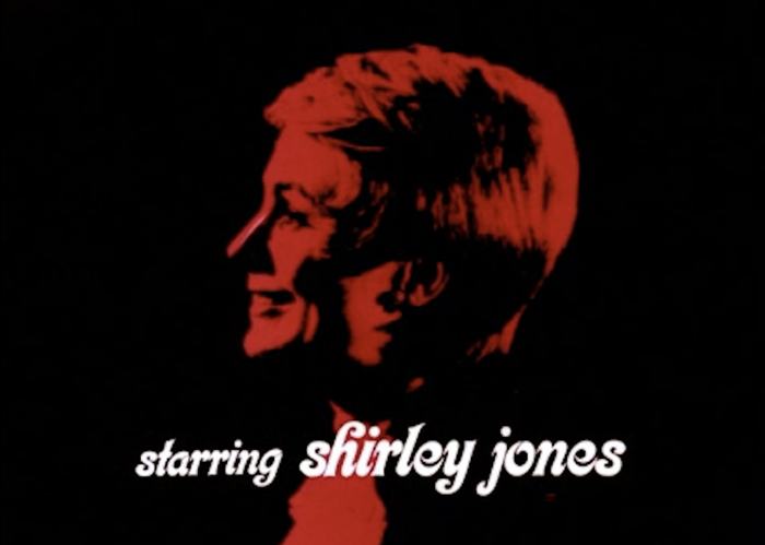
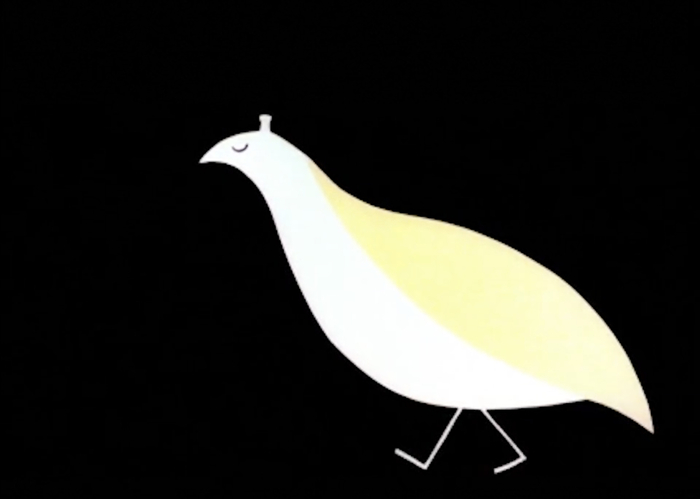
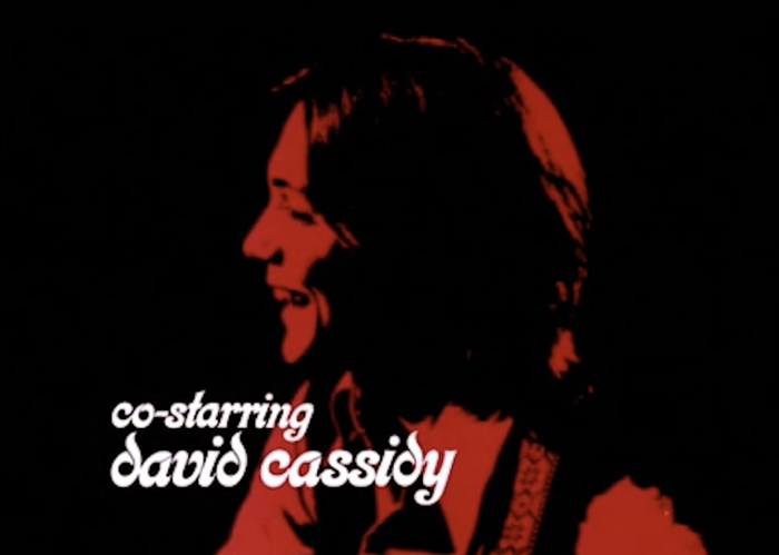
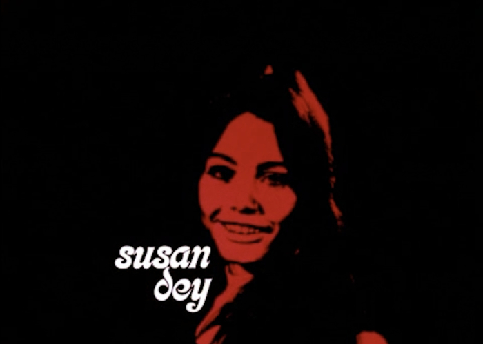
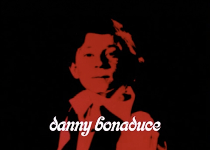
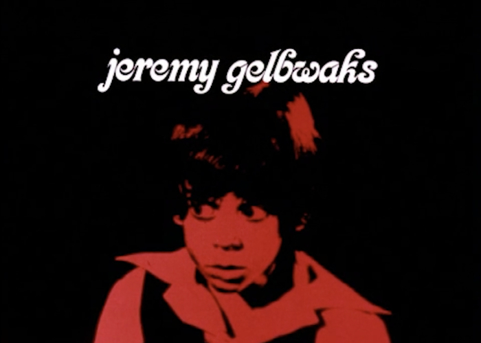
All-lowercase Kalligraphia was chosen for the titles of The Partridge Family. Designed by Sandy Dvore, the opening sequence features an animated family of partridges. See the walking birds in action in the video at the end of this post. Dvore’s original art of the partridge hen and her five chicks was offered in an auction in 2016.
From Wikipedia:
The Partridge Family is an American musical sitcom starring Shirley Jones and featuring David Cassidy. Jones plays a widowed mother, and Cassidy plays the oldest of her five children, in a family who embarks on a music career. It ran from September 25, 1970, until August 24, 1974, on the ABC network as part of a Friday-night lineup, and had subsequent runs in syndication. The family was loosely based on the real-life musical family the Cowsills, a popular band in the late 1960s and early 1970s.




Typefaces
Formats
- Film/Video (647)
Designers/Agencies
- Sandy Dvore (2)
Tagged with
- TV series (103)
- sitcoms (19)
- ABC (American Broadcasting Company) (19)
- 1970s (1109)
- title sequences (236)
- all lowercase (595)
- reversed type (1940)
- duotone / halftone on color (70)
- animation (178)
- eggs (16)
- birds (101)
- partridges (1)
- Shirley Jones (1)
- David Cassidy (2)
- red and black (770)
- high profile (511)
- The Partridge Family (1)
Artwork location
- United States (6359)





















1 Comment on “The Partridge Family (1970–1974) titles”
Sandy Dvore used all-lowercase Kalligraphia already for the titles of Wild in the Streets from 1968.
So far, the earliest documented use of Kalligraphia in the mid 20th century is on the cover of See What Tomorrow Brings by Peter, Paul and Mary, designed by Milton Glaser at Push Pin Studios in 1965.