
NMBS “kleurige treinen, fleurige vakantie” advertisement
Contributed by Eva Silvertant on Dec 6th, 2021. Artwork published in
.
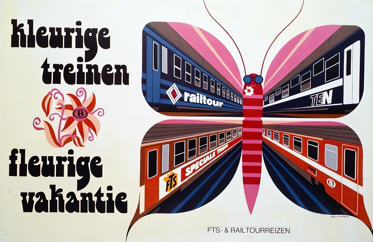
“Colorful trains, flowery vacation”: A nice hand-rendered Bottleneck (Tony Wenman, 1972) in quite a gaily 1979 advertisement for the National Railway Company of Belgium (NMBS).
The ‘flower-powered’ ad was designed by Paul Funken (1932–), who was responsible for many of the progressive Swiss-style NMBS advertisements and posters in the 1960s. Arjan den Boer posted a tweet about this poster (translated from Dutch):
The Belgian railways were progressive in poster design in the 1960s. This is mainly thanks to the designers Paul Funken and André Pasture. They developed a Belgian variant of the Swiss Style with sleek typography, lots of white space, and abstracted or geometric representations.
Part of the Belgian train museum Train World.


")


")


")
