
Cobra Kai TV series (2018–) logo
The Karate Kid – a classic piece of Americana – has ensconced Danny LaRusso alongside other coming-of-age icons like Holden Caulfield and Huckleberry Finn. After crane kicking the irredeemably douchey bully, Johnny, out of the All Valley Karate Championships, Danny would go on two more karate related adventures. His trainer, the legendary Mr. Miyagi, would even go on to train future Million Dollar Baby, Hillary Swank. But the last we saw of Johnny, he was a victim of a brutal assault at the hands of his own sensei, Kreese, of the villainous Cobra Kai dojo. An entire generation grew up wondering, what happened to that guy?
Cobra Kai has the answer: not much. The show, originally created for YouTube but now available on Netflix, introduces us to Johnny 34 years later, washed up, out of luck, and desperately clinging to relics of his ’80s cool: hair metal, a Pontiac Firebird, and his trademark golden locks. Karate is no longer part of his life, until one night he dusts off his skills defending a kid from bullies, and the show is off running. Johnny is unquestionably still douchey, but now he’s redeemable – by karate.
In choosing the Cobra Kai title font, Sony Pictures Television needed something that captured that lost ’80s cool – a font that could pack all the action and adventure of the Reagan era into two words. They needed a font with the balance, flow of moment, and mastered aggression of a black belt in karate. They needed BLKBK’s Dead Stock.
Like Okinawan calligraphy, Dead Stock is written with a brush and ink. Its movements are carefully plotted and practised, yet finish with shouts of aggression. Like the best karateka, poised to strike, the font remains loose yet perfectly balanced. In execution, it displays a variety of forms and motions, lifting from the page with the speed and grace to elude the fight that brought it there. True to Cobra Kai, it strikes hard, strikes first, and shows no mercy.

Netflix poster. “Now streaming” is in Netflix Sans.
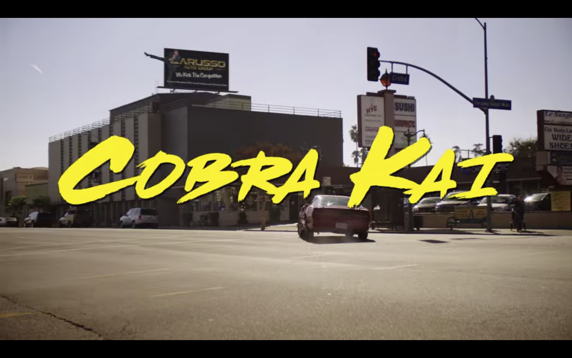
Title screen from episode 1


 movie titles")


")


")


