

“2 Tones for That Great Illusion!” page in Frederick’s of Hollywood catalogue 1972
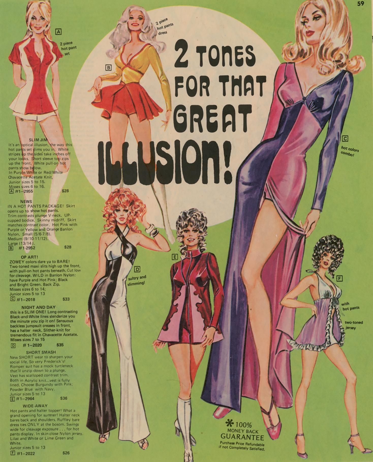
With the very kind permission of J.J. Englender at Adsausage I am able to make a third font use contribution under Davison Arabesque, this example thereof appearing on page 59 of a 1972 catalogue by Frederick’s of Hollywood. Sadly, unlike my two previous contributions related to Davison Arabesque, Of Course You Can Sew! and Diabolus, this is not in mixed cases, but it still is a fairly eye-catching example of its use.
Frederick’s of Hollywood (founded in 1947 by the inventor of the push-up bra, Frederick Mellinger) no longer exists as a chain of physical stores (as of 2015). However, in a sort of tribute to its catalogues, it still exists as an online only store at fredericks.com. It is notable, though, that Frederick’s has apparently abandoned the outerwear market that it clearly occupied at the time of this catalogue.
The artwork for the catalogues was provided by Dorothy Kahn (1922–2000), about whom one can read more at KahnArt on Zazzle.


")


")


")

 film posters")


2 Comments on ““2 Tones for That Great Illusion!” page in Frederick’s of Hollywood catalogue 1972”
Thanks, Christopher!
All smaller type on this page is set on an IBM Selectric Composer, using their adaptation of Univers and, for “100% Money Back Guarantee”, the exclusive Theme.
Thanks!
I think Lizzie Bramlett at The Vintage Traveler will love this when I tell her about it, with it involving vintage fashion.