
The Cooperage, Albuquerque
Contributed by Kevin Glasgow on Apr 23rd, 2022.
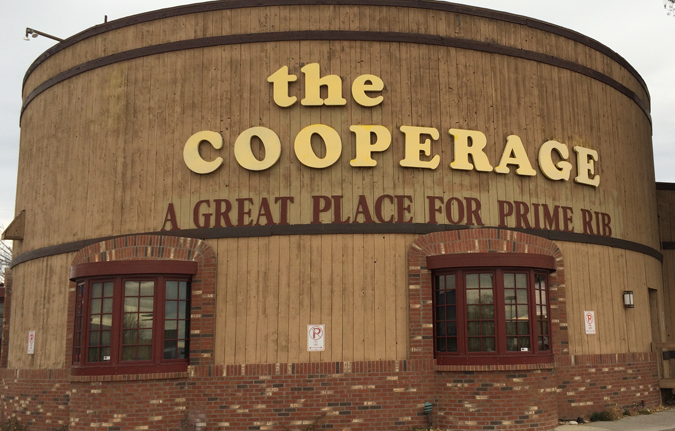
Photo: Kevin Glasgow. License: All Rights Reserved.
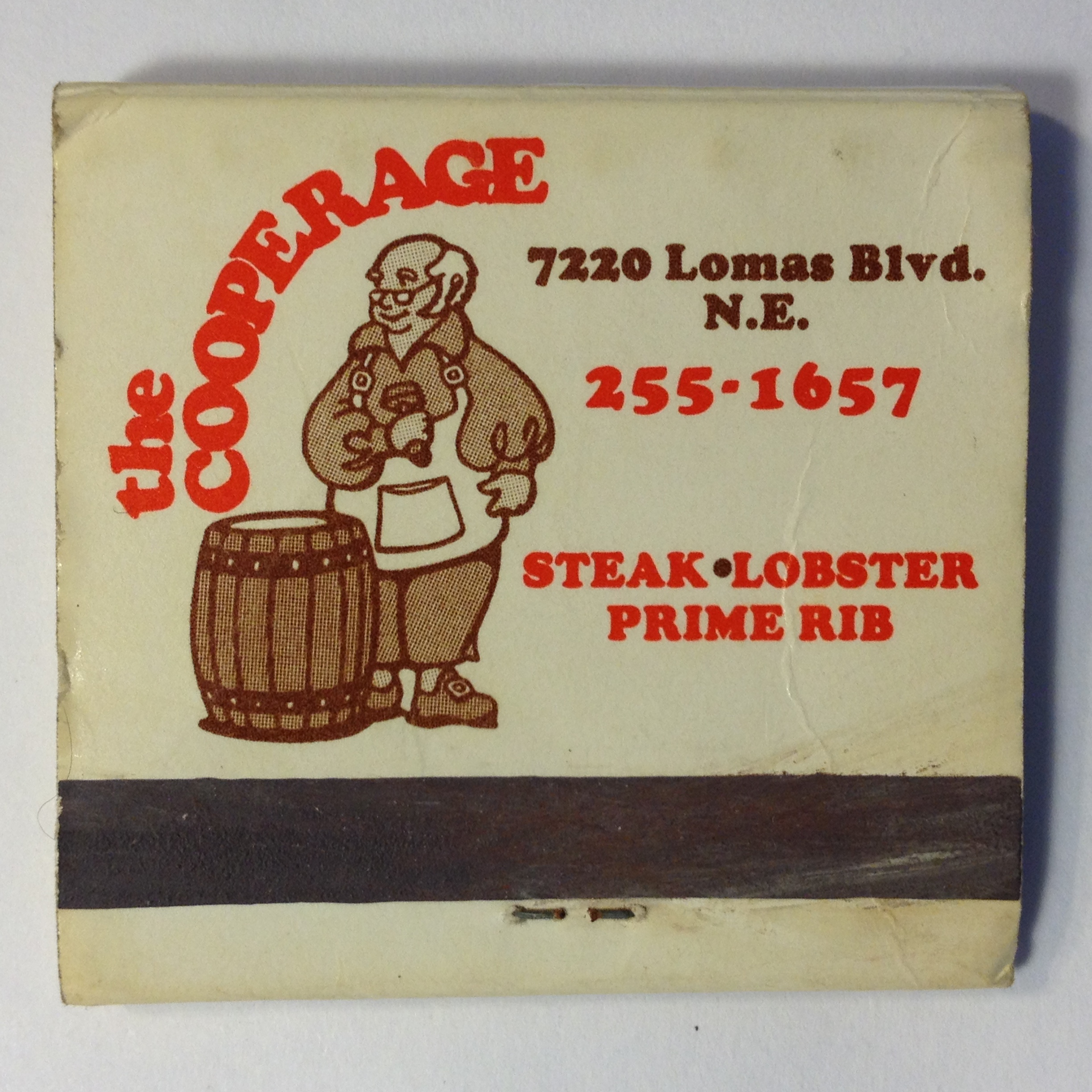
A victim of the Covid-19 pandemic, the now closed Cooperage was an Albuquerque fixture for over 40 years. The distinctive barrel-inspired architecture marked it as local landmark. Naturally, Cooper Black was used in the eatery’s word mark.
The typeface used for the slogan (“Great prime rib place”) is unidentified – Plantin Bold Condensed comes close.

Photo: Kevin Glasgow. License: All Rights Reserved.
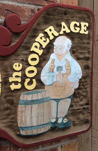
Photo: Kevin Glasgow. License: All Rights Reserved.


")


")

