
César Franck – Psyché album art
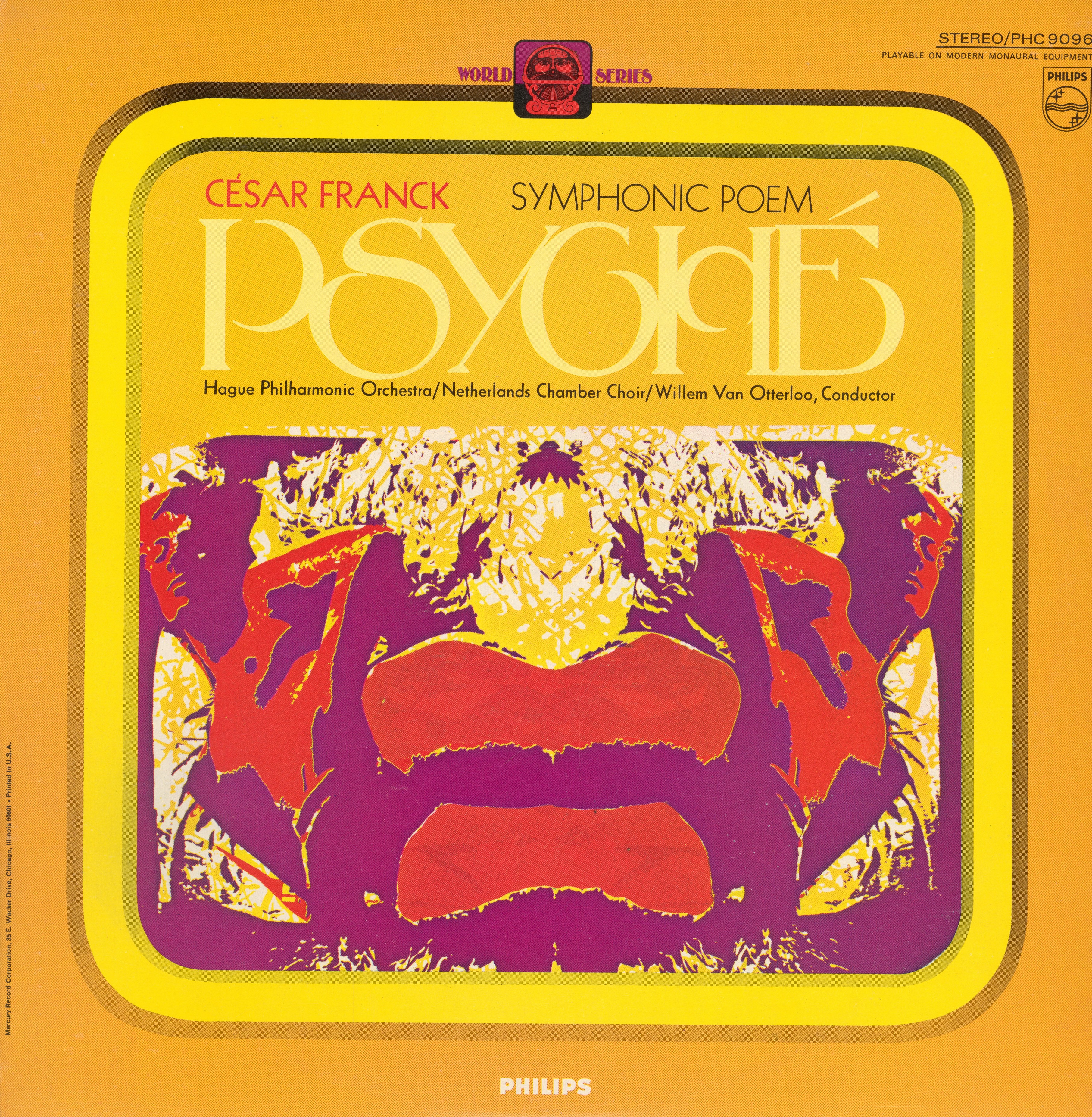
Psyché is a symphonic poem based on the Greek myth of Eros and Psyche, written by Paris-based composer César Franck between 1886 and 1888. This recording was performed by the Residentie Orchestra (Hague Philharmonic Orchestra) together with the Nederlands Kamerkoor, conducted by Willem van Otterloo. The record was released in the Philips World Series, featuring a logo in Binner. Unfortunately, the cover design with the Rorschach test-like art in loud colors in uncredited.
The title is set in tightly spaced Chippendale. This all-caps face is shown by Lettergraphics in catalogs dated 1968 and 1976. The design is several decades older, though: Chippendale is an adaptation of a capital alphabet designed by Detroit lettering artist Charles Jay Strong (1866–1910). It’s shown without name in the second edition of Strong’s Book of Designs from 1917. Digital interpretations of this historical source include Key West (Kalynn Campbell for Roulette Studios, 2000) and MFC Petworth Monogram (Monogram Fonts Co., 2015).
The second typeface on this cover is an interesting one, too: it’s Neu-Kabel a.k.a. Cable perfect, a revision of Rudolf Koch’s Kabel with Futura-like forms for a e g W 7, issued by Klingspor in 1953.


")


