
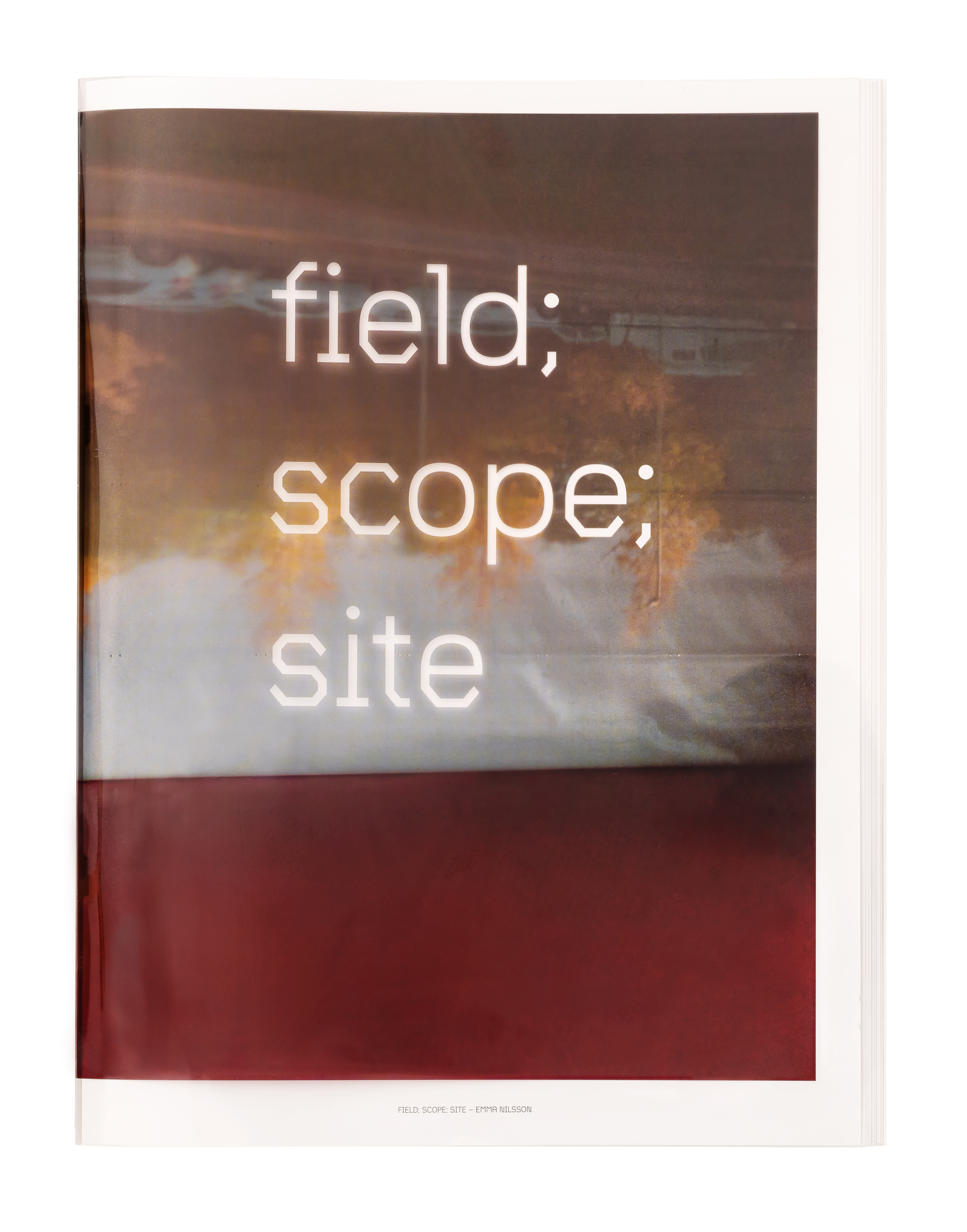
field; scope; site by Emma Nilsson
The book field; scope; site by Emma Nilsson was published by Sailor Press in an edition of 300 stapled copies. From the project page:
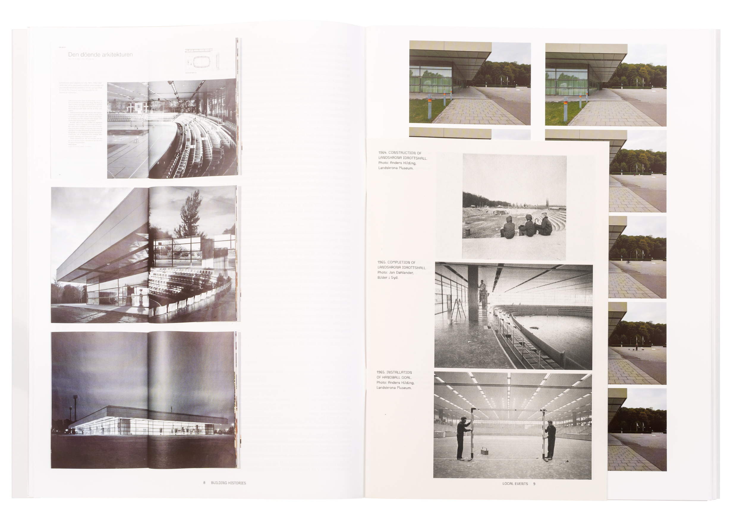
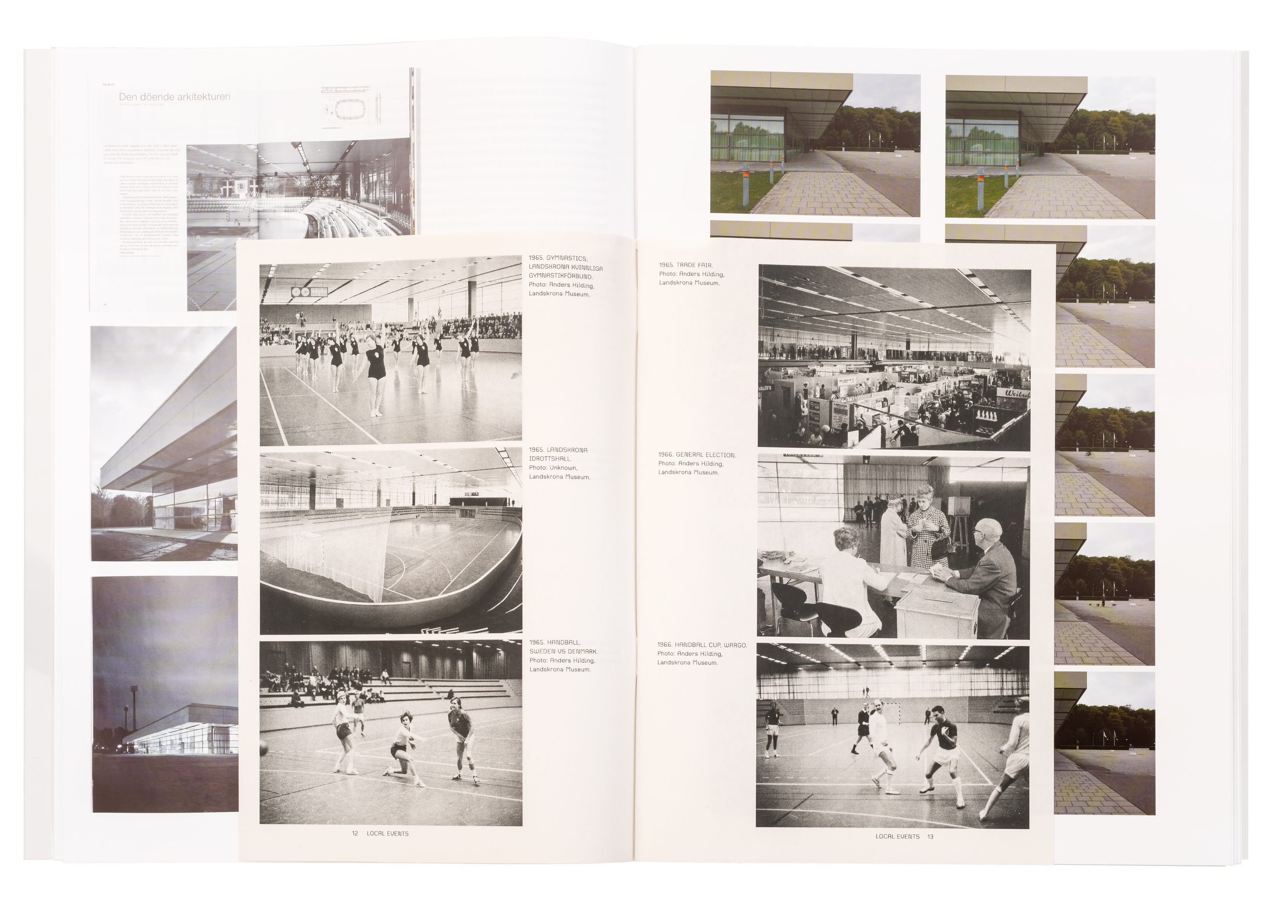
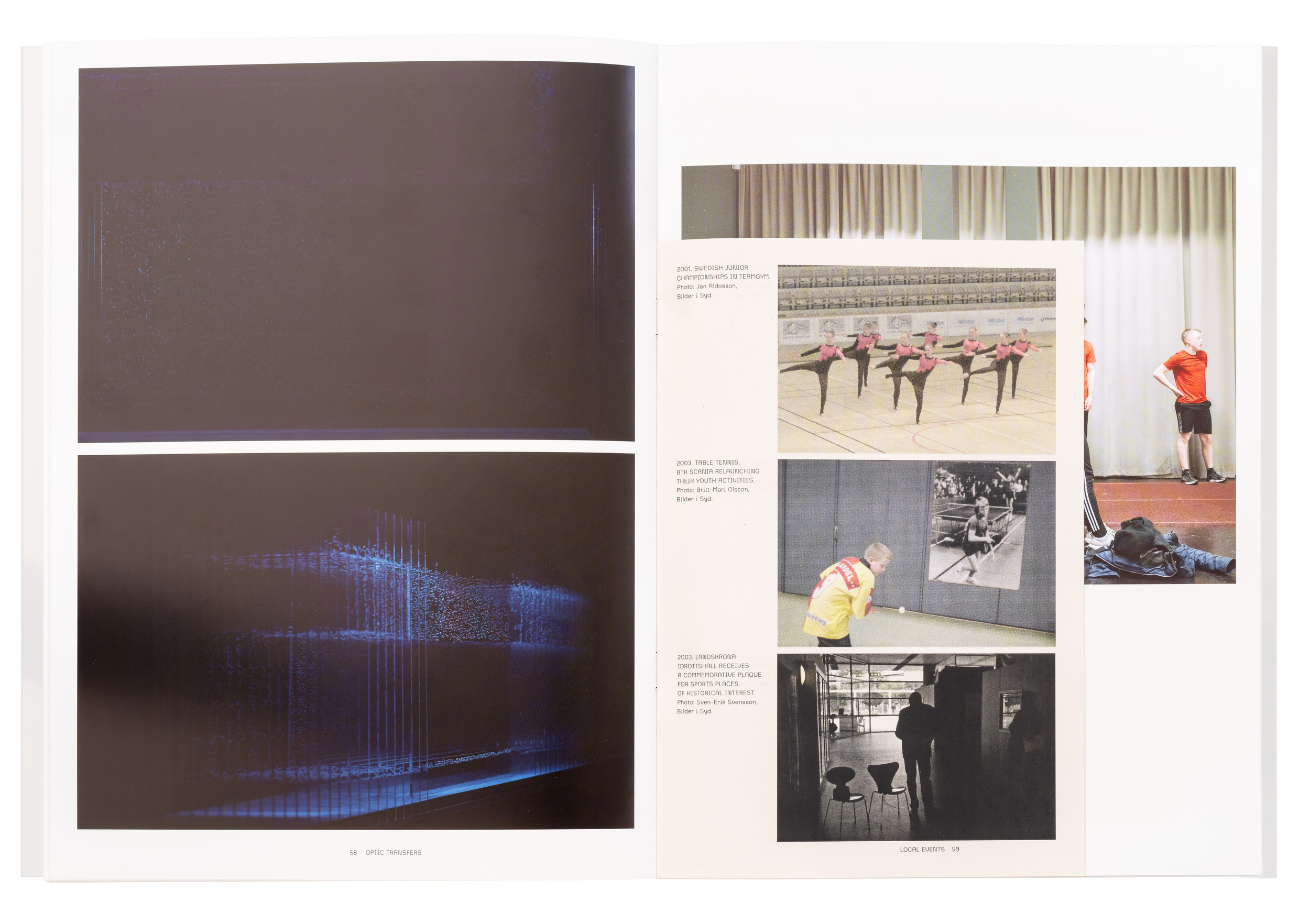
The most straightforward way to introduce of field; scope; site would be to call it a photographic documentation of Landskrona Idrottshall, a building designed by the Danish architect Arne Jacobsen in the sixties. Albeit correct, it is a somewhat misleading characterization. Landskrona Idrottshall is indeed the object of study, but above all, it constitutes an objective to conduct a series of investigations, where photography is explored as a method for architectural thinking and making.
Initially produced and displayed as an exhibition, the photographic work and accompanying writings have since been transformed into this book. Similar to the original photographic acts not aiming to depict a particular building, the book is not a documentation of an exhibition. Rather, we have reinterpreted the exhibited work into the spatial logic of the book. The book enacts another chronology as well as a different chorology, creating its own photographic space.


")


 documentary")


")


")

")


1 Comment on “field; scope; site by Emma Nilsson”
Congrats, Jonas – that’s a flawless LTypI!
Is it just me, or is the cover a nod to Ed Ruscha? With the three words each set on a new line, in octogonal monolinear letters, and reversed on a multicolored background with a nature motif, there definitely are similarities, see e.g. God Knows Where or Start Over Please.