Wolle Kriwanek & Schulz Bros. album art
Wolfgang “Wolle” Kriwanek (1949–2003) was a blues rock musician from Stuttgart, Baden-Württemberg, who is best known for popularizing the Swabian dialect in German pop music.
The typeface used on the sleeve of this album from 1980 is GST-Magnet. It’s one of three dozen typeface designs (with a total of 160 styles) drawn by Georg Salden (b. 1930) for the GST-Kreis. Started in 1972, this circle was a collaboration of Salden with a number of phototypesetting studios, initially in (West) Germany, and later also in neighboring countries. At regular meetings, Salden presented proposals for new typeface designs, and worked on those that received the most votes. About once a month, Salden delivered a new typeface design that was then exclusive to the club members. This setup allowed Salden to quit his graphic design practice and make a living as an independent type designer.
Salden’s extraordinary skills and innovative ideas, combined with the exclusivity of his faces, soon attracted plagiarists. Typeshop, a chain of phototypesetting studios that were competing with the GST-Kreis members, wanted to offer a design like Magnet to their customers as well. Typeshop was linked to the Brendel Type Studio, founded by Walter Florenz Brendel (1933–1992), a pioneer of digital type. The studio created their own exclusive typefaces, known as Typeshop Serials. These were typically adaptations of existing classics (Baskerville, Bodoni, Futura, Times – you name it), expanded to cover a range of weights, plus outline and shadow styles.
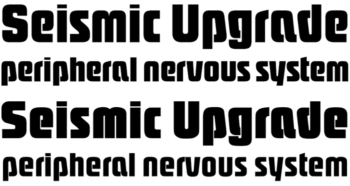
Magnet (TypeManufactur’s digital version, first two lines) compared to SoftMaker’s Pasadena Serial Heavy (third line) and ExtraBold (fourth line). Note how in Pasadena, S has the same basic shape as s, e has a sharp corner, the i dot is heavier, and the terminal of r is flatter. Other differences include the shorter center of w/W.
In some ethically more problematic cases, though, the adopted designs weren’t old classics from bygone centuries or at least from the days of metal type, but rather very recent designs. Pasadena is a case in point: made in 1974 (according to some sources that I haven’t verified), it’s a blatant ripoff of Magnet that Salden had made available to his partners just a year earlier. The unauthorized copy was expanded to seven numbered weights. Pasadena’s two boldest weights are roughly equivalent to the original Magnet. Typeshop introduced some superficial differences, apparently to make it legally incontestable. Some of the Typeshop fonts are being sold in digital form to this day, by various outlets including The Quick Brown Fox, TypeShop Collection, and Softmaker. If you want to do the right thing, avoid Pasadena and go with the original instead. A digital version of Magnet is available on request from TypeManufactur.
Formats
- Album Art (2720)
Topics
- Music (4102)
Designers/Agencies
- Karlheinz Groß (1)
Tagged with
- Wolle Kriwanek (1)
- Phonogram (2)
- Philips Records (34)
- blues rock (18)
- folk (music) (86)
- album records (1631)
- vinyl records (2282)
- rotated type (1397)
- ampersands (177)
- 1980s (446)
- West Germany (130)
- typeface profile (71)
Artwork location
- Germany (2667)





















1 Comment on “Wolle Kriwanek & Schulz Bros. album art”
Was surprised to see my photo here :)